Marketing design
21
min read
Imagine scrolling through your feed. Walls of text blur together. Stock photos barely register. But a good infographic example? You stop. You pay attention — and you remember.
That’s no accident.
We process visuals 60,000 times faster than text, and when images support information, we retain 65% of it, compared to just 10% from plain words. In today’s crowded digital world, infographic design examples aren’t a bonus. They’re essential.
But a real infographic isn’t just a colorful poster. It’s a story, crafted to guide the eye and deliver a clear message. Building one that works takes more than decoration. It takes real design skill, and that’s exactly what is a marketing designer all about.
The numbers tell the story. Infographics impact:

You probably noticed the graphic above. That wasn’t just information. It was an example of an infographic doing its job — grabbing your attention, making the stats stick, and sparing you another wall of text, echoing the effectiveness of email marketing design principles.
Infographics like that aren’t just pretty extras. They boost traffic, drive engagement, and get shared far more than text alone.
Of course, success doesn’t happen by dragging charts into a template. It comes from sharp thinking, strong visuals, and a deep understanding of your audience. (And if you want one that actually works, TodayMade’s team can help.)
Let’s look at what separates forgettable designs from professional infographic examples that leave a lasting impression.
A great infographic doesn’t just display facts. It makes them impossible to ignore.
It guides the eye, tells a story, and leaves your audience feeling like they learned something important without effort. That’s the magic. You take complex information and turn it into something anyone can understand in a few seconds. These are the kinds of good examples of infographics that people remember, while also showing the value behind questions such as how much do illustrations cost.
Here’s what sets the best infographics apart:

The most effective infographics focus on a single point. When you try to cover everything at once, you end up with a confusing mess that nobody finishes. Research shows that 81% of online readers skim content, which means a focused, simple infographic has a much higher chance of landing its message.
2. Logical visual flow
Good infographics guide the reader's eye naturally from start to finish. Layout, white space, and visual hierarchy should lead people through the story without confusion.
This matters because infographics are 30× more likely to be read fully than plain-text articles.
Design elements like typography, color, and icons must serve the content, not fight for attention.
Using color intentionally can boost attention span and comprehension by 82%, making your message stick faster and longer.
Great infographics spark curiosity, highlight surprising facts, or trigger a strong emotional reaction.
Studies show that people are 43% more persuaded by visuals compared to plain text, so emotional or insightful content gets results.
Trust is critical. Infographics should use real, reputable data that drives the story forward, not random numbers thrown in for decoration.
61% of consumers say they understand and retain information better when it’s presented visually, which proves why your data must be solid and meaningful — a key trait of strong informational infographic examples.
Knowing what makes a great infographic is one thing. Seeing it in action is another. Let’s look at what separates forgettable designs from effective infographic examples that leave a lasting impression.
Artistic infographics aren’t just tools for explaining data. They can also be powerful works of design — grabbing attention, stirring emotions, and sticking in the memory long after the scroll. These are some of the best infographic examples that show how clarity and creativity can work together.
A flowing timeline that visualizes how internet technologies evolved from the 1990s to today. Curved lines, color-coded categories, and minimal text keep it clean despite the complexity.

Lesson to learn:
When dealing with complicated timelines or processes, smart visual structuring (like flowlines and color bands) helps people see the bigger picture without feeling overwhelmed.
A circular, kaleidoscope-like chart showing genomic relationships, mutations, or patterns. Data arcs and radial lines form dense, mesmerizing visuals.

Lesson to learn:
Radial designs are ideal for representing interconnected systems where hierarchy isn’t linear. Use structure to guide the eye without needing to spell everything out.
A rainbow arc visualization of all 63,779 cross-references in the Bible. Each arc connects two related verses, with the length and placement reflecting their position in the text. The base histogram shows chapter lengths. It's both poetic and precise.

Lesson to learn:
When data has a deep structure or meaning, the right visual format can create both an emotional response and clarity. This example shows how information design can turn invisible patterns into something beautiful, even sacred.
An animated, data-driven film and infographic that visualizes the human cost of WWII. Millions of deaths are represented with slowly accumulating dots, building scale through rhythm and repetition.

Lesson to learn:
Emotionally charged data benefits from minimalist, somber design. When dealing with tragedy or sacrifice, restraint is more powerful than decoration.
A beautifully illustrated infographic series that visualizes the stages of human embryonic development, from fertilization through organ formation. Each phase is represented through detailed anatomical drawings and spiral visual metaphors, blending art, science, and storytelling.

Lesson to learn:
When visualizing scientific complexity, combine precise illustration with a narrative structure. Lutz’s work shows how visual storytelling can make abstract biology both accessible and awe-inspiring — a powerful blend of education and wonder.
A vibrant, hand-crafted geological map of the Moon that combines NASA data with ornate, vintage-style cartography. Over 40 geologic units are color-coded in sweeping detail, creating a map that feels both like a scientific tool and a piece of art.

Lesson to learn:
Scientific accuracy can coexist with visual splendor. By borrowing the language of antique maps and mixing it with modern planetary science, you can make even raw geology feel wondrous and immersive.
A retro-styled A–Z visual glossary where each letter represents a core design principle from Aesthetics to Leading. Each block uses bold, symbolic illustrations and color schemes that reinforce the concept it represents.

Lesson to learn:
When teaching abstract or creative ideas, structure content in a familiar format (like the alphabet) and let typography and visuals embody the concept. Good design education is visual, and a great infographic teaches by example, not just explanation.
A stunning logarithmic map showing everything from Earth to the edge of the observable universe in concentric circles. It combines astronomical data with visual metaphor — from planets to galaxies to the cosmic microwave background.

Lesson to learn:
Use a logarithmic scale and radial symmetry to visualize abstract vastness. When the scope is overwhelming, form becomes the hook for comprehension.
This infographic compares liberal and conservative ideologies through a carefully structured visual metaphor. Rather than listing political stances, it presents two worldviews side by side — using symmetry, color, and concept-driven imagery to invite reflection.

Lesson to Learn:
When visualizing abstract ideas, a strong infographic can function like a visual essay. It doesn’t just inform; it encourages interpretation and deeper thinking.
This infographic blends portrait illustration, timelines, and data visualization to explore the intersection between writers’ sleep patterns and their creative output, including productivity metrics (books published) and awards (Nobel, Pulitzer).

Lesson to learn:
When visualizing behavior, creativity, or cultural patterns, combining data with illustration helps create emotional resonance. Metaphoric visuals and poetic layouts can turn raw stats into something memorable and human.
A poetic data visualization of conflicts from 1900 to the present, where each red poppy represents a war, scaled by its death toll and duration. The timeline and color-coded regions evoke both remembrance and insight.
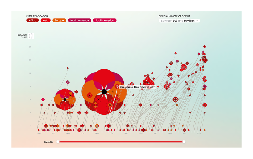
Lesson to learn:
When visualizing tragic history, aesthetic sensitivity can deepen emotional impact. “The Poppy Field” uses metaphor and minimal text to transform data into memory, making viewers pause, reflect, and feel.
While artistic infographics grab attention, some designs aim to explain — not just impress.
Data-heavy infographics take complexity head-on. These examples show how clear structure and smart visuals can make even dense datasets feel digestible.
A visual breakdown of government and business expenditures, with each block sized proportionally to the amount spent.

Lesson to learn:
When you want to highlight inequalities or shocking comparisons, proportional sizing (like bubble or block diagrams) instantly shows scale in a way text never could.
A bubble chart showing major data breaches, with bubble size representing the number of records compromised. Color codes indicate breach type (hacking, accidental publishing, etc.).

Lesson to learn:
Combining scale (bubble size) with category (color coding) makes complex issues instantly understandable. A good infographic doesn’t just visualize — it also organizes chaos.
A calm, structured flow diagram shows how 433 active shooter incidents in the U.S. ended, using a Sankey-style layout to map outcomes like suicide, police intervention, or bystander response. Color and line thickness indicate frequency, guiding the reader through a difficult subject with clarity and control.

Lesson to learn:
When illustrating sensitive or emotionally charged data, use calm, transparent structures to guide understanding. Flow diagrams help simplify branching logic, making complex topics easier to grasp without sensationalizing the story.
A time-series line chart compares how Democrats and Republicans rated the U.S. economy over a decade, with clear shifts marked by major events like presidential inaugurations and the COVID market crash. The visual highlights growing partisan divergence and the reactive nature of economic perception.

Lesson to learn:
A basic line chart becomes powerful when paired with thoughtful annotations and key event markers. In politically polarized data, a minimalist design helps emphasize contrast, letting the story speak without distraction.
A bar chart comparing estimated suicide rates per 100,000 people in various countries, separated by gender. The use of contrasting colors (blue for men, red for women) emphasizes the global disparity and highlights regions with the highest rates.

Lesson to learn:
For sensitive or impactful statistics, clarity and restraint are key. Gender-segmented bar charts like this allow users to see inequalities at a glance, while a minimal design ensures the seriousness of the subject is preserved.
A visually striking infographic that compares major world religions by number of followers, using candles as a metaphor for presence and influence. Candle height and flame brightness correspond to population size, giving the chart symbolic and emotional depth.

Lesson to learn:
When dealing with cultural or spiritual topics, metaphor (like candles for belief) can make statistics feel human. This infographic blends data visualization with symbolic imagery, helping viewers absorb both scale and meaning.
A flowing timeline bar chart where each line represents a single person killed by gun violence, ending at the age they might have reached.

Lesson to learn:
Even cold statistics can be individualized through thoughtful design. This infographic combines data with empathy, making it more than just a chart — it’s a moral argument backed by data.
A U.S. heatmap shows the chances that a child born in the bottom 20% income bracket will reach the top 20%, depending on where they grow up. Color gradients highlight dramatic regional differences, with lower mobility concentrated in the Southeast and higher rates in parts of the Midwest and West.

Lesson to learn:
Choropleth maps are effective for exposing regional disparities. This example works by combining intuitive color scales, geographic context, and a single focused metric — turning a massive dataset into a clear, compelling message.
A vertical timeline traces key moments in internet history, from early theoretical concepts like the “World Brain” to the rise of Google, social media, streaming, and viral culture. Colored tracks represent different themes — such as innovation, communication, and entertainment — helping organize a dense historical narrative.

Lesson to learn:
When presenting complex timelines with overlapping themes, color-coded paths help readers follow parallel developments without confusion. This structure makes it easier to group ideas and spot long-term patterns.
A clean, chemistry-based infographic that breaks down the elemental composition (in grams) of the 2024 Olympic gold, silver, and bronze medals. It highlights not only material percentages, but also the meaningful inclusion of iron from the Eiffel Tower in each one.

Lesson to learn:
When communicating technical or scientific breakdowns, use icons, atomic symbols, and standardized weights alongside strong visual symmetry. This ensures clarity for both experts and lay audiences — and anchors abstract data in a real-world context.
A 2D scatterplot ranking dog breeds by popularity (y-axis) and a custom “data score” (x-axis) that includes intelligence, cost, grooming needs, and more. Breed size and color reflect group and size classifications.

Lesson to learn:
A smart use of multivariate visual encoding (position, size, color, shape) can unpack a subjective topic like pet preference into something meaningful and surprising. Great infographics reveal hidden patterns — even in personal choices like choosing a dog.
A colorful timeline that maps out famous historical figures across centuries and disciplines, such as artists, thinkers, leaders, and entertainers. Overlapping colored bars create a sense of cultural density over time.

Lesson to learn:
Categorical color coding combined with a temporal scale helps viewers relate people across history, creating a broader context through a clean, artistic layout.
Not all infographics are about numbers. Some guide the reader through a process, clearly, step by step.
From user onboarding to internal workflows, process-based infographics simplify instructions and keep people moving forward with less confusion.
A highly detailed 3D animated infographic showing internal combustion engine mechanics in motion.

Lesson to learn:
Complex mechanical or technical processes benefit from layered visual explanations. Animation or sequential storytelling can replace hundreds of words of description.
This minimalist 3-panel infographic uses red and blue tiles to show how voting districts can be manipulated. The left shows overall voter distribution, the center shows a fair districting model, and the right shows a gerrymandered outcome that flips the majority through district boundaries.

Lesson to learn:
When trying to expose manipulation or systemic distortion, use side-by-side visual comparisons. Simple shapes and color codes can convey deep political truths faster than paragraphs ever could.
An illustrated step-by-step guide that teaches how to estimate remaining daylight using your fingers and the sun's position in the sky. It combines visual storytelling with numbered instructions and accurate proportional cues.

Lesson to learn:
When teaching physical techniques or survival skills, combine realistic visual demonstrations with sequential numbering and annotated diagrams. The combination of imagery, simplicity, and clarity makes the information immediately actionable.
A detailed taxonomy of sandwich types is organized by primary ingredient categories like pork, beef, chicken, and vegetarian. Each visual stack shows sandwich components from bottom bread to top garnish, creating an easy visual comparison across formats and cultures.

Lesson to learn:
For complex systems with many variations — like recipes or taxonomies — a clean grid layout with consistent visual structure helps readers compare without needing detailed explanations. This format teaches by showing, not instructing.
A clean visual with numbered steps and consistent knot position throughout — ideal for fashion or grooming guides.

Lesson to learn:
When hands or objects shift position, keep visual continuity (e.g., color, orientation) so users never lose track of where they are.
A step-by-step layout explains how vaccines trigger immune responses, including memory cell formation, the role of booster shots, and herd immunity. Each panel uses simple icons and minimal text to make the science accessible without sacrificing accuracy.

Lesson to learn:
When explaining scientific or medical processes, a clear panel layout with iconography helps simplify complex systems for general audiences. This approach supports both comprehension and trust.
A six-step illustrated guide demonstrates how to turn bedsheets into an improvised rope for emergency escapes. Retro-style drawings, bold highlights, and numbered panels create a clear visual sequence that’s easy to follow at a glance.

Lesson to learn:
When illustrating emergency or survival techniques, use simple, sequential visuals with minimal but clear instructions. Strong visual cues and consistent formatting help users process steps quickly — even in high-stress situations.
Commonly posted in public restrooms during the pandemic — this 6–8 step handwashing guide mixes text, simple hand icons, and sequence.

Lesson to learn:
Even the simplest routine benefits from visual steps. Visual reinforcement increases recall and reduces the likelihood of missed steps.
Instructional infographics clarify how things work. If you're wondering what does an infographic look like when used for guidance, these process visuals show exactly that.
Marketing and business visuals are some of the most effective examples of an infographic when it comes to clarifying buyer behavior, funnel stages, or product value.
A simple, striking radial infographic showing the massive volume of online activity that happens every 60 seconds, from emails sent to Instagram uploads.

Lesson to learn:
Scaling numbers visually (instead of listing them) makes the scale relatable and shocking. Radial formats work great for emphasizing circular, recurring events like time or cycles.
Two side-by-side donut charts compare Tesla’s $942B market cap with its global vehicle sales relative to major automakers in 2024. The layout makes the gap between valuation and production visually obvious, contrasting financial dominance with limited output.

Lesson to learn:
Juxtaposing related but imbalanced metrics — like value vs. volume — makes abstract comparisons feel concrete. When highlighting a disconnect, paired proportion charts often say more than raw numbers.
A vertical bar chart visualizing the most lucrative tech and media acquisitions by return on investment. Each bar shows the estimated market cap contribution versus the original purchase price, with logos and color-coded brands for quick identification.

Lesson to learn:
Use side-by-side scale comparisons to convey ROI clearly — especially when there's a dramatic delta between cost and return. Branding elements (like company logos and colors) make financial data more relatable and instantly scannable.
A circular brand map showing how a small number of multinational corporations dominate the consumer goods landscape. Each segment of the wheel represents one parent company, with its portfolio of recognizable products displayed in logo form, highlighting the power of brand iconography, the opportunities of a brand refresh, and the importance of decisions such as how many colors should a brand have.

Lesson to learn:
Use brand logos as data points to make market concentration visually overwhelming — and memorable. Circular layouts work well for showing how a few players dominate a crowded space, especially when brand recognition does the storytelling.
A side-by-side bar chart comparing 2014 and 2024 prices for popular McDonald’s menu items, with percent increase labels and product icons along the x-axis.

Lesson to learn:
When illustrating price changes over time, pairing clean visuals with branded imagery (like menu items) makes the message instantly relatable. Simple comparisons plus percent deltas drive the point home fast and clearly for broad audiences.
A Voronoi-style circle visualization that sizes each country’s area according to its nominal GDP, grouped by continent and annotated with flags and figures.

Lesson to learn:
Use area-based diagrams (like Voronoi maps or bubble charts) when you want to visualize proportion across many categories while keeping geographic or organizational groupings intact. This layout is great for conveying relative scale at a glance while maintaining global context.
A portrait-style ranking infographic that uses engraved-style illustrations, regional color codes, and bold typographic hierarchy to show the estimated net worth of reigning monarchs globally, blending conceptual design with creative presentation ideas.

Lesson to learn:
When visualizing rankings tied to wealth or influence, using consistent portrait framing, strong type, and geographic color coding enhances clarity and memorability. This style is especially effective for blending historical aesthetics with modern data storytelling.
A Sankey diagram visualizing Google's Q3 2023 revenue streams, expenses, and profits. It traces money flow from services like Search, YouTube, and Cloud through to cost of revenue, operating expenses, and net profit.

Lesson to learn:
Sankey diagrams are ideal for visualizing proportional flows. This graphic simplifies a complex financial report into an intuitive map of where money comes from — and where it goes.
An expansive ranked portrait chart showing the richest individuals by wealth category (overall, by country, and by sector), including dollar values and headshots. Categories include women, China, India, tech, finance, media, and sports.

Lesson to learn:
Combining portraits with segmented rankings helps personalize data and makes economic hierarchies visually intuitive. Highlighting subsets within the same layout adds nuance without overwhelming the viewer.
A side-by-side comparison of Coca-Cola and Pepsi visualized in the shape of a soda bottle. The infographic compares brand rank, value, market share, revenue, social media presence, and distribution metrics — much like the direct, engaging format seen in pop up examples.

Lesson to learn:
Using a shape relevant to the subject (like a soda bottle for beverage brands) makes data more memorable. Combining contrast colors and vertical flow helps tell a compelling brand story in a single glance.
A radial bar chart visualizing income distribution across different U.S. religious groups. Each wedge breaks down income brackets — from under $30K to over $100K — and compares them to the national average.

Lesson to learn:
Stylized layouts like radial charts can make socio-economic disparities feel more personal and visual. By wrapping statistical data around iconic religious architecture, this infographic turns abstract numbers into a narrative on faith and class in America.
Modern marketing visuals borrow a lot from the past, because good design principles don’t expire.
Some of the most enduring infographics are decades, even centuries, old. These historical examples prove that clear visual thinking has always been a powerful communication tool.
"Diagram of the Causes of Mortality in the Army in the East" by Florence Nightingale
A groundbreaking polar-area diagram created in 1858 to show the seasonal causes of death in the British Army during the Crimean War. Colored wedges radiate from a central point, visually emphasizing the impact of disease over wounds or other causes.

Lesson to learn:
Elegant, minimal use of shape and color can make urgent statistical insights unforgettable. When data is visualized with clarity and intention, even 19th-century charts can drive policy change and save lives.
A classic 1869 flow map that visualizes the size of Napoleon’s army as it advanced toward and retreated from Moscow in 1812. The chart overlays troop numbers, geography, temperature, and direction all in one integrated visual narrative.

Lesson to learn:
A powerful infographic doesn’t just show data — it tells a story. By combining time, geography, and quantity in a single elegant graphic, Minard turned military disaster into a clear, emotional, and memorable visual.
An early example of economic data visualization, this shaded area chart tracks imports and exports between nations over time. Distinct color fields separate the two flows, with annotations marking trade surpluses and deficits. The chart is part of Playfair’s pioneering work that introduced many modern graph types.

Lesson to learn:
Inventive chart design can clarify abstract economic patterns. Playfair’s layering, color use, and contextual notes show how even early infographics blended data with storytelling — a principle that still defines effective visual design today.
A seminal visual system created for the 1972 Munich Olympic Games, this work introduced a modern, modular pictogram language to represent each sport clearly and internationally. These posters combined color-coded design, symbol sets, and data overlays in an elegant, minimal style that influenced generations of information designers.

Lesson to learn:
Designing with clarity across language barriers requires simplicity, consistency, and universal visual logic. Aicher’s pictograms show how graphic design can bridge cultures through form.
A navigational map used during the Age of Exploration and colonial maritime trade, this chart visualizes wind patterns across the Atlantic Ocean. It shows trade winds, ocean currents, and routes critical for transatlantic voyages between Europe, Africa, and the Americas.

Lesson to learn:
Even centuries ago, data visualization served a vital role in decision-making. By translating invisible forces like wind into navigable lines, this map enabled global exploration and commerce — demonstrating how data + geography can shape human history.
A visual language from the 1920s–30s that used repeated pictograms (like stick-figure people, factories, and tools) to represent data in government reports, museum displays, and educational materials. It was foundational in the development of public-facing visual communication.

Lesson to learn:
By standardizing symbols and simplifying complexity, Isotype made information universally readable. Visual storytelling becomes truly powerful when it’s inclusive of all literacy levels.
An isometric cross-section explaining how the ferry capsized shortly after leaving Zeebrugge port, with callouts showing rescue operations, ship layout, and timeline of events. Insets map the location of the accident and track critical errors.

Lesson to learn:
When reporting complex events, clear spatial storytelling combined with numbered sequences can turn chaos into comprehension. Annotated diagrams help audiences understand physical environments and decisions under pressure, especially in real-time crisis coverage.
A neoclassical architectural metaphor of history, where columns represent centuries and rows group notable figures (statesmen, philosophers, warriors, poets, theologians). The floor shows a flowing timeline of civilizations, guiding viewers from the Creation to modern nations.

Lesson to learn:
This infographic proves that metaphorical and spatial design — here, turning history into a literal temple — can elevate data from a static list to an immersive experience. It’s a masterclass in visual storytelling from the pre-digital era.
While these historical examples show that the fundamentals of great information design haven’t changed, modern audiences expect more. Attention spans are shorter, the stakes are higher, and the visual competition is relentless.
That’s why great infographics today aren’t just about data or decoration — they require deliberate, thoughtful design.
Great infographics aren’t built in five minutes.
They require you to understand the data, simplify it without dumbing it down, and shape it into a clear narrative. Every element — layout, color, font, typography, icons — has to be intentional. If any part distracts or confuses, the message gets lost, weakening both visual storytelling and brand visual identity, and showing the importance of copywriting and graphic design working hand in hand.
At TodayMade, we design infographics that do more than look good. We combine marketing insight with visual storytelling to create content that informs, persuades, and sticks. Whether it's for lead generation, education, or internal communication, we focus on results, not decoration — the essence of marketing design, regardless of whether you choose a freelance graphic designer vs agency.
If you’re creating something quick or personal, start with a simple formula: one idea, one visual. But when the message matters — when it’s part of your business, campaign, or reputation — it pays to work with a team that treats design like strategy.
Need help turning your content into visuals that work? Whether you’re exploring graphic design examples, budgeting for illustrations cost, refining your email marketing designs, or deciding whether to hire a graphic designer or go with graphic design outsourcing — we’ll help you make the right call.


