Marketing design
10
min read
Humans process visuals 6x to 600x faster than text.
That’s a key reason why visuals are so powerful in marketing and design.
Every brand tries to stand out through clean design, clever copy, or polished visuals. But often, something crucial is missing: the story. The part that moves people, sticks with them, and makes your message matter.
Great marketing doesn’t just show — it moves. It invites people into a narrative. That’s the power of visual storytelling, and it also raises the question: what is a marketing designer in this process?
Take Airbnb. Their homepage doesn’t just list properties, it showcases inviting, cozy spaces that evoke a sense of home and belonging. Through visuals alone, they’re selling an experience, not just a place to stay. That’s visual storytelling — selling the story, not the product.

But visual storytelling isn’t just about being artistic. It’s strategic. It’s knowing what to show, how to show it, and why it matters.
At TodayMade, we help brands turn design into story, using principles that guide emotion, build clarity, and drive action. In this guide, we’ll show you how to create a visual story that connects and converts.
You’ll learn:
Let’s break down the art of visual storytelling so that your brand doesn't just look good; it connects.
Visual storytelling is the art of communicating a message through imagery, layout, color, and typography. It’s about direction. Done well, it creates a seamless experience that speaks louder than copy ever could — exactly what a visual storyteller aims to do, while clients often wonder how much do illustrations cost to achieve that effect.
Think about the opening sequence of Pixar’s Up. In just a few silent minutes, we witness Carl and Ellie’s entire love story, told only through visuals. Color shifts show mood. Composition shows closeness. Pacing shows change. No narration. No dialogue. Just story.

The same principle applies in design. While words are often present, it’s the storytelling visuals that unlock emotional connection.
Take a Heinz ad with a single burnt fry and a neat dollop of ketchup. No headline, no slogan, just one image — and you feel the heat. Heinz isn’t just selling a condiment; it’s telling a story of intensity, flavor, and fire.

Even when it seems like there’s no story, good design is always telling one, just more quietly.
Look at Dropbox’s landing page. A black background. Simple layout. Focused text. Bright call-to-action buttons. It doesn’t need to say “we’re efficient.” You feel it the moment the page loads. That’s visual storytelling — subtle, but powerful.

Even the simplest layouts — bold typography, generous whitespace, purposeful contrast — carry narrative weight. They shape how people interpret your brand before they read a single word, showing how closely copywriting and graphic design work together.
If your users can understand your product, feel confident using it, and know what to do next, all without a paragraph of text, you’ve told a story visually.
So how do you bring this into your own work?
Let’s break it down with clear, practical techniques and examples you can start using today.
In this section, we’ll explore practical and actionable visual storytelling techniques that you can use to enhance your marketing design. These are more than just creative ideas — they’re proven strategies that can make your designs more engaging, easier to navigate, and emotionally impactful. By mastering these tactics, you’ll be able to elevate your brand, capture attention, and leave a lasting impression on your audience, ensuring a consistent brand visual identity.
Let’s dive into these powerful visual storytelling techniques and start turning your designs into stories that truly connect.
Negative space (or white space) is the empty area around your design elements. It may seem like "nothing," but it’s actually essential for balance and focus.
How it works:
Negative space surrounds elements like text, images, or buttons and helps guide the viewer's attention to what matters most. It creates order and clarity.
Why it matters:
When used effectively, negative space makes designs feel clean and easy to navigate. It highlights the important parts of your design without overwhelming the viewer.
Example:
Mercedes-Benz uses negative space in their ads by showing a huge expanse of sky around a small amount of text. The empty space makes the message feel more powerful by focusing attention where it matters most.

A visual metaphor uses an image to represent an idea or concept. It helps simplify complex messages and makes them easier to understand.
How it works:
Visual metaphors take something familiar — like a butterfly or a maze — and connect it to an abstract idea, making it more relatable, as seen in creative pop up examples.
Why it matters:
It engages your audience by allowing them to connect personal meanings to your message, making your design more memorable and meaningful.
Example:
Penguin Audiobooks uses a pair of headphones to represent Shakespeare. The simple image tells the story that literature can now be listened to, not just read. It’s an instant connection, no explanation needed. Similarly, Apple’s ad uses a lone apple to represent the brand itself. Without showing the product, it conveys simplicity and innovation, perfectly echoed by the tagline: “Simplicity is the ultimate sophistication.”

Repetition involves repeating design elements to build familiarity. Contrast highlights differences between elements to grab attention.
How it works:
When you repeat something — like a color or shape — it becomes easy to notice. Contrast, on the other hand, makes key elements stand out by creating visual differences, much like in the best infographic examples.
Why it matters:
Repetition helps create a sense of order, while contrast directs attention to the most important parts of your design. Together, they make information easier to digest.
Example:
Citroën uses repetition and contrast in a car ad. They show the same image of a dog in a rear window twice — first blurry (representing an ordinary diesel engine), then clear (representing Citroën’s advanced diesel). The contrast makes the point clear right away. Sharpie applies the same principle by illustrating one scene in two drawing styles — bold for a moon landing, fine for a film set — visually reinforcing the message: “one story, two points.”

Visual exaggeration takes an element of your design and makes it larger than life to emphasize a key message or feature, showing how conceptual design can transform simple ideas into striking visuals.
How it works:
By stretching or enlarging a design element, you draw the viewer’s focus to what matters most.
Why it matters:
Exaggeration makes your message stand out and stick in the viewer’s mind. It turns the ordinary into something unforgettable.
Example:
Parker uses an oversized, coiled red pencil to show the abundance of lead in its product. It’s playful and exaggerated, making it impossible to forget.

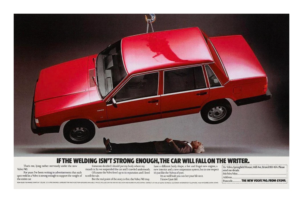
Dramatic perspective manipulates scale or tension to make a message feel more powerful and emotional.
How it works:
By playing with size or placing something in a high-stakes context, you create a sense of urgency or importance.
Why it matters:
It makes your message feel urgent and impactful, grabbing the viewer’s attention and leaving a strong impression.
Example:
Volvo uses a real-life stunt with a full-size Volvo hanging above a writer. The tension in the ad communicates Volvo’s commitment to safety with powerful, high-stakes storytelling.
Disruptive layouts break traditional design norms to create something unexpected. This could involve minimalism or rearranging elements in new ways.
How it works:
By shifting elements around or leaving empty space where you wouldn’t expect it, you force the viewer to pay attention.
Why it matters:
Breaking away from typical design conventions makes your message stand out and become more memorable.
Example:
Volkswagen’s 1960s Beetle ad uses minimal design. The tiny car is tucked into the corner, surrounded by empty space. In a world of loud, busy car ads, this one stands out by being quiet and simple.

A paradox in design presents two conflicting ideas to challenge the viewer’s assumptions and make them think deeper.
How it works:
By showing something unexpected — like damage on a car that’s supposed to be perfect — you force the viewer to reconsider their expectations.
Why it matters:
It creates a deeper emotional connection by challenging perceptions and making the viewer rethink what they thought they knew.
Example:
Volvo flips the usual car ad narrative by showing a wrecked car, not a polished one. The ad tells the story that the car’s strength is proven even when damaged, building trust through unexpected transparency. Patagonia takes a similar approach in its “Don’t Buy This Jacket” campaign, using paradox to promote sustainability over sales — asking people not to buy reinforces the brand’s commitment to conscious consumption.

What it is:
Typography manipulation alters the form of text to convey emotions or concepts visually.
How it works:
You change the size, shape, or clarity of the text to evoke a feeling — like confusion or excitement — without needing to say it directly.
Why it matters:
Manipulating typography adds another layer of meaning to your design. It makes the message hit harder, drawing the viewer into the emotional experience, and serves as a foundation for powerful creative presentation ideas.
Example:
An Alzheimer’s awareness ad uses fading text to represent the loss of memory. As the text disappears, the viewer feels the confusion and grief that comes with the disease, creating an emotional impact without needing to explain it. KFC takes a bolder approach by rearranging its logo to read “FCK” on an empty bucket. The typo adds humor and urgency, turning a simple typographic tweak into a memorable brand apology.

Visual irony presents something that initially seems "wrong" but makes perfect sense after a second look. It’s about creating a twist in the viewer’s expectations, much like rethinking conventions such as how many colors should a brand have.
How it works:
Irony challenges assumptions, often through surprising or unexpected visuals that make people think harder about the message.
Why it matters:
It engages viewers by flipping their expectations and making them see the message from a new, more thought-provoking perspective.
Example:
WWF’s "Give a Hand to Wildlife" ad uses a handprint that looks like a symbol of help — but on closer inspection, it resembles a vulnerable animal. This irony deepens the message, showing that humans are both the cause of harm and the solution. Burger King’s Moldy Whopper ad applies the same twist, showing a decomposing burger to highlight the absence of preservatives. It flips the norm of perfect food imagery to turn “gross” into proof of honesty and quality.

Visual suggestion taps into the brain’s tendency to find familiar patterns in everyday visuals — even when they aren’t explicitly shown. It relies on subtle cues that trigger recognition and emotional response without stating the message outright.
How it works:
This tactic uses shape, lighting, or placement to spark subconscious associations. The brain fills in the blanks, often recognizing symbols or brand elements from minimal or unrelated visuals.
Why it matters:
It creates a sense of discovery, making the viewer feel clever for "getting it." That moment of recognition forms a stronger memory and emotional connection with the brand, reinforced through consistent brand iconography.
Example:
McDonald’s ad shows a nighttime traffic jam where the brake light reflections form the shape of the iconic Golden Arches. It’s not a logo — but it feels like one. Paired with the line “If you see the signs, you’re probably hungry,” the ad brilliantly turns everyday street visuals into brand triggers through suggestion alone.

These visual storytelling techniques are powerful tools for connecting with your audience on a deeper level. However, they aren’t one-size-fits-all solutions. Context matters, as does your audience's expectations and preferences. Always consider user feedback and continuously test your designs to ensure that the storytelling approach resonates as intended — a best practice to follow during any brand refresh.
Now you know — visual storytelling isn’t fluff, and it’s definitely not just “making things pretty.” It’s a strategic weapon that shapes how people feel, what they remember, and what they do next.
When done right, your design doesn’t just support the message — it is the message. The right visuals speak louder than words and stay with your audience long after the scroll, click, or swipe, which is why many brands weigh the choice of freelance graphic designer vs agency.
So, what is a visual story made of? Here’s your toolkit:
Use these not as decoration, but as visual narrative tools. That’s how you design stories that stick.
Need help bringing your ideas to life? Whether you're hiring a graphic designer, a website designer, working with a freelancer, or exploring design outsourcing — we can help you make the right call.