Design examples
7
min read
Great email marketing design is what makes readers stop scrolling and start clicking. In this article, we unpack the 80/20 rule, explore must-know email design trends, best practices, and break down real-world email designs that drive conversions.
Things are getting difficult with email marketing. The competition is growing. But what's worse, the attention spans are dwindling.
In a 2018 report, it was found that people spend, on average, 13.4 seconds looking at a marketing email. In 2022, this time decreased to 9 seconds. You have less and less time to capture the readers' attention and even less to persuade them to take the action you want.
All this drama boils down to one thing: changes are needed.
In good old-fashioned email marketing, copy was considered to be the most essential part. Now, the text on its own is not good enough. The design of your emails is just as vital as the persuasive copywriting within them. And we're not talking about the visual appeal only. Readers should be able to grasp the essence of your message within two to three seconds.
So, how to create and design email marketing campaigns so they are at their most efficient? Let's dig in.
Email marketing design is a strategic approach to creating emails that speak directly to your audience, capture their attention using various visual elements, and inspire action. Here, each visual element, piece of text, and interactive button must be thoughtfully placed to lead readers exactly where you want them to go.
As we've already mentioned, consumers spend only a few seconds scanning an email, and you should design smartly to ensure that key information is clear, concise, and immediately impactful. All of this will later contribute to better open rates, engagement, conversions, and ultimately the success of your business.
The 80/20 rule, also known as the Pareto Principle, is a powerful concept that suggests roughly 80% of your results come from just 20% of your efforts. Applied to email marketing, it means that a small number of carefully designed emails — those that genuinely resonate — will generate most of your conversions, engagement, and revenue, focusing on the right details.
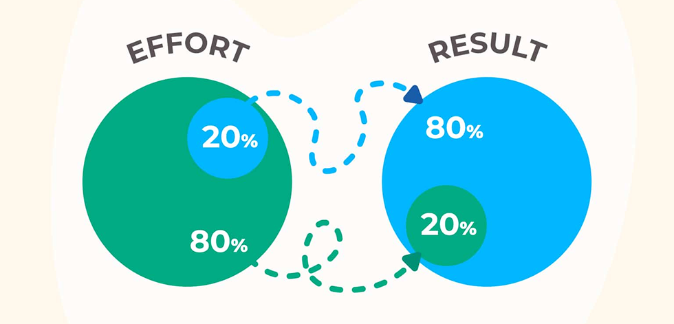
In practical terms, the 80/20 rule encourages marketers to prioritize quality over quantity. Instead of flooding inboxes, focus your resources on creating highly targeted, relevant, and visually appealing email designs.
By investing in the 20% of emails that truly matter — those that deeply connect with your audience through personalization — you'll significantly amplify your email marketing success while avoiding wasted effort.
If you thought email design was something simple and you're ready to create your email campaign, hold on for just a moment. First, let's explore three main email design categories: plain-text, rich HTML, and interactive emails.
Of course, you don't have to limit yourself to choosing just one of the categories above for your message. You can mix, match, and personalize each style according to your unique goals, web page brand identity, and body copy.
Here are tips and tricks that work for creating efficient email marketing designs regardless of what you are trying to sell.
Over 60% of emails are now opened on mobile devices. So, for starters, you have to prioritize responsive designs and ensure that your email designs look good and are easy to interact with across various screen sizes.
Some of the specific email marketing design tips you should keep in mind:
.webp)
"Skimmable" is one of the email marketing design trends you should always keep in mind. Remember those 9 seconds? No one, not even the biggest, most loyal fans of your brand, will actually read your email. So, the best thing you can do is to make sure they can grasp all the info you need during those few seconds they will pay attention. What can you do to achieve this?
You can make the readers skip through your email, but that doesn't necessarily mean they will want to take the desired action. You can nudge them a little bit with persuasive and attention-grabbing elements, both in copy and design.

Even if you've already established contact with the customer and it's not cold emails you're sending out, you'll likely need to use emails to prompt action. Just think of all the "activate your email" letters from various websites you've received. These tips work for them as well.

While in the previous section, we covered the overt persuasion elements (grab attention, create a sense of urgency, and so on), there are some cognitive biases you can make use of in the process of creating marketing email designs that enhance the customer journey.
People are naturally choosing the path of least resistance. To guide the reader to take the action you need, you can use not only obvious methods like adding arrows pointing at the button, but also, for example, an inverted pyramid design.
.webp)
Sometimes, the simpler, the better. For example, when trying to persuade the reader to jump on the bandwagon of the last day of sale, you don't need to be coy about it. Large letters, arrows, moving elements – anything that grabs attention works.

The Von Restorff Effect, also known as the isolation effect, is a psychological principle that suggests that an item that stands out is more likely to be remembered. For example, if you see a herd of sheep, the lone cow with them will be more noticeable and remembered, and you'll be drawn to it more. In email marketing, leveraging the Von Restorff Effect can significantly enhance the visibility and impact of key elements, particularly your CTA buttons.

According to Hick's law, the more choices there are, the harder it is to choose. You can present your readers with different options, but you don't want to send them into decision paralysis.

What does it mean practically for your emails? Even if you want to pack many offers in one email, make sure they are presented as visually distinctive blocks and are not competing against each other.
If you yourself are having trouble deciding what's important enough to include in this specific email, stick to the Rule of 3. It's exactly what it says on the tin: people remember threes easily. Two options might not be enough, or the reader might feel like you're making your own products or offerings compete against each other. Four might be too much. Three? Easy to choose, easy to remember. Take note that while in the example above, there are more options, they are divided into three blocks.
In emails, just like in digital marketing in general, consistent branding and essential elements are key for establishing a strong and recognizable identity and increasing the customer's trust. Consistency in branding extends beyond just adding your logo to every email; it encompasses a harmonious integration of colors, fonts, logos, and overall design elements.

Good email design can transform casual readers into loyal customers. Let’s look at five inspiring real-world examples that demonstrate how smart, thoughtful design can significantly boost conversions.
Duolingo excels at using personalized, data-driven visuals to increase user engagement. Their emails clearly show user progress through colorful, gamified graphics, motivating recipients to keep using their app. A prominently placed CTA encourages users to continue their learning journey, resulting in boosted interaction and high click-through rates.
.png)
Headspace, a meditation app, uses a minimalistic yet warm and inviting design in its onboarding emails. Clean, open spaces paired with friendly illustrations and concise messaging guide users smoothly into the product experience. Clear CTAs, often a simple, brightly colored button, effectively nudge new users toward premium subscriptions.
.png)
Airbnb designs emails filled with highly personalized recommendations, strategically organized in visually appealing sections. Featuring bright, aspirational imagery combined with location-based offers, these emails are irresistible and highly clickable, effectively converting curiosity into bookings.
.png)
Grammarly masterfully leverages user-generated insights to build engaging email designs that link back to their website. Monthly activity summaries are neatly visualized, clearly highlighting users’ writing improvements. A bold and simple layout with actionable CTAs directly reinforces user engagement and upselling potential.
.png)
Apple is known for its sleek, visually impactful emails announcing new products. These emails feature high-quality, visually striking product images alongside concise and persuasive messaging. With minimal text and bold, direct calls-to-action, Apple effortlessly drives clicks and conversions by sparking curiosity and excitement.
.png)
Keeping up with email design best practices and marketing strategies is essential for your business because fresh design is what engages audiences better, boosts conversions, and can provide additional information. Here are several key features and trends currently shaping the world of email marketing:
1. Dark mode compatibility
With many users adopting dark mode for devices, designing emails optimized for this viewing option has become crucial. Emails that adapt to dark mode enhance readability, reduce eye strain, and offer a sleek aesthetic that resonates well with audiences.
Tips:
.png)
2. Hyper-personalization
Emails are increasingly tailored to user preferences, behaviors, and demographics. Incorporating personalized recommendations, data-driven insights, or dynamic content ensures relevance, building stronger connections with subscribers.
Tips:
.png)
3. Interactive email experiences
Emails featuring interactive elements — such as quizzes, surveys, polls, or dynamic content — are gaining popularity. They not only captivate users but also deliver valuable data insights, creating a memorable brand experience and enhancing customer engagement.
Tips:
.png)
4. Mobile-first, responsive design
As mobile device usage continues to dominate, mobile-optimized, responsive designs are a non-negotiable trend. Single-column layouts, larger buttons, and simplified navigation ensure that emails are accessible, attractive, and effective across all screen sizes.
Tips:
.png)
5. Animation and motion graphics
Subtle animations, GIFs, and cinemagraphs add dynamic, eye-catching appeal to emails. When used tastefully, these elements capture attention, highlight key messages, and enhance the overall user experience without overwhelming the recipient.
Tips:
.png)
6. Bold typography and minimalist layouts
Clean, minimalist email layouts paired with bold, attention-grabbing typography help essential information stand out clearly. This trend leverages white space and strong visual hierarchy to quickly communicate key points.
Tips:
.png)
7. Accessibility and inclusive design
Accessibility is becoming central to good email design. Ensuring emails are easy to read, navigate, and understand — for all users, including those using screen readers or other assistive technologies — reflects brand inclusivity and widens your potential audience.
Tips:
.png)
8. User-generated content (UGC)
Incorporating user-generated content, such as reviews, testimonials, or customer-submitted photos, boosts authenticity and trust. By highlighting genuine customer experiences in your email content , you can resonate deeply, building loyalty and increasing conversions.
Tips:
.png)
With email marketing, you only have seconds to grab the audience's attention, and you have to make sure every one of them counts. Clear copy, segmentation, and personalization are all vital for boosting email marketing campaigns' success in any business . But copy and design are two sides of the same coin, and you can't have one without the other and expect your efforts to generate leads.
If you're not sure you can create your emails on your own, consider seeking a marketing designer's help. At TodayMade, we can cover all your design requests without the need to hire an in-house designer or rely on a freelancer. Contact us today and see how a professional's hand can transform the look and feel of your marketing emails!
Great email design directly impacts your open rates, click-through rates, and conversions. Thoughtful design ensures your emails are readable, accessible, visually engaging, and capture the recipient's attention in just seconds with the right details.
The 5 T’s are:
The 4 P’s of email marketing are:
Aim to refresh or review your email templates and details regularly (at least quarterly) to keep up with evolving trends, maintain audience interest, and optimize conversion rates. Pay attention to performance analytics to determine when your designs might need a refresh.
Ensure your emails follow a responsive design approach: opt for single-column layouts, clear and large fonts (14px minimum), touch-friendly buttons (at least 44x44 pixels), and minimal scrolling. Always test your emails on various devices and different apps before sending.


