Typography
13
min read
Bad typography, like low contrast text, can ruin readability, dilute your brand, and turn users away. Common mistakes include poor font pairing, sloppy kerning, hard-to-read typefaces, and cramped line spacing. Knowing what to avoid and how to fix it ensures your designs stay clear, professional, and visually appealing.
Remember that Papyrus? The font that somehow made its way into Avatar, one of the most expensive films ever made.
If you’ve never seen the SNL sketch roasting it, you’re missing out. That logo became a meme overnight, and the entire design community cringed in unison.

Yet, bad typography isn’t just about using Comic Sans or Papyrus. Even those infamous fonts can work if they’re used intentionally. The real problem starts when typography decisions are made accidentally, when text feels unbalanced, unreadable, or just plain wrong.
At TodayMade, we design marketing materials that speak clearly and sell confidently. We treat typography not as decoration but as strategy. It shapes how users read, feel, and trust what they see — the very essence of typography in graphic design.
Below, we’ll break down some of the most common and painful typography mistakes, the kind that go viral on Reddit’s r/badtypography. But we’re not just here to point and laugh. We’ll explain why these choices don’t work and how to fix them, using insights from our real-world design work.
Let’s start with a mistake almost every beginner makes: the center-aligned paragraph.
Center alignment feels safe. It looks neat and symmetrical. You probably see it used on wedding invitations and assume it brings balance and elegance to a design. And in some rare cases, it can.
However, center-aligned text is harder to read, especially in longer blocks. Each line starts in a different spot, so your eyes have to work overtime to find the beginning of the next line. The rhythm breaks, making important elements harder to track. Scanning slows down. And the layout starts to feel disjointed — an effect that also ties into font psychology and how readers perceive design.
This mistake shows up often in portfolios, event promos, and early-stage startup websites. The intention is usually to keep things minimal and clean. But the result is a jumbled experience that frustrates the reader.
Here’s one of the bad examples of typography spotted on Reddit:

A promo for a London beer festival where the headline, subhead, body copy, and pricing CTA are all center-aligned, and none of them hold visual hierarchy. Each section competes for attention instead of leading the eye naturally through the message. The result feels less like a conversation and more like a monologue delivered by five people simultaneously.
What to do instead:
Left-align your body text, especially anything more than one or two lines long. It’s what people are used to reading, from books to blogs to software UIs.
As one Redditor put it, “I like left-aligned. Justified looks neat at the edges, but there being random spacing between words just bugs me.”
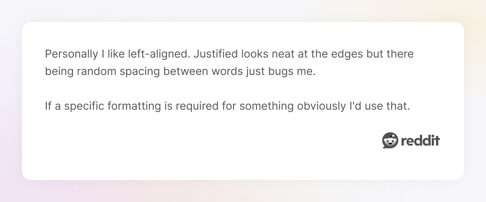
If you want a bit of flair, you can still center-align short elements like a headline or a CTAwhile carefully considering choosing fonts, as long as the layout around it supports the choice.

One of the most common mistakes beginners make is using too many fonts in a single design. You’ve likely seen it: a website hero with a bold display font for the headline, a quirky serif for the body, an all-caps sans-serif for buttons, and maybe a cursive thrown in somewhere for good measure.
The problem isn’t just aesthetic. It’s structural. Every typeface has its own rhythm and visual weight — the foundation of mastering how to combine fonts. They start competing when you throw multiple fonts together without hierarchy or intention. Your layout feels unbalanced when there are too many different fonts competing for attention. The message gets buried under the noise. Recent bad typography examples found on Reddit show this clearly — especially when contrasted with good typography design examples.

In a Scientific American guest blog header, each part of the headline seems to be rendered in a slightly different style: serif characters clashing with inconsistent formatting. It’s hard to tell if it’s a broken font render or just a poor styling decision, but either way, the result is confusing. The message gets lost in visual noise. (And "It s" instead of "It’s" doesn’t help either.)

This is especially common on marketing websites and pitch decks. Founders want to stand out, so they pick fonts they like, but not necessarily pairing fonts that work together.
How to fix it:
Stick to two fonts max: one for headings, one for body text. And maybe a third for accents or UI elements. But even that third font should earn its place.
Not sure where to start? Use an appropriate font superfamily like Roboto or Inter, or explore curated font combinations that are proven to work together. That way, you get contrast and hierarchy without the chaos.
In one of our recent redesigns at TodayMade, a client came to us with a landing page that felt disjointed because of a bit outdated flat-style illustrations. We suggested a subtle shift to a calm green palette and streamlined everything using just one typeface: Jakarta Sans. With a few spacing tweaks and a clear hierarchy, the page instantly felt modern, focused, and professional, without rewriting a single line of copy.

Kerning is the space between individual characters. Tracking is the consistent spacing across a group of letters. Both are easy to overlook, especially when you rely on default settings, but they can make or break how your text feels.
Poor kerning is responsible for some of the internet’s most infamous design fails. Think “FLICK” looks like… something you wouldn’t want on a billboard.
One of the best (worst?) real-world examples of bad typography is the Kids Exchange sign, where a lack of proper spacing created a wildly inappropriate mashup that went viral for all the wrong reasons.

How to fix it:
Zoom in. Always manually check letter spacing on large headlines, display fonts, and logos, especially when using decorative or custom typefaces. Most design tools (Figma, Sketch, Adobe XD) let you adjust kerning and tracking easily. Use it.
Don’t trust the defaults. Type designers build spacing based on general use, but not every font behaves well at every size. A stylish display font that looks perfect at 36pt might fall apart at 14pt. Pay attention to size, context, readability, and use typography trends with intention, not impulse.
If you’re unsure how to size your typography properly, tools like Typescale can help you find harmonious font ratios across paragraphs, headings, and subheadings. It’s a quick way to create structure and rhythm without guessing or eyeballing everything in Figma.

Justified text aligns both the left and right edges of a text block, creating a neat, magazine-style column. It feels polished. Serious. Maybe even a little fancy. But if you’re not careful, it also creates something designers dread: rivers, weird vertical gaps that snake through the text like white-water rapids.
The problem comes from forcing uneven words to line up perfectly. If your text layout doesn’t have the right settings, like hyphenation or optical kerning, the software will stretch out the spacing between words to make things fit. And it’s rarely subtle.
You end up with something that looks like typesetting a 1960s newspaper, as in the example below:
The text is technically aligned,
but it's barely readable, and
everyone suffers as a result.

How to fix it:
If you’re writing for the web or a mobile app, just… don’t use justified alignment. Again, stick with left-aligned text. It’s more readable on responsive layouts.
If you must use justification, for example, in a printable PDF, make sure you:

When lines are too long, your eyes struggle to track back to the beginning of the next line. It’s exhausting. When they’re too short, reading becomes choppy, like trying to converse with someone who pauses. After. Every. Word.
What’s “too long” or “too short”? Based on the WCAG guideline, for most web content, anything over 75 characters per line is pushing it. Anything under 40 can start feeling awkward. This range is based on how our eyes scan horizontal blocks of text.
You’ll often see bad line length on startup landing pages where the designer stretches a full-width paragraph across a huge screen. Or on mobile, where someone shrinks a desktop design without adjusting font size and spacing, turning it into a waterfall of one-word lines.

If you're not confident making these adjustments yourself, exploring graphic design outsourcing can be a smart move. Typography is one of those details you can’t afford to get wrong if you want to cater to your target audience. It shapes first impressions before users read a single feature.
How to fix it:

Bad contrast is one of the most common and damaging typography mistakes. It usually appears as light gray text on a white background, or pastel text on a pastel background. It might look stylish in Figma, but it becomes a legibility nightmare in real life, especially on mobile screens or under sunlight.
This is also an accessibility issue. Poor contrast affects users with low vision, color blindness, or tired eyes. If someone can’t read your copy, they won’t click your CTA, finish your article, or buy your product. That’s a business problem, not just a design one.

How to fix it:


Hierarchy is what helps readers understand what’s most important on a page. Without it, everything feels loud and messy.
This happens often on landing pages: the headline is bold and massive, but so is the subheading. The buttons are oversized. The body text is heavy. There’s no clear entry point or reading flow. Instead of guiding users, the design overwhelms them.
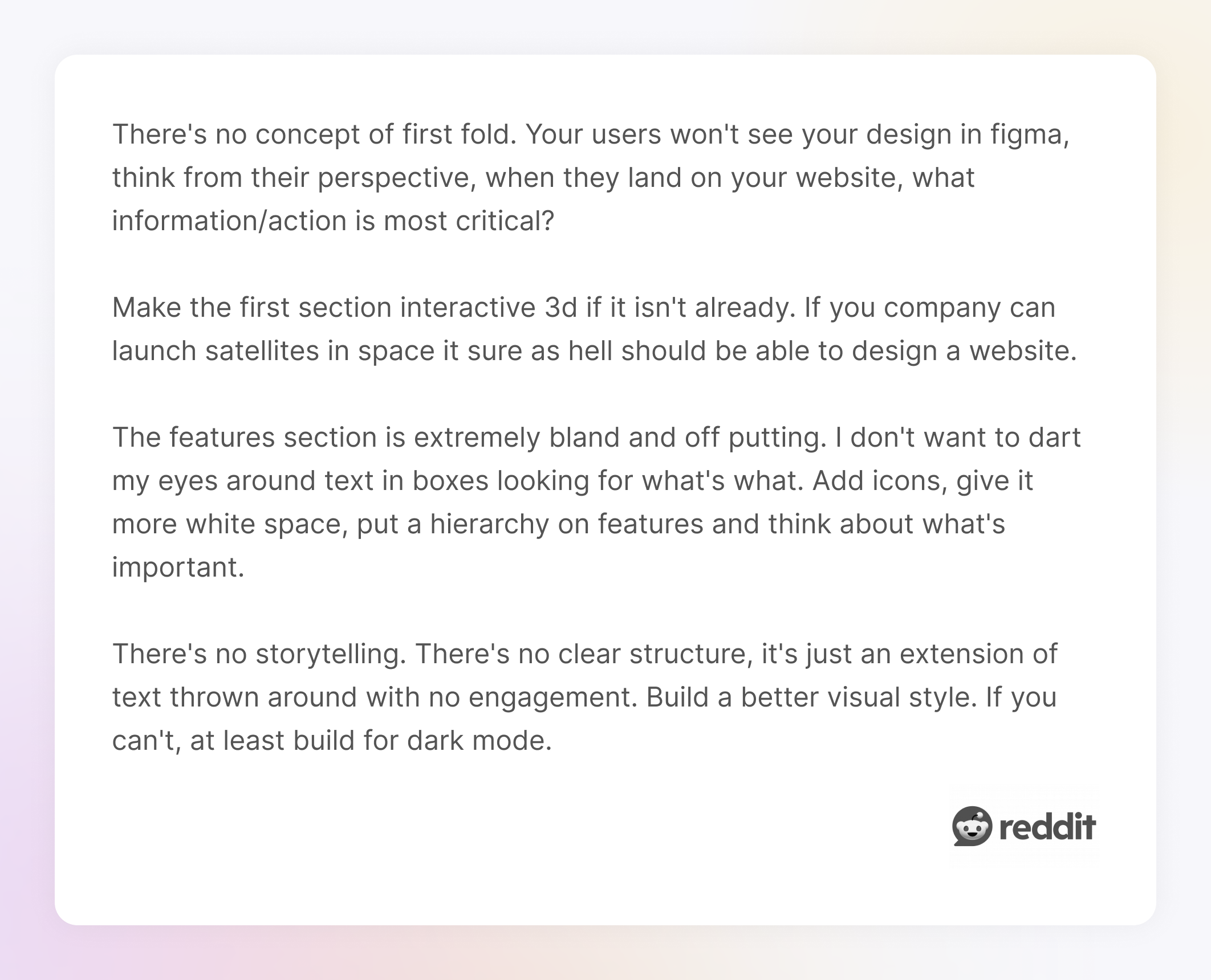
One Reddit user posted a landing page for feedback and asked, “How can I improve this?” The responses were spot on.

One commenter said, “I don't want to dart my eyes around text in boxes looking for what's what. Add icons, give it more white space, put a hierarchy on features, and think about what's important”. That’s exactly the point.
Hierarchy isn’t just about font size. It’s a combination of:
How to fix it:
Start by asking: What’s the one thing I want users to see first? Then build your hierarchy from there. Use:
In cases like this, even bringing in a freelance graphic designer for a quick cleanup can make a big difference, helping you refine your visual tone and avoid expensive first impressions that fall flat.
Our clients, Order Desk, had a homepage that crammed way too much into one view, especially the sidebar menu. There was no clear structure, and users didn’t know where to start.
We simplified the layout and introduced a proper hierarchy: fewer font sizes, consistent styling, and a sidebar that grouped content by relevance.
These are the kinds of mistakes most users won’t consciously notice, but other designers will. And trust me, they will judge you for them.
We’re talking about using a hyphen when you need an en dash. Or inch marks (" ") when you meant proper quotation marks (“ ”). Tiny differences? Yes. But they instantly reveal whether you’ve paid attention to the details or just slapped text into a layout and moved on.
Let’s break it down:
You’ll find these slip-ups all over, especially in pitch decks, slide presentations, or software UIs that were rushed through bad typography design. They don’t necessarily ruin readability, but they undermine credibility.
How to fix it:
Overcrowded typography is common, especially when designers try to fit too much information into a small space. What you end up with is a wall of text without line spacing, margins, or padding.
This usually happens in feature descriptions, modals, onboarding flows, anywhere space is limited, and the instinct is to squeeze in just one more sentence. But squeezing doesn’t help. It overwhelms the reader and makes them tune out.
There’s also a psychological effect: crowded layouts look cheap. Open, spacious design feels premium, and more importantly, readable.
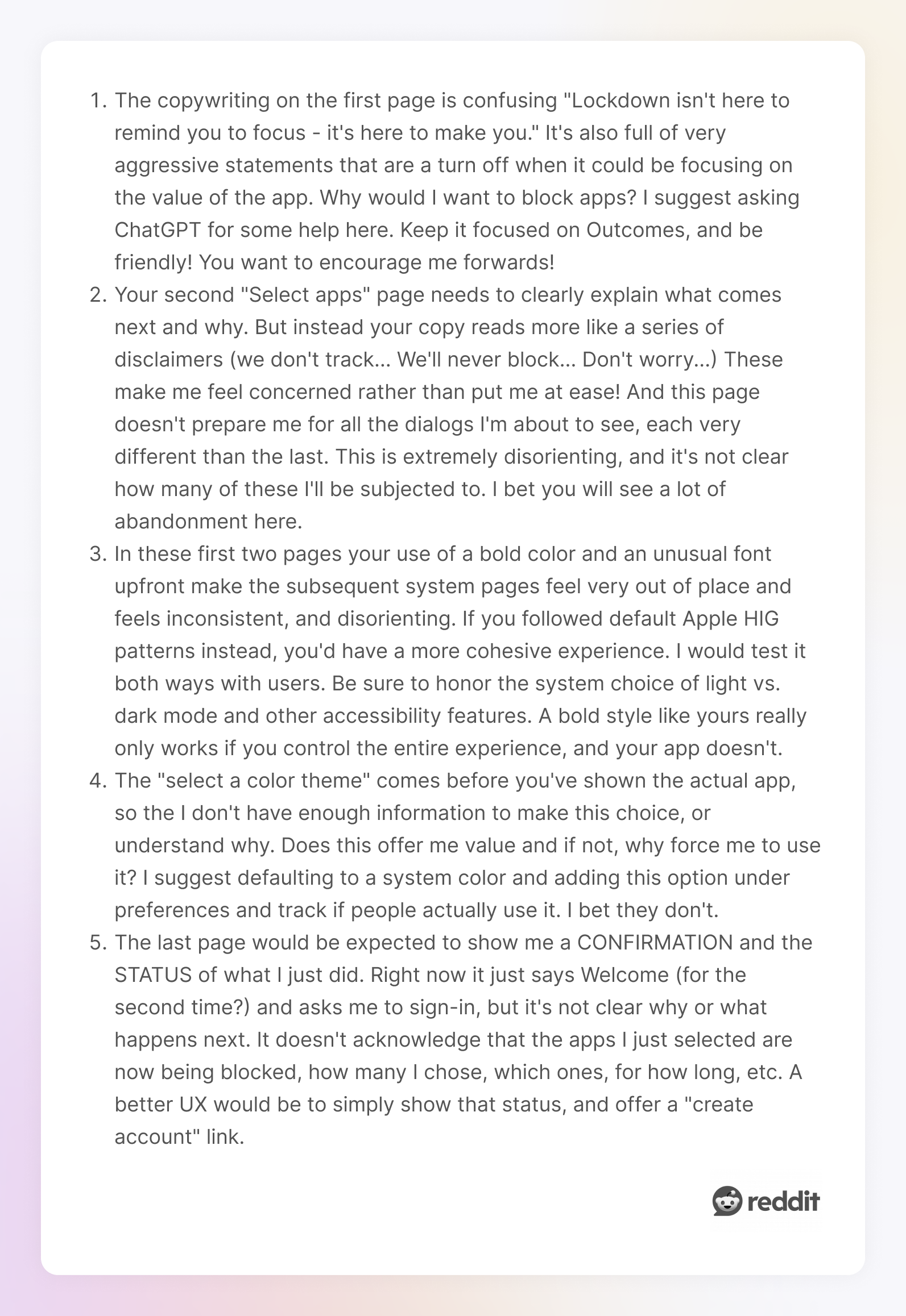
One Redditor shared their onboarding screen for feedback. The response was brutally honest and helpful.

One user wrote, “The copywriting on the first page is confusing. Lockdown isn't here to remind you to focus - it's here to *make* you." It's also full of very aggressive statements that are a turn-off when it could be focusing on the value of the app.”
How to fix it:
We all love to dunk on Comic Sans. It’s practically the mascot of bad typography. But ask any designer, “What is the worst font”? Comic Sans is usually the first name dropped.
Yet, the real problem isn’t the font itself, but using a font that doesn’t fit the content, the brand, or the medium. We’ve seen ultra-decorative script bad fonts used for body text, futuristic fonts in baby product ads, and handwritten styles in enterprise SaaS dashboards.
Every time, the result is the same: confusion, as we see in one of the bad font examples shared on Reddit.

How to fix it:

Looking back at all these mistakes, like the messy fonts, the suffocating layouts, and the accidental swear words created by bad kerning, it might seem like the problems are all different. But underneath, they usually come from the same place:
1. Lack of intention
Most bad typography doesn’t happen because someone tried to be bad. It happens because no one made an intentional choice. Fonts get defaulted. Spacing gets ignored. Alignment just… happens. Typography only works when it’s deliberate. If this kind of user-centered design doesn’t come naturally, it might be time to hire a graphic designer who can bring structure, consistency, and purpose to your design.
2. Prioritizing style over function
This one’s especially common in early-stage design. You fall in love with how a typeface looks in a mockup, not how it reads in real life. But typography isn’t art for art’s sake. It's design. And the design needs to work. Pretty isn’t enough.
If you want visual inspiration, check out these graphic design examples. They showcase how thoughtful typography transforms a layout from average to exceptional, and how it reflects the latest typography trends.
3. Ignoring the reader
If you design only for yourself or to impress other designers, the actual user often gets lost in the shuffle. Bad contrast, crowded lines, confusing hierarchy… these things tell your reader, “You’re on your own.” Good typography says, “Hey, this way.”
Luckily, these are easy to fix. You don’t need a design degree or 15 years in Figma to get it right. You just need to slow down, pay attention, and make intentional choices to create fun designs — a principle you’ll notice across kinetic typography examples.

If you’ve made some of the mistakes in this list, that’s okay. Every designer has. What matters is learning to see the problems before your users do, especially when it comes to details like leading in typography.
At TodayMade, we’ve learned these lessons working on real products, with real users, and real deadlines. We’ve seen how a small tweak in line height or a font swap can transform a product’s feel.
So the next time you start a project, don’t treat the text as an afterthought. Treat it like what it really is: your product’s voice. And make sure that voice doesn’t sound like it’s yelling from inside a blurry JPEG.
Or better yet, let us help you find the right voice. Contact us for clear, intentional marketing design that makes your message land.


