Typography
10
min read
Ever looked at a design that just… didn’t sit right? It wasn’t the font, wasn’t the colors. Something about the text just felt off, like it was either gasping for air or packed in like sardines.
That something is probably text leading.
Leading (pronounced “ledding”) is one of those typography tools you don’t really notice until it breaks — and it plays a big role in shaping typography trends. But when it breaks, oh, it breaks everything. It’s the vertical space between lines of text — the space that tells your eyes where to go next. Too tight, and your paragraph becomes a tangled mess. Too loose, and your sentences feel like strangers.

Mastering leading is one of the simplest ways to level up your designs. No fancy fonts or plugins — just smarter spacing and a touch of font psychology. And if you'd rather not wrestle with it yourself, TM can help. We’ve tuned type across web and mobile to make sure it always looks as good as it reads.
So, what exactly is leading in typography, and why does it have such a weird name? Let’s start with the basics.
Let’s keep this simple. Leading is the space between baselines of text — the invisible line your letters sit on. It gives vertical breathing room between one line and the next.

You might hear it called different things:
They all mean the same thing.
Where did the name “leading” come from? It dates back to letterpress printing, when typesetters used thin strips of lead to separate lines of metal type. Add a strip for more room. Remove one to tighten the space. It was a physical, hands-on process. Today, we use sliders and input fields, but the concept is the same.

Let’s make this real. Same font, same size, same words, but with different font leading, the results are drastically different:

That “just right” zone is what you’re aiming for. Proper leading gives text room to breathe without breaking the visual unity of a paragraph.
So, why does leading matter so much? Let’s break it down.
Leading might be invisible, but it has a big impact. When it’s done well, people don’t notice. When it’s off, they skim, squint, or bounce entirely. Here’s what makes it such a deal-breaker:
Leading helps the eye move from one line to the next. If it’s too tight, letters from different lines collide, creating visual noise. Too loose, and lines feel like separate thoughts, making readers work harder to keep their place.
In both cases, the flow breaks. And that’s a problem, especially for longer content.
Line spacing isn’t just functional, it creates mood.
Whitespace has emotional weight, and leading in design is one of your most effective tools to manage it.
If your heading and body copy don’t align in spacing, something will feel off. Either the elements blur together or seem disconnected.
General rule:
One of the most common mistakes? Changing font size but forgetting to adjust the leading.
Design isn’t just about isolated parts, it’s about flow. Good leading creates vertical rhythm, which is essential for what is leading in graphic design to actually support readability. If your line spacing jumps around, that rhythm stumbles.
Even if users can’t explain why a layout feels weird, they’ll feel it.

Okay, so leading clearly matters. But how do you actually get it right? There’s no one-size-fits-all answer, but there are a few solid rules of thumb that will get you close.
Getting leading right isn’t about hitting some magic number, but if you work in digital or print, typography in graphic design — and especially in graphic design for professional projects — is essential, and you can see why in countless typography design examples. It’s about knowing where to start, testing what feels right, and adjusting based on context. That said, there are a few reliable tricks to help you get there faster.
This is the most common baseline. Designers and tools alike rely on this ratio to keep things readable.
It’s not perfect for every use case, but it’s a solid place to begin and far better than default “auto” settings.
Some font size/leading pairs are tried and true. These combos come from decades of print design and offer insight into how to combine fonts effectively:
That’s font size followed by leading. A lot of these add 3–4 points of space, which often feels just right for body text.
Or follow the rule of “+2 to +4 points” above your font size, depending on how small or dense the type is.
Whether it’s superstition or a typographic sixth sense, it’s hard to argue with the results.
As your text gets larger, you usually need less space between lines, not more. That’s especially true for all-caps text, which doesn’t have descenders that dip below the baseline.
If a two-line heading looks like it’s falling apart, it probably needs tighter leading.
Just be careful when mixing lowercase letters with tall ascenders or long descenders. You don’t want lines crashing into each other unless that’s the style you’re going for.
This is a workflow thing. Always fix the horizontal spacing first.Otherwise, tight tracking can make the text block look darker and denser than it really is.
When the micro-spacing is balanced, you’ll see the vertical spacing more clearly.
This one’s easy to skip but super important. Leading problems don’t always show up when you’re testing a headline or one sentence.
Drop in a few real paragraphs. Scan them at a normal reading distance. Does your eye glide down the page, or does it feel like work?
If something feels off, adjust. It’s right when it looks right.
Guidelines help, but trusting your eye is what really sets your type apart.
Getting leading right isn’t just about following rules; it’s about understanding what does leading mean in typography by seeing it in action. The best designers develop a feel for spacing through practice. Here’s how to build that visual instinct:
Turn your layout upside down or view it in a mirror. This breaks the habit of “reading” the text and forces you to see the shapes and spacing instead. It’s a quick way to catch inconsistent gaps between lines.
Blurring the details helps you judge the overall “color” of the text — how dense or airy it feels. A good block of text has a consistent tone. If some sections look darker or lighter, your leading might need adjusting.
Try tools like Type.method.ac or the Eyeballing Game. They sharpen your sense of proportion, spacing, and alignment — skills that directly affect how you set leading.


Leading can look wrong when the letter-spacing is off. Before adjusting line spacing, make sure your tracking (overall letter-spacing) and kerning (individual pairs) are in a good place. Otherwise, you’re solving the wrong problem.
Study how your favorite websites, books, or magazines handle spacing. Sites like Typewolf and Fonts In Use are goldmines for great type in action. The more good type you absorb, the more natural your decisions will become.


Eventually, you’ll start noticing it without even trying. That’s when you know your eye is getting sharper.
Once you’ve trained your eye, it’s time to apply it, because not all text needs the same treatment. Let’s look at how leading changes based on context.
Not all text needs the same treatment. The “right” leading depends on what you're designing, where it's going, and how leading in graphic design shifts across contexts. Here’s how to tailor your line spacing for different scenarios:
For paragraphs, aim for around 120–130% of your font size. This range gives your readers just enough breathing room without making the text feel disjointed. On the web, that usually means a line-height of 1.4–1.6 in CSS.
If your font has a tall x-height or thick strokes, lean toward the looser end. For small font sizes (like 10pt or under), even a bit more space can help legibility.
Big text? Less leading. For headings, 100–110% of font size often works best. In all-caps titles, you can even go tighter, sometimes slightly overlapping the lines for dramatic effect.
The goal is to keep lines feeling like a single unit. If a headline breaks across two lines, they should still feel connected, not like two separate thoughts.
There’s no formula here, just vibes. The goal is unity. If a logo has stacked text, the leading is all about optical balance. You might even use negative leading to get a snug, intentional lock-up.
Pro tip: Convert your logo text to outlines and manually nudge the lines until it looks right. Because “right” in logos is more visual than technical.
Smaller screens = tighter space. But tighter leading? Not always the solution. For mobile body copy, stick with 1.4–1.6 line-height for comfort. If your font size drops, compensate with looser spacing.
Short lines (like in a sidebar or card layout) can handle tighter leading, but make sure touch targets and readability aren’t affected.
Long-form print (books, reports)
For print, especially long reads, generous leading is your friend. Novels often use 10pt text with 13pt leading, giving the eye a relaxed pace. Serif fonts typically need more spacing than sans-serifs, but always test.
In multi-column layouts, align your type to a baseline grid. This keeps rhythm and structure tight across the page.
Let’s look at how leading actually works inside the tools you use every day.
Every design tool handles leading in graphic design a little differently. Here’s how to adjust it in the ones you’re most likely using.
In Figma, leading is called line height. It’s often set to “Auto” by default (roughly 120%). To change it, click the line-height value and type in your own, either as a pixel value or a percentage.
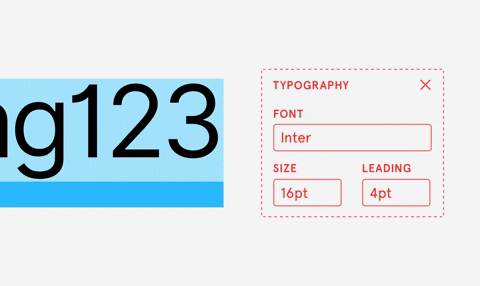
Tip: Use percentages (like 150%) for relative control, or pixel values (like 24px) for exact sizing. Drag the number up and down to see real-time changes. Don’t be afraid to override Auto, especially for headings and display text.
InDesign was built for typographic control. It literally uses the term Leading in the Character panel. By default, it’s set to Auto (120%), but you can enter your own values, like 14pt leading for 12pt text.

Pro tip: Use a baseline grid to align all your text consistently. You’ll find it under Preferences > Grids. It helps keep vertical rhythm tight in print layouts.
Similar to InDesign, Illustrator lets you set leading in the Character panel. Since it’s often used for logos or posters, you’ll probably adjust leading creatively, not systematically.

Shortcut: Use Alt + ↑/↓ (or Option on Mac) to nudge the leading up or down. This makes it easy to eyeball adjustments without typing in new numbers.
In CSS, use the line≥-height property. The default for body text is around 1.5 (or 150%). Use unitless values (like 1.5) so the spacing scales with the font size.
In Webflow or other builders, you’ll see “line height” as a visual setting. Adjust per breakpoint if needed — mobile often needs slightly more space than desktop for readability.
Tip: Avoid setting the same line-height for all elements. Headings, body text, and UI labels often need different treatments to look cohesive.
Now that you know how to spot and fix spacing, you can confidently explain what is leading in design and how to get it right every time.
Leading is invisible when it works and distracting when it doesn’t. Once you start spotting it, you’ll see it everywhere:
Watch for the signals: сrashing descenders, cramped layouts, blended paragraphs, floating lines, wobbly UI text — these are all red flags and classic bad typography examples. And now, you know how to fix them.
It takes practice. But with every tweak, your eye sharpens, and your type starts to sing. If you want to explore motion in type, check out kinetic typography examples for creative ways to add movement and impact.
Curious how we think about design at TodayMade? Start with the basics, like understanding how much illustrations cost, then dig into bold aesthetics like brutalist web design, or get inspired by our favorite landing page examples. And if content is more your thing, don’t miss our guide to writing a great blog.


