Typography
14
min read
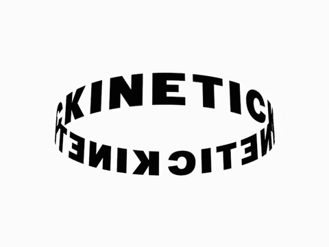
Fonts can dance. They can shout, whisper, and punch you in the face. That’s the magic of kinetic typography — when words stop sitting still and start doing the talking, showing the expressive power of typography in graphic design.
But here’s the thing: most “inspiration” posts just toss you a pile of flashy videos with no explanation. Cool? Sure. Useful? Not really. You scroll through a bunch of eye candy, close the tab, and… now what?
This guide is different.
We’ve curated a list of kinetic typography animation that don’t just look great, but teach something. For each one, you’ll see:
Whether you're a designer working with typography motion graphics, or a content marketer dreaming of words that move, you’re in the right place — especially if you want to stay ahead of typography trends.
We’ll also throw in some wisdom from Reddit’s motion design corners, because sometimes the best advice comes from someone who just figured it out last week.
By the end, you won’t just know what kinetic typography looks like, you’ll know how to create your own.
Let’s roll.
You can scroll through Pinterest boards and YouTube thumbnails all day, but the real magic of kinetic typography only shows up when form, timing, and emotion work together.
This list isn’t just a roundup of kinetic type examples or cool-looking videos. It’s a curated collection of motion design done right, where every transition, fade, or slam of a word actually means something. These typography animation examples show how the best creators use animated type to teach, tease, sell, or simply punch you in the gut (creatively speaking).
Each one breaks down what’s happening on screen and more importantly, why it works. Let’s get into it.
A campaign that made “Whopper Whopper” stick in your head for days. Big, bold typography set to a jingle that’s so bad it’s good. The text pulses, jumps, and flashes in sync with the music, like it’s been drinking too much soda.
Why it works: It leans into audio-first pacing. The text doesn’t follow a grid, it follows the beat. And that creates rhythm. Motion + music + meme = mass recall.
Text whips across at lightning speed — each phrase timed so the viewer reads just enough, fast enough. It relies entirely on kinetic motion to hold attention.
Why it works: It respects our shrinking attention spans. Fast typography + brevity = message that sticks (without feeling rushed).
Bold typography takes center stage, perfectly illustrating the principles of font psychology. Phrases like “Global Top Artist” and “26.1 billion streams” explode onto the screen, stretching and fading with the music. The timing is tight. The message is loud. And the vibe is pure victory.
Why it works: Its motion is used like a spotlight. Each word lands with purpose. The animation mirrors the hype, speeding up for impact, slowing down for drama. You’re not just seeing a stat, you’re feeling it.
Text layers animate in sync to support the “Black-Owned” narrative, sliding and fading to build momentum behind the message.
Why it works: It amplifies the message and rhythm of the anthem. The motion isn’t decorative, it’s an emotional underscore.
Text fades in gently, pauses with intention, then glides out like an exhale. Words like “breathe” and “focus” take their time. There’s no rush, only rhythm and space.
Why it works: It flips the kinetic typography script. Instead of speed and punch, it uses stillness and softness. The pacing is the point, syncing perfectly with the brand’s calming tone.
This isn’t flashy motion graphics, it’s visual theology. Dense scripture is made digestible through animated text, symbols, and transitions. Kinetic type appears exactly when needed to emphasize names, concepts, and key phrases. Not one word is wasted.
Why it works: It’s all about pacing and restraint. Text moves only when it adds clarity, not decoration. And in a video this content-heavy, clarity is everything.
Text zips in, flies across the grid, and fades away to build suspense before the film even starts. Minimal, sharp, and iconic, grounded in perfectly contrasting fonts combinations.
Why it works: This sequence defined the genre. It uses motion not as flair, but as foreboding. The typography doesn’t just introduce names, it sets the tone for an entire film.
Each punchline in this parody is timed with a matching typographic motion. Bouncing words, pop-ups, and transitions mirror musical phrasing.
Why it works: Timing is everything. The typography supports the rhythm, the humor, and the clarity. It’s a masterclass in how kinetic motion can make educational content truly entertaining.
Thin, sans-serif type moves seamlessly through silhouetted scenes of pursuit. The text enters and exits in rhythm with the jazz score, weaving between characters and background elements.
Why it works: Typography becomes part of the story. Each move is timed to the beat, creating a playful and polished narrative that sets the tone before the film even begins.
Set against a moody, Bond-style backdrop, the lyrics appear line by line in crisp serif fonts. Words fade in with slow reveals, dissolve into darkness, or echo outward with soft motion blur. Everything is dramatic, stylish, and deeply intentional.
Why it works: This is typographic animation as tension. The pacing is glacial in the best way — every movement builds mood. It's not just lyrics, it’s a visual echo of the music.
In this video, Stephen Fry's eloquent speech on language is brought to life through dynamic text animations. Words twist, turn, and transform, emphasizing the nuances of his commentary.
Why it works: The kinetic typography mirrors the intricacies of Fry's speech, making complex ideas more accessible and visually stimulating.
Each commandment appears with dramatic pacing and bold black-and-white contrast. Clean, spacious typography and sharp transitions mirror the weight of the message.
Why it works: The motion is restrained but deliberate. It adds gravity without distraction, making the words feel as serious and lasting as their meaning.
Samuel L. Jackson’s iconic monologue is visualized with high-contrast fonts, hard cuts, and timed zooms. Words expand, shatter, and snap into frame as if being fired from Jules' mouth. It’s gritty, intense, and loyal to the rhythm of the scene.
Why it works: The motion typography becomes part of the performance. Motion matches volume, tempo, and fury, turning spoken word into cinematic design.
This kinetic typography piece transforms the Campfire logo with smooth, flame-like animations. Text flows in with the rebrand theme, flickering softly before settling into place.
Why it works: The animated typography mirrors the visual identity, reinforcing brand meaning through motion. It’s a cohesive logo story told through text movement.
This fan-made video transforms the classic back-and-forth into a fast-moving word game. Words jump, flip, and stack chaotically as the sketch escalates. The motion captures the rhythm of the performance and the sheer confusion built into the bit.
Why it works: Timing is everything. The kinetic text mirrors the punchlines, pauses, and overlaps perfectly, making the old-school comedy feel just as sharp in visual form.
This ad doesn’t just list features, it throws them at you. Bold, oversized text slams across the screen in sync with engine revs, metal impacts, and deep narration. Creative transitions and punchy colors reinforce the message of strength and innovation.
Why it works: Typography here feels like the product: powerful, sharp, unapologetic. It’s a moving spec sheet with attitude, selling performance through every frame of motion.
This stunning graduation project starts with print basics like margins and alignment, then shifts into kinetic typography’s role in film. The Saul Bass tribute stands out with precise transitions and confident design.
Why it works: It’s a perfect showcase of kinetic typography motion graphics in action, teaching through design, not just showing off. Instead of decorating the content, the animation demonstrates how typography evolved from static layout to cinematic storytelling.
This ad tours New York and Istanbul through animated text. Landmarks are made from headlines pulled from the paper’s first Turkish edition, turning fonts into architectural elements.
Why it works: Typography becomes both content and form. It bridges two cultures by building literal cityscapes from language and layout.
Each letter from A to Z gets its own font and motion style, animated in time with a whimsical French tune. The result is minimal but full of character.
Why it works: Each letter from A to Z gets its own font and motion style, animated in time with a whimsical French tune. The result is minimal but full of character.
This kinetic tribute visualizes Conan’s final speech using clean text, a grey and white palette, and subtle yellow accents. The final zoom-out reveals the full speech composition as a single frame.
Why it works: The design stays quiet so Conan’s words can lead. The motion matches his pacing and emotion, making the message hit deeper without distraction.
Slack shows how generative AI helps users stay productive. Animated phrases move fast and confidently, with smart transitions and a modern aesthetic.
Why it works: The text mirrors the product’s promise. Quick, clear motion communicates intelligence and momentum, reinforcing Slack’s position as a modern work assistant.
This 15-second spot uses Star Wars–style scrolling text, dramatic lighting, and cinematic music to pitch a Big Mac like it’s saving the galaxy.
Why it works: It’s fast, funny, and instantly familiar. The parody grabs attention, while bold kinetic type delivers the message with sci-fi flair.
This recap video uses kinetic typography to highlight user achievements with punchy transitions, bold stats, and color-blocked motion. Text moves at a runner’s pace — quick, rhythmic, and full of momentum.
Why it works: It turns data into dopamine. The type celebrates personal milestones with the energy of a finish-line sprint, making every number feel earned.
This launch video uses kinetic typography to explain the story behind the Bélo symbol. Animated text moves with icons and shapes to show not just how the logo was made, but what it stands for.
Why it works: The motion adds meaning. It makes the logo feel less like design and more like identity.
In this short film, a Mississippi farmer shares how tech helped her grow community. Key phrases from her story appear in sync with the voiceover, gently layered over real visuals.
Why it works: The animation is quiet but powerful. It supports the story without distracting from it.
The best kinetic typography examples are built on more than style. Behind the motion is structure, timing, and purpose.
Here’s what makes kinetic typography truly work.
So, what is kinetic typography, really? A great kinetic type animation isn’t about showing off effects. It’s about enhancing clarity, emotion, and message through motion. It’s a visual choreography of words, and when done right, you don’t just watch the message, you feel it.
Here’s what separates strong kinetic typography from forgettable scroll-pasts:
Timing is the backbone of any motion piece. It determines whether your message lands or slips by unnoticed. The pacing should match the tone and rhythm of the audio, whether it’s narration, dialogue, or a music beat.
Think of your type like a drumbeat — every entrance and exit should feel intentional. That’s the foundation of great typography in motion.
No matter how creative the animation, if the audience can’t read the text, the message is lost.
Best practices:
Good motion design should reduce cognitive load, not add to it.
The movement of your typography should reflect the feeling of the content. High-energy video? Go for pop-ins, bounces, fast cuts. Telling a heartfelt story? Smooth fades or slow zooms will feel more honest and grounded.
Always ask: what mood does the motion convey?
Motion is your second narrator — treat it like one.
Design theorist Barbara Brownie outlines three primary styles of kinetic typography. Understanding these gives you a framework for how to animate your text meaningfully:
Words or letters morph in place — stretching, twisting, or transforming without moving across the screen. Best for surreal, emotive, or metaphor-heavy content.
Words move across the screen like a news ticker or credits crawl. Clean, simple, directional. Often used for lyrics, data, or rhythmic scripts.
Text elements move in relation to each other sliding, rotating, colliding, or reorganizing on screen. Great for narrating complex ideas, relationships, or structured data.
.png)
Most strong type animation examples blend these styles for texture and variety, just make sure each motion choice aligns with your message.
Knowing what works is one thing. Planning your own video is the next step.
Here’s how to storyboard a piece using kinetic text examples as a reference point, even if you’ve never animated a frame.
You don’t need to animate to plan a kinetic video. A clear, simple storyboard can guide your design or help a motion designer understand your intent. Here’s a 4-part structure to keep your flow clear and purposeful:

Grab attention immediately with one powerful phrase or word. This is your scroll-stopper. Use size, contrast, and a bold entrance — pop, zoom, snap — even borrowing tension from brutalist web design if needed.
Tip: On social platforms, you’ve got about three seconds to hook someone. Make them count.
Now that you’ve got attention, deliver your core message. Use dynamic motion here — slide, rotate, build word-by-word — but keep it readable.
Sync it with audio if you have a voiceover. Aligning words to the beat or vocal rhythm boosts engagement and retention — just like proper leading in typography boosts readability.
This is the meat of your video. Expand the message. Add supporting points, stats, or lines from a quote. Use varied movement, maybe switch from scrolling to fade-ins to maintain visual interest.
Design tip: Animate lines sequentially, not all at once. This keeps viewers following along without overwhelm — the same principle applies when learning how to combine fonts effectively.
Leave a lasting impression. This is where your CTA, brand, or tagline appears. Use slower motion or a clean fade to give your message space to settle.
Pro move: End with stillness. Let the final phrase sit silently for a beat. It signals “this matters.”
Open a kinetic typography template in After Effects, hit “U” to reveal keyframes, and study the timing. You’ll learn more from seeing when things move than from any tutorial. It’s like musical sheet reading for motion design.
With your storyboard in place, you’re ready to bring it to life.
These tools and templates make the jump from idea to animation a whole lot easier.
Whether you're mocking up a quote in Canva or animating a full lyric video in After Effects, there's a tool for every style, skill level, and deadline. Here’s what to reach for depending on how deep you want to go.
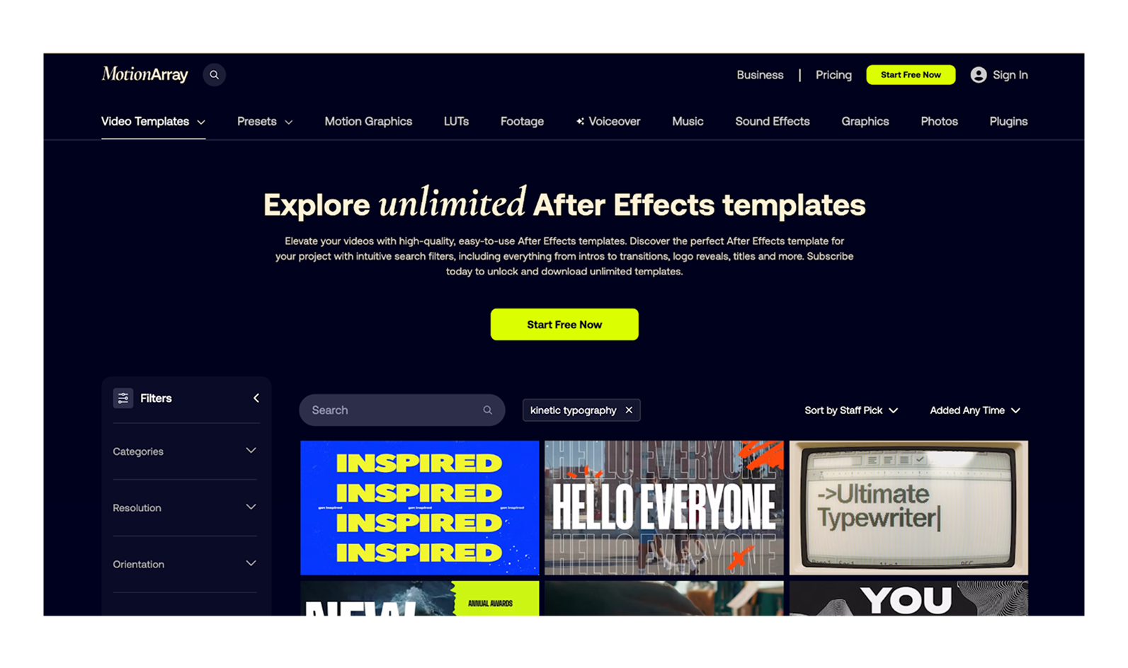
If you're working on professional kinetic typography, AE is your best friend. It gives you full control and loads of shortcuts.
Pro tip: Start with a template, tweak as needed, and focus on the message, not manual keyframes.
Templates let you move fast while still looking polished. They’re not just shortcuts — they’re teaching tools too.

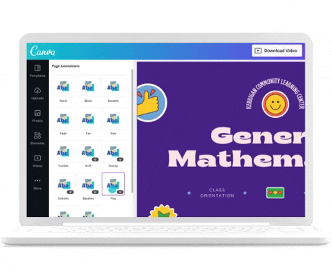
If you want motion without motion design skills, browser-based editors are your low-lift option.
When visual design meets generative code, you get tools like DrawBot — a playground for experimental typography.
Once you’ve got the right tools, it’s all about putting them to use.
Let’s wrap up with a few takeaways to keep in mind as you start animating.
Kinetic typography isn’t about showing off. It’s about making your message clearer, stronger, and more engaging. The best examples use motion with intent — every transition, pause, and layout adds meaning.
Use this guide to plan your own piece, just like you would when writing a great blog, and avoid common mistakes by learning from bad typography examples. Start with a storyboard, try a template, and learn by watching what works. Keep it readable, match the mood, and move with purpose.
Want more design inspiration beyond moving type? Explore TodayMade’s curated graphic design examples, typography design examples, smart tips on email marketing designs, and standout landing page examples, because great design moves people, no matter the format.