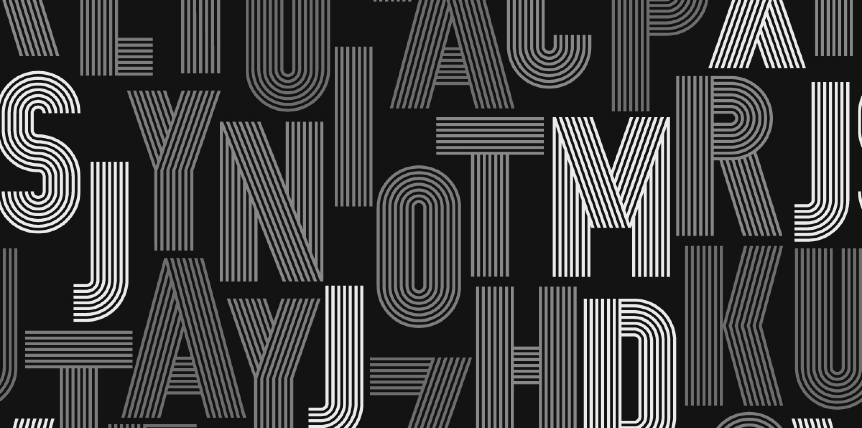
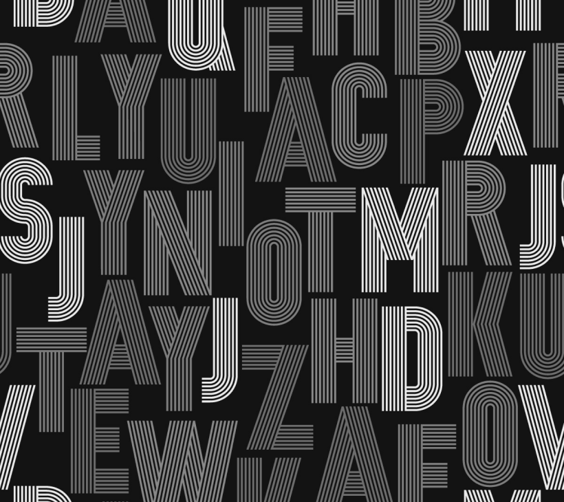
Typography
13
min read
This guide breaks down the top creative typography design trends for 2025—backed by real brand examples and practical tools. Whether you're rethinking your brand voice or building a type system from scratch, you'll find ideas, layouts, and resources to make your typography work harder (and look better).
Fonts don’t just tell stories; they shape them. Whether it’s Duolingo’s bubbly optimism or Spotify’s rhythmic minimalism, type choices whisper what brands stand for before a single line of copy is read. Typography is the quiet force behind brand identity, UX clarity, and emotional resonance.

And yet… it’s wildly underrated.
Good typography doesn’t mean knowing 400 fonts or geeking out over kerning (although that helps). It’s about making readable things expressive and expressive things readable. It’s the balance between art direction and accessibility, mood and message, beauty and function.
In this article, we’re not just going to throw font pairings at you and hope something sticks.
You’ll get:
Let’s explore what’s possible when your fonts aren’t just fonts — they’re part of the story.
Typography in 2025 has outgrown its role as a finishing touch. It’s now one of the clearest ways a brand, or a marketing designer, can express personality, cut through digital fatigue, and earn trust in an AI-saturated world. The visual language of type is evolving — and the most interesting shifts aren’t always loud. You start to see them only when you pay attention.
Designers are ditching pristine perfection for something a little more… human. AI-generated sameness is pushing brands toward warmth, imperfection, and expressive type. You’ll see more hand-drawn quirks, asymmetrical layouts, and character-packed fonts popping up in everything from landing pages to onboarding flows.
It’s not just about looking cool. It’s about signaling, “Hey, a real person made this.”
No more juggling six weights of the same font. Variable fonts — single files that can flex in width, weight, or slant — are finally having their moment. Netflix Sans is a great example. It adapts across devices and layouts without sacrificing brand consistency.
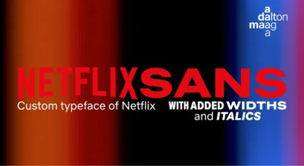
Bonus: they reduce load time, which your dev team will thank you for.
Storytelling has moved from blogs to full-on brand systems. More companies are leaning into editorial-inspired layouts, generous whitespace, and strong headline hierarchies. It’s part of a larger shift: treating content like a product.
Mailchimp’s Courier magazine nails this look — clean serif titles, thoughtful typography rhythm, and zero fluff.

2025 loves a good throwback. Retro serifs, pixel fonts, and VHS-inspired type are back — but reimagined with slick grids and responsive layout systems. Think Liquid Death’s irreverent print ads or Burger King’s rebrand.
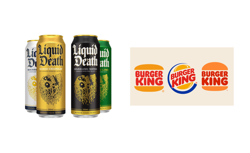
It’s not irony. It’s memory with a facelift.
Designing for everyone isn’t optional anymore. Accessibility has become a trust signal, not just a legal checkbox. When a brand chooses clean, readable type over flashy-but-frustrating layouts, it’s sending a clear message: “We care about your experience.”
And the best part? You don’t have to trade personality for clarity. In 2025, you can have both. Whether you’re building a SaaS dashboard or a landing page, your type choices do a lot of heavy lifting.
Here are nine typography ideas you can apply to your next project — each paired with real examples and tools to help you bring them to life.
These typography designs aren’t meant to live in a vacuum — they’re part of a broader system of layout, hierarchy, and visual clarity, just like other graphic design examples that balance function with personality. Some of these styles feel familiar. Others are trending. All of them are versatile enough to adapt to real-world projects.
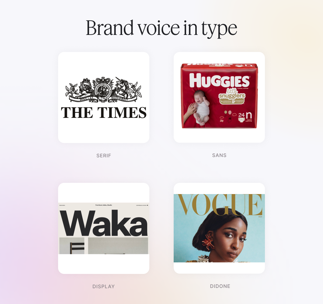
If you want your brand to feel thoughtful, timeless, or deeply content-driven, look to editorial design. This style pairs a classic serif with a clean sans-serif to create a structured, magazine-like reading experience — perfect for blogs, thought leadership, or long-form storytelling.
Think of Kinfolk, or any of the many digital experiences inspired by it. You’ll see soft serif headlines, generous spacing, and a pace that invites the user to slow down. This kind of typography is perfect for long-form reading, brand storytelling, or visually refined marketing.
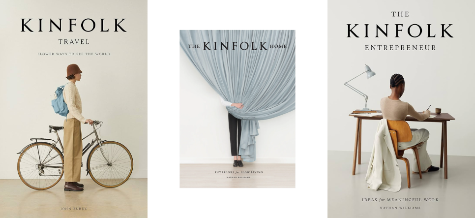
Why it works: Serif fonts build trust and rhythm. Sans-serifs add modern balance. Together, they make your message feel well-considered.
Try this:
If your brand thrives on warmth, friendliness, or just a touch of weird — a geometric or rounded sans-serif might be your secret weapon. These typefaces strike the balance between clean and quirky, making your product feel more human without sacrificing clarity.
Take Vitamiin by Typokompanii. It’s a playful sans-serif with rounded terminals and just enough asymmetry to feel hand-touched. It calls itself a “semi-softie,” and that’s spot on. It mixes geometric structure with organic curves — and it works beautifully in brands that want to feel cheerful, casual, and full of life.
Why it works: Rounded sans-serifs soften the voice of digital products. They’re approachable, readable, and perfect for UI that wants to be welcoming.
Try this:
Nostalgia is powerful, but only when it’s purposeful. The modern retro trend mixes vintage typography (like 70s serifs, slab fonts, or pixel-style display faces) with clean layouts and smart color blocking. The result: a design that feels both familiar and refreshingly bold.
One great example: The Brand Creation Kitchen. It combines script typography and dramatic letterforms with playful layout and nostalgic color treatments, like a zine made for the web. Or explore projects in the Vault of VHS, where old-school type gets reborn with motion, grids, and brand storytelling.
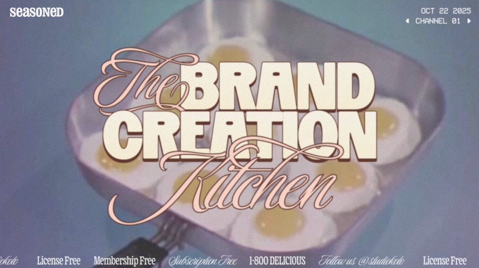
Why it works: Retro type triggers emotion and recognition. When paired with modern design principles, it creates strong contrast and brand memorability.
Try this:
Typography doesn’t have to sit still. When done right, motion turns type into an experience. And no one nailed this better than Spotify in their 2024 Wrapped campaign.
In a celebratory highlight video for Taylor Swift, phrases like “Global Top Artist” and “26.1 billion streams” don’t just appear — they burst onto the screen. The type stretches, snaps, and fades in perfect sync with the music. Every movement amplifies the message. You’re not just reading stats. You’re feeling the momentum.
Why it works: The animation acts like a spotlight. Motion adds rhythm and emotional weight without overwhelming the text. Each word is timed for impact: fast for energy, slow for emphasis, always intentional.
Try this:
Modern brands are getting bolder with structure, not by shouting, but by creating tension. One powerful approach: combining a rigid, brutalist grid with soft, rounded typography. This contrast brings edge and balance to your layout. It's a little rough, a little gentle, and very effective.
Take Roze Bunker, a fruit beverage brand from the Netherlands. Its site features a sketchy black grid as a full-bleed backdrop. The bottles, illustrations, and wonky type all seem to ignore it — but together, it works. Why? The grid provides tension and order, while the casual font and doodle-like illustrations add flavor (pun intended).
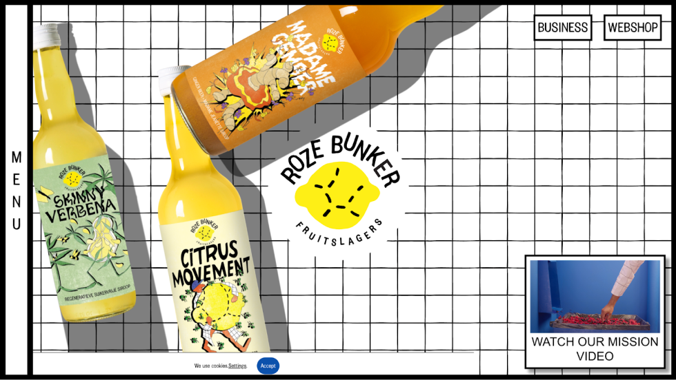
Why it works: Brutalism gives clarity and edge. A soft or hand-drawn font balances it out with warmth and approachability. This pairing is perfect for indie brands, mission-driven packaging, or bold editorial work.
Try this:
Some fonts can do it all — light and airy for a product page, bold and assertive for a hero headline, slanted and speedy for campaign motion. Variable fonts make that flexibility possible without switching typefaces. You get multiple weights, widths, and styles within a single font file.
Take Decathlon Sans, for example. The brand uses its custom variable font across everything from performance ads to store signage. With just one typeface, they can stretch for drama, condense for utility, or italicize for rhythm — all while staying unmistakably “Decathlon.”

Why it works: It builds a consistent brand voice without sounding repetitive. Instead of juggling ten fonts for every context, one smart variable font adapts to tone, platform, and pace — all while keeping your identity tight.
Try this:
Typography isn’t just about typefaces — it’s also about how color directs attention. When used intentionally, color becomes part of the reading flow.
Refera, a HIPAA-compliant dental referral platform, worked with TodayMade to rebuild its brand identity. Instead of relying on overused medical blues, the new system introduced a calming green for trust and a bright orange to highlight calls to action. The combination reinforces structure, supports clarity, and communicates professionalism across every screen.
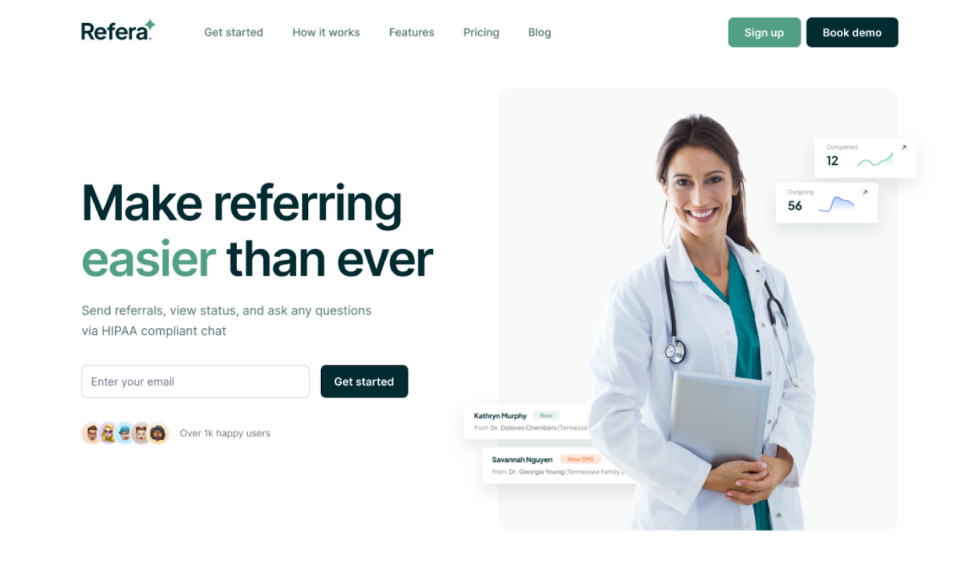
Why it works: Color strengthens visual hierarchy when it’s used with purpose. It helps the user focus, scan, and act without overwhelming the message.
Try this:
When the message matters, say less, but say it big. This approach strips away everything but the essentials: one strong typeface, oversized text, and whitespace doing the heavy lifting.
Think of Apple’s website design: a single sentence, center stage. Bold typography, restrained color, and not much else. It’s clarity turned into visual drama.

Why it works: Big type commands attention. Minimal design reduces distractions. Together, they make the message feel immediate and intentional.
Try this:
Not everything needs to feel polished. Handwritten or rough-edged fonts bring warmth and authenticity — perfect for brands that want to feel approachable and human.
Higgidy’s packaging uses chunky, irregular type that feels handmade and cheerful. The slightly off-kilter lettering pairs perfectly with illustrated ingredients, giving the brand a crafted, kitchen-table personality that stands out in the frozen aisle.
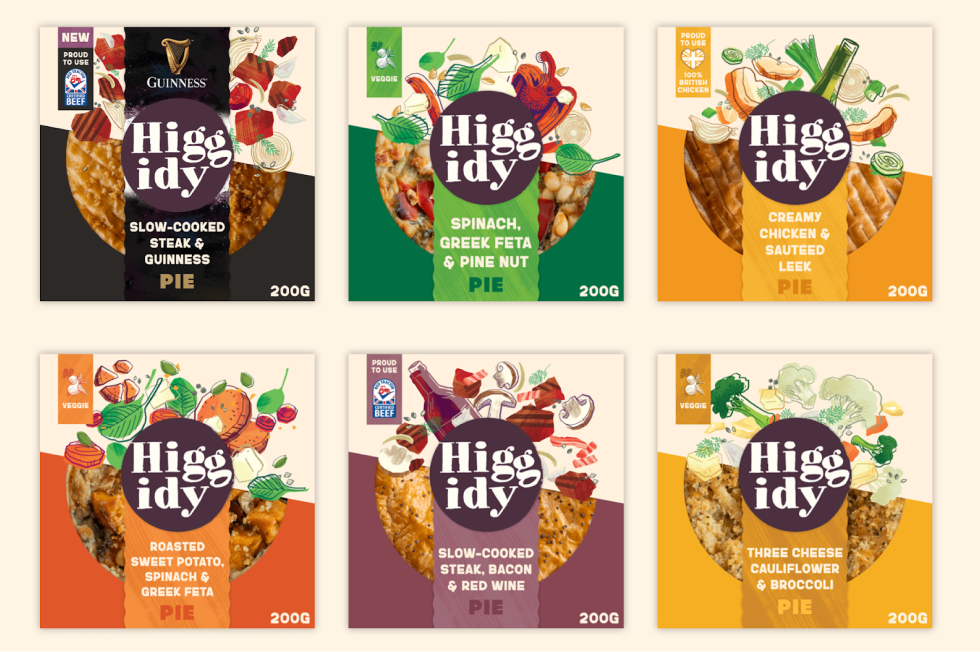
Why it works: It breaks from the clean, digital mold and builds trust through imperfection.
Try this:
Not every font is made for reading paragraphs — some exist to make you stop and stare. Display type can carry the entire mood of a brand, especially when it’s used as a visual element, not just text.
Alpine Bio is a perfect example. The brand uses a dotted, modular font that breaks traditional rules of readability and that’s the point. It feels biotech, experimental, and a little bit weird (in the right way), making the typography itself the brand's personality.

Why it works: Display fonts can define your tone at a glance. They’re not subtle — they’re statements. Used sparingly and intentionally, they make your identity unforgettable.
Try this:
Typography doesn’t live in isolation. It’s one thing to find inspiration — it’s another to translate those ideas into a consistent, usable system that works across screens, campaigns, and content.
A great type system does more than look good — it speaks with one voice across everything you publish. From landing pages to emails to product UI, consistent typography builds recognition and trust. But consistency doesn’t mean rigidity. The right system gives you rules and room to adapt.
Here’s how to make your typography work in the real world.
Start with adjectives that describe your brand's personality. Are you bold? Thoughtful? Experimental? Reliable? Your font choices should reflect those traits.
Then match those traits to font archetypes:
Don’t just pick fonts you like — pick fonts that speak for your brand when your words aren’t there.
Think of your typography like a layout skeleton. Every size, weight, and style tells the reader what to pay attention to.
Define styles for:
Use size, weight, and spacing to create contrast, not just different fonts. If everything stands out, nothing does.
Bonus tip: Most design tools let you set text styles (e.g., H1, H2, Body) — use them to stay consistent and scalable.
A type system doesn’t live in a brand book — it lives in buttons, hero sections, email subject lines, and social ads, all of which you’ll want to get right when you hire a graphic designer.
Before finalizing, test your fonts in context:
And always ask: Does this typography express our voice and support usability?
When it does both, you've built a type system that actually works.
You don’t need to start from scratch — there’s a whole ecosystem of tools that make exploring, testing, and refining your typography easier (and faster).
Before you commit to a typeface, see how others are using it. Not just in mockups — in real brands, on real sites.


Once you’ve chosen fonts, the next step is applying them to a layout that feels intentional, not just stacked boxes.

Your typography should work for everyone, not just designers with perfect vision and a Retina display.

While tools and type libraries give you a great head start, strategy is what brings everything together. The real power of typographical design lies in how you apply it across your brand voice, layouts, and user journeys.
Typography does more than decorate — it defines how your brand speaks visually. From bold, expressive display fonts to quiet, trustworthy serifs, your type choices set the emotional tone before a single sentence is read.
In a design landscape crowded with AI-generated content and cookie-cutter templates, typography is how you stay human. It’s how you create pause. Focus. Recognition.
At TodayMade, we believe great design starts with clarity, and that includes how your type system functions across every page, slide, and scroll. Whether you’re shaping a new identity or refreshing an existing one, your typography should do more than look good. It should build trust, guide the eye, and reflect the voice behind your brand.
If you’re ready to turn inspiration into design that drives results — whether through in-house or graphic design outsourcing — we’d love to help.
→ Book a demo to see how smart, strategic typography can bring your brand to life.