Typography
18
min read
Choosing fonts shouldn't slow you down. Here’s how to pair with purpose, backed by 24 real examples and the logic behind each decision.
In a world with over 200,000 available fonts, choosing the perfect pair can feel like an impossible task.
You sit down to design and realize just how fragile typography decisions can be. You pick a header font you love, try pairing it with a body font… and somehow, the whole thing just looks off.
The truth is that even seasoned designers feel this.
So, how do you pair fonts without losing your mind? At TodayMade, we’ve worked on countless design projects, and we’ve faced this challenge many times. In this guide, we’ll help you do the same.
In graphic design, the typography you choose often carries more weight than colour, imagery, or layout. Yet, despite this importance, most designers find themselves frustrated when selecting font pairings. Why?
1. Too many choices
With thousands of fonts accessible, designers face a vast sea of options. And while variety is a good thing, it often makes the starting point unclear. For almost all designers, narrowing down variations becomes time-consuming and mentally taxing.
This moment of “it doesn’t feel right” often comes because the problem is in subtle relationships among fonts.
In research, one major challenge highlighted is that “this is a fine‑grained problem, in which the subtle distinctions between fonts may be important.” When that nuance is hard to articulate, it becomes even harder to trust your font choices.
2. Invisible rules
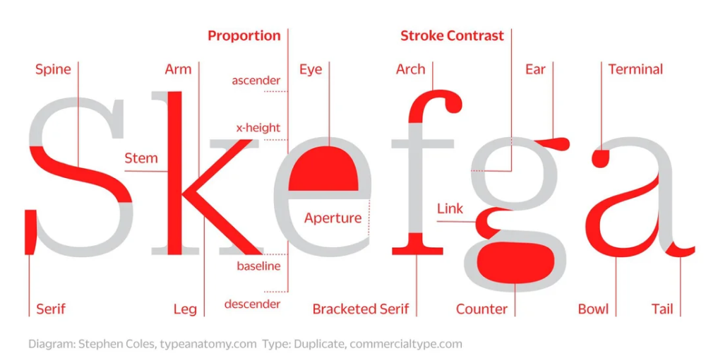
Beyond choice overload, there are rules of typography that lie beneath the surface: contrast, proportion, rhythm, tone, and legibility. These are rarely spelled out explicitly for non‑designers, but they matter.
For example, if two fonts share nearly the same proportions, weights, and styles, you’ll end up with a pairing that feels indistinct or even “clashy.” Similarly, if your fonts don’t match the intended mood, you’ll undermine trust and clarity.
When you make the wrong combination of fonts, your design suffers and fails to communicate effectively with your audience.
3. Fear of being “wrong”
In design, typography is part of the user experience, the brand voice, and even how people trust and engage with your content. Because of that, many designers get stuck in doubt, constantly questioning whether they’ve made the best font pairing.
When you combine choice overload + hidden rules + the pressure to get it “right,” font pairing becomes a mental hurdle.
At TodayMade, we’ve found it helps to apply a repeatable process rather than randomly trialling font combos.
Step one is to start with matching the message. Every design carries a certain tone, and typography plays a key role in communicating it. That’s why we begin by analyzing what kind of emotion or function the design needs to support. Once that’s defined, we look for good font combinations that reinforce the message.
From there, we include contrasting fonts in a design to create a hierarchy. This might mean mixing a serif with a sans, or placing a bold headline above a lighter body font. But that contrast should never look chaotic.
Finally, we look for ways to unify the pairing through rhythm. Fonts that share visual cues, such as similar x-heights, letter widths, or spacing, tend to read more cohesively, even if their styles are distinct. When rhythm is aligned, even two very different fonts can feel like part of the same system.
To help you simplify the decision-making process, we’ve compiled a list of good font pairings. Of course, not every combination will be the perfect fit for your specific brand or use case. And that’s fine. Our goal in this section is to give you a strong starting point.
Use cases: Landing pages, brochures, onboarding screens
Category: Grotesque sans + Transitional serif
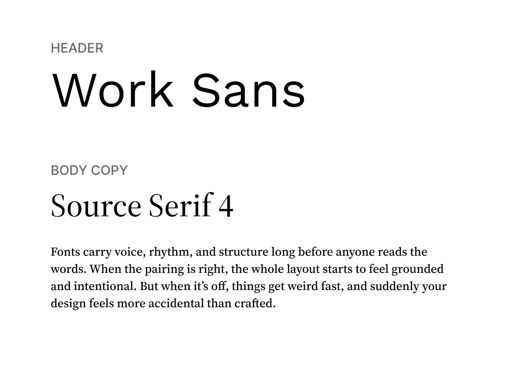
Work Sans, with its clean geometric shapes and slightly humanist warmth, handles headings with ease, especially on screens. It’s designed for digital environments, which makes it highly readable at a range of sizes.
Source Serif 4 brings in contrast without creating tension. It’s a modernized serif that looks refined but unpretentious. Used in body text, it introduces enough traditional structure to make reading long blocks of text feel grounded.
Use cases: Brand websites, pitch decks, editorial blog posts
Category: Geometric sans + Old-style serif
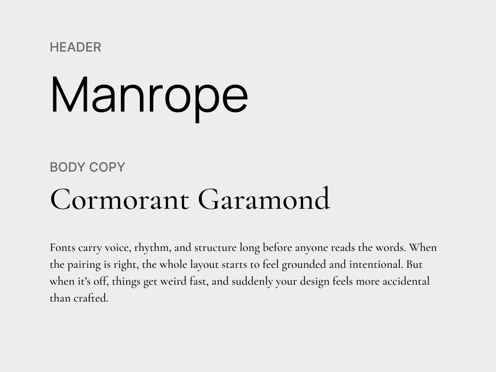
This pairing brings together the restraint of modern sans with the expressive detail of a high-contrast serif. Manrope is structured and minimal, excellent for headings or UI components where clarity matters most.
Cormorant Garamond adds drama in all the right places. Designed with calligraphic roots and a high stroke contrast, it gives body text a distinctive rhythm. Together, they strike a tone that’s professional but still full of personality.
Use cases: Dashboards, product pages, presentation design
Category: Humanist sans + Grotesque sans
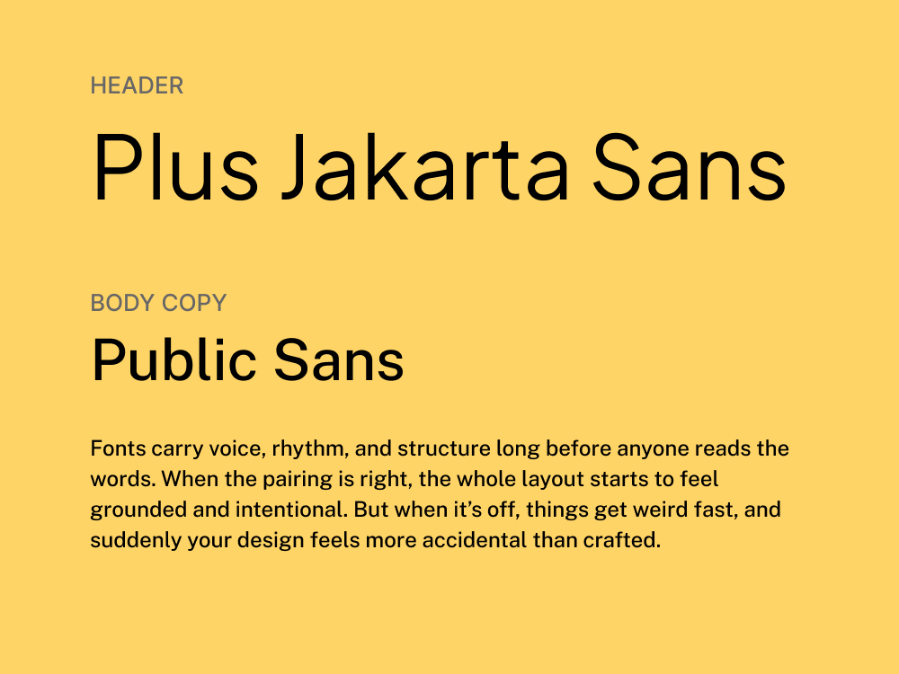
Jakarta Sans is a versatile geometric sans with open counters, clean lines, and a generous x-height, making it ideal for interface design and marketing copy. It works for headlines, UI elements, and anywhere else you need precision.
Public Sans, designed for U.S. government websites, brings a utilitarian vibe to body text. It’s not flashy, and that’s exactly the point. Its spacing, structure, and readability make it feel like infrastructure: invisible, but strong.
Use cases: Brand identity, hero sections, posters
Category: Geometric sans + High‑contrast serif
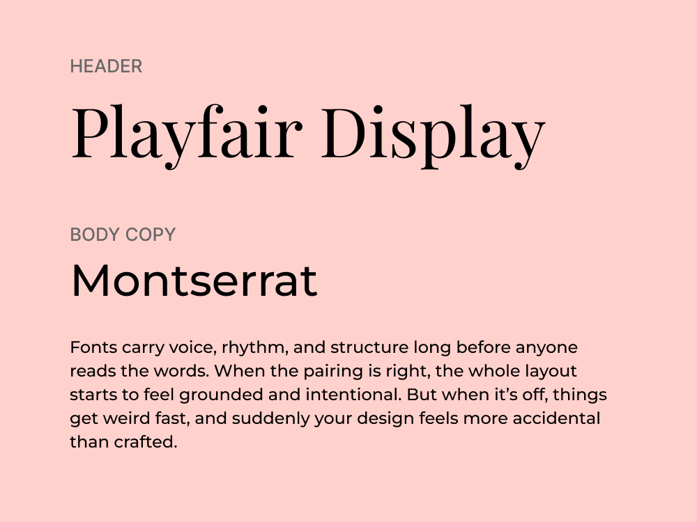
Montserrat carries the clean geometry and modern tone of the original sans‑choice. It’s versatile, friendly, and free via Google Fonts. Playfair Display steps in for the high‑contrast serif role with elegant curves and refined proportions.
Together, this pairing creates a high-impact visual tone: powerful, stylish, and well-composed. It works especially well for marketing design that aims to blend fashion-forward aesthetics with strategic clarity.
Use cases: Brand identity, landing pages, annual reports, brochures
Category: Grotesque sans + Modern serif
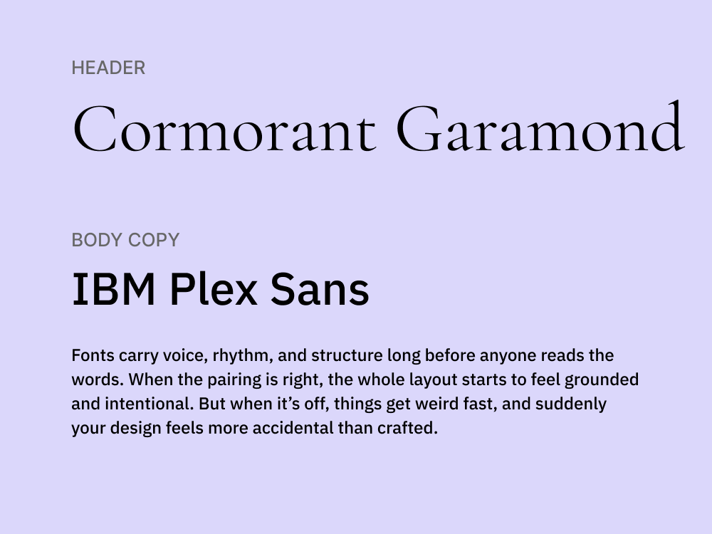
IBM Plex Sans has the neutrality and Swiss-inspired clarity, but with just enough character to feel warm and contemporary. It’s a functional sans that adapts well across branding, interfaces, and long-form content.
Cormorant Garamond introduces high contrast and elegance, echoing the print-inspired sophistication. This pairing feels both modern and editorial, being great for design-forward companies that want structure with a bit of flair.
Use cases: Reports, pitch decks, whitepapers, corporate websites
Category: Hybrid sans + Old‑style serif
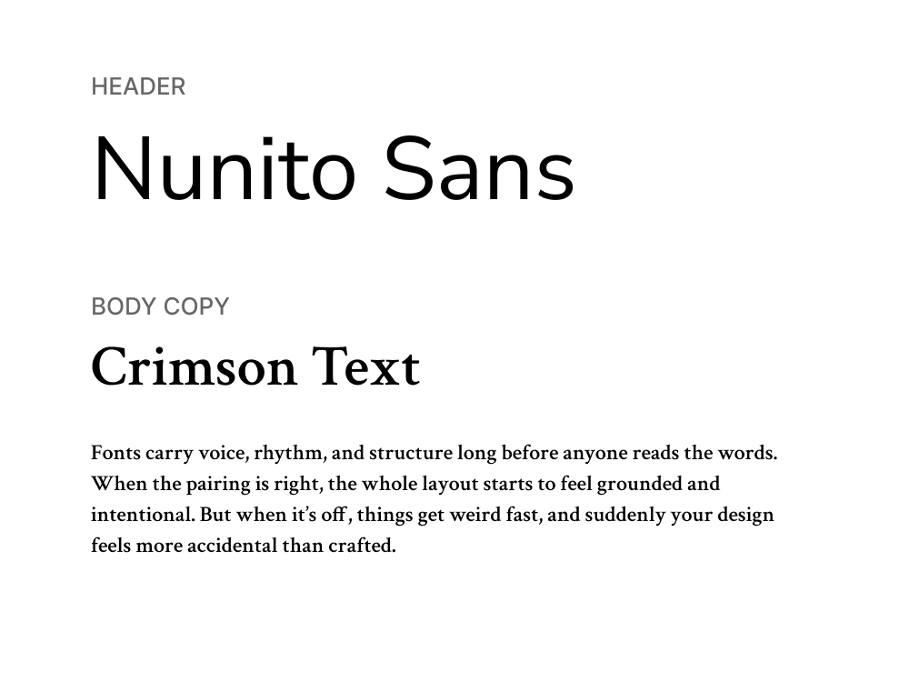
Nunito Sans brings the flexibility and clarity of a hybrid sans‑serif, with soft geometry and strong readability. Its balanced proportions make it reliable across UI components, headings, and even smaller paragraph styles.
Crimson Text mirrors the elegance and readability of an old‑style serif, delivering warmth and sophistication to long‑form content. This pairing feels perfect for content‑heavy formats that still need a strong visual presence.
Use cases: SaaS websites, help centers, blogs
Category: Humanist sans + Transitional serif
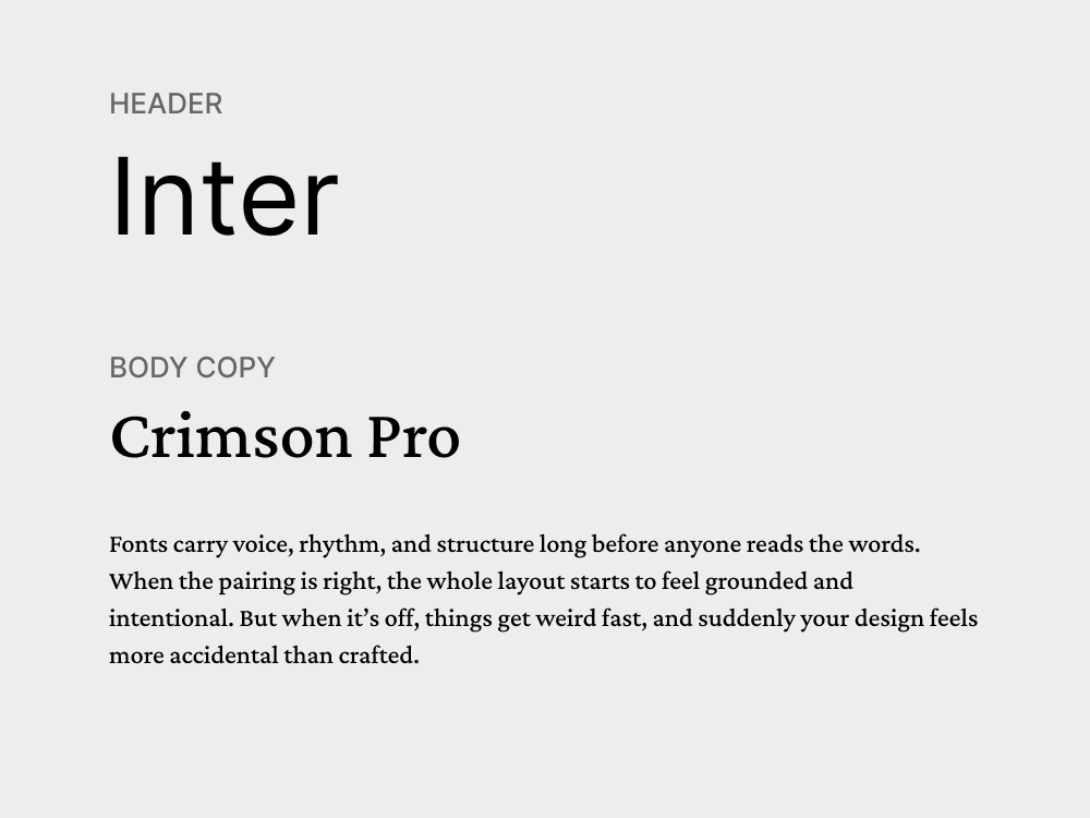
Inter was designed specifically for screens. With excellent legibility at small sizes, open shapes, and thoughtful spacing, it performs well in UI elements, headings, and body copy. It’s a favorite among digital product teams because it works.
Crimson Pro brings in the typographic richness of a transitional serif with wider letterforms, a warm tone, and strong readability for longer content. Its classic proportions and smooth curves make it feel refined.
Use cases: Blogs, promotional emails, lifestyle landing pages
Category: Geometric sans + Contemporary serif
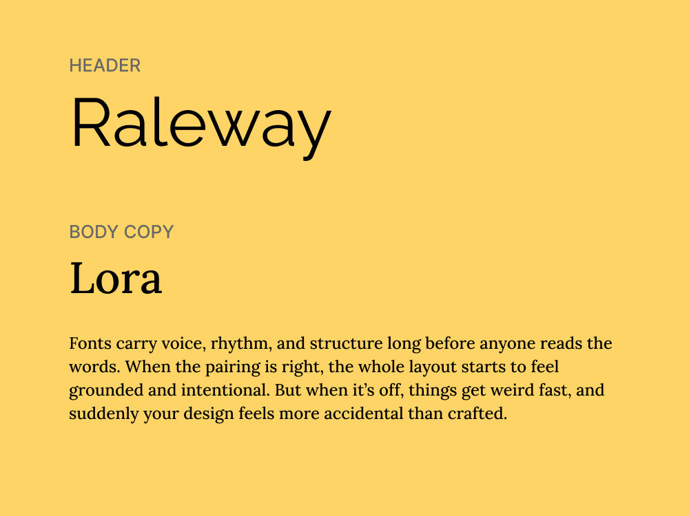
Raleway is a sleek, geometric sans-serif with a sense of lightness that works well in headings. Rounded forms and clean lines make it feel stylish but not overdesigned. At larger sizes, it brings a contemporary edge that stands out.
Lora is a well-proportioned serif designed for digital text, with a subtle calligraphic flavor. This perfect font pairing strikes a refined but accessible tone that works well for content-first layouts that still want a hint of polish.
Use cases: Educational content, explainer pages, infographics
Category: Accessibility-focused sans + Rounded geometric sans
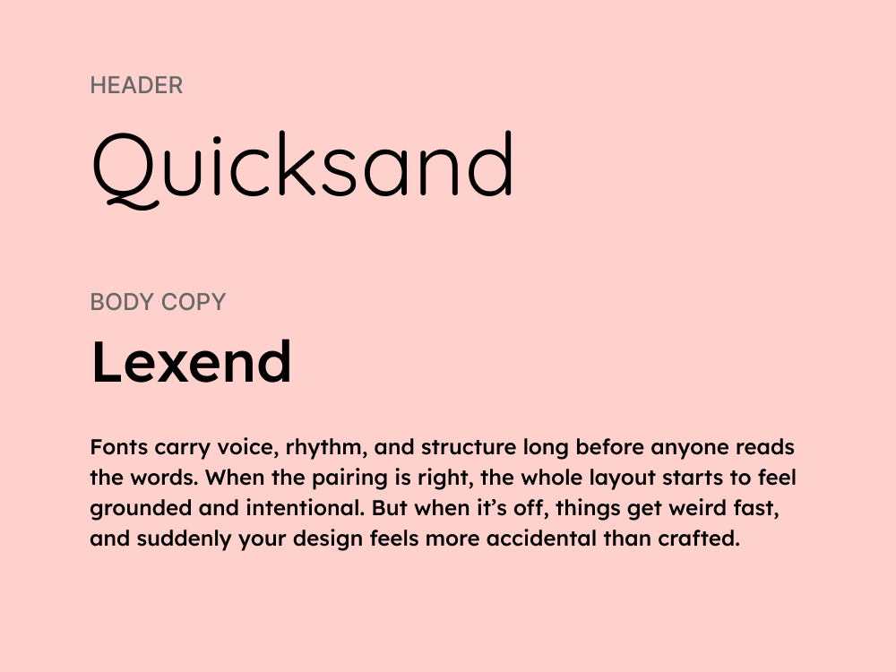
Lexend was designed with a goal to improve reading performance. Having generous spacing, open counters, and wide letterforms, it’s an excellent choice for body text, as it reduces visual stress and helps maintain a smooth reading rhythm.
Quicksand complements this with its soft forms and approachable tone. It’s a perfect match for headlines that need to be friendly rather than forceful. This pairing is not flashy, but it’s quietly effective where user experience is a top priority.
Use cases: Promotional banners, social media posts, product packaging
Category: Geometric sans + Display sans
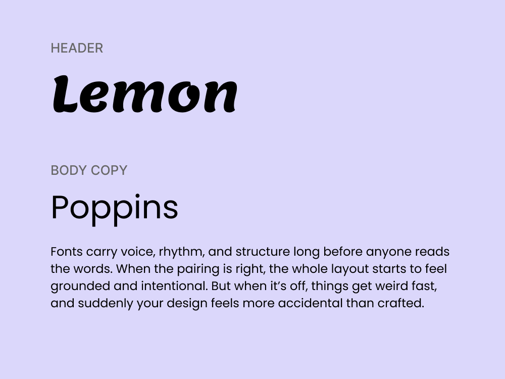
Poppins is a versatile geometric sans with circular forms and a friendly tone. It’s widely used in digital design because it scales well and feels approachable. In this pairing, it plays the supportive role, often used for subheads or body text.
Lemon Milk steps in with a dramatic presence. It’s an all-caps display font with sharp edges and a confident stance. It’s the kind of typeface that demands attention, being great for bold headlines, splash screens, or limited-word designs.
.webp)
Use cases: Editorial websites, portfolios, newsletters
Category: High-contrast serif + Humanist sans
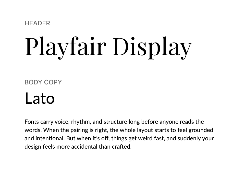
Playfair Display brings high contrast and refined curves, everything you’d want in a headline that feels classic yet elevated. Its roots in transitional typefaces make it ideal for brands or content that want a sense of timeless sophistication.
Lato, meanwhile, grounds the pairing with its soft sans-serif structure. Originally designed for corporate use, it’s versatile and easy to read at small sizes. It offers personality to avoid looking generic, but not so much that it competes for attention.
Use cases: Blogs, eBooks, presentations
Category: Geometric sans + Transitional serif
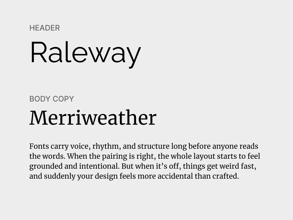
Raleway, with its sleek geometric construction, brings a sense of modernity and minimalism to headings. Merriweather complements it perfectly as a serif designed for comfortable reading for longer-form content.
This font combination creates a balance between sharpness and softness. Raleway guides the eye with clear hierarchy, while Merriweather does the heavy lifting for content-driven designs that need to look trustworthy.
Use cases: Whitepapers, blog articles, landing pages
Category: Neo-grotesque sans + Contemporary serif
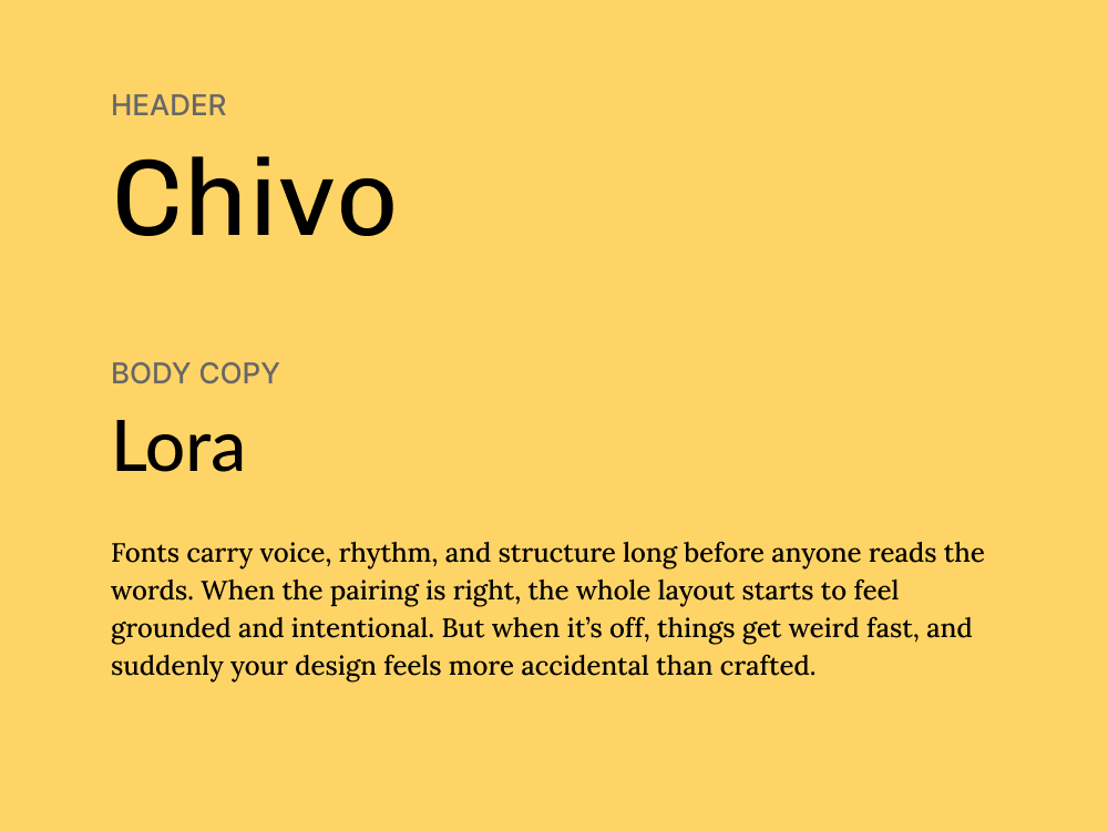
Chivo is a strong sans-serif with personality, but not so much that it draws attention away from content. Its slightly condensed structure gives it an intentional tone, making it great for headlines, subheads, and section labels.
Lora balances that intensity with warmth and rhythm. Designed for readability, this font has soft curves, moderate contrast, and a subtle calligraphic touch. It handles body copy beautifully and adds depth to the overall tone.
Use cases: Ad banners, slide decks, social media graphics
Category: Heavy grotesque sans + Humanist sans
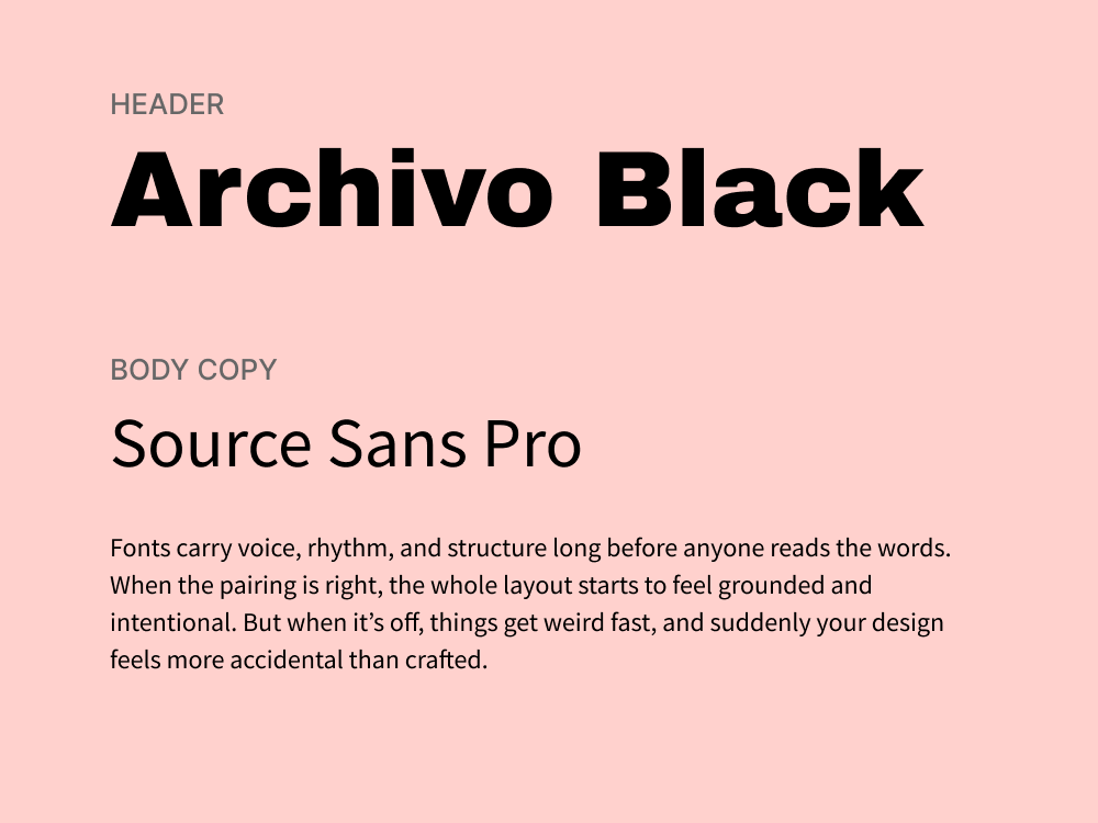
Archivo Black is a heavy, compact sans-serif designed to grab attention. With its tight letter spacing and strong verticality, it’s perfect for punchy, high-impact headlines that need to get the message across fast.
Source Sans Pro steps in to balance the weight. It’s clean, open, and designed for readability in interfaces and print alike. As a body font, it offers clarity without fuss, making it a reliable partner for the assertiveness of Archivo Black.
Use cases: Posters, promo banners, landing pages, slide decks
Category: Geometric sans + All-caps display sans
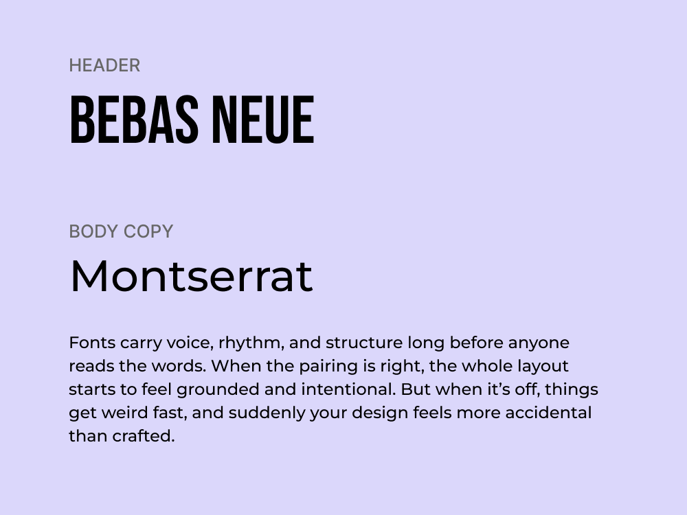
This pairing is about impact. Montserrat, inspired by urban signage in Buenos Aires, is one of the most widely used geometric sans serifs, and for good reason. This font is versatile, legible, and modern without feeling sterile.
Bebas Neue, on the other hand, is a tall, uppercase-only display typeface that commands attention. It’s made for headlines, slogans, or hero copy, helping squeeze in messaging without sacrificing presence.
Use cases: Tech product pages, brand refreshes, startup pitch decks
Category: Neutral sans + Quirky display sans

Space Grotesk delivers the clean geometry and screen‑friendly performance you’d expect from a modern neutral sans. It adapts well across weights, making it reliable for everything from minimal interfaces to expressive hero sections.
Barlow Condensed adds a quirky, display‑style twist with tight spacing and character. Its condensed structure gives it presence without overwhelming space, which makes it perfect for bold, efficient storytelling.
Use cases: Invitations, product packaging, brand assets
Category: Script display + Humanist sans
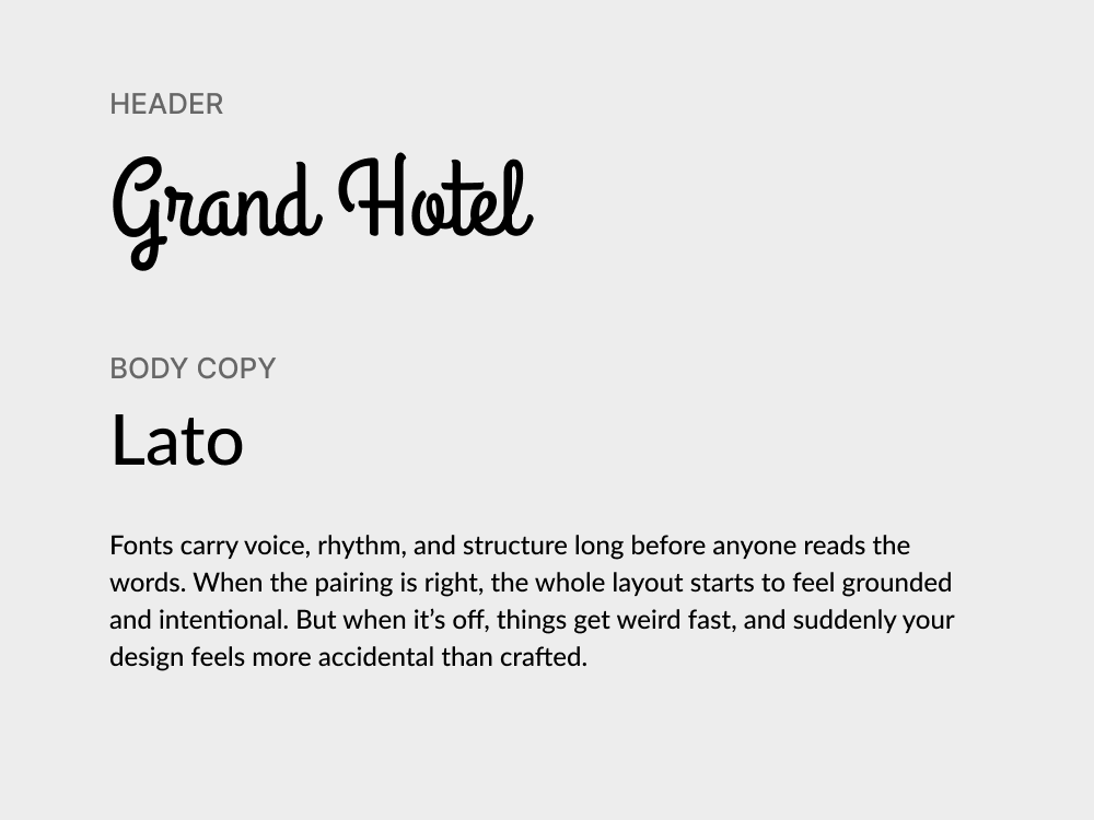
Grand Hotel brings a vintage charm to any design. Its script lettering is smooth and flowing, evoking the feeling of hand-painted signage or classic postcards. Simply put, it’s expressive without being overly ornate.
Lato serves as the calm, neutral counterpart. It’s a clean, versatile sans-serif that blends well with more decorative fonts, keeping the overall layout grounded. In body copy or subheads, this font maintains readability.
Use cases: Product labels, beauty campaigns, thank-you cards
Category: Script display + Contemporary serif
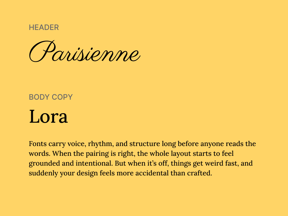
Parisienne is a delicate script with soft curves and a handwritten font quality that adds a sense of intimacy and grace. It works beautifully in short, decorative text, like logos, taglines, or accent words, where personality and flair matter most.
Lora complements this with grounded elegance. Its balanced serif structure and subtle calligraphic influence give it a refined tone. It’s reliable for body text, but it also has just enough style to hold its own in more expressive designs.
Use cases: Tech branding, gaming interfaces, promo posters
Category: Futuristic display sans + Geometric slab serif
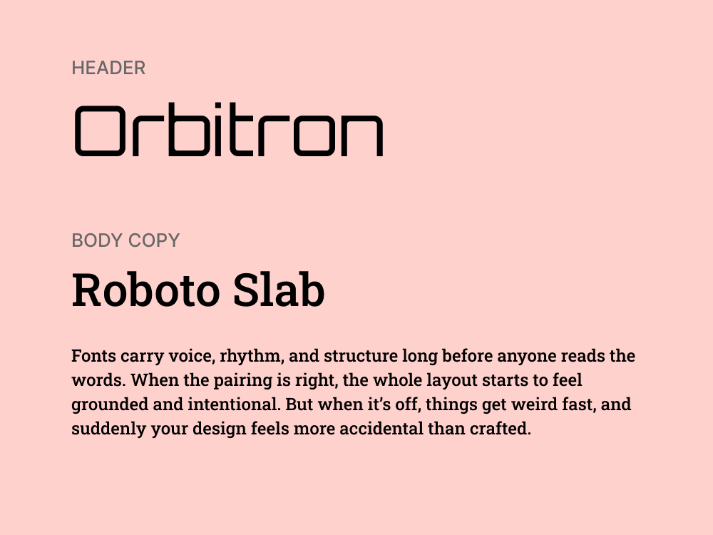
Orbitron is unapologetically futuristic. With its squared curves, sharp angles, and sci-fi-inspired letterforms, it commands attention in digital contexts. It’s best used in uppercase headlines or short, impactful phrases.
Roboto Slab brings balance to that energy. As a geometric slab serif with a tech-friendly tone, it provides weight and structure without being old-fashioned. It’s clean, readable, and adaptable across body text and subheads.
Use cases: Indie game design, tech zines, retro-style websites
Category: Pixel-style sans + Monospaced sans
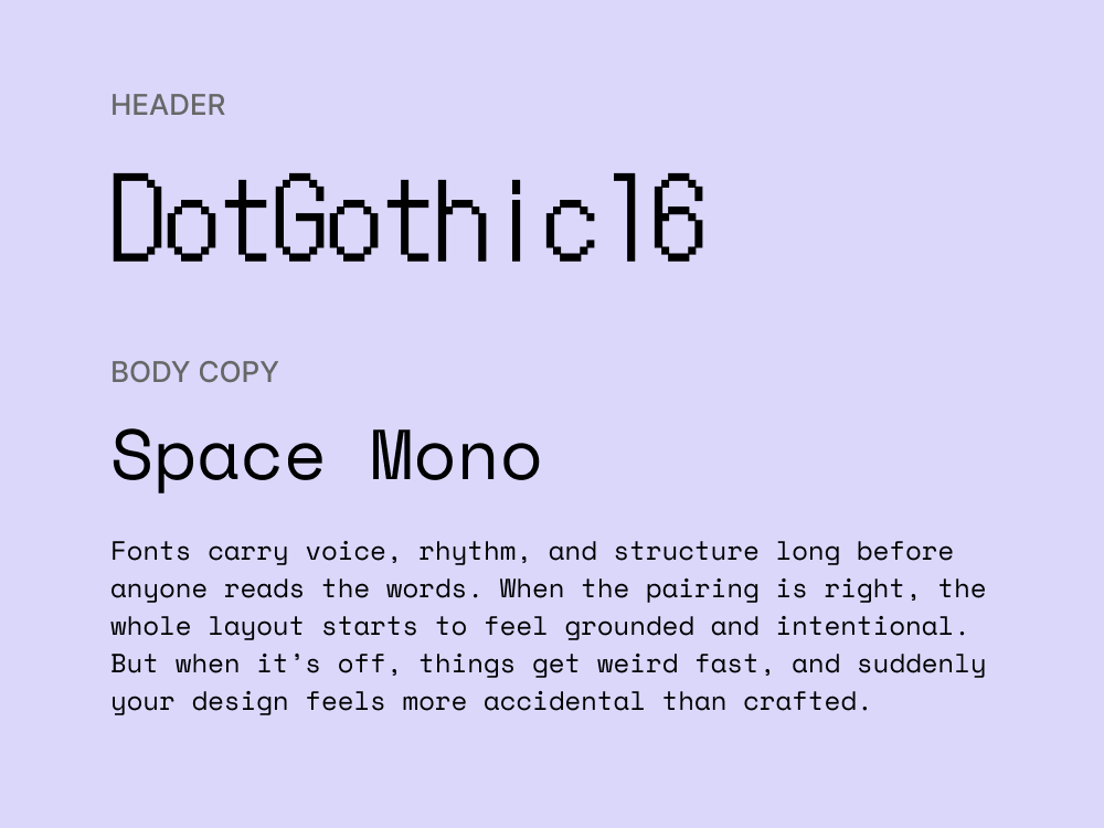
DotGothic16 is a pixel-style sans-serif that brings a nostalgic, arcade-like vibe to your design. It’s blocky, low-res, and full of personality. While not suited for large bodies of text, it’s great for titles or labels that embrace that 8-bit aesthetic.
Space Mono complements it with a similarly quirky vibe. As a monospaced font, it offers strong alignment and a techy look. It’s excellent for secondary text or small passages, especially when you’re aiming for a code-inspired visual language.
Use cases: Posters, campaign visuals, quirky landing pages
Category: Decorative serif + Slab serif
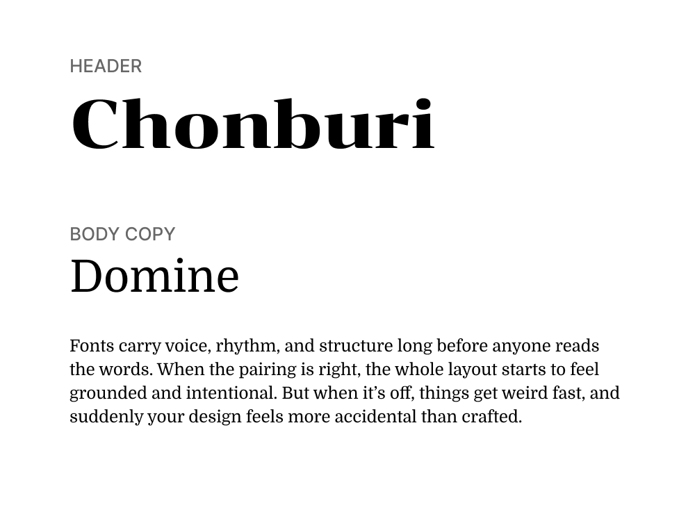
Chonburi is a bold, decorative display serif with playful curves and a retro flair that commands attention in headlines and logos. Its exaggerated forms bring character and charm, making it a natural fit for expressive design moments.
Domine balances that energy with a solid, grounded slab serif structure, ideal for longer text and body copy. It maintains readability while reinforcing a classic tone that complements Chonburi’s visual personality.
Use cases: Event branding, digital invitations, portfolios
Category: Classic serif + Contemporary serif
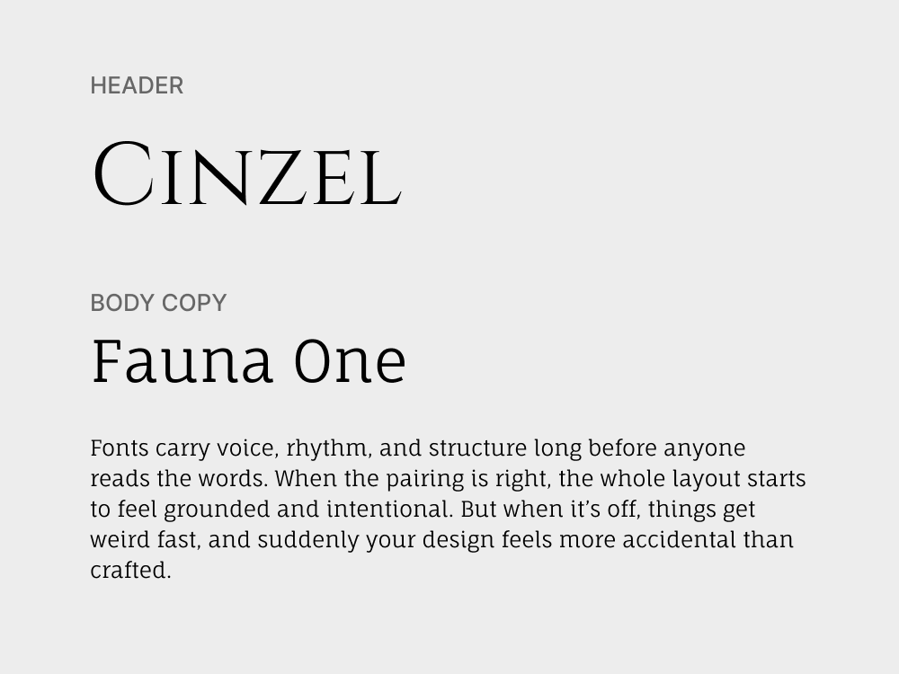
Cinzel draws on Roman inscriptions for its dramatic, formal presence, giving headlines a ceremonial and timeless quality. Its sharp serifs and all-caps elegance make it ideal for statements that need weight and sophistication.
Fauna One brings a softer, more organic serif feel to body text, with gently curved terminals and fluid rhythm. It complements Cinzel’s authority with warmth and legibility, making the pairing feel refined but approachable.
Use cases: Personal brands, boutique websites, lifestyle blogs
Category: Monoline script + Transitional serif
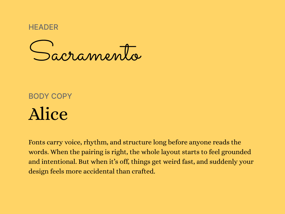
Sacramento is a monoline script that feels casual, handwritten, and elegant without being fussy. It adds a personal, human touch, being a perfect match for headlines, signatures, or branding accents.
Alice brings a traditional serif tone to the pairing, with high legibility and a subtle literary feel. It grounds the layout in structure, providing a stable base for Sacramento’s expressive personality.
Use cases: Creative agencies, product pages, experimental layouts
Category: Geometric display sans + Humanist sans
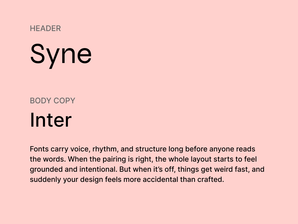
Syne is a wide, experimental sans-serif designed for display use, with unexpected proportions that make it instantly recognizable. It’s ideal for bold headlines and visuals that need to stand out in a crowded scroll.
Inter supports Syne with functional clarity. It’s built for screens, highly readable, and flexible enough to work across UI elements, body copy, and system text. The contrast in tone creates hierarchy without friction.
There’s no formula that guarantees a perfect match, but there are principles that help you spot what works, what clashes, and what to adjust. Here are a few we rely on when choosing and testing font combinations in real projects.
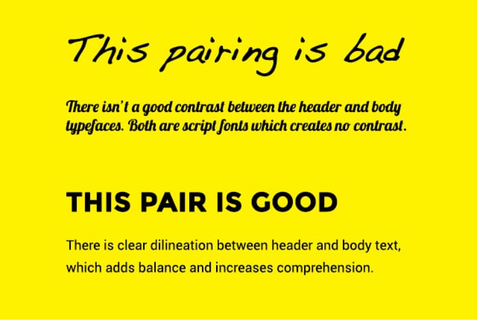
Most font pairings fall apart because they try too hard to match or not hard enough. The result is either too subtle to notice or too chaotic to follow.
To avoid this, aim for contrast in style, weight, or size. For example, a serif vs. sans-serif pairing naturally creates contrast both stylistically and emotionally. Decide which font is the “lead” — usually the headline — and which is supporting text.
This way, they won’t visually compete, and readers will be drawn to the most important text first. Use bold, oversized headings to anchor the layout, and keep supporting text lighter and smaller to maintain balance.
Fonts have personalities. Some are loud, expressive, and impossible to ignore. Others keep to themselves. When you pair them without thinking about tone, the design feels confused. What works is contrast with balance.
If one font is highly stylized, the other should step back. When choosing a pairing, complement a decorative display typeface with one that knows how to stay quiet.
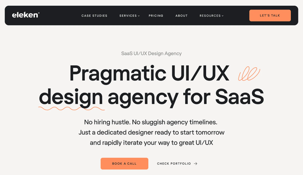
We followed this dynamic when working on Eleken’s UX design agency website. We paired Regola Pro, a confident, architectural serif, with Inter, a clean sans built for UI. These fonts don’t compete. They reinforce the same message in different ways.
While contrast brings visual interest, certain shared traits help fonts feel like they belong together. Look for typefaces with similar x-height, stroke contrast, or overall proportions — these details help them align comfortably on the page.
For example, two fonts with tall x-heights and open letterforms can feel cohesive, even if one is a serif and the other a sans. That subtle visual harmony is what makes a pairing feel intentional, not accidental.
Many modern superfamilies — like IBM Plex, Source, or Public Sans/Serif — are designed with this in mind. Their serif and sans styles share the same visual DNA, which makes them an easy, reliable way to achieve unity.
In font pairings, the simplest approach is to assign roles early. One font leads — usually for titles and headers. The other supports — often used for paragraphs, labels, or interface copy. When those roles are clear, the design feels grounded.
But roles only work if the fonts are built for them. A dense, stylized serif might look beautiful in a heading, but it’ll wear out the eye in long text. And the cleaner your supporting font is, the more freedom you have to experiment with the lead.
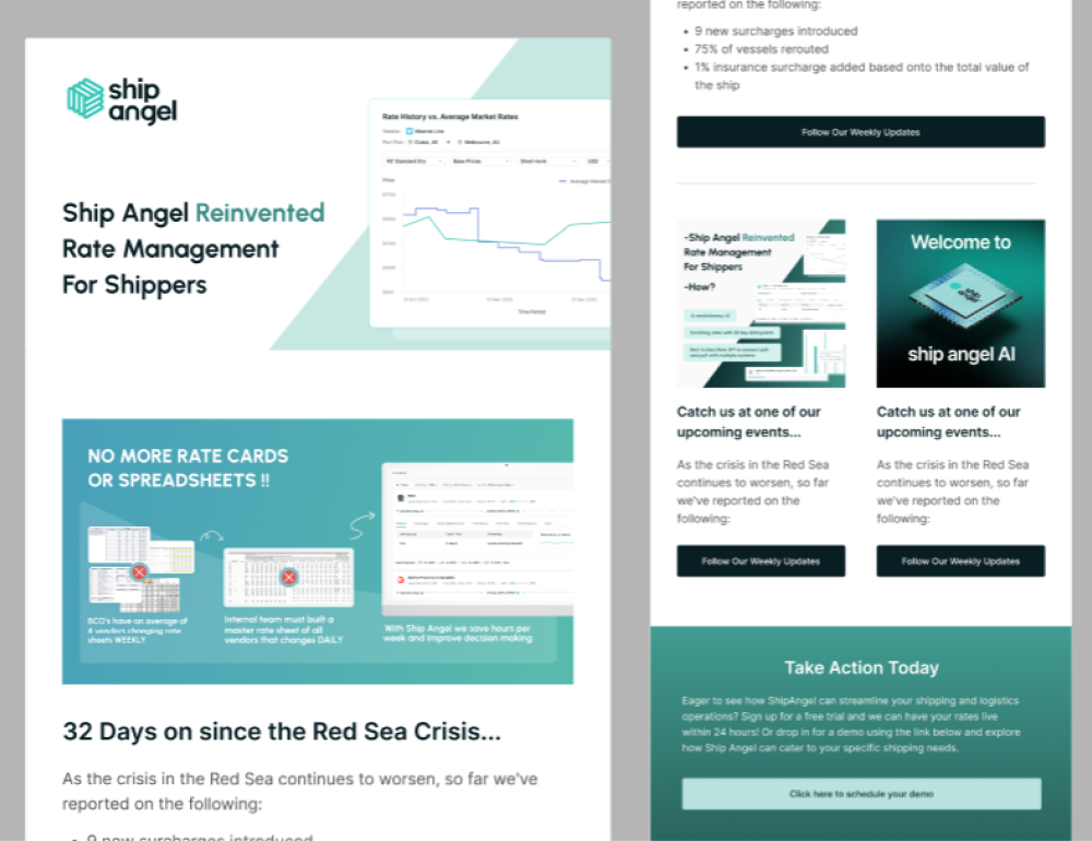
We followed this logic when working on the Ship Angel project. In designing their emails, we paired Urbanist, a crisp sans-serif with personality, with the neutral reliability of Inter. That combination gave us the desired visual contrast.
Too many fonts pull the reader in different directions. The tone shifts. The rhythm breaks. And instead of building trust, the design feels uncertain.

The safest rule is to stick with two fonts. If you need variation, look inside the font family itself. Most modern typefaces come in a full range of styles — bold, light, italic. That’s usually more than enough to create contrast without losing cohesion.
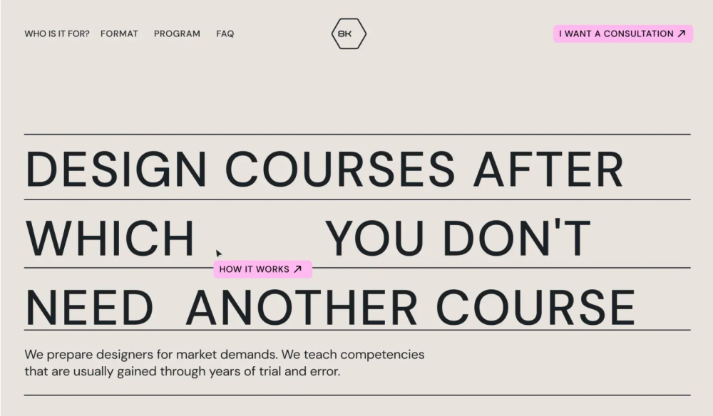
In the 8k Academy project, we didn’t use a second font at all. We stuck with just one — Coolvetica Bk — and used its stylistic variations to shape the hierarchy. Bold for headers. Regular for the body. It kept the layout clean and the content easy to follow.
No font pairing is perfect in theory. It either works on the page or it doesn’t. That’s why testing matters more than rules. Some combinations that look great in a mockup fall flat when used in real content. Others, even if they break conventions, just click.
The only way to know is to try.
Start with layout, not logos. Drop your fonts into a real use case and see how they behave. Sometimes the problem isn’t the fonts themselves but how they interact: the spacing, the weight ratio, the contrast between headline and body.
If something feels off, swap one out or adjust sizing. A bold serif might overpower a light sans at certain sizes. Or two fonts might look similar until they’re stacked in hierarchy — and then suddenly compete for attention.
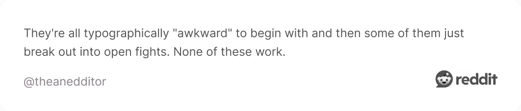
We couldn’t write this article without seeing what the internet really thinks, so we dug into a few Reddit threads, and as expected, designers had a lot to say.
Some fonts came up again and again. Montserrat, for one, is practically a community favorite. People love its balance — not too sharp, not too soft — and how easily it fits into everything from startups to slideshows.

Right behind it are staples like Poppins, Futura, Proxima Nova, Helvetica, Bahnschrift, and Acumin. The kind of fonts you trust to get the job done.
But not everyone is loyal to just one. A few designers mentioned they don’t have a favorite at all. Instead, they choose a new pairing for every project, based on tone, layout, and mood, which, honestly, makes sense.
Some stay true to the classic font pairing. Times New Roman, Calibri, Inter — fonts that might not win awards, but they don’t need to. They’ve already earned their place in the default settings of half the internet.
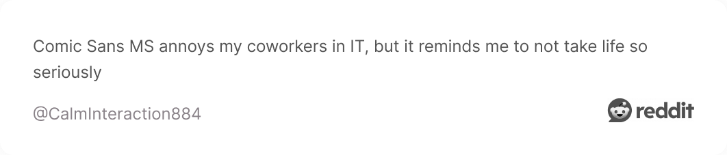
And then there’s Comic Sans. Somehow still part of the conversation. Some users genuinely defend it. Others lean hard into sarcasm. Hard to say which is which, and maybe that’s the point.

The community may not always agree on what works best. But they do agree that it has to work somewhere, not just in theory.
Let’s be honest, sometimes you just don’t have the inspiration to figure out the great font pairing. Everything starts to feel off, and nothing seems to work together. In those moments, a shortcut like a font pairing generator can help.
We won’t claim they’re always the best solution, but they can definitely speed things up. These tools can spark ideas and help you test combinations quickly.
Here are a few worth trying:
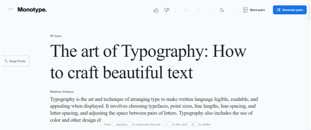
1. Monotype Font Pairing Tool
🔗 URL: https://www.monotype.com/font-pairing
Monotype comes from one of the most established names in typography. It features font pairings examples from real-world projects and gives you the flexibility to change the sample text, so you can see how different content behaves with each combo.
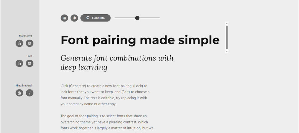
2. Fontjoy
🔗 URL: https://fontjoy.com/
Fontjoy uses neural networks to suggest font pairings based on contrast, similarity, or randomness, and lets you lock one font while cycling through others. It’s a fast way to explore stylistic combinations and tweak your way to harmony or tension.
3. Fontpair
🔗 URL: https://www.fontpair.co/
Focused on Google Fonts, Fontpair is a resource that offers ready-to-use pairings by category, like serif + sans, display + body, and so on. Each suggestion is shown in actual layout examples, so you get a quick feel for how it might work in context.
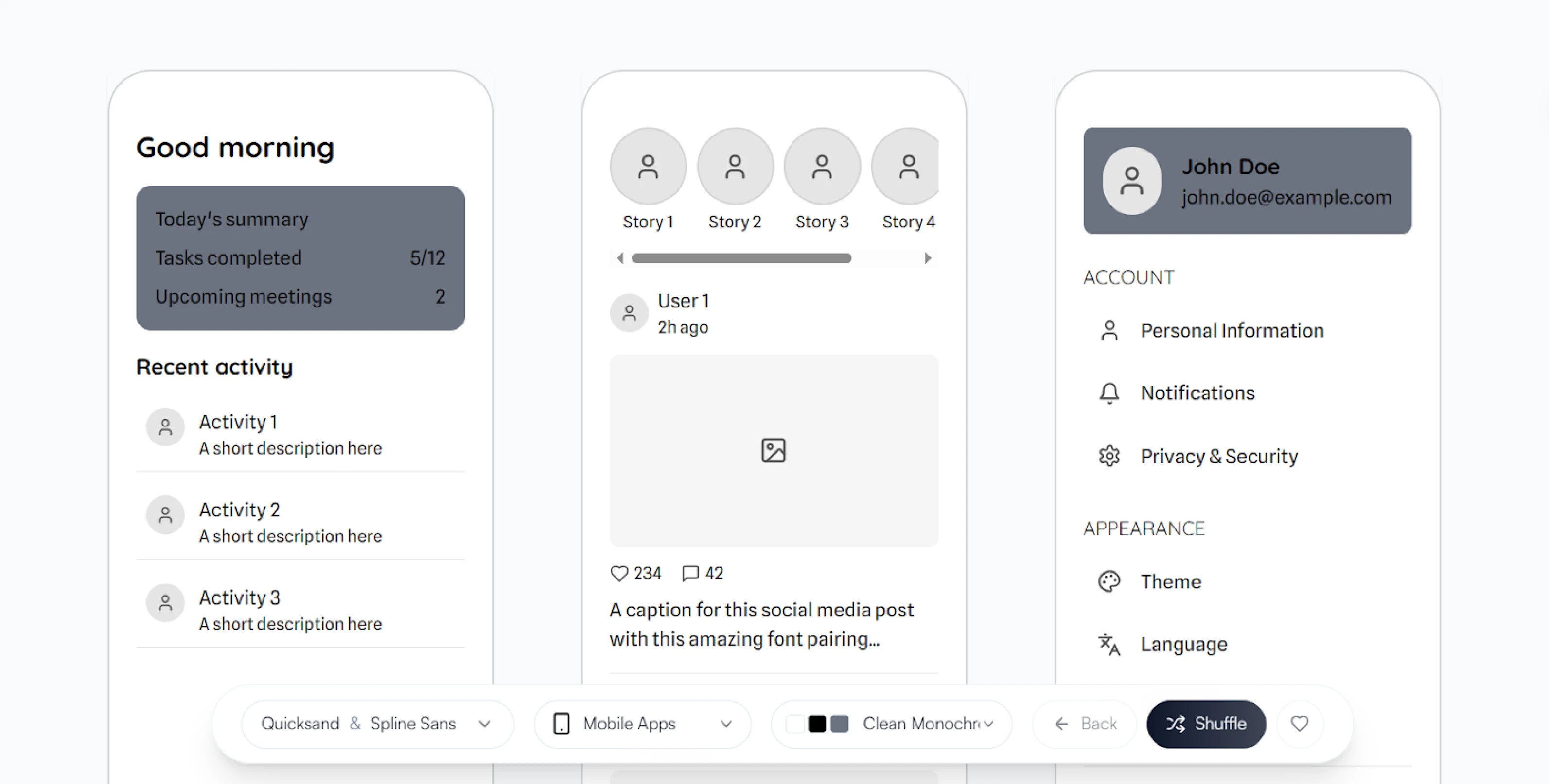
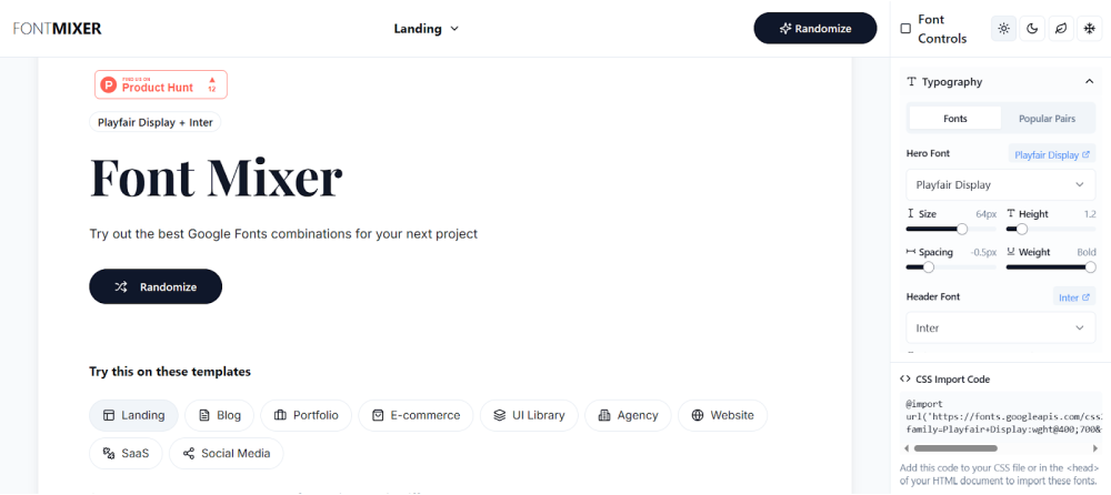
4. Fontmixer
🔗 URL: https://fontmixer.app/
Fontmixer gives you real-time previews and easy controls, all within a side-by-side font comparison layout. It’s designed for experimentation and quick iteration, helping you visually test font relationships across digital screen sizes.
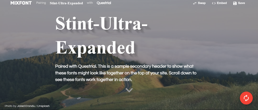
5. Mixfont
🔗 URL: https://www.mixfont.com/
Mixfont blends pairing suggestions and even lets you preview the best font combinations on your own site using an embeddable code snippet. You can randomize until something clicks or browse trending pairs curated by the community.
In marketing design, font pairings shape perception quickly. The right combination can signal trust, push emotion, or create structure before a single word is read. And when you’re designing at speed, these decisions happen fast.
Most of the heavy lifting comes down to knowing what to look for: tone, contrast, rhythm, clarity. Once you get fluent in those, the pairings start to make sense, and you spend less time second-guessing your font type.
At TodayMade, that’s how we approach it. No one’s building moodboards for weeks. We match fonts to the job, test them in real layouts, and ship. And if you ever get stuck in the early phase or just need designs done, we’re here to help.
So, instead of looking for the “perfect” combo, look for the one that works in the space you’re designing for.