Typography
13
min read
Typography is the art of arranging type to make your message clear and engaging. This guide explains what typography is, why it matters in graphic design, and how smart type choices can instantly elevate your visuals.
You might not know the difference between a serif and sans-serif yet, and that’s okay. Maybe you've tried picking fonts and somehow ended up with something that looks like a school project gone rogue. Been there.
The good news? Typography isn’t some mysterious talent. It’s a skill. One you can learn, practice, and actually enjoy.
In this article, we’ll answer “What is typography in graphic design?”, why it matters, and how to start getting better at it, even if right now, you feel totally lost. To make sure you get a clear, no-fluff explanation packed with practical examples, we asked our UI lead at TodayMade, Darina Silchenko, who also has tons of experience teaching graphic design, to share her insights.
Let’s get started with typography definition.
Typography is the way of arranging text so that it's readable, visually appealing, and aligned with the tone of the message. It’s about how words are laid out on a page or screen to create meaning and flow.
Think of a book cover. The title is large and bold, the subtitle smaller and lighter, and the author’s name in a contrasting font. That balance of size, weight, spacing, and style? That’s typography at work.

The main purpose of typography in graphic design is to make written language readable, clear, and visually engaging. It’s not just decoration, it’s communication design at its core.
As one Creative Director on Reddit put it:
“You're in the business of communication. If you can't successfully communicate a message, you can't be a graphic designer.”

Typography in design shapes how people absorb information, feel about a brand, and even whether they stick around or bounce off your design.


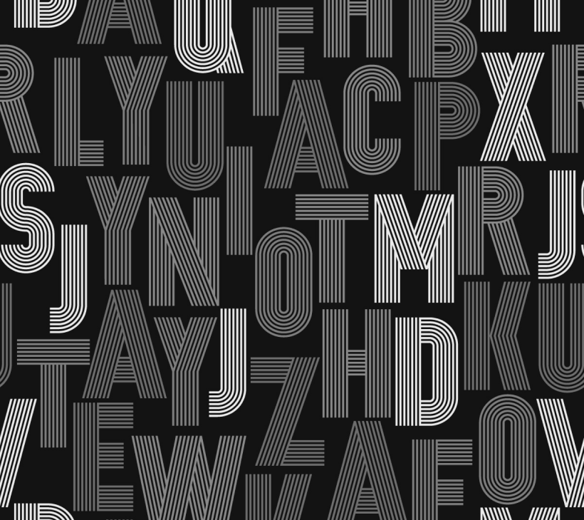
Typography is everywhere in design. You can’t avoid it, but you can get really good at it.
Typography can feel like learning a new language. Between the jargon, historical styles, and invisible rules, it’s easy to feel overwhelmed. But once you get familiar with the core elements, things start to click.
Below, we break down the typography basics in plain English, with practical context and examples to help it stick.
First of all, let’s clear up a common source of confusion: typography vs. fonts vs. typefaces.

In short: Typefaces are what you choose. Fonts are what you use. Typography is how you use them.
Once you understand the difference, you’ll start to notice how skilled designers use type to guide your eyes, shape your emotions, and tell stories without saying a word.
These terms belong to the typeface classification in typographical design, which is based on whether the letter has or doesn’t have a tiny stroke – “serif”.

Serifs are the tiny “feet” or strokes at the ends of letterforms. Think Times New Roman or Garamond — classic, bookish, and rooted in tradition.

Serif fonts are distinguished from each other by the type of stroke.

Each serif style carries its own personality and practical implications:

Here are some good typography examples of using serifs:

Unlike serif fonts, sans serif fonts, also known as “grotesks”, skip decorative endings on their letterforms, giving off a clean, modern vibe.

Here’re some of examples:


They come with bold, blocky endings that feel assertive and great for headlines. Some popular examples are Rockwell or Clarendon.

To sum up, all of the above typefaces aren’t just style choices. Serif fonts tend to feel trustworthy and traditional, perfect for long reads or printed content. Sans serifs are often easier to read on screens. Slab serifs command attention, making them favorites in ads and editorial headlines.
Want to go deeper? Check our blog post on font psychology.
Spacing might sound boring, but it’s where bad typography goes to die and great design quietly shines.


Even subtle tweaks can transform cluttered text into breathable, elegant copy. Especially in UI design or product interfaces, thoughtful spacing makes content digestible and beautiful.
These terms might sound technical, but they all affect how your text feels and how well people read it.

Together with color and spacing, weight and contrast help build hierarchy in typography, guiding the reader’s eye through the content, indicating the importance of different text elements.

Aperture is the opening of letters like “e” and “c.” A narrow aperture can feel stylish but might hurt legibility at small sizes.

You’ve learned the theory, now it’s time to apply it. Choosing a font for your project can be an important design tool, and there are several key factors to consider:
1. Type of project
Are you designing a website, a logo, a printed brochure, a poster, or an animation? Each format brings its own constraints and expectations. A responsive UI needs clear, readable fonts at small sizes. A logo, on the other hand, might benefit from distinctive, stylized lettering that wouldn’t work well in body text.
2. Audience
Who are you speaking to? If your audience is kids, a bubbly rounded font might feel right at home. A corporate audience? Probably best to keep it classic and professional with a neutral sans-serif or serif. Font personality matters a lot.
3. Style and mood
What kind of mood are you trying to set?
Typography helps establish the emotional tone of your design before anyone even reads a word.
4. Readability
It doesn’t matter how cool a font looks — if people can’t read it, it’s a problem. Make sure your font works well at different sizes, especially for long-form reading. Check letter spacing (tracking), line height, and character distinction (like the difference between capital “I” and lowercase “l”). Some fonts are made for headers, others are built for paragraphs. Know which is which.
Typography trends change quite dynamically, still here’s a list of classy fonts that are likely to work well for most projects.
Choosing the right font is one thing. Most probably you’ll want to create font combinations for your project. That’s where things get tricky, but also fun.
To combine fonts wisely, you need to understand their core traits, which is the first step in learning how to combine fonts.
The goal is always balance: fonts that look good side by side while maintaining their individual character.
There are three main pairing strategies:


How to make these pairs work

Pairing fonts is about contrast with control, making sure they complement each other without fighting for the spotlight.
Once you know what you’re looking for, the next step is knowing where to look. Here are solid places to find the right typeface for your project—whether you're on a tight budget or ready to invest in quality:
With so many resources to get fonts you may wonder “If there are free and paid fonts, are there any rules or usage restrictions?”
Fonts are not just downloadable assets — they’re intellectual property, and using them incorrectly can lead to legal trouble. Every font comes with a license that defines how you’re allowed to use it.
Here are some key restrictions and conditions you might encounter in a font license.
Using fonts responsibly not only protects you from legal issues, it also supports the designers who make them.
Ready to put everything into practice? Here are a few quick exercises and habits to build your typography skills and confidence:
Create a simple flyer, poster, or Instagram graphic. Use one expressive display font for the headline, and pair it with a neutral sans-serif for the body. Play with spacing, size, and alignment until it feels balanced.
Test your design across devices and formats — desktop, mobile, even printed paper. Does it still work at small sizes? Can you tell a capital “I” from a lowercase “l”? These small checks prevent big mistakes.
There are platforms that offer built-in pairing suggestions and can help you explore combinations and see how fonts behave in headers vs. body text. Some examples: fontpair.co, femmebot, typ.io.
Share your design in a typography subreddit or design Slack group. Ask targeted questions: Is the text easy to read? Does the pairing feel cohesive? Is the tone right for the message?
Came across some great graphic design examples? Whenever a font works well, save it. Create a folder with your favorite fonts, license details, and a few screenshots of how you used them. It’ll save you hours on future projects. By the way, you can also learn useful lessons on bad typography examples.
If you’re ready to go deeper into the world of typography (or just want to sharpen your eye), here’s a solid starter pack of books, tools, and communities:
That’s it for our guide. For more advanced inspiration, check out these kinetic typography examples to bring motion to your designs. Hope it was helpful and you’ll start applying your newfound typography knowledge right away. And in case you lack the time or resources to execute it, TodayMade is here to assist.

We offer a subscription-based design service that provides you with a complete creative team, including illustrators, web designers, animators, and more, for less than the cost of hiring a single in-house designer. Contact us to ensure your marketing campaigns are never held back by design bottlenecks.