Typography
13
min read
Choosing the right font can make or break your design — but what does great typography actually look like? This guide features 40 handpicked examples from popular brands, showing how smart type choices shape user experience, drive conversions, and build brand identity.
Good typography plays a role that doesn't shout. It stays invisible and quietly does its job. It tells you where to look, what to feel, and how to trust a brand, often without you realizing it. And yet, so many design teams treat typography like an afterthought. Choose a font, set a size, call it a day.
At TodayMade, we've worked on enough projects to say this with confidence — don't do that. To prove our point (not just with words), in this article, we'll walk through a list of real-world typography examples that get it right across the web design, product, marketing, and branding.
You can’t spot good typography instantly, but you can feel it. The layout reads easier. The product seems polished. The message lands better. And that’s the point.
There are a few traits that nearly all good typography design shares. First, readability. That means sufficient font size, clean line spacing (1.4 to 1.6 is a safe range), and enough contrast between text and background, which directly ties to leading in typography.
Second — visual hierarchy. Headlines, subheads, body text, and buttons should be clearly distinct, not just slightly different sizes of the same font.
Third, consistency. Once you've defined spacing, styles, and alignment, stick to them. After all, a tech blog and a skincare site shouldn't sound or look the same, and examples of typography in graphic design ahead will show what that means in practice.
Relying on typography trends won’t get you to a product that stands out. Choosing the right font that makes it more structured, more polished, and more premium will. A skilled freelance graphic designer can guide that decision, but the inspirational typography examples below are aimed to help you find the right direction.
Font: Inter Variable
Linear's typography is intentionally quiet. It is a geometric sans-serif font for interfaces, and here it delivers surgical clarity with great aesthetic appeal . Subtle font-weight shifts build hierarchy without relying on color or UI noise. Nothing screams “design,” yet everything is refined.

Font: Helvetica Neue
RayRayLab's portfolio plays with word spacing in a way that immediately catches your eye. It creates a calm rhythm that feels futuristic and slightly offbeat. Helvetica Neue keeps the structure grounded, while the whitespace adds personality to the artwork without needing extra visuals.
Font: Geist
Geist is an ultra-clean solution for code-heavy reading. The Vercel blog uses solid hierarchy: big, low-contrast headlines, readable body text, and generous spacing. It’s technical without being dry — the kind of cool typography design that makes you want to keep scrolling.

Fonts: Reckless, Basis
Teachable mixes two typography choices in a way that doesn’t appear cliché, showcasing how to combine fonts with style. Reckless brings warmth and contrast to the headlines, setting a professional tone. Basis takes over for the body text, offering easy reading that holds up across long-form content.

Fonts: Sharp Grotesk 23, Atlas Grotesk
Dropbox’s corporate site comes off as a serious tech company that still knows how to breathe. Sharp Grotesk brings personality to the big headlines — it’s wide, slightly quirky, and packed with character. Atlas Grotesk, in turn, handles the body copy, keeping things crisp and readable.

Font: Regola Pro
For Eleken, we use Regola Pro, which has just the right mix of modern geometric consistency and sharpness to cut through the noise on a busy feed. It's equally effective in bold headlines and small captions to maintain a consistent tone across carousels and video covers.

Font: Notion Inter
Notion uses a custom version of Inter optimized for readability and minimal distraction. The typography is designed to get out of the way, allowing the viewer to focus entirely on their content. It works equally well for small to-do lists and dense documentation, providing consistent hierarchy across pages.

Font: Mona Sans
Mona Sans was explicitly created for the platform — a sharp, flexible sans-serif font that balances clarity with a bit of edge. On the GitHub blog and across the product UI, the font plays multiple roles: informative without being bland, modern without losing its developer-first tone.

On marketing sites, the job of type is simple: get the message across fast and make it easy to act. Do it right, and someone clicks “Buy now.” Rely on poor typography in advertising, and you'll see them bounce. Font psychology is a powerful thing, and the good examples of typography below will show you just how much of a difference it can make.
Font: WF Visual Sans
Webflow’s own sans-serif typeface is designed to be bold and modern, just like the platform. It’s used to build crisp hierarchy: big, loud headers that grab attention, paired with compact body copy that stays out of the way. The typography helps users scan fast, process benefits clearly, and move straight to the CTA.

Font: Graphik
To support thousands of sellers and product types, Etsy uses Graphik font and handles it with a neutral tone. Headlines are set with subtle weight variation, product listings stay clean and uniform, and the spacing keeps everything breathable. The typography doesn’t try to sell — it lets the content (and the photos) do that.

Font: Light Bulb
It’s not the kind of typeface you’d expect from a pizza chain, and that’s exactly why it works. Light Bulb is bold, a bit offbeat, and instantly grabs your attention. The chunky, expressive letterforms give weight to every message and make the headlines impossible to ignore.

Fonts: Phudu, Inter
For Gamaya’s landing page, we decided to move on with something fresh and expressive. In this regard, our team chose Phudu for bold headlines and Inter for consistency. Such a subtle example of typography contrast creates hierarchy and visual interest without cluttering the message.

Font: SF Pro
Apple’s typography is so deeply integrated with its design language that you almost forget it’s there. SF Pro is clean, subtle, and engineered for legibility across screen sizes. Product pages use thin weights and generous line spacing to create a high-end aesthetic, while pricing or feature breakdowns become instantly skimmable.

Font: School Book
Molly Jogger, an outdoor lifestyle store, uses a serif that feels straight out of a 1970s nature guide. School Book typography gives the brand warmth and nostalgia, which fits the backcountry vibe. It’s not “conversion-optimized” in a traditional sense, but it builds emotional connection, which drives sales here.

Fonts: Marlin Soft SQ, InterVariable
Arc’s landing page is minimal but emotionally powerful. The use of rounded Marlin Soft SQ in the hero copy looks modern and a little mysterious. InterVariable supports the structure and brings clarity to smaller elements. Combined, they guide attention to the single CTA: download. And you do.

Font: Neue Helvetica
Zara proves that you don’t need a flashy typeface to make a strong impression. Neue Helvetica’s sharp geometry and tight spacing give the site a sense of urgency and polish. Paired with oversized imagery and minimal UI, the typography focuses on the product, and the scroll moves toward checkout.

Before presenting the product to the world, you shape how it speaks. And to do that well, you think through every detail, especially the kind of personality and mood you want to convey. The following examples of typography show how the right type can turn a brand’s voice into something full of emotion.
Font: Helvetica Now Display
Ethnocare blends a highly human-centered mission with a futuristic visual language, and Helvetica Now Display helps bridge that gap. It’s a classic, sure, but in this case it’s used with bold weights, tight kerning, and oversized layouts that seem more like protest posters than polite medtech branding.

Fonts: Gilroy, Nunito Sans
To avoid generic templates, for the SEO Alive agency redesign, our team used Gilroy font and brought a geometric look. Complementing the identity, we relied on Nunito Sans to soften the UI with its rounder shapes. The contrast creates a brand that’s confident and approachable.

Font: ABChanel Corpo
Few brands are more instantly recognizable than Chanel, and that’s thanks in large part to its good typography choice. The custom uppercase serif — stark, symmetrical, and always spaced right — communicates authority and luxury in a single glance. There’s no decoration, no tricks. It’s pure, elegant power.

Font: Google Sans
Google Sans is geometric, precise, and clean enough to support a vast ecosystem of products. But what makes it effective here is how it’s used: bold weights for product names, tight spacing in pricing blocks, and just enough contrast in scale to guide the user without shouting.

Font: NYT Mag Slab
The NYT Magazine’s typography sets a tone before you read a word. The slab serif headlines are slightly retro — a perfect fit for deep-dive journalism and high-concept visuals. The spacing, line length, and contrast are all editorially tuned. This is typography that tells you, “We take ideas seriously.”

Font: ITC Franklin Gothic
Adidas Arena leans into a classic American typeface — ITC Franklin Gothic — to build boldness into every interaction. The font is perfect for massive headers that scale across screens. In this context, it feels fast, sharp, and competitive, just like the brand behind it.

Fonts: Chapeau, Maison Neue
Eye on Design uses typography to tell a story. The site mixes Chapeau with Maison Neue to create a layout that is part magazine and part visual experiment. Headlines are often oversized and unconventional, while body text stays readable and grounded.

Font: Helvetica
Saint Laurent makes a statement by doing almost nothing. The use of Helvetica in all caps with tight spacing creates a brutalist tone that conveys a high-fashion vibe. There are no flourishes, no curves, no softness — just pure typographic confidence.

When designing for content-heavy or documentation platforms, your goal isn’t to clutter things up. In this case, you’re looking for ways to help people stay focused, and the next selection of good typography examples will show you how to do just that.
Font: GDS Transport
This typeface was built from scratch for public service use. It’s calm, utilitarian, and highly legible even at smaller sizes. GDS Transport’s wide spacing and large x-height help the British government’s site deliver information with zero friction.

Font: Atlas Typewriter
Atlas Typewriter lends a slightly analog feel to The Pudding’s interactive data stories. It creates a subtle tension between modern visuals and retro type. Compared to other graphic design examples, this has an editorial vibe without looking like a traditional news outlet.

Font: Moderat
Moderat brings a neutral tone to a site that works across global regions and languages. It is grounded and contemporary, with strong readability and a generous layout. Body copy is ultra-scannable, while headlines stay crisp and direct even when spanning long words.

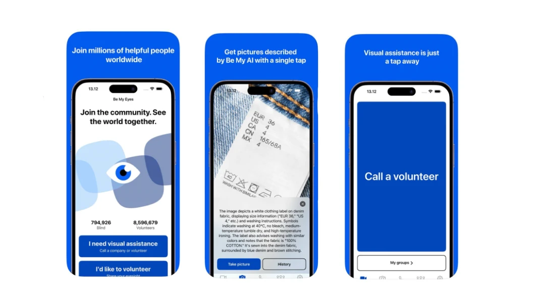
Font: Inter
Be My Eyes focuses on accessibility from the ground up, and typography is part of that promise. Inter, with its wide letterforms and excellent screen rendering, makes the app readable across devices, contrast modes, and screen sizes. It’s a practical choice that holds up in real-world use.
Fonts: Marfa, Consolas
ReadMe combines two font choices, giving each content line its voice. Used for headings and instructions, Marfa brings a touch of character. Consolas supports the developer-focused content by maintaining a familiar coding aesthetic.

Font: Fantastic Mr Font
This custom display typeface captures the magical tone of Roald Dahl’s universe. It’s playful enough for children and refined enough for adults — and that balance is tough to nail. Every letter looks like it came out of a storybook, but still works in a modern digital context.

Fonts: Eksell Display, Ivar Text
Noema’s typography comes across as a philosophy journal rather than a blog. Eksell Display delivers high-contrast headers, while Ivar Text grounds the reading experience with sharp body text. It’s a perfect match for longform, intellectual writing.

Font: Sans serif
Wikipedia may not be flashy or trendy, but that’s exactly what makes it work so well. The serif body text is readable across thousands of words, dozens of languages, and every type of device. The layout uses generous line spacing and restrained formatting to avoid overwhelming long-form content.

Sometimes, typography doesn’t want to behave. It stretches, moves, fades, rotates, or adapts to the user’s input. This way, brands provide experiences people will remember long after. To check if this is really true, let’s look at some typography design examples.
Fonts: Maison Neue, Engravers Gothic, Arial
Right when the page loads, you’re hit with a font combination: bold, italic, and regular, each in its own voice yet somehow fully in sync. This variable typography is a brand signature. It’s confident, a little chaotic, and impossible to ignore.

Font: Roobert
This product site uses a scroll-triggered type that fades into color as you move. Roobert is used across all sections but is styled with variety: big, tiny, bold, and minimal. It feels consistent but never static.

Font: Ivar
Each Stripe Press “book” has its typographic identity, but when you open one, you’re welcomed by Ivar — a serif that brings editorial gravitas. Sometimes it’s black, sometimes it’s colored, but it’s always intentional. Among great typography examples, this one reflects the care that goes into every title, down to the letter.

Fonts: PP Supply Mono, Aeonik
The use of animated type here adds movement and rhythm without overwhelming the minimalist design. The Mono typeface gives structure, while Aeonik supports a fresh tone. Type sizes and transitions shift on scroll, creating enough motion to keep things dynamic.

Fonts: Rajdhani, TT Lakes
This site is immersive enough to make you forget it’s a website. Typography fades in, rotates, and blends with underwater visuals, making the story alive. Rajdhani and TT Lakes complement the oceanic tone, enhancing focus on visuals.

Fonts: IBM Plex Serif, Times New Roman
For a game built on storytelling, interesting typography is a key. AI Dungeon handles it well, using IBM Plex Serif to bring structure to interactive elements and Times New Roman to tap into that nostalgic, “choose-your-own-adventure” feel.

Font: Futura PT
Pilot’s site heavily uses animated typography with rotating copy and scroll-triggered fades — making it one of the standout kinetic typography examples. It’s more than motion for motion’s sake: the type reacts to user behavior, pulling you into the brand’s narrative. Futura PT’s sharp geometry fits perfectly with the high-tech theme.

Fonts: Roc Grotesk, Kumbh Sans
Arcade blends futuristic branding with expressive typography that seems straight out of a sci-fi game interface. Roc Grotesk drives the headlines — wide, heavy, and full of attitude. Kumbh Sans supports the body text with just enough structure to keep things cohesive.

Even the best design system can fall apart with the wrong typography example. Fonts set the tone, define structure, and shape how people experience your product, and when something's off, users spot it immediately (even if they don't know why). If you're not confident making those design choices solo, it might be time to hire a graphic designer.
But to give you some practical takeaway, let’s analyze five common mistakes.
1. Too many typefaces = chaos
Mixing three, four, or five fonts might seem “creative,” but it can also create visual noise. Don’t overdo it and let contrast in weight or size do the rest.
2. No hierarchy = confused user
When everything on the screen is equally important, users won’t know where to start. Use the appropriate font size, weight, and spacing to guide the eye.
3. Tiny font sizes = poor accessibility
If someone has to zoom in to read your text, you’ve already lost them. Don’t go below 16px for body text and always test on smaller screens.
4. Lack of contrast = poor readability
Grey text on a slightly lighter grey background might be sleek, but it’s hard to read. Put focus on usability and make sure your typography actually shows up.
5. Wrong font = off-brand experience
Once the type doesn’t match your brand’s personality, things feel off. Choose a font that fits your tone, audience, and product — not just one that looks cool.
By the way, there are cases when things go wrong... So you don't make the same missteps, check out our roundup of bad typography examples.
Wow! Going through 40 examples of good typography was quite a ride, wasn’t it? Now that you’ve made it to the end, it’s time to wrap things up.
Typography works in the background, nudging users in the right direction, reinforcing emotion, and shaping taps, scrolls, and clicks. You might not remember every word a product says, but you’ll remember how it made you feel. In digital products, that kind of experience is hard to earn and easy to lose.
Hopefully, after everything you’ve seen here, picking a font won’t be an aesthetic decision anymore. Treat it like a product’s voice, because it is. And if you’re not sure what your typography is saying right now, maybe it’s time to start asking or get in touch with someone who can help. We’re here if you need us at TodayMade.


