Marketing design
15
min read
Web design in 2025 is all about creating smarter, more human digital experiences. This guide breaks down 10 key trends (plus the classics still going strong) to help you design websites that feel fresh, functional, and future-ready.
Web design is at the heart of the digital experience, shaping how site visitors interact with brands and absorb information. As we approach 2025, the design landscape continues to evolve, driven by new technologies, changing user expectations, and the growing need for accessibility and sustainability.
The latest web design trends are not merely aesthetic shifts but a reflection of deeper technological advancements and behavioral patterns. From AI-powered personalization to eco-friendly practices, current trends are transforming websites into dynamic, engaging, and purpose-driven platforms.
Understanding these trends is essential for designers, marketers, and businesses looking to create memorable digital experiences that foster human connection . Whether you’re redesigning an existing site or starting fresh, knowing what’s on the horizon ensures your project remains relevant and competitive.
In this article, we’ll explore the top web design trends for 2025, offering actionable insights and inspiring examples.

Artificial intelligence has revolutionized various industries, and web design is no exception. In 2025, AI-powered personalization will move from being a nice-to-have feature to an essential component of modern websites. By analyzing user behavior, preferences, and interactions, AI enables websites to create highly personalized and engaging experiences.
Today, advanced algorithms can track how users interact with a site and use that data to make real-time decisions. For instance, a travel platform might spotlight cheap flights for frequent flyers, while someone browsing vacation ideas sees beach getaways front and center. Chatbots now use natural language processing to respond to users like a helpful concierge, and predictive tools surface content users haven’t even thought to look for yet.
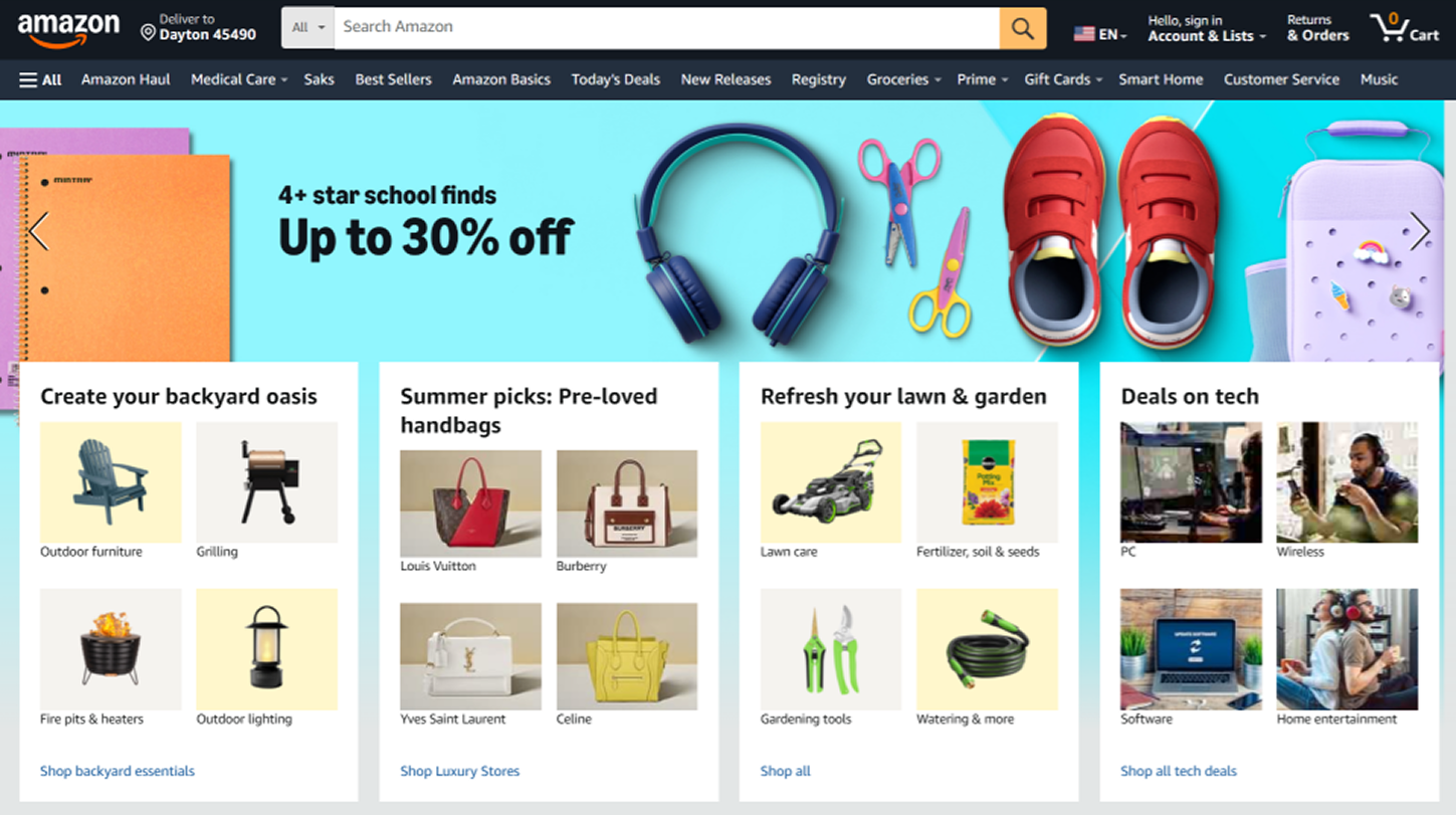
A great example is Amazon. Its recommendation engine analyzes your browsing history, purchase patterns, and even the time of day you shop to suggest products you’re more likely to buy. It’s seamless, relevant, and effective, and it keeps users coming back.
A handful of tools are powering this revolution. Adobe Sensei helps designers create smarter, more intuitive content. Platforms like Dynamic Yield and Personyze take personalization even further by analyzing massive datasets to optimize what each user sees at scale, thereby increasing visual interest.
What does this all lead to? Better engagement, more conversions, and happier users who feel like your website design was made just for them — with website design for SEO and strong website speed metrics ensuring they actually find and enjoy it.
If you want to implement AI personalization to improve website performance, follow these steps:
1. Start with simple personalization features, such as recommended content based on browsing history.
2. Use heatmaps and user analytics to identify patterns and design accordingly.
3. Regularly update algorithms to stay relevant and prevent data biases.

Flat design is giving way to something far more engaging — 3D. As we move into 2025, immersive 3D elements, along with geometric shapes, are no longer reserved for gaming or architecture. They’re becoming mainstream, helping brands tell stories, explain products, and guide users through interactive journeys.
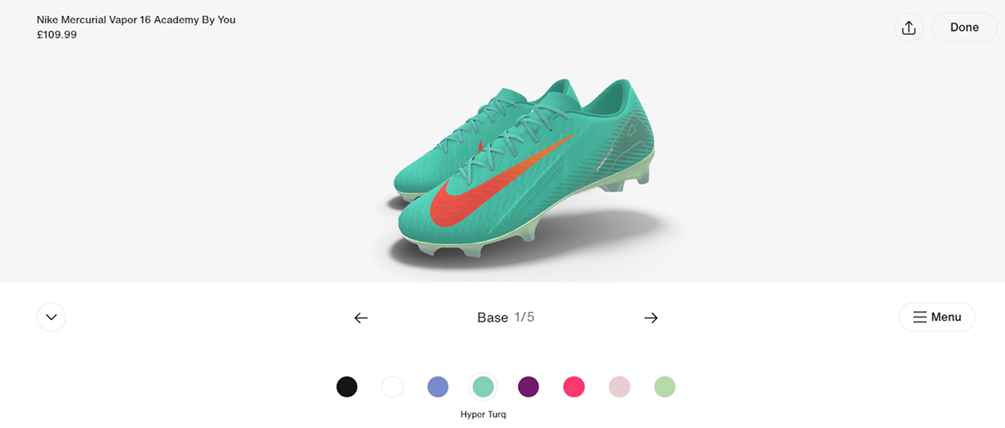
With 3D, users can explore a product in a more immersive way. One standout example is a Nike site, where users could rotate and zoom in on a 3D sneaker model, examining every detail and customizing it for themselves.
If you’re thinking of adding 3D elements to your site, keep in mind a common rule: less is more. You shouldn’t turn your website into a video game, but to create meaningful moments that enhance the user experience. Whether it’s a product demo, a data visualization, or a virtual walkthrough, every 3D element should have a purpose.
Performance matters as well. 3D can slow down your site if not handled properly, especially on mobile. To avoid that, optimize assets, use lazy loading, and test your site on different devices. And finally, give users control. Let them rotate, zoom, hover, or click. When users can engage directly, the experience becomes much more memorable.
For creating 3D experiences, you can rely on the next tools:
As 3D technologies become more accessible, businesses of all sizes can harness their potential. The immersive and interactive nature of 3D design is set to redefine how websites engage and retain users in 2025.

Sustainability is becoming a crucial consideration in web design, reflecting a broader global emphasis on environmental responsibility for website visitors. Sustainable web design focuses on reducing the environmental impact of digital products by minimizing energy consumption, optimizing resources, and promoting ethical practices.
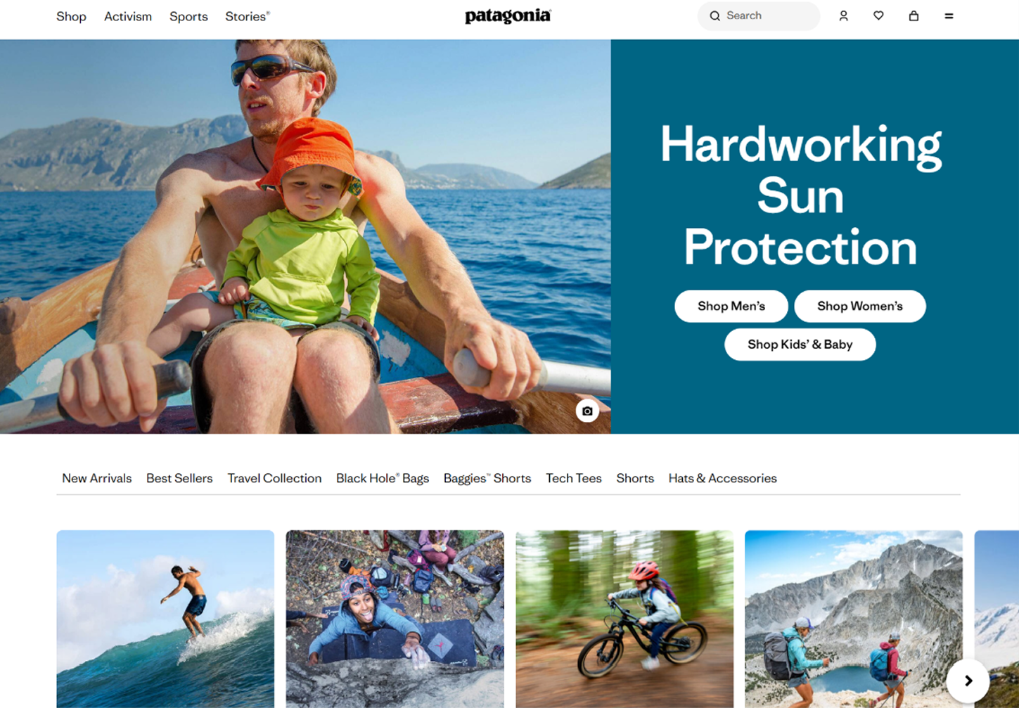
With websites accounting for significant energy use due to data transfer and server demands, the push for greener solutions is more critical than ever. And Patagonia reflects this. The outdoor clothing brand applies sustainability everywhere, including its website design. With fast load times, minimalistic visuals, and clean code, their online presence reflects the same values they promote offline.
So, what does sustainable design actually look like in practice? It starts with performance. Compressing images, reducing video autoplay, and using lazy loading ensure your website loads faster and consumes less energy. Hosting matters too — green hosting providers like GreenGeeks use renewable energy, making sure your website doesn’t leave an unnecessary footprint.
Simplicity plays a huge role. Clean layouts, timeless aesthetics, and minimal code reduce the strain on devices and servers alike. It also means your site won’t need a full redesign every year, as modular systems allow for incremental updates, saving resources and time.
It’s also worth noting that this shift has a great influence on websites. Greener websites perform better. They’re faster, more SEO-friendly, and cost less to host. On top of that, today’s users, especially Gen Z and Millennials, actively support brands that align with their values.
Once you want to join the list of sustainable websites, use these tips:
As digital consumption continues to rise, sustainable web design trend offers a pathway for businesses to minimize their ecological impact while enhancing user experience. In 2025, adopting these practices will demonstrate corporate responsibility and position brands as leaders in a growing global movement.
Voice User Interfaces (VUIs) are transforming the way people interact with technology. As voice assistants like Alexa, Siri, and Google Assistant become household staples, websites are adapting to meet the growing demand for voice-activated features.
Whether it’s asking for a product, finding a piece of information, or navigating a site hands-free, VUIs open the door to faster, more accessible digital experiences. They’re especially helpful for users with visual impairments or motor challenges, and can also delight visitors who are multitaskers wanting to shop or search on the go.
Some businesses are already tapping into this potential. For example, Domino’s Pizza “Dom” voice assistant allows users to order pizza via voice through their app. It’s a great case of VUI making the checkout process faster and hands-free.

The beauty of VUIs is in their convenience. But to make them work, they need to feel natural. That means designing with real human speech in mind — simple phrases, clear feedback, and always a backup plan for users who prefer touch or typing.
Among technologies for creating VUIs are:
VUIs are already making an impact in industries like healthcare, retail, and education, where they help users book appointments, find products, or access learning materials just by speaking. Looking ahead, this hands-free, intuitive interaction model will become a key part of what makes a website feel truly modern and user-friendly.
Dark mode has evolved from a trendy feature to an essential design element, gaining widespread popularity for its aesthetic appeal and functional benefits. As we move into 2025, using bright colors in dark mode is becoming a standard option on websites, offering users greater flexibility in how they interact with digital content.
Users increasingly prefer darker interfaces for a variety of reasons. It’s easier on the eyes, especially in low-light environments, and feels more modern and elegant. In fact, a study by Android Authority found that 81.9% of users prefer dark mode for its comfort and sleek appearance.
Brands have also embraced the aesthetic benefits. Dark themes often convey a sense of sophistication and innovation, helping companies stand out and align with cutting-edge design trends. Spotify, for example, uses a dark interface to reinforce its premium feel while also reducing glare during long listening sessions.

If you’re planning to implement dark mode, our main advice is to provide a toggle option. This way, users will switch seamlessly between light and dark modes based on their preferences. To enhance it, you can use high-contrast colors to maintain readability and avoid oversaturated hues that can cause eye strain.
Testing across devices and browsers is also critical to ensure consistency, and accessibility should never be overlooked. Following WCAG guidelines and checking contrast ratios is essential for inclusive design.
Here are some helpful tools to support dark mode integration:
As dark mode becomes a design staple, businesses must go beyond merely offering a toggle to enhance visual appeal. Future dark mode interfaces will likely integrate adaptive features, such as adjusting themes based on the time of day or user environment.
Micro-interactions and animations are subtle yet powerful tools in modern web design, used by more and more websites . They enhance the user experience by providing visual feedback, making interfaces more engaging and intuitive. These small design elements might seem minor, but they play a crucial role in shaping how users perceive and interact with a website.
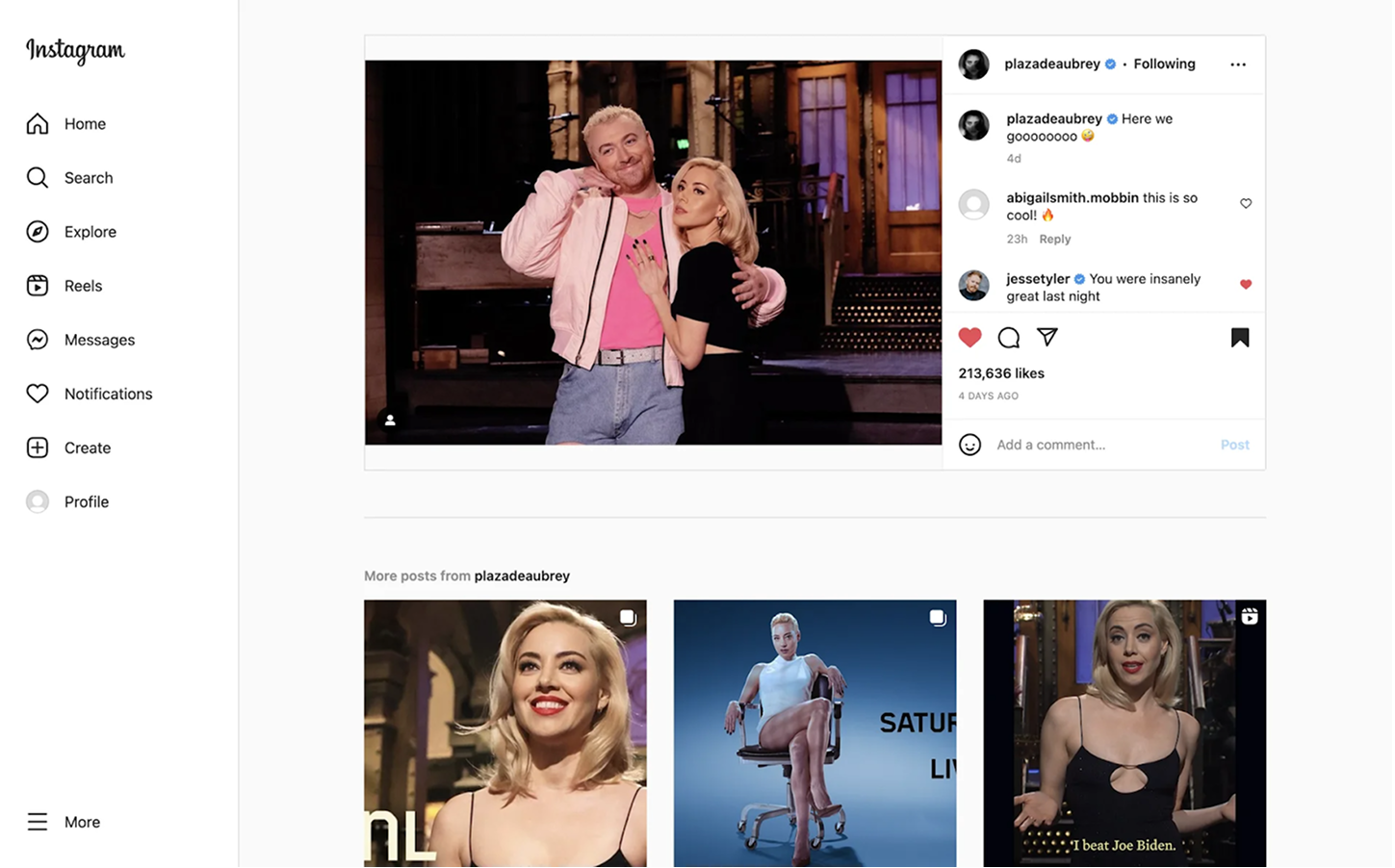
At their core, micro-interactions are those tiny design details that react to user behavior. Think of Instagram’s heart icon that fills with color when you like a post, or a button that gently enlarges when hovered over — small touches that make the interface feel responsive and alive.
Despite being charming, micro-interactions have a job to do. They provide immediate feedback (like letting users know a form was submitted), guide actions (such as changing button colors on hover), and build consistency in design language. When used thoughtfully, they quietly support the user journey without shouting for attention.
To craft smooth and lightweight micro-interactions, designers often turn to tools like Lottie for JSON-based animations, GSAP for high-performance motion design, and Framer Motion for building advanced animations in React applications.
As users expect more intuitive and visually appealing interfaces, micro-interactions and animations will be key to:
Incorporating micro-interactions isn’t just about aesthetics; it’s about creating meaningful interactions that resonate with users. In 2025, the websites that succeed will be the ones that use these tools to create a seamless and engaging user journey.

Minimalistic and content-centric design emphasizes simplicity, clarity, and a laser focus on delivering essential information. This design philosophy strips away unnecessary elements, ensuring that users can quickly and easily access the content they care about most. It works well for three key reasons:
Several core features define a minimalist and content-centric website design. First, there’s whitespace, which helps break up content and guide the user’s eye. When used well, it improves legibility and gives websites a sense of elegance, and that’s a detail worth checking when you decide how to find a web designer or hire a website designer for your project.
Typography also plays a major role. Take Medium, for example. It’s clean, bold fonts put the focus entirely on the written word. Such a choice reflects a wider design philosophy: let content do the talking.

Color palettes are treated with restraint. Rather than overwhelming users with flashy graphics, minimalist websites tend to lean on neutral or monochromatic palettes that put the spotlight on text and imagery.
Plus, a content-centric design makes sure users immediately see what matters. Effective landing pages, for instance, present the brand’s value proposition right away, without forcing users to scroll or guess. And with personalization becoming more advanced, content can even adjust based on a visitor’s behavior — a hallmark of mastering web design and a core principle of modern web design.
Here are a few practical ways to bring minimalistic and content-centric design into your website:

Scrolling has evolved into a storytelling tool that engages users and enhances their overall experience. They’re especially effective on long-form content, portfolio sites, or feature-rich landing pages where flow and narrative matter. Among popular techniques are:
These techniques do more than look cool. When used with intention, they improve storytelling, increase engagement, and streamline navigation by reducing the need for constant clicking. Instead of jumping between pages, users simply scroll through a cohesive, guided experience.
But with power comes responsibility, and you should keep in mind that heavy animations can slow down sites, especially on mobile. Tools like ScrollMagic or Locomotive Scroll can help manage this by providing smooth animation capabilities. Designers should also provide visual cues (like arrows or hover hints) so users understand how to interact with the interface.
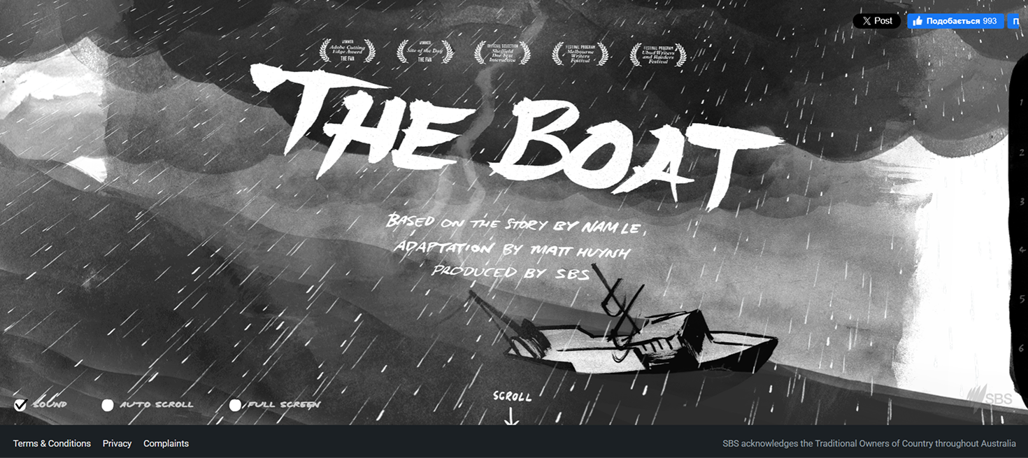
One standout example of advanced scrolling in action is The Boat, an interactive website that combines parallax effects with scroll-triggered animations. As users scroll, the narrative unfolds visually, immersing them in a compelling story that feels like an animated graphic novel. It’s a great demonstration of how scroll mechanics can drive emotion, engagement, and storytelling without a single click.
Looking further, advanced scrolling techniques will continue to be a staple in web design, enabling brands to create memorable and immersive experiences — even in unconventional styles like brutalism web design.

Inclusive and accessible design ensures that websites are usable by everyone, regardless of their physical abilities, cognitive differences, or technological access. This design trend is about empathy, equity, and creating experiences that work for real people in real situations.
The importance of inclusive design
Accessibility rests on a few core principles: content must be perceivable, operable, understandable, and robust. That means using alt text on images, captions on videos, and clear, consistent layouts. Interactive elements should be usable via keyboard, and complex forms should include helpful labels and error messages. Without them, even the best-designed lead generation website risks losing valuable conversions.
Apple is one brand that consistently leads by example. Its devices offer screen readers, zoom, and display adjustments, voice control, and switch control features. These tools are deeply integrated into macOS, iOS, and watchOS, making Apple’s devices usable for people with a wide range of physical and cognitive abilities.

When designing with accessibility in mind, focus on contrast and readability. Use scalable layouts so users can adjust font sizes or screen zoom without losing function. Most importantly, test with real users, including those with disabilities. Feedback from actual experiences will highlight barriers that automated tools might miss.
Looking forward, we’ll likely see AI-powered tools that help automate accessibility improvements, as well as personalized interfaces that adapt to users’ unique needs. Inclusive design will also become more critical in emerging technologies like AR, VR, and voice interfaces.
In an era dominated by clean grids and polished UI, many brands are intentionally embracing design that feels a little… human. Hand-drawn illustrations, rough-edged icons, subtle textures, and “imperfect” shapes are making a comeback in 2025, not because they’re technically impressive, but because they’re emotionally resonant.
This trend brings warmth, personality, and a sense of craft to digital experiences. It helps brand personality stand out in a sea of sameness by breaking the pixel-perfect mold in favor of something more expressive. These elements can hint at playfulness, transparency, or even nostalgia, depending on how they’re used.
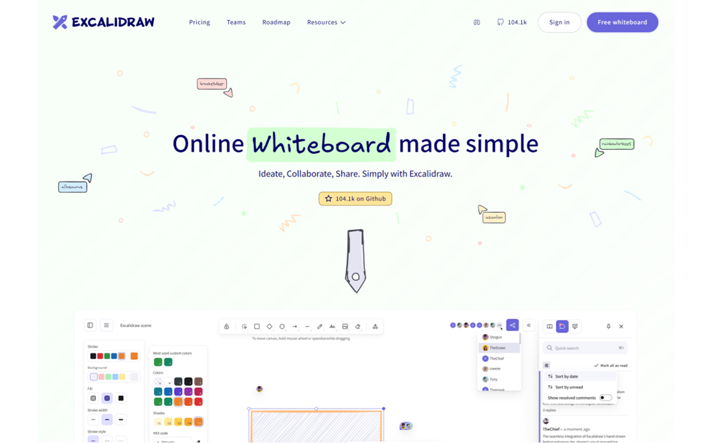
One brand that uses this design approach effectively is Excalidraw, a collaborative whiteboard tool known for its signature hand-drawn style. Its website design perfectly mirrors the product’s purpose: from the sketched icons to the playful UI touches, every element looks like it was drawn by hand. These visuals reinforce the tool’s core idea and make the site feel casual, creative, and intuitive.
But like any stylistic choice, hand-drawn elements work best when they support the brand identity. They should feel aligned with the tone, not random or forced. A fintech platform might opt for subtle textures or warm icon sets, while a design studio could go all-in on sketch-style graphics and animated scribbles.
Here’s how to use hand-drawn and imperfect elements effectively:
In 2025, this design direction reflects a broader shift: digital doesn’t have to feel sterile. A little human touch goes a long way in building emotional connection and standing out from the algorithmic crowd — just look at the most effective SaaS landing page examples that combine minimalism with storytelling.
Not every trend fades with time. Some design patterns have proven their staying power and become part of the standard design toolkit. They’re reliable, functional, and continue to shape how users interact with digital products. Let’s take a look at five familiar approaches that still earn their place in modern digital design.
White space, or negative space, isn’t just an empty background. It’s a critical design tool that creates breathing room, improves readability, and helps focus user attention on key content or actions. By giving elements room to breathe, white space reduces cognitive load and guides the eye through the layout naturally.
Notion website applies this principle throughout its interface. The generous spacing between blocks and clean, borderless layout makes content feel structured without overwhelming the user.

Once seen as a flashy design trick, gradients have evolved into a versatile visual element. They’re used subtly to add depth, energy, or emotion, whether in backgrounds, buttons, or overlays. Gradients can help soften minimal layouts or inject vibrancy into neutral color palettes.
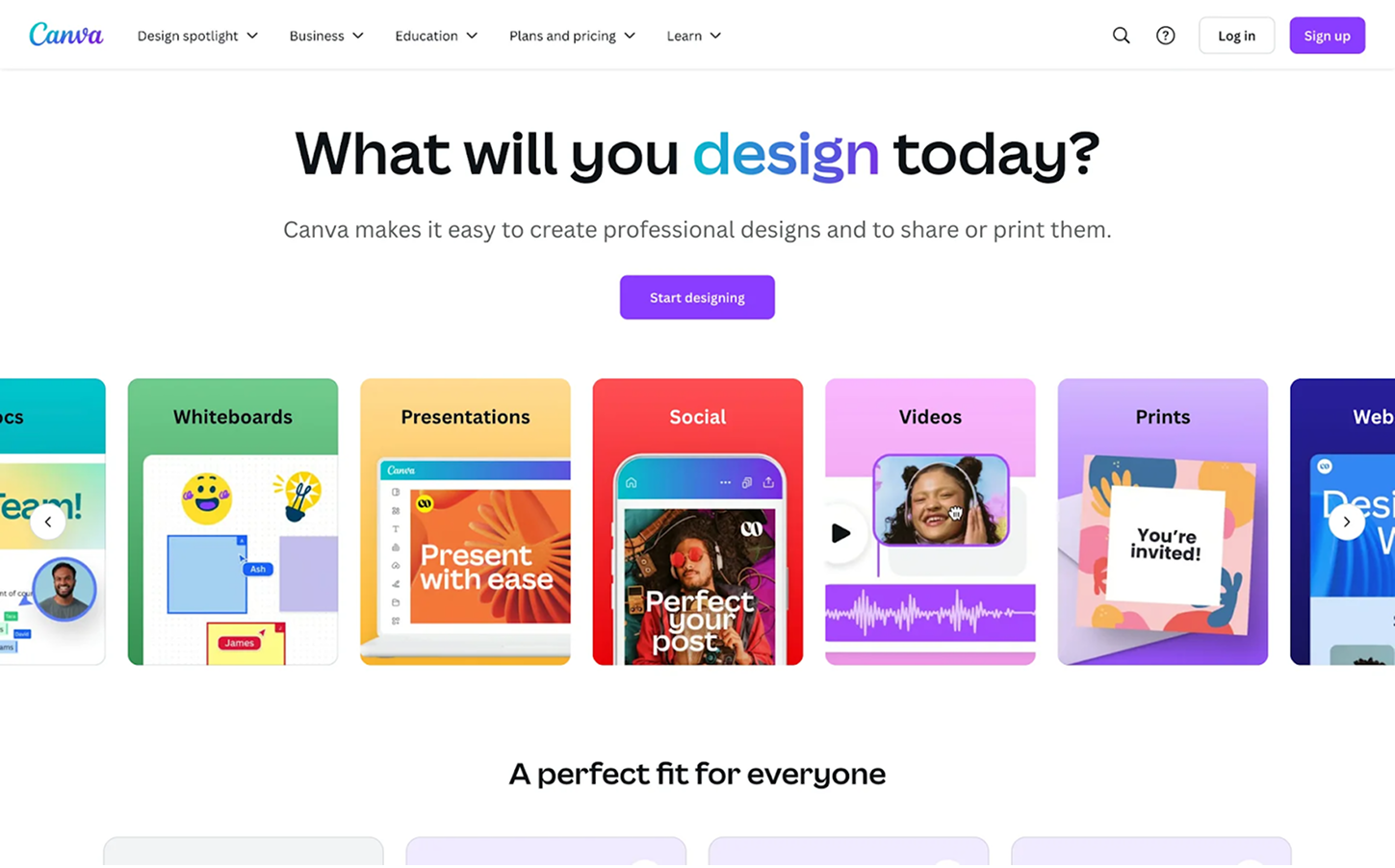
Canva uses gradients effectively across its landing pages and visuals. They bring color to backgrounds, illustrations, and CTAs, injecting vibrancy while keeping the overall design clean and user-friendly.
Layered visuals bring a sense of dynamism to a page, blurring the lines between content and design. Overlapping text and images can suggest depth, draw attention, or create visual tension that keeps users engaged. When used purposefully, it adds a modern, editorial feel.
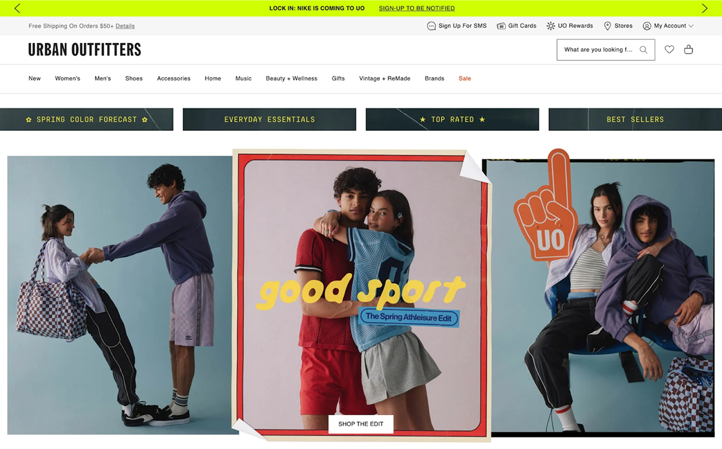
Urban Outfitters leans into this trend across its product and campaign pages. Large headlines partially cover images or bleed into interactive elements, creating a dynamic, magazine-like vibe that matches the brand’s bold and trend-driven identity.
The hero section is often a user’s first impression, and making it interactive helps spark curiosity and engagement. Whether through micro animation, hover effects, or scroll-based transitions, interactive hero sections invite users to explore instead of passively observe.
Runway sets a high bar with its homepage hero. High-quality video with smooth transitions and bold text immediately reflects the brand’s creative, cutting-edge positioning.

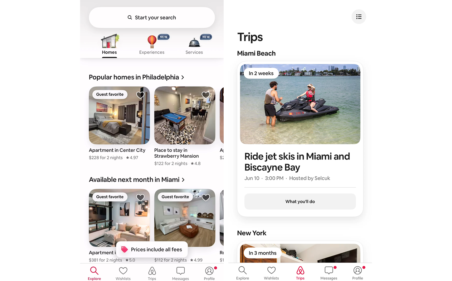
With mobile traffic surpassing desktop in most industries, responsive design is no longer optional. Today’s mobile-friendly layouts prioritize performance, accessibility, and thumb-friendly navigation. It’s about more than shrinking content — it’s rethinking layout, spacing, and interaction for small screens.
Airbnb delivers a near-seamless experience across devices. On mobile, its structured layout adjusts effortlessly, cards stack, navigation simplifies, and key actions remain easily tappable.
Web design in 2025 will be defined by innovation, inclusivity, and sustainability. As the digital landscape continues to evolve, designers and businesses must adapt by embracing emerging trends to remain relevant and engaging. At the same time, understanding website design cost and having a clear website owner’s manual will be essential for planning and maintaining this long-term success.
As you plan your next website redesign or digital project, consider how the trends above can elevate your online presence. Start by identifying the core goal you want to achieve and let that guide your design choices. And if you ever feel stuck or unsure about the next step, our TodayMade team is always here to lend a hand.


