Web design
15
min read
When you open modern websites, you’re usually impressed at first, right? Everything looks top-tier, and the visuals whisper premium. But then you try to navigate. You look for a button, a section, something familiar, and you get lost.
That’s the modern paradox. We’ve gotten so good at making things look modern that we’ve started to forget what makes them feel modern.
Somewhere in the gradients, glassmorphism, and loading animations, we lose the one thing that matters: function. Because in 2025, our job as designers is to make sure the site works for users who are impatient, mobile-first, and multitasking.
That’s what this article is here for. We’ll break down what makes a modern website design work, show real examples, sharp takeaways, and a few gentle roasts along the way. From emerging web design trends to bold moves like brutalism web design, it’s time to cut through the noise and see what modern really means.
“Modern” is one of those words that gets thrown around so much it starts to mean… nothing.
For some, it means a site with glassy buttons, soft shadows, and scroll-triggered animations. For others, it’s a clean sans-serif and some brutalist web design edge. And for many, it’s just whatever looks expensive enough to impress the founder’s investors.
To go beyond the hype, we explored what designers and users really think, browsing Reddit threads, community debates, and practical teardown posts. Here’s what we found:
✅ What makes a website modern?

❌ What makes a site look modern but feel broken?

Of course, community opinions are all over the place. One person’s “clean and modern” is another’s “cold and lifeless.” You’ll always find someone praising minimalism and someone else begging for more color and movement.
And honestly, they’re all right.
The same layout can’t be fresh in every setting. So while it’s tempting to chase web design trends, what’s crucial is how well a design fits the site’s purpose, audience, and behavior patterns. And our next examples are going to show this in practice.
The moment you land on Igloo’s website, a cold, quiet winter landscape stretches before you, with a lone igloo tucked into the snow. There’s no menu shouting for your attention. No clutter. Just visual storytelling at its purest.
And that’s the point.

Knowing that the human brain processes visuals 60,000 times faster than text, Igloo leans all the way into the power of imagery. You navigate not by reading, but by doing — every scroll and mouse move pulls you further into the world. It’s part microsite, part portfolio, part contemporary website design showcase.
There’s barely any text, which means zero distractions. The soft ambient music is a subtle flex, adding mood without overwhelming. This site is a perfect example of how modern design isn’t always about information density. Sometimes, the best experience is the one that says the most with the least.

Continuing the topic of visuals, our next example doesn’t fall far from that philosophy.
The AIM website wastes no time trying to impress you with complexity — it hits with focus. A black, bold uppercase title — AIM — appears front and center when the page loads. Stark, commanding, and impossible to ignore.

As you scroll, that one word becomes your companion. It stretches, rotates, fragments into blocks, and somehow still sticks with you. This subtle yet deliberate animation transforms a simple page into a rich experience.
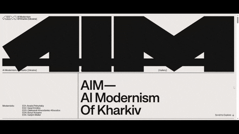
Visually, it’s incredibly restrained: white and platinum tones in the background keep things sleek and elegant, giving full attention to motion and type. KH Teka holds its own across breakpoints, delivering sharpness and structure.
The Apple Vision Pro website is a masterclass in modern web page design. Once you land, you’re dropped into a near-cinematic experience. Smooth 3D transitions glide you through a product demo in motion, no click required.
Each scroll opens a new chapter.

What’s exciting is that you don’t read about the product (though there is text), you experience it. You see it in action, follow its features as they unfold, and feel the logic of the layout build a narrative as you move.
There’s a balance between visuals and copy — video leads and text supports. The transitions are smooth, the pacing intentional, and the result is a highly engaging walkthrough that never breaks stride.
We also tried it on mobile. For a site packed with high-res renders, full-bleed video, and animated transitions, there’s zero lag.

With Estate Logs (a SaaS landing page project we helped bring to life), our focus was simple: make modern feel effortless.
Most users won’t go deeper than two or three clicks to find what they need, and our team designed accordingly. All the key actions are right there, front and center, so visitors can get to top-level content at a single glance. This experience respects their time.

Visually, the page embraces space. The headline sits boldly in the center, surrounded by plenty of breathing room. There’s just enough text to guide, but never overwhelm. Small, hand-sketched-style illustrations are scattered throughout, adding warmth and texture.
For the background, we chose Ghost White to support readability and keep the entire experience easy on the eyes.
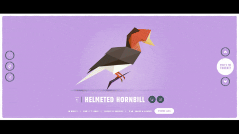
In Pieces looks like something you haven’t seen before. This site is a striking tribute to 30 endangered species, using a completely custom design language to make you stop, observe, and think.

Animals are constructed from animated fragments — geometric shards that float into place as you scroll, then scatter and reform into the next. It’s delicate, deliberate, and strangely moving.
What’s interesting is that this contemporary web design is all done with pure CSS.
Each scroll transitions you to a new species, a new shape, and a new mood, with the background color changing to reflect the tone and identity of the character on screen. The site doesn’t rely on text (though detailed info is available if you interact) to tell you how important these creatures are. The design makes you feel it.
Earlier, we mentioned that web design depends a lot on the niche it serves. And among all modern web design examples we looked at, Don’t Board Me took one of the most refreshing routes.
This site offers personalized in-home pet care, a service most businesses in this space would wrap in safe card layouts, service grids, and puppy photos.
Here, each scroll looks like a mini scene in a quirky little game. You move from one bit of storytelling to the next, guided by light animations and pastel tones that soften the visual experience. Its custom pack of illustrations instantly set the tone.
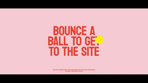
There’s a clear focus on emotion here. The storytelling builds trust. The movement keeps things engaging. And the visual choices make the entire experience handcrafted, which aligns perfectly with the personalized care the service promises.
Modern users give a site 10 seconds (maybe less) before deciding whether to stay or bounce. The creators of Foll-ow clearly understood that and chose to turn their homepage into a fully interactive map.
As soon as you open the site, you’re looking down on a tiny 3D office floor plan from above. People walk around. Lights glow. And as it turns out, this is your navigation. Click left, right, up, or down and zoom into different rooms. Each one holds a section of the site: Careers, Founders, What We Do, Cases, and more.

It’s engaging, playful, and just unfamiliar enough to make you want to click. You’re not reading — you’re exploring. It even resembles The Sims a bit, but if The Sims were quietly teaching you about a creative agency.
These kinds of modern website layouts aren’t for every brand, but for one that wants to show, not tell, and pull users into a space rather than scroll past it.
If we’re judging a site by how well it meets the needs of today’s users, then Feastie gets a solid yes.
The layout follows the F-pattern, which instantly makes scanning a breeze, especially for users who aren’t here to read, but to decide. The typeface is distinctive yet readable, and the font size is just right — no squinting, no pinching to zoom.

Visually, it’s bold and flavorful. A bright, energetic color palette grabs your attention, while high-quality food and drink photography makes you hungry. It’s visual persuasion done right.
The site is practical, too. Every CTA is placed where you’d expect it, and the flow is intuitive. There’s never a moment where you’re left thinking “wait, where do I click next?” The UX holds your hand just enough and doesn’t slow you down.
What we loved about TrueKind Skincare is how much it embraces simplicity, and how well that simplicity works.
Right from the start, you’re met with a strong hero section backed by background video. It sets the tone without trying too hard. From there, the layout flows block by block in a smooth, logical sequence.

There’s plenty of white space, which helps everything breathe — a welcome contrast in a niche where overcrowded pages and trend-chasing visuals are common. Instead, TrueKind gives you clarity, one scroll at a time.
Being in the skincare space, visuals matter, and this site nails it. The photography is absolutely top-tier: soft, detailed, and product-focused. Animation is also there, but only just. Transitions are subtle, fluid, and never steal the spotlight. Just a clean, modern web design experience that quietly earns your trust.

Inkwell isn’t typical among examples of modern websites. It’s more of a digital narrative that unfolds with every scroll.
From the start, interaction is everything. The page pulls you forward, scene by scene, with scroll-based transitions that gradually reveal the brand’s message. Some elements even respond to your cursor, letting you move objects, not just view them.
It’s tactile, a little unexpected, and highly engaging.
However, the real reason Inkwell earned a spot on this list is the way it handles orientation. Immersive sites often make you feel lost. Inkwell solves that with a minimal progress bar on the side that quietly shows how far along you are, while a page indicator at the top tells you exactly what’s coming next.
It’s a small detail, but it changes everything, keeping users grounded in a space that could’ve easily felt abstract.

A lot of trendy website designs rely on modular layouts to guide users, and with Gamaya, we decided to lean into that idea with intention. Our team wasn’t aiming to create a dramatic wow effect. Instead, we wanted to express clarity. A calm, clean presentation of exactly what the user needs.
The landing page opens with a focused header and clear calls-to-action that let visitors know where to go next. A full-width background image sets the tone visually, but never steals the spotlight.

From there, the content unfolds in a structured card-based layout. Every section is self-contained, easy to scan, and visually balanced. There’s no guessing where to look or what to do, just a logical flow that keeps things moving.
Gamaya is a reminder that modern design doesn’t always mean “bold.” Sometimes, it means thoughtfully quiet.
If someone asked us to show modern website examples that nail the use of white space, we’d point straight to ForAI.
Just take a look — there’s nothing extra. No clutter, no visual noise, no over-explaining. And yet, everything you need is right there. It’s minimalism with intention, not emptiness.

Visually, ForAI taps into one of the standout web design trends: liquid metal textures. The gleaming, fluid-like visuals add futuristic depth to the otherwise calm layout, keeping things fresh.
One more detail worth noting: the navigation menu. It stays fixed as you scroll, with clean buttons that follow you down the page. This is a small touch that makes a big difference in usability.
Returning to what modern users actually want, we can’t ignore one of the most appreciated features in recent years: light/dark mode switching. And Dylan Brouwer’s portfolio takes it one step further by offering even a playful spring theme to match your mood.

That’s the first thing you see when you arrive: a simple prompt asking how you’d like to experience the site. And once you choose, the site opens up — compact, focused, and entirely scroll-free.
Everything you need is right there on the homepage. There’s clean navigation, a few punchy lines of copy, and plenty of clickable buttons to explore Dylan’s work and hire a designer.

Front and center is a 3D animation that follows your cursor, adding an interactive focal point that keeps the site from ever feeling static. It’s sleek, responsive, and just dynamic enough to be modern.
Lacoste is a legacy brand, and it shows in the best way. They know their audience, they trust their product, and that same confidence carries through to this microsite.
The layout is stripped back to the essentials: a header, two buttons, and a 3D animation. That’s it. But that’s all it needs.

Want to browse existing T-shirt designs? Click Gallery. Inspired to create your own? Click Create. From there, everything just flows.
The navigation is exactly where you expect it to be, and every interaction feels like second nature. It’s the kind of experience that proves just how powerful intuitive design can be when paired with strong branding.
Designers know how to make an impression, and Alec Tear’s portfolio proves it the moment you land. The entire site is wrapped in a deep, electric blue. It’s intense. Memorable. And almost impossible to forget.
You’re welcomed with two clear choices: Design or Lettering. That’s it. Just two paths into the actual work — and for agencies or clients who want to find a web designer, that kind of focus is invaluable. You immediately know what Alec does, and what you’re about to see.

The rest of the navigation is just as straightforward: About, Contact, and nothing that doesn’t need to be there. The result is a portfolio that shows confidence not through complexity, but through directness.
Alec’s site shows that current web design trends mean knowing exactly what you want people to do, and helping them do it instantly.
It’s easy to scroll through modern website design examples in 2025 and think, “Of course it looks like this — this is what modern is.” But it wasn’t always. In fact, the definition of “modern” has shifted dramatically over the last decade.
Let’s rewind.
Back in 2010, web design was all about textures and depth. To show you what that actually looked like, we took a quick trip to the Web Design Museum. Spotify’s site, for example, had an interesting header, shadows, layered visuals, and effects that created a faux 3D look. All of it felt dimensional, almost physical.

Then came the flat design wave in 2013. Everything got a visual detox. No more shadows. No more gradients. Spotify followed the trend — buttons became colored rectangles without outlines, icons flattened, and white space reigned. It was clean, sure. Maybe too clean.

By 2016, things got louder and more colorful. Web design embraced full-screen backgrounds, vibrant overlays, and more personality. In this era, we can see the shift with brighter palettes, softer button shapes, and layout choices that felt friendlier and more immersive.

Jump to 2020, and the scene changed again. Suddenly, breaking the rules was at the top of modern web design trends. Spotify’s design became edgier. Typography was louder. Visuals got bolder. Anti-UX experiments entered the mainstream.

And today, in 2025, the tone has matured. Spotify’s site now reflects what contemporary design is really about: bold, readable typography, modular layouts, and an emphasis on clear, focused interaction. It doesn’t want to shock you. It guides you with a fast, clean, and beautiful structure.

By now, we’ve seen that “modern” can mean a lot of things — bold typography, modular layouts, scroll-triggered animations, even turning your homepage into a mini-game. But behind all of that, there’s one key question every site should answer:
You don’t need a full redesign to figure that out. Sometimes all it takes is a reality check. So here’s a simple web design guide to help you see where your site stands:
▢ Is your layout modular, breathable, and easy to scan?
▢ Is the site mobile-first?
▢ Are your CTAs obvious and easy to find (without hunting)?
▢ Do images load quickly and look crisp, not stretched or pixelated?
▢ Are transitions and animations smooth?
▢ Can users understand your value within 10 seconds of landing?
▢ Do you offer theme flexibility (dark/light) or any kind of personalization?
▢ Is the site fast, accessible, and frustration-free?
If you answered “no” to two or more of these, it might be time to reconsider how your site fits into today’s digital habits. And if you’re not sure where to start, don’t worry, we’ve got a few modern website design ideas coming next.
As we just said, you don’t need to tear everything down to make your site modern.
In fact, some of the most impactful changes are the smallest. You can take time to analyze your existing website design and improve the things people notice most. Often, that means focusing on website design for SEO, tracking website speed metrics closely, and mastering web design through practice.
Here are some specific updates you can make today, without blowing up your whole site. And if you’re wondering what a redesign might cost, check out our breakdown of website design costs.
Modern design starts with readable typography. If users have to zoom or squint, they’re gone. To avoid this, keep the following advice in mind:
→ Body text should be minimum 16px, ideally 18–20px for desktop.
→ Use a 1.5× line height for better readability.
→ Make headlines look clickable or skimmable.
Just look at SaaS landing page examples — the best ones prove that typography choices are as crucial as the product itself.

When everything’s crammed together, users feel stressed. When there’s space, content becomes digestible. Here’s how to make that work:
→ Use 32–40px padding between major sections.
→ Leave 24px–30px between paragraphs or elements in a block.
→ Don’t let text bump into the edges — add proper margins (especially on mobile).

Modular layouts break content into manageable chunks and work beautifully across screen sizes. So, use this practical solution wisely:
→ Group related content into visual “blocks.”
→ Use consistent sizing, padding, and hover feedback to unify elements.
→ Keep 4–8px spacing inside cards, and 16–24px between them.

Visuals are often the first thing users notice and the easiest way to increase bounce rates. In this regard, stick to the recommendations below:
→ Swap stock photos for authentic images with good lighting.
→ Use next-gen formats (like WebP or AVIF) to improve load speed.
→ Compress large hero videos, and consider auto-pausing them on mobile.

In modern design, when your buttons guide the user, they can be a quiet engine for lead generation via the website. Think of it as the hidden backbone of any effective lead generation website, where even a website owner's manual would highlight CTAs as mission-critical. For this, do the next:
→ Place at least one above the fold.
→ Use contrast, hierarchy, and action-oriented copy (“Get started”, not “Submit”).
→ Keep buttons 44x44px or larger, as anything smaller hurts usability.

At the end of the day, modern web design can look like a lot of different things. But when it looks good and works well, you win from pretty pages, satisfied visitors, and improved performance metrics, and knowing how to find a web designer or when to hire a website designer makes that success sustainable.
And honestly, what’s more beautiful than that?
It’s the kind of design that understands how people think, scroll, hesitate, and decide.
We hope the examples and ideas we’ve shared here help you see your site with fresh eyes. And if you’re still not sure, or just want a second opinion, drop us a few lines. From creative direction to clarifying your website design cost, we’re always up for a good design conversation.


