Web design
14
min read
Minimalism works best when every detail has a purpose, and in this article, we’re going to prove it. Explore the design patterns behind 35+ standout minimalist websites and learn how to apply them with clarity and intent.
If you open most websites today, the first thing you’ll notice is that they say less. They go against high-gloss animations and embrace simplicity as a strategic advantage. And in 2025, you’ll spot more brands leaning into that design approach.
So, why is everyone suddenly so into minimalist web design?
Honestly, there’s no single answer. As a design agency, we use minimalist patterns all the time, and we’ve seen firsthand how they quietly cut through the noise. If you’ve landed on this article, we’ll show you what that looks like in practice.
To show you what minimalism looks like in practice, there’s no better way than with real designs. So we went looking across the internet and handpicked 20 minimalist website examples that are actually worth your attention.
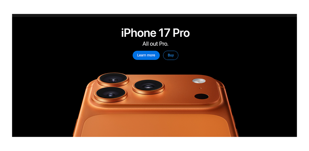
Our list opens with Apple’s minimalistic website, where nothing distracts from the core message. Generous white space, sharp product photography, and a restrained color palette let the product speak entirely for itself.
What to learn: A focused layout with confident white space can make a product feel iconic without saying much at all.
Framer’s homepage shows how minimalism can still feel dynamic. It pairs a clean dark layout with large typography and subtle microinteractions that guide users. Everything serves a single goal — help users get started fast.
What to learn: Oversized type and subtle motion are enough to create momentum when the message is already clear.

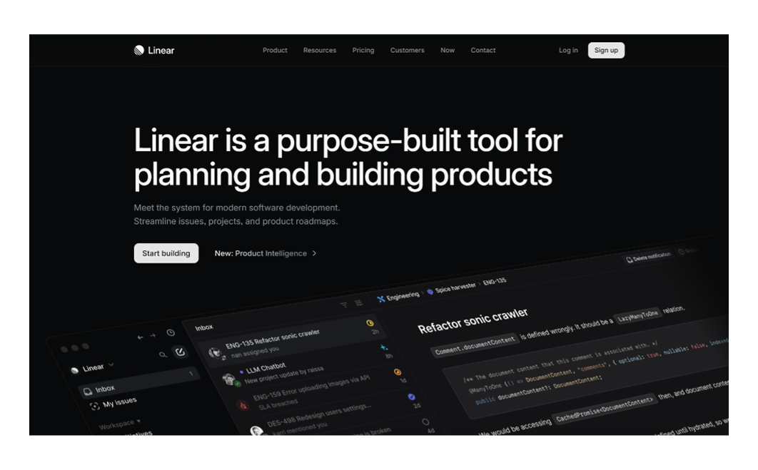
Linear takes a similar approach to Framer’s website. A muted palette, spacious layout, and sharp typography reflect the same clarity and precision as the product itself. The graphic design aligns closely with the brand’s message.
What to learn: A muted palette and sharp typography can create clarity without relying on extra visuals or effects.
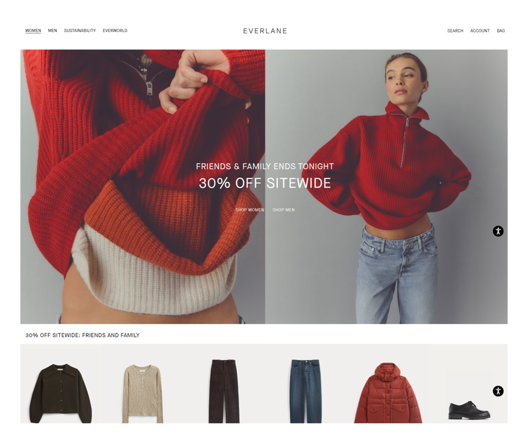
Everlane’s website proves that e-commerce doesn’t have to be loud to convert. Its minimalist design relies on product-focused imagery, supported by clean grids and neutral tones that enhance the shopping experience.
What to learn: Honest photography and a quiet grid can do more to sell than any marketing copy ever could.
When working on the Refera project, our TodayMade team knew we were designing for a healthcare audience. To build trust and communicate professionalism, we focused on a clean layout, keeping the same approach at every touchpoint.
What to learn: Clean design builds trust fast, especially when the audience is choosing who to depend on.

Paul Furey’s website leans into soft pastel tones of beige and green. But its minimalism lies in the storytelling. The site unfolds through a scroll-based narrative that invites visitors to keep going, just to see what happens next.
What to learn: A scrolling narrative with soft colors can guide users deeper without a single forced interaction.
Despite being a massive retailer, IKEA keeps its website refreshingly simple. Clean product grids, straightforward navigation, and a neutral color scheme help users focus on what matters — the products.
What to learn: Even large-scale e-commerce works better when the layout stays simple and the navigation feels familiar.

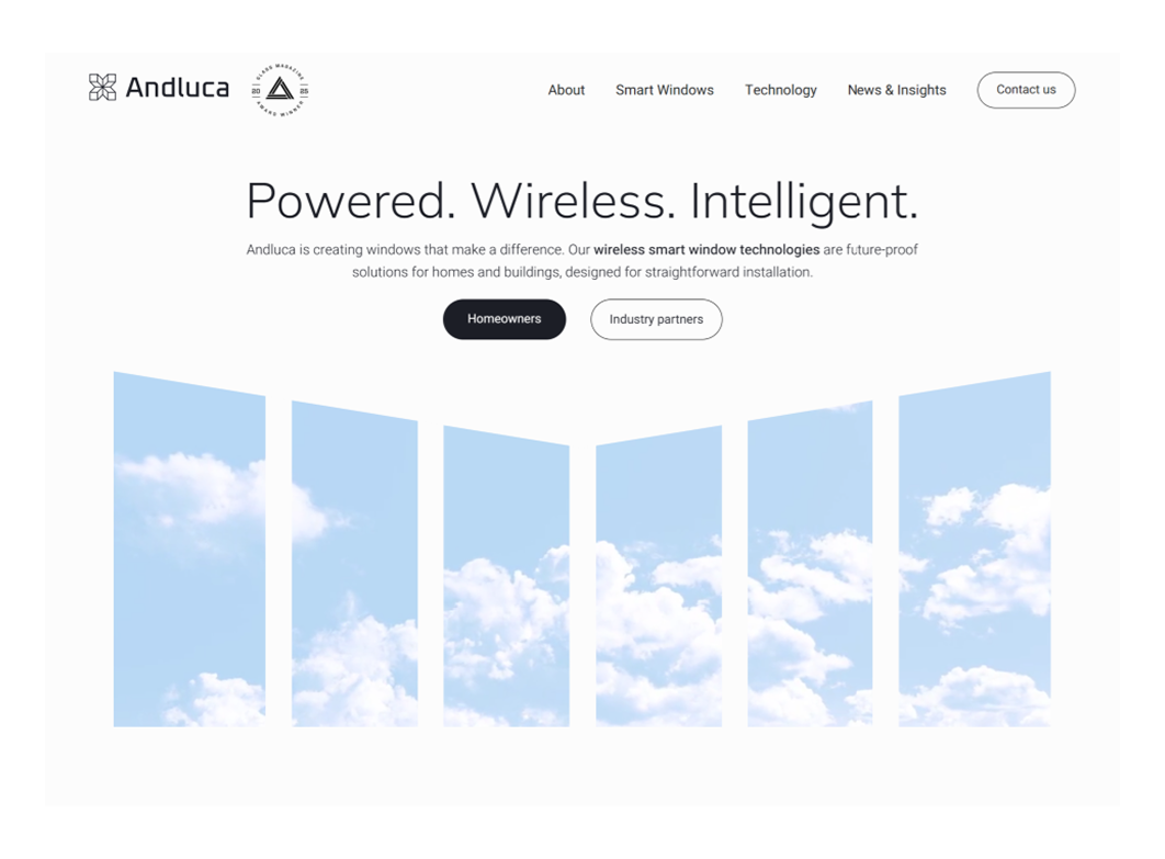
Andluca’s website immediately gives off a sense of calm. With a predominantly white interface, clean geometric icons, and thin lines, the design feels light and intentional. Even the unexpected purple footer doesn’t break the mood.
What to learn: A nearly all-white interface creates calm, leaving room for subtle color to make an impression.
As a luxury residence, The Missing Element set the tone through its minimalist website. A black theme, high-quality images, and subtle animations come together to create an immersive experience that matches the brand’s upscale vibe.
What to learn: Dark minimalism works when imagery and motion are restrained enough to feel intentional.

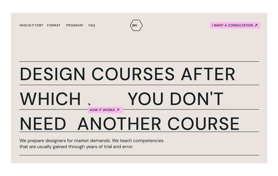
For the 8K project, our designers chose to go bold but stay minimal. We paired a pastel palette with confident typography to create a distinct visual identity. The grid is logical, the layout is intuitive, and users can quickly find what they’re looking for.
What to learn: A pastel palette and clean type hierarchy can stand out without competing for attention.
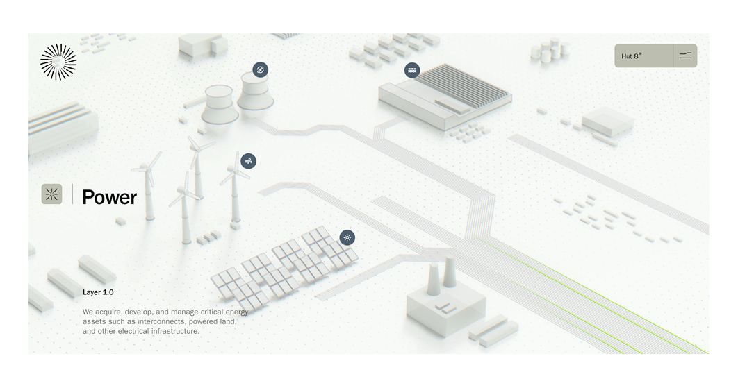
At first glance, Hut 8’s website feels immersive, and as you scroll, it only deepens. A full-screen background video greets you, but it quickly gives way to a minimalist white layout that calmly explains how the company operates.
What to learn: Mixing immersive visual narrative with clean content blocks keeps attention till the end.
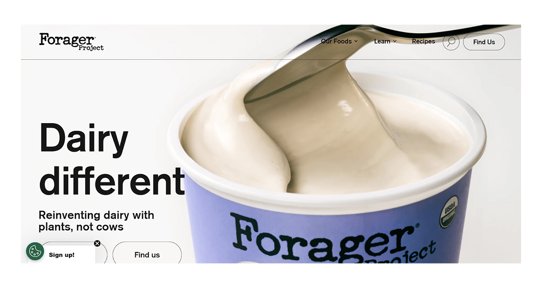
The moment you land on Forager Project’s website, you’re met with a blend of white space, bold visuals, and strong typography. It strikes a perfect balance and guides users to what they’re viewing, where they are, and what the brand stands for.
What to learn: Strong visuals and bold text work best when the layout does nothing to get in their way.
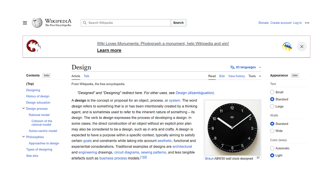
Wikipedia may not look like a typical example of minimalist design, but functionally, it’s one of the purest. There’s no fluff, no distractions, just content and navigation, all wrapped in a black-and-white theme. Its stark simplicity puts usability first.
What to learn: Function-first minimalism is a great fit when structure and clarity replace decoration completely.
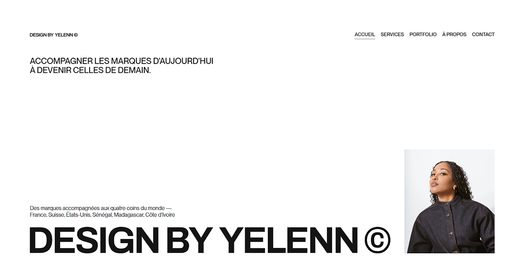
Portfolios are often great examples of minimalist website designs, and Yelen’s is no exception. The layout is clean and restrained, but subtle design tweaks keep it engaging without ever feeling crowded.
What to learn: A minimalist portfolio doesn’t need to feel cold when layout and detail carry the personality.
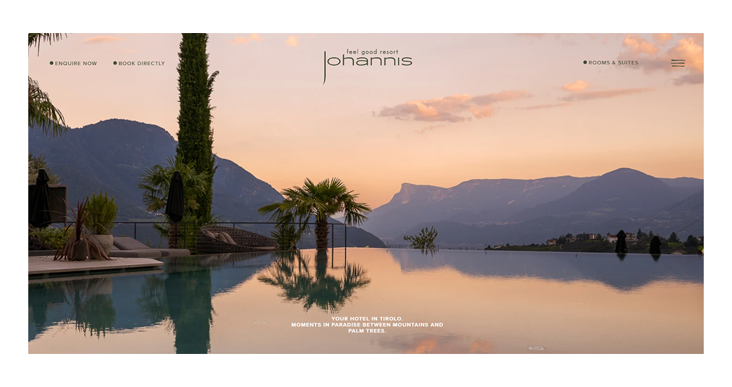
The Johannis resort website design invites you to unwind in South Tyrol’s serene beauty. A white, spacious layout paired with luxury imagery sets a calm tone. Soft pastel accents complement the experience without disrupting its quiet elegance.
What to learn: When the brand tone is serene, minimalism becomes the fastest way to match it visually.
When you land on the Lamborghini website, the first thing you’ll notice is how black and white dominate the design. The contrast frames the visuals and reinforces the brand’s personality. Everything feels sharp, powerful, and unmistakably premium.
What to learn: Minimalism can feel brutalist and luxurious if contrast and typography carry the brand’s energy.

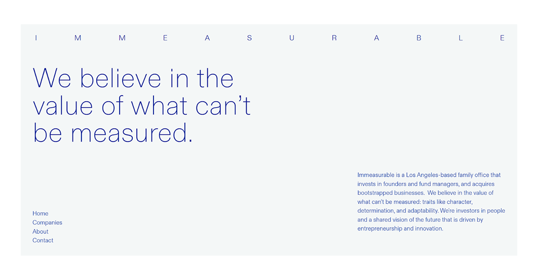
Among minimalist web design inspirations, Immeasurable takes things to the extreme. There are no visuals, no animations, just color and typography placed in a balanced layout, and doing all the work.
What to learn: Color and typography are enough to create a full brand experience when used with absolute restraint.
The Pellonium website doesn’t scream for attention. It quietly does its job. Important elements are highlighted using a darker tone, while the rest of the layout remains light and airy. It’s a calm design that directs focus without ever feeling forceful.
What to learn: Quiet layouts become more effective when visual weight is used to guide attention.

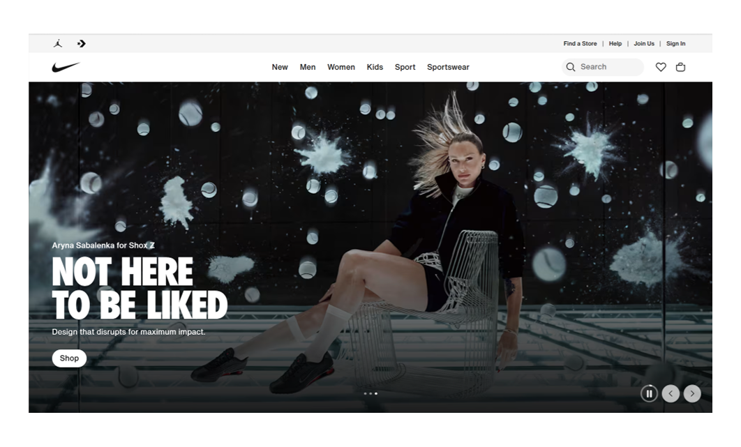
Nike’s website shows how a global brand can use minimalism without losing energy. The layout is clean and product-focused, supported by bold typography, subtle motion, and lots of white space.
What to learn: Even global brands benefit from minimalist principles when clarity and performance lead the experience.
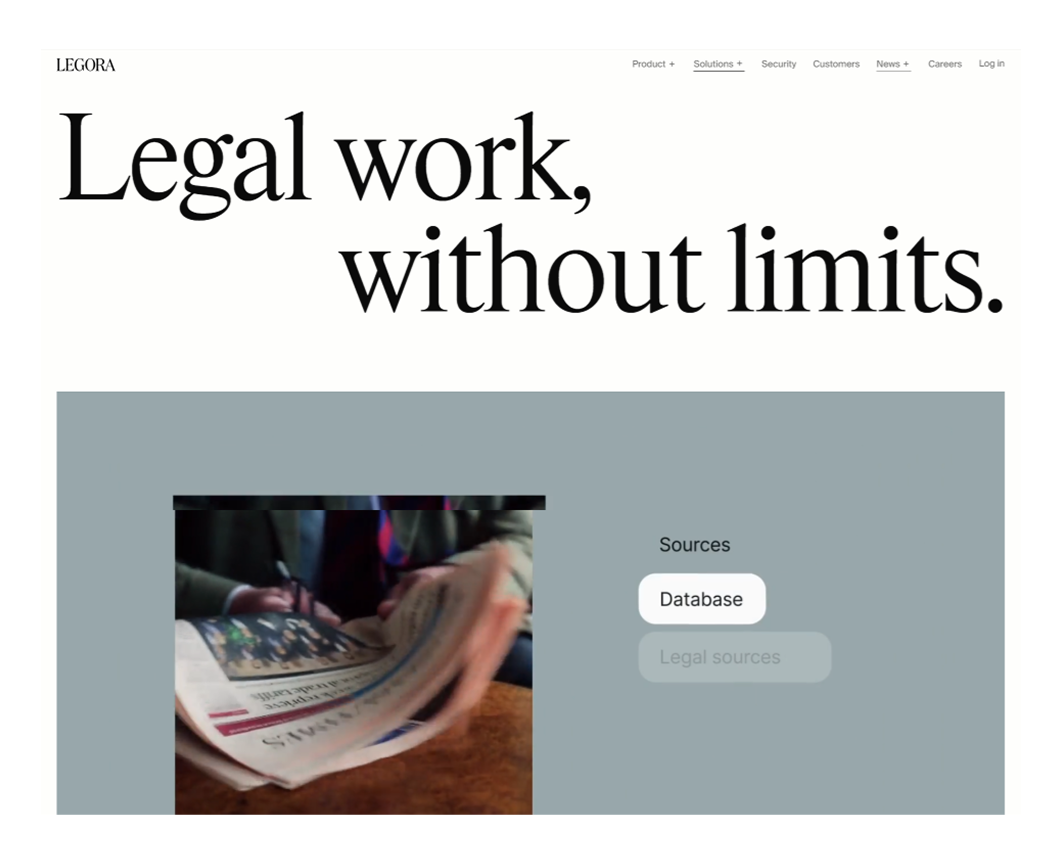
Legora offers AI-powered legal services, and its minimalist website design explains it without overwhelming the user. A balanced layout, clear icons, and short videos work together to make the message accessible.
What to learn: A complex service feels more approachable once the design removes noise and focuses on sequence.
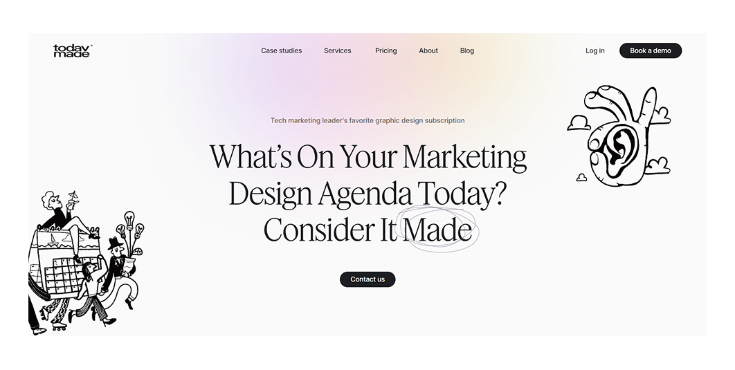
We couldn’t make a list of minimalist websites without mentioning our own. When you land on TodayMade, you won’t see any screaming colors or visuals. There’s just a soft background gradient, black-and-white illustrations, and focused messaging.
What to learn: A soft gradient and monochrome illustrations can carry an entire brand presence without adding visual noise.
The hero section of Unknown, Untitled is entirely typographic, on a white background. As a design office, they use this minimal approach to lead with clarity. Case studies are presented in a structured layout, with only subtle touches of color.
What to learn: Letting typography take the spotlight can create confidence and clarity with almost nothing else.
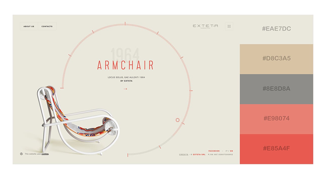
.png)
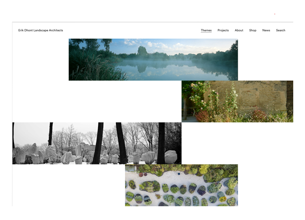
This landscape architect website lets the work speak first. The moment you land on the site, you’re met with a grid of colorful project images. The layout feels a little unconventional, but that’s what makes it intriguing.
What to learn: Unusual layout choices feel deliberate when balanced with strong imagery and tight structure.
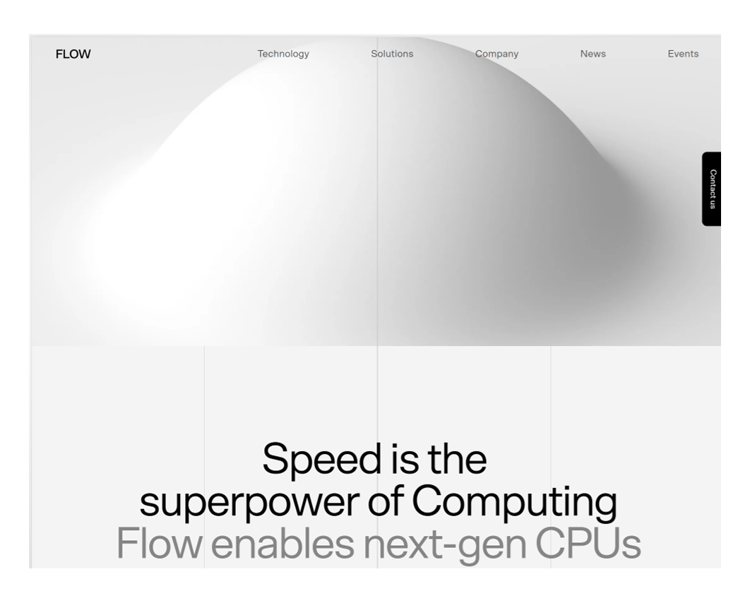
What immediately stands out about Flow’s website is the absence of animations. This stillness lets the content take center stage. The hero features an intriguing visual installation, supported by minimal text and clean imagery.
What to learn: Stillness and simplicity can create impact, especially when visuals are thoughtful and color is limited.
We’ve already seen a few minimalist portfolios, but Ur Friend brings something a little different. The site leans into white space and a quirky illustration. Despite its simplicity, a few understated buttons guide you through the designer’s work.
What to learn: A single illustration and open space say more than a gallery of visuals if paired with clear navigation.

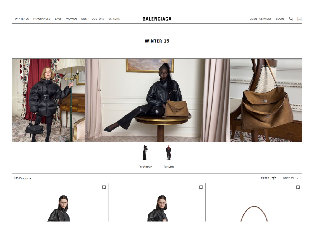
Balenciaga strips away everything that’s not essential. Its web design looks stark and deliberate. The layout features minimal text, plenty of white space, and product visuals that stand front and center.
What to learn: Silence in design creates presence, which feels even stronger when surrounded by minimal elements.
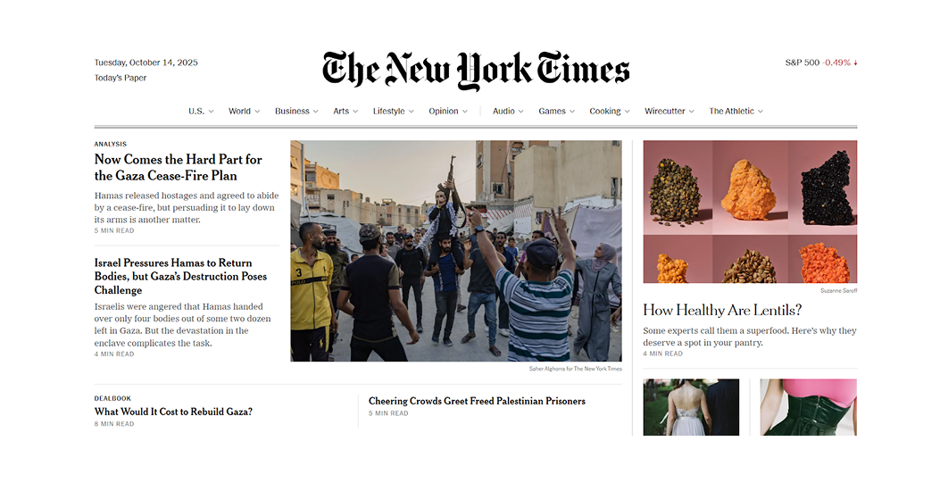
The New York Times may be packed with headlines on the page, but the layout never feels overwhelming. A neutral color palette, clean grid, and structured typography keep everything readable and easy to scan.
What to learn: Minimalism in content-heavy sites relies on tight grids and restrained type rather than reducing volume.
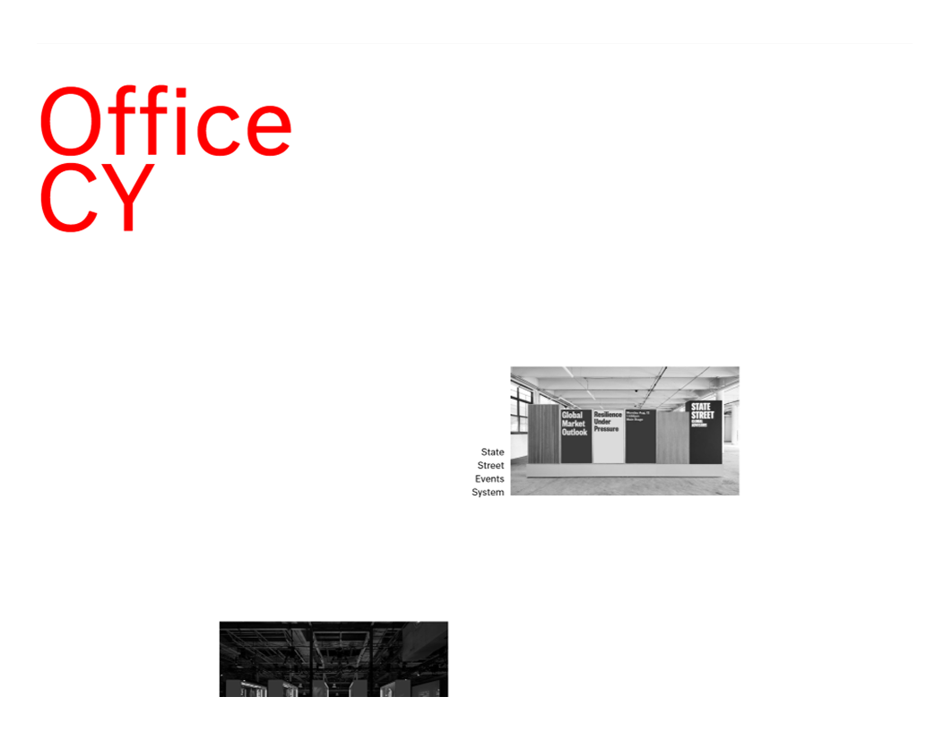
Office CY is a design studio that creates unexpected objects, including its website. Projects are displayed in an unconventional grid that instantly grabs attention. The studio’s name sits boldly in the top-left corner, standing out in large, uppercase type.
What to learn: Breaking the grid works beautifully when typography holds everything together with confidence.
Fathom Architects is built entirely on shades of blue, and that’s all it needs. Yet the message comes through clearly. The layout is simple, and the tone is confident. You instantly understand what the company does, without needing a single visual cue.
What to learn: Using one color in multiple tones can create depth and identity without relying on imagery.

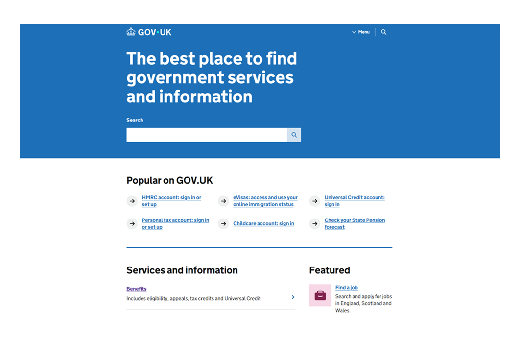
Gov.uk is a great example of practical minimalism. Every element is there to serve a purpose. A simple grid, high contrast, and plain language make the site easy to use for anyone, on any device.
What to learn: Minimalism becomes most effective when the goal is usability, and every element earns its place.
ETQ’s website opens with a full-screen layout — one part product image, one part clean message. The transparent header stays out of the way as you scroll, and even the widget-rich footer manages to feel minimal.
What to learn: You don’t need to strip out content to stay minimal if every element respects the same visual rhythm.

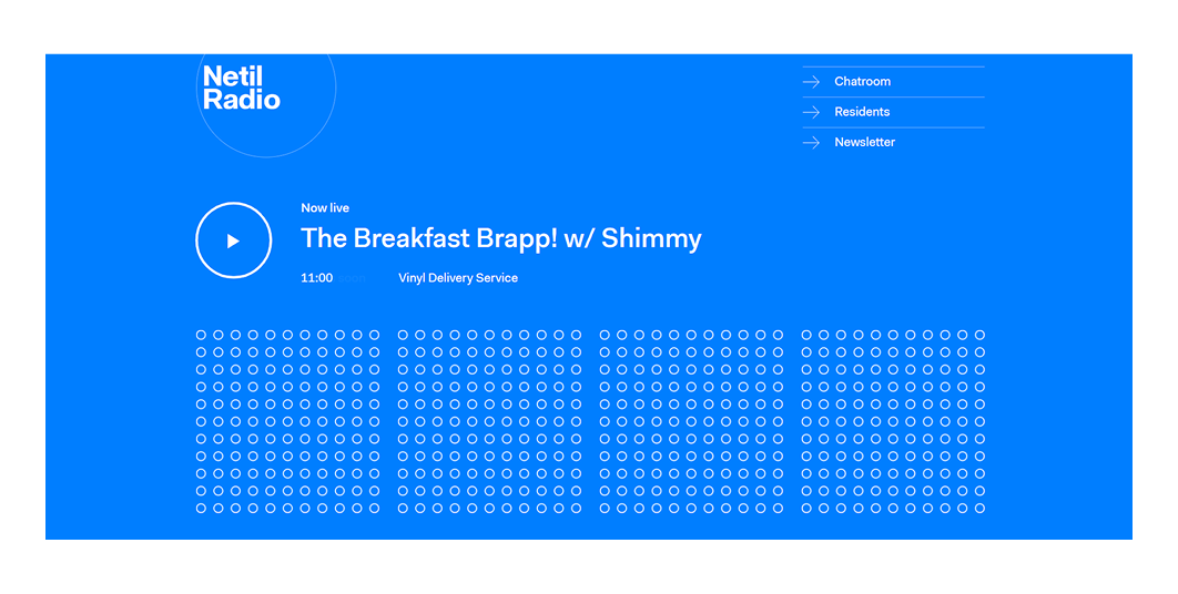
Netil Radio’s bold blue background might catch your eye first, but everything else looks quiet. The play button doubles as a visual cue, turning scattered dots solid on click, all within a clean one-page experience.
What to learn: Even playful interfaces feel focused when the layout stays tight and every interaction serves the core experience.
Notion’s landing page relies on space and clarity to do the heavy lifting. With just a headline, product visuals, and a clear CTA, it removes every possible distraction. What’s left is a smooth scroll and a strong structure that respects users’ time.
What to learn: SaaS landing pages convert better when the layout focuses on one message and one action at a time.

Airbnb’s homepage is designed with just enough — a large search bar, calm colors, and light typography that gives the interface room to breathe. Visuals are clean, spacing is generous, and every element lets the user search quickly.
What to learn: Design feels invisible when every element quietly supports a single action with clarity, purpose, and ease.

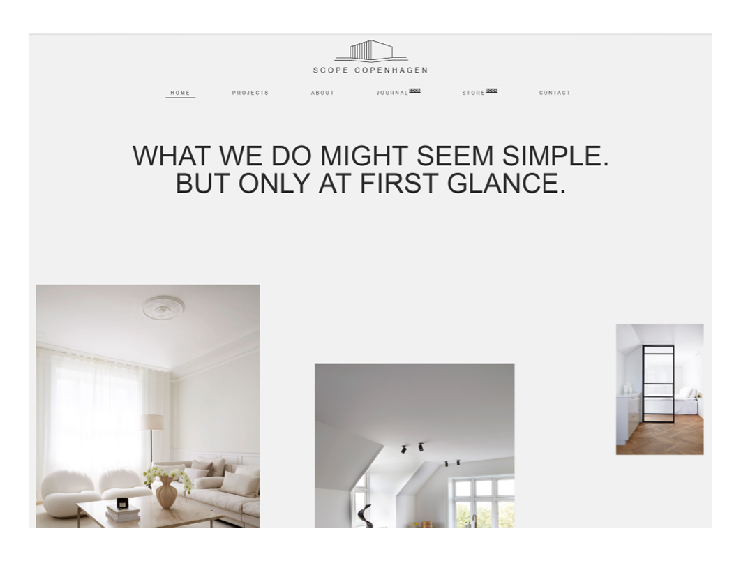
Scope Copenhagen reflects its Danish roots with a simple message, elegant project images, and structure. Navigation floats in unobtrusively, while the footer balances utility and minimalism with clean links and a subtle day/night mode toggle.
What to learn: Minimalism doesn’t mean hiding content if the layout makes everything feel accessible without noise.
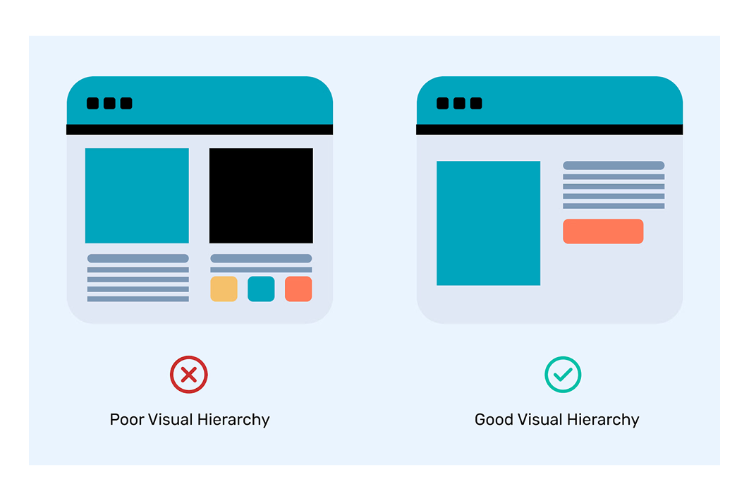
Sure, a restrained color palette and a clean layout might be the first things you notice. Though what really makes these websites work are the small, strategic decisions that keep them usable, readable, and quietly persuasive.
Let’s take a closer look at five micro-principles that hold them together:
1. One job per screen
Each screen or section of the websites above asks the user to do just one thing — read a headline, click a CTA, or scroll down to learn more. You’re never left wondering what to pay attention to. That clarity is designed into the flow from the very first fold.
2. Whitespace as structure
When space is used well, it gives every element on the page room to breathe. But more than that, it creates order. You’ll notice how many of these sites leave generous space around buttons, headlines, and product cards.
3. Just enough color
Most of these sites work with a base of neutrals paired with one accent color. That accent isn’t loud or constant. It shows up where it matters: to highlight a CTA, reinforce brand recognition, or create visual rhythm. The restraint makes those small moments stand out.
4. Predictable patterns
Minimalism doesn’t mean reinventing UI conventions. In fact, the opposite is true. Most of these websites lean on Jakob’s Law: users spend most of their time on other sites, so familiar patterns (like sticky navs or clear breadcrumbs) reduce friction and build trust.
5. Readable by default
Big ideas need to be easy to read. The best minimalist designs start with the 16–18px body text, strong contrast (at least 4.5:1), and link styles that are clearly visible. If your content is clear but unreadable, minimalism loses its point.
After going through the minimalist web design examples above, you’ve probably saved a few for inspiration, and that’s a great start. But it’s not enough. The exciting part comes with applying the patterns that work without turning your own site into a mess. That’s where this section comes in.
Trim your top-level navigation down to the essentials — ideally five items or fewer. Everything else (privacy, careers, sitemap, social links) can live in the footer. And don’t fall into the trap of thinking that more options make your site more helpful. In reality, shorter menus reduce cognitive load and help users move faster.

What to include in top nav:
Use a consistent grid system — typically 12 columns with an 8pt spacing base — to keep structure tight and layouts clean. Align cards, copy blocks, and images with intention. More margin around important blocks (like CTAs or form sections) increases their visibility without needing bright colors or heavy borders.
Before going live, check whether your button blocks are spaced at least 50–100% more than the surrounding copy. If not, increase the padding or margin. That space creates natural attention.
Stick to one or two typefaces at most, and define a clear scale (e.g., 16px body, 28–32px headings). Line-height should fall between 1.5 and 1.7 for readability. Choose font styles that are legible on all devices, and don’t rely on thin weights for visual style, as they often fail accessibility standards.
Our advice is to use variable fonts (like Inter or IBM Plex) when possible. They keep load times down while offering full control over weight and width.
Minimalist design thrives on color discipline. Use neutrals (white, black, gray) as the base, and add one accent color for interactivity — like hover states, buttons, or form inputs. Avoid gradients, glows, or overly saturated tones unless they’re core to your brand (and even then, use them sparingly).
You might also use tools like Coolors or Paletton to build color scales that pass accessibility checks out of the box.
Animations should support usability. To do this well, keep motion subtle and fast: hover effects, scroll cues, and image transitions should stay under 200ms with ease-in-out timing. Avoid parallax and heavy JS-based motion unless it adds real value and passes performance checks.
What you can animate:
What’s better to avoid:
Minimalist doesn’t mean inaccessible. In fact, when you remove visual noise, contrast and structure become even more important. When designing, make sure you’re hitting key accessibility basics:
Fast is part of minimal. Keep your initial load under 300KB where possible, especially for landing pages. Defer non-critical JavaScript, compress images, and avoid loading entire font libraries for one or two weights. Use tools like Lighthouse or PageSpeed Insights to check your baseline.
Also, watch out for:
Before shipping, test your homepage and landing screens against these three questions:
If any of these are unclear, no amount of beautiful spacing or neutral tones will save the experience. A great practice is to show your homepage to someone unfamiliar with your product and ask them to answer those questions. If they hesitate, simplify.
Once your minimal website design is live, test the small things. Run A/B tests on your headline, CTA label, or hero layout density. You don’t need to overhaul the site — often, a clearer button, a sharper value prop, or a better-structured headline can move the needle without breaking your minimalist vibe.
Minimalism leaves less room to hide behind visual tricks, so your message, hierarchy, and microcopy matter more than ever.
There’s something honest about a well-built minimalist site. It doesn’t try to impress you with tricks or chase your attention. It just shows up with clarity, says what it needs to say, and makes the next step obvious.
And we’ll admit, designing that kind of simplicity is the hard part. But when it works, it speaks louder than any layout ever could.
If you’re building something that deserves clarity, minimalism might just be the sharpest tool you have. And if you need an experienced team who knows how to use it well, you can always contact us.