Web design
13
min read
Your website is a strategic tool that shapes how people perceive your brand, how they interact with your product, and whether they stay long enough to convert.
A Google study found that users form an opinion about your site’s design in just 50 milliseconds, and 94% of those first impressions are based entirely on how it looks and feels.

At TodayMade, we approach web design as both a craft and a business function. Every decision we make, from layout to interaction, is intentional. We build websites that are fast, accessible, and focused on clarity, so they don’t just look good. They perform — with website design for SEO in mind, website speed metrics carefully tracked, and aesthetics rooted in modern web design.
This guide walks you through our practical approach to web design and gives you clear, actionable website design guidelines to follow at every stage.
But first, let’s start with the fundamentals.
When someone lands on your site, they make a split-second judgment and instantly decide whether to stay or go. That first impression? It is the design that is doing the heavy lifting.
Web design is the practice of shaping digital experiences through structure, visuals, and interaction.
At its best, web design guides people toward clarity. It helps them understand your message, take the right action, and feel like they’re in the right place, without thinking about it. Knowing how to find a web designer and when to hire a website designer ensures you get results that actually feel this seamless.
Let's break down its essential building blocks to understand how great web design works in practice.
Great design is the result of a few core elements working together: structure, style, and usability, all aligned with purpose.
Here’s what brings it all to life:
Text accounts for around 90% of the average website, yet typography remains one of the most overlooked design elements. So, it’s time to change that.
Typography helps set the tone. According to the Perception of Fonts study, people associate different personalities with different font types. A sans-serif feels modern and versatile. A serif is classic and trustworthy. And playful fonts? Comic Sans consistently triggers a cheerful, creative mood, whether you love it or not.

Also, typography is about using it with intent. A clear hierarchy guides the eye. Bold headings pull attention, while well-spaced, readable body text keeps users engaged. Proper line height and contrast are especially important on mobile, where attention spans are short and readability is everything — no matter if you’re following web design trends, experimenting with brutalism web design, or calculating website design cost.
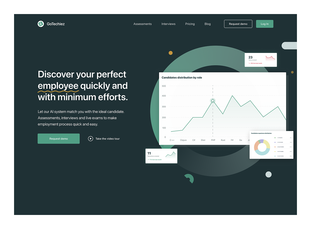
When we designed the homepage for Gotechiez, we implemented a scalable, consistent typographic system using SF Pro Display for primary UI and IBM Plex Mono for monospaced elements, a subtle nod to the developer audience.

We applied consistent font weights (Regular, Medium, Semibold, Bold) across all content layers. This helped unify the look and feel, reduce visual noise, and make navigation more intuitive.
Color sets the emotional tone and quietly tells visitors how to feel about your brand. In 2025, many web design trends center around clarity, contrast, and accessibility, and color plays a key role in all three.
Understanding a bit of color theory helps. For example, complementary colors create bold contrast. Analogous colors feel more harmonious. And each hue carries meaning:

A solid web design system typically includes a primary color, a few secondary accents, and neutrals for balance. They serve a purpose. Bold colors draw attention to CTAs, while softer tones improve readability and reduce fatigue.
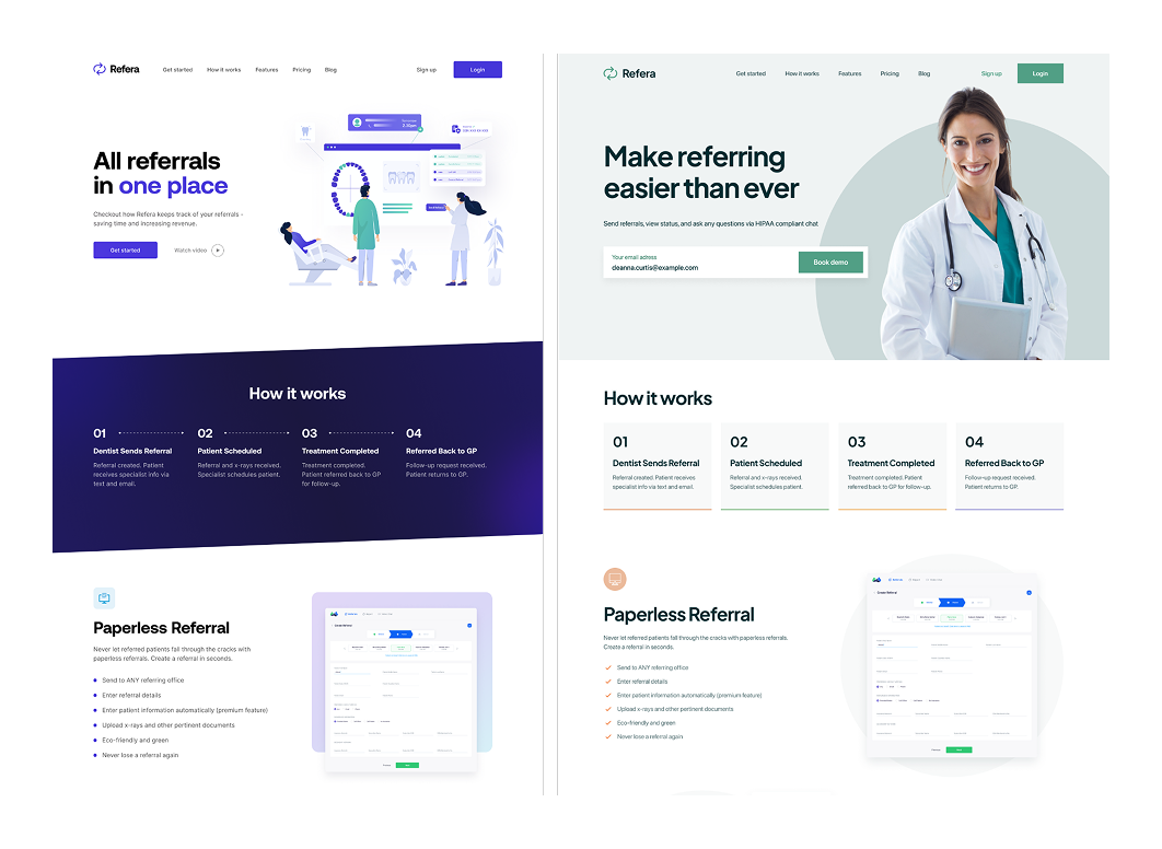
Take our client, Refera. Their original palette used loud, felt-tip colors, making the interface feel frantic. We helped them shift to calm, muted greens, which are more appropriate for a healthcare product, and introduced orange as an accent to guide action.
The difference was immediate: the product felt more trustworthy, focused, and aligned with its users.
We always say that interaction design is the difference between a static website and an alive one. Think smooth scrolling, hover states, and animated transitions, small touches that make a big difference. These principles power a lead generation website, stand out in SaaS landing page examples, and should be included in every website owner’s manual.
One of our favorite examples? Animating the “add to cart” button. It’s a tiny bounce or color flash, reassuring the user that their click worked. There is no need to reload or wonder what just happened.

Links, buttons, and menus should behave the same throughout the site. Predictability keeps users confident and engaged, because at the end of the day, interaction isn’t just motion; it’s communication.
A strong layout coherently integrates text, images, and buttons. It establishes visual hierarchy, helping users scan the page and instantly know where to look. Designers often rely on grid systems (like the trusty 12-column grid) to align elements and create balance.
Visual hierarchy is your best friend here. Bigger, bolder elements draw attention first: a headline, a striking image, and then your call to action. Supporting details follow.
Whitespace (or the “empty” space) is just as important. It keeps things from feeling chaotic and gives your key content room to shine. Clean, well-spaced layouts are the hallmark of modern design in 2025. They signal clarity, confidence, and intention.
A common trap? Trying to cram everything “above the fold,” just in case users don’t scroll. But it results in clutter, confusion, and decision fatigue.
We always tell clients to focus on flow, not density. Let content breathe. Build in rhythm. Use space to lead users, not overwhelm them.
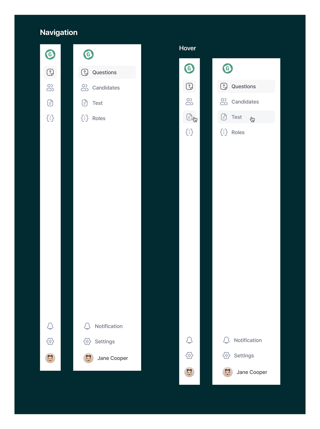
Let’s look at Gotechiez again. Beyond designing a clean UI, we also rethought how information was structured. We refined layout and navigation patterns to make the experience smoother and more goal-oriented, so users could focus on what mattered, not fight through clutter.
According to Statista, over 61% of global web traffic comes from mobile devices.

These days, many designers take a mobile-first approach, starting with the smallest screen. It forces smart content prioritization and ensures the most essential information always comes through, no matter the device.
Designers use flexible grids and CSS media queries to reflow content at key breakpoints.
That slick three-column layout on desktop? It becomes a stacked, single-column view on mobile, so text stays readable and buttons are thumb-friendly.
Responsiveness also means optimizing performance. That includes loading smaller images on mobile, touch-friendly navigation, and smooth scaling across breakpoints.
However, responsive doesn’t equal inclusive. Alongside responsiveness, accessibility is essential. Designing to WCAG website design standards means adding alt text, ensuring good color contrast, supporting keyboard navigation, and making content usable for everyone, including those with disabilities.

Now that you’ve got the fundamentals, we’ll walk through a step-by-step process to apply them in a real marketing website workflow.
Designing a website is an iterative process, especially for a marketing website when you want to craft a journey that informs and persuades visitors.
Here are the website guidelines to tackle it, step by step:
Before opening Figma or sketching wireframes, take a step back and look around. Every great design starts with reference points.
Start by browsing websites in your space and outside it. If you’re a founder, peek at your competitors’ sites and answer:
If every company uses the same layout and color palette, you have a chance to stand out while still maintaining familiar elements users expect (the “Sign Up” button in the top-right is basically a law).
Next, dive into design playgrounds like Dribbble, Awwwards, or Webflow Showcase. These platforms are full of gems, from bold, animated landing pages to minimal, typography-led layouts. Tools like Lapa Ninja, SaaS Frame, or curated collections of the best SaaS landing pages are gold mines for layout, visual tone, and messaging ideas that convert. These platforms show how top SaaS brands position themselves and where your site might stand out.

At this stage, your job is to collect, observe, and save what catches your eye: clean navbars, bold color palettes, quirky illustrations, and subtle interactions. Even things you don’t like can be helpful.
Maybe you’re drawn to minimalist elegance or something bolder, like brutalist web design, with its unapologetically raw layout and loud typography like this one.

Save what resonates and matches your audience. Then, organize it all in a simple mood board or a Figma dump. It doesn’t have to be pretty. It just has to guide the website design’s next step.
You’ve gathered inspiration. Now it’s time to define your site’s structure, with content leading the way.
When content comes first, design has a clear purpose. Start by writing down the core sections your site needs. For a typical marketing website, that might look like:
This can be done in a Google Doc, Notion page, or Figma, like in the example below.

Then, take your references and imagine how they could pair with your content:
By the end of this step, you’ll have a rough content blueprint and a mental image of how it might come to life, guided by your references and grounded in your message.
Instead of designing the whole page at once, break it down into sections or blocks.
Start with the hero, it’s your first impression. Use your content: headline, subheadline, CTA.
Then look back at your references and determine what caught your eye: a bold headline, a clean layout with some animation. Use that as a model, not a template.
For example, Stripe’s homepage often pairs a minimal headline with soft gradients and whitespace. You might do something similar, but with your brand’s own voice and colors.

Focus on clarity: Does this section explain who you are, what you offer, and what users should do next?
Then move on to the features block. This might be a grid of 3–4 key benefits, each with an icon and a short description.
Keep it visually distinct from the hero but consistent in typography and button styles. If your hero was light and minimal, maybe this section introduces a soft background color or new layout flow.
Next, design testimonials or social proof. You could highlight a strong quote, add a customer’s photo, or a logo strip of companies that trust your product.
Apply the same logic to every section: about, pricing, call-to-action, footer, whatever your site needs. And don’t be afraid to jump around. Designing the footer early, for instance, helps you lock in styles like link colors and font sizes.
Tip: Create a quick style web design guide in Figma with reusable text styles and color swatches. It'll save time and keep everything consistent. For example, pick one CTA button color and stick to it site-wide. Users remember patterns, not variations.

Next, we’ll start pulling everything together into a unified wireframe.
After designing the individual pieces, it’s time to assemble them into a wireframe.
Use Figma, pen, and paper, whatever works. Place each section, such as hero, features, testimonials, CTA, and footer, in order on a single canvas.

Keep it simple. Use placeholder boxes for images and blocks of text. The goal is to ensure everything flows logically, nothing feels cramped, and the story makes sense from top to bottom.
A wireframe helps you catch problems early and notice if something is missing. This is also a great moment for feedback.
We love this part because it's collaborative by nature. A strong wireframe gets everyone aligned before you dive into visual polish.
Founders can look at the big picture: Are we telling the right story? Does anything feel out of order?
Designers can consider recording a quick Loom walkthrough to explain their reasoning. Async feedback makes collaboration smoother and more efficient.
Once your design layout for the website is locked, the real design magic can begin.
With your wireframe in place, it’s time to bring it to life, turning that structure into a polished, branded mockup:
Use your chosen color palette, fonts, and logo throughout. Replace placeholder grays with your real design choices: maybe a navy header, a bright teal CTA, and soft dark-gray body text. These subtle details start shaping how your site feels.
It can be product shots, team photos, or visuals that support your content. Even stock photos work at this stage, as long as they match your tone. Use images intentionally: a smiling customer for a testimonial, or an abstract illustration to represent a product feature.
Set heading sizes (maybe 48px bold for H1s, 32px semibold for H2s), adjust line height for readability, and add visual rhythm with consistent spacing. Small touches like bolding key phrases or italicizing quotes go a long way in making the design feel polished.
Compare your design to your original references. Does it feel as clean, bold, friendly, or modern as you imagined? If not, tweak: maybe the colors are too muted, or the layout feels cramped. Iterate freely. This is the moment to experiment and refine.
Fresh eyes can catch inconsistencies or give you honest first impressions that might get lost when you're deep in the weeds.
Tools like Figma are ideal here. You can create clickable prototypes to simulate navigation or user flow.
And while you’re at it, think ahead to responsiveness: how will this layout adapt to mobile? You don’t need to design every mobile screen yet, but check that your hero headline won’t break on a small screen, or that a three-column section can collapse cleanly into one.
You have a high-fidelity draft that feels like a real website. One final pass will take it from good to great.
You’ve built the structure and layered on visuals. Now, it’s time to polish and prepare for launch:
Are spacing, font sizes, and button styles uniform across the site? Do all your “Sign Up” buttons look and behave the same? A mini style guide pays off here; double-check that your components follow it.
Analyze what a button looks like when hovering or clicking. If you have dropdowns, modals, or form states like errors, show how they behave. It's a small investment now that saves time in development later.
If you haven’t already, consider mobile and tablet layouts. You don’t need to design every breakpoint in detail, but make sure key elements like headlines, CTAs, and images scale well. Resize your Figma frames or build responsive variations if needed.

Swap placeholders with real images, prepare multiple crops for desktop vs mobile if necessary, and export assets in web-friendly formats (WebP for photos, SVGs for icons).
Designers usually provide assets and specs for dev handoff or no-code tools. If you're working with a developer, organize your final files, include a style guide (fonts, colors, spacing), and annotate tricky parts (e.g., “This section uses a scroll animation”).
Clear specs and clean files help your team, reduce surprises during development, and help control website design costs, whether you're working with freelancers, devs, or a Webflow expert.
Figma’s Dev Mode or Zeplin makes this easy. Think of it as your website owner’s manual, a visual and functional website design guide that helps everyone, from marketing teams to developers, stay aligned post-launch.

If you're building in Webflow, your high-fidelity design becomes the reference; just open a canvas and start building.
Present the design to stakeholders. At this stage, changes should be small: a wording tweak, image swap, or extra CTA. Confirm that the design tells the right story, feels on-brand, and checks all the boxes for your launch.
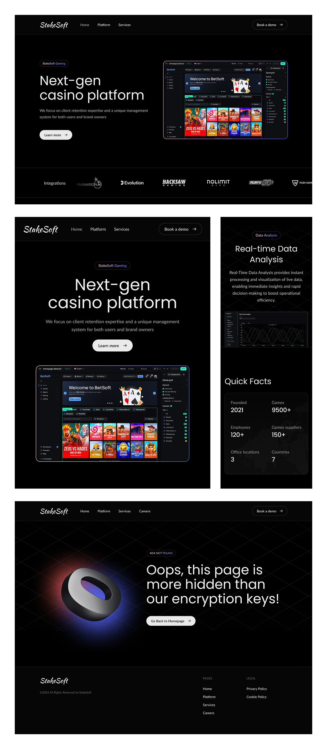
Bonus tip: Think ahead. Do you need a cookie consent design? A 404 page? A signup confirmation? Plan for those now. They’re easier to build when everything’s fresh. That’s exactly what we did when working with Stakesoft. We included a custom 404 page design upfront to keep the user experience thoughtful, even when things go wrong.
Yes, web design includes colors and buttons. But it’s so much more than that. It guides your audience, reflects your brand’s personality, drives outcomes like lead generation via your website, and helps your business grow.
If there’s one takeaway from this guide, it’s this: great design is always intentional. All decisions or best practices for website design you follow should support your message and move your users closer to action.
If you’re not ready to build it alone, you don’t have to. Whether you want to hire a website designer or bring in a strategic partner, we’re here to guide you from rough ideas to a live site that performs.
At TodayMade, we specialize in marketing design that’s not just beautiful, but strategic. We collaborate closely, show progress early, and ask for feedback when it actually matters, not after everything’s baked in.
If you're looking for a design partner who gets both the craft and the why behind every pixel, let’s talk. We’ll help turn your early idea into a website that’s clear, purposeful, and built to perform.


