Marketing & Ad Basics
18
min read
Most banner ads get ignored because they’re generic and cluttered. This article breaks down real ad design examples from top brands, showing why they work and how you can remix the tactics for your own campaigns. You’ll walk away with practical tips, inspiration, and a checklist to create advertising designs that actually get noticed.
Most banner ads get ignored. Not because people hate ads, but because most of them feel like wallpaper: generic, dull, and easy to scroll past.
Instead of real-world inspiration, you often end up with mockups, Dribbble shots, or vague tips like “use a bold color palette.” That’s not helpful, especially when there are plenty of real graphic design examples that show how creativity connects with results.
Here’s what you’ll find instead.
This post gives you real advertising design examples — actual display ads from brands doing it right. For each one, you’ll get:
You’ll leave with a swipe file of proven advertisement design ideas, a checklist for building high-performing banners, and a clear sense of what “good” actually looks like.
Let’s fix banner blindness — one ad design example at a time.

Mailchimp keeps it weird in the best possible way. The ad features a bold yellow background with the unexpected line: “Grow your business with CRM-powered postcards.” It’s surprising, and that’s what makes you pause.
Most people associate Mailchimp with email, not direct mail, so the contrast immediately grabs attention. The design is bright and clean, with a single blue CTA that reads, “Sign Up Now.”
This works because it leads with a feature that feels fresh. If your product has an unexpected angle, highlight it. Let the surprise do the work without overexplaining. Simplicity and curiosity can carry the message.

LinkedIn’s ad speaks directly to a common hiring headache: finding the right candidates quickly. The line “Find the people you want to interview, faster” addresses that pain without any fluff or jargon.
Visually, the ad features a single smiling person framed inside a soft targeting box. It’s a simple image, but it clearly reinforces the message — you’ll be able to focus on the right applicants. The CTA, “Post a free job,” makes the next step feel low-commitment and easy to try.
This ad works because it keeps the message focused and empathetic. If your product solves a time-consuming task, consider framing it as a shortcut to clarity — and make sure your visual reflects that benefit.

The New York Times ad starts with a loaded word: Truth. That single word sets the tone for what follows: “It comes at a cost.” It’s not selling a product. It’s positioning a belief.
Only after that message do you see the offer: “Get up to 40% off the Times subscription of your choice.” But the sale feels secondary. The copy reframes it as a way to support independent journalism, not just get a deal.
The design is stark and serious — black type on white background, a plain CTA that reads, “See my options.” There’s no decoration, no fluff. Just intention.
For brands built around a mission, this ad is a great example of how to lead with values and let the product follow. It earns attention by standing for something, not just selling something.
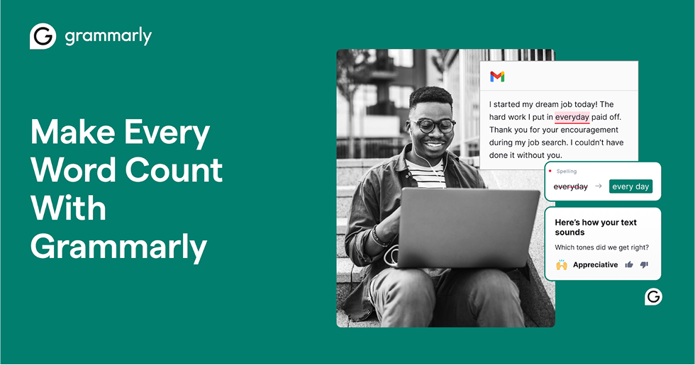
Grammarly’s ad doesn’t just tell you what it does — it shows you. On the left, bold teal and a simple headline: “Make every word count with Grammarly.” On the right, a user writing a thank-you message about landing their dream job, with Grammarly quietly correcting “everyday” to “every day” and confirming the tone as “appreciative.”
It’s smart. The tool is doing its job in the background, helping someone communicate clearly at a real, emotional moment. There’s no need to oversell, just like the best email marketing designs, the product speaks for itself.
That’s the move here: instead of listing features, Grammarly builds trust by showing exactly how it helps — when it matters most.
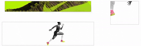
Nike’s animated banner takes minimalism and adds movement. At first, you see flashes of neon green with the iconic swoosh. Then the frame shifts to a black-and-white athlete sprinting across the space, with only the shoes in color. The sequence is fast, clean, and unmistakably Nike.
This ad works because the motion feels purposeful. The neon palette gives it stopping power, while the selective coloring keeps the focus on the product. The athlete in motion reinforces Nike’s brand ethos — performance, energy, and speed — without needing a single line of copy. The animation is smooth and lightweight, so it doesn’t feel like a gimmick or distraction.
The lesson here is that animation doesn’t have to mean complexity. A few frames of purposeful movement can make a banner stand out while still keeping the design uncluttered. For brands in fitness, lifestyle, or tech, a micro-animation that highlights the core product or feature can add just enough energy to stop the scroll.

Disney+ doesn’t need to explain much. It just needs to show. This ad does exactly that by stacking five instantly recognizable franchises in one vertical banner: Disney, Pixar, Marvel, Star Wars, and National Geographic. It feels like scrolling through a dream watchlist.
The visuals do all the heavy lifting. You know the characters, you know the brands, and you know the value without reading a word. The copy at the bottom simply confirms it: “Stream the best stories in the world.” The CTA, “Start Your Free Trial,” is direct, low effort, and impossible to miss.
This ad works because it builds trust through association. Viewers already love these stories, so Disney+ only needs to gather them in one place and make the next step obvious. It’s not persuasion, it’s presentation.
For products with a deep library or bundle of benefits, this is a winning formula. Put your strongest assets side by side, let the audience recognize their value instantly, and guide them toward a single clear action. It’s the same principle behind strong SaaS landing page examples that highlight core value upfront.

Samsung’s Galaxy Tab S6 ad takes the minimalist route and pulls it off. The layout is almost entirely white space, with a single product image on the right and a simple three-word headline on the left: “Create. Work. Anywhere.”
That headline does the heavy lifting. Each word is short, punchy, and loaded with possibility. Together, they promise freedom and flexibility without needing to spell it out. The product photo reinforces the point by showing the tablet propped up with a keyboard and stylus, suggesting it can handle both creativity and productivity.
This ad works because it relies on restraint. There are no flashy effects or paragraphs of copy. The message is clear, the product is centered, and the CTA is tucked into a simple arrow inviting you to click through.
For brands selling multi-use products, this is a strong formula to copy. Pick three words that capture the core benefits, give the product room to breathe, and resist the urge to clutter the space with extra detail. Clean design in advertising can communicate confidence better than a thousand words.
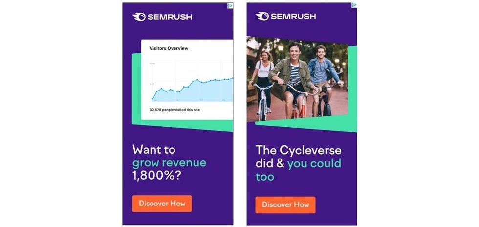
Semrush knows that numbers speak louder than taglines. Their ad leads with the headline, “Want to grow revenue 1,800%?” The giant percentage is the first thing you see, and it’s impossible to ignore. Right below it, they back up the claim with social proof: “The Cycleverse did and you could too.”
Visually, the design is simple but effective. A clean chart signals growth. Bright purple and teal keep the brand recognizable. The orange CTA, “Discover How,” stands out immediately and feels like the natural next step after seeing such a bold promise.
This works because it’s both aspirational and credible. The number hooks your attention. The named customer makes it believable. And the call to action invites you to learn more without feeling pushy.
For brands looking to run performance-driven advertising and design campaigns, this format is a blueprint: lead with a specific result, ground it in a real example, and keep the design clean so the message stays the focus.
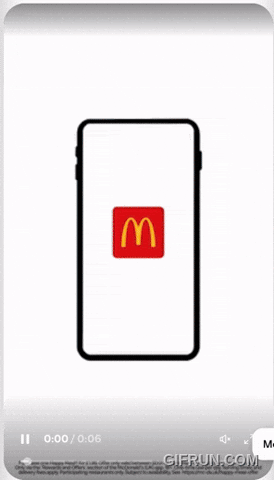
McDonald’s doesn’t need to overexplain. This mobile banner starts with a simple phone outline, instantly signaling that the ad is about the app experience. The golden arches sit at the center of the screen, and with a quick animation, the app experience unfolds — menus, deals, or delivery options — all pointing toward convenience.
The ad works because it leverages what people already know about the brand. There’s no need for flashy copy or heavy detail. The animation makes the phone feel interactive, which mirrors the action they want you to take: open the app. The red-and-yellow palette ensures it’s unmistakably McDonald’s, even if you glance at it for just a second.
The takeaway here is simple. If you’re advertising an app or digital experience, show the product in use, not just the logo. A few seconds of purposeful animation can make the action feel intuitive and familiar, while the brand trust does the rest.

Amazon’s hiring ad doesn’t waste a single pixel. The headline reads, “We are raising the bar on wages.” It’s bold, simple, and immediately relevant to anyone scanning job opportunities. Just below, the copy gets specific: “Now hiring warehouse team members in the Salt Lake City area.” That local mention makes the ad feel personal and targeted.
The design is stripped down to the essentials. A dark blue background keeps the text legible, while the Amazon smile logo and the white CTA button, “Join our team,” make the next step obvious. There’s no jargon, no distracting imagery, just a clear benefit and a clear action.
This ad works because it balances credibility and urgency. The wage angle speaks directly to a primary motivator, while the geographic callout makes it feel immediately applicable. For recruiting campaigns, the lesson is simple: highlight the biggest benefit upfront, make it location-specific, and keep the advertising designs uncluttered so the message can stand on its own.
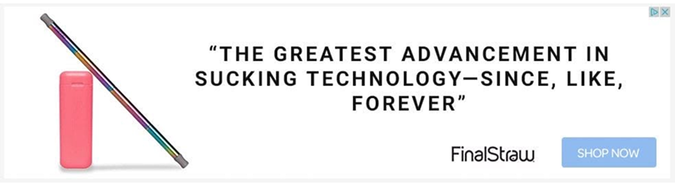
FinalStraw’s banner ad doesn’t lean on sleek design or heavy product details. Instead, it leads with a playful line: “The greatest advancement in sucking technology — since, like, forever.” It’s cheeky, unexpected, and makes you look twice.
The humor works because it’s self-aware. It acknowledges the product is “just a straw” while still making it sound like a must-have. Paired with the colorful, reusable straw image on the left, the message is simple: sustainable can also be fun. The CTA, “Shop Now,” sits in a clear blue box that stands out without trying too hard.
This ad works because it uses personality as the differentiator. The copy is memorable, the design is clean, and the product is instantly recognizable. If your brand lives in a crowded category, a sharp voice can make you stand out more than features ever could.
For marketers, the takeaway is simple: don’t be afraid to use humor when the product itself might not feel inherently exciting. Personality can be the hook that pulls people in, much like the clever twists you’ll see in effective pop-up examples.
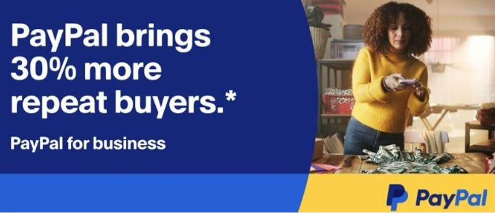
PayPal keeps it simple and proof-driven with this banner. The headline reads, “PayPal brings 30% more repeat buyers.” That number is the hook. It’s specific, easy to understand, and instantly connects to a business owner’s biggest priority: getting customers to come back.
The design splits into two halves. On the left, bold white text sits on PayPal’s signature blue background, making the stat impossible to miss. On the right, a small business owner is shown at work, grounding the message in a real-life scenario. The PayPal logo at the bottom reinforces trust, while the subtle subtext, “PayPal for business,” makes clear who this message is for.
This ad works because it balances credibility and clarity. There’s no vague language about “growth” or “opportunity.” Instead, PayPal leads with a quantifiable result and ties it directly to customer loyalty, which is what most merchants care about most.
For brands trying to win attention in the B2B space, the formula here is straightforward: highlight a single, proven metric, pair it with recognizable branding, and keep the rest of the design clean so the message lands without distraction.
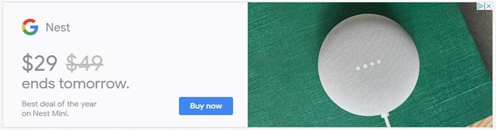
Google’s Nest Mini ad proves that less is often more. On the left, the copy is stripped down to the essentials: the price, a strikethrough discount, and a deadline — “$29, ends tomorrow.” On the right, a clean product shot shows the Nest Mini on a textured green surface, adding just enough visual interest without distraction.
The ad works because it combines clarity with urgency. The discount is front and center, and the strikethrough makes the savings instantly obvious. The deadline creates a fear of missing out, while the “Buy now” CTA removes friction by telling you exactly what to do next.
It’s not about building brand awareness. It’s about capturing intent. And for performance-focused campaigns, that’s the point.
The lesson here is simple: if your goal is direct response, don’t overcomplicate the creative. Lead with the price, show the product, and add urgency with a deadline. Then get out of the way and let the deal do the selling.
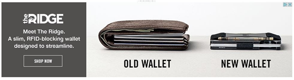
The Ridge doesn’t bother with long explanations. Instead, it shows you two images side by side: a bulky, overstuffed leather wallet labeled “Old Wallet” and its own slim, metal design labeled “New Wallet.” That single comparison tells the entire story.
The copy is short and functional: “Meet The Ridge. A slim, RFID-blocking wallet designed to streamline.” It reinforces the benefit, but the visuals are doing most of the work. The CTA, “Shop Now,” is placed clearly in a black button that matches the brand aesthetic.
This ad works because it’s built on contrast. You see the problem and the solution instantly, and the product looks better without needing explanation. It’s a classic before-and-after setup, and in a world of busy advertising and marketing design, that clarity is powerful.
The takeaway is simple. If your product replaces something outdated or inefficient, don’t overcomplicate the creative. Put the old and new side by side and let the difference sell itself.

Wix Partners doesn’t pitch templates or pricing in this ad. Instead, it leads with expertise: “Psychological principles of high-converting sites.” The message is aimed squarely at designers, marketers, and agencies who want better results for their clients.
The design keeps the focus on clarity. A bold blue background contrasts with large white text, ensuring the headline is the first thing you see. A simple mockup of a landing page sits below, complete with visual callouts for elements like the shop button and cart icon, reinforcing the “conversion” theme.
This ad works because it sells value before the product. By offering educational content, Wix positions itself as a partner rather than just a tool. The CTA, “Download,” feels low friction and promises an immediate benefit.
For B2B brands, this is a reminder that you don’t always need to advertise features directly. Sometimes the best way to capture attention at the top of the funnel is to lead with knowledge your audience finds genuinely useful, then link that expertise back to your product.
Looking at these ads side by side makes one thing clear: the best campaigns aren’t accidents. They follow patterns. Certain elements keep showing up, and certain design choices consistently make the difference between forgettable and effective.
That’s where a few practical tactics come in.
Great banners might look effortless, but they all share a handful of ingredients. Miss one, and the design falls flat. Nail them, and even a simple static ad can stop the scroll.
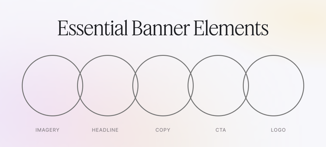
Think of these as the non-negotiables:
Getting these five pieces in place is the first step. But structure alone isn’t enough. What makes advertising and design actually work are the principles guiding how those elements come together.

These are the principles that hold everything together:
Once the elements and principles are clear, execution is where campaigns live or die. That’s where technical best practices come in.
Once the basics are in place, execution makes the difference. A few rules keep banners polished and performant:
Mastering the building blocks is one thing. But seeing how they come together in real campaigns is what makes the lessons stick. Numbers, results, and context bring the design choices to life.
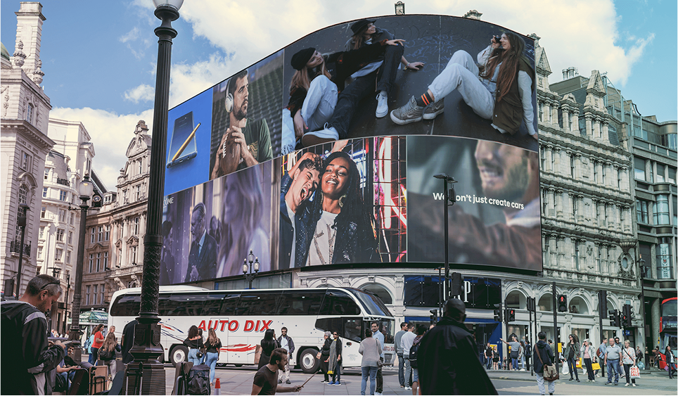
Tactics give you the framework for building better banners. But banners are just one piece of the puzzle. Ad design stretches across many formats from billboards to social to direct mail and each comes with its own strengths.
Not every campaign runs on banners. Marketing advertising design stretches across channels, and each type has its own strengths. Here’s a quick guide to the main formats marketers use today:
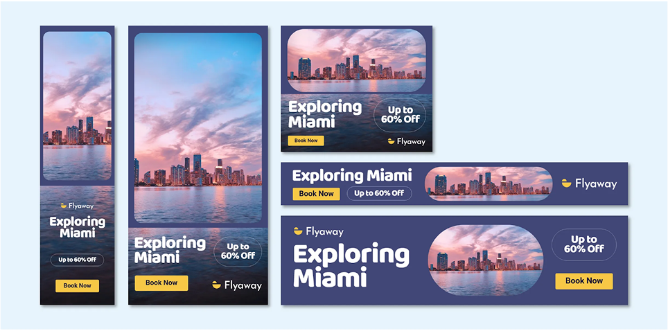
Each type has its place. Some work best for awareness, others for conversion. And the best campaigns mix formats — think of a display ad that sparks interest, then a social retargeting ad that closes the loop.
Even the smartest creative idea is just a guess until it runs in the wild. That’s where testing comes in. The difference between a decent banner and a top performer usually comes down to small, deliberate tweaks you’ve proven with data.
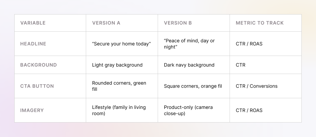
The best place to start is A/B testing. And here’s the golden rule: isolate one variable at a time. If you swap the headline, background, and CTA all at once, you’ll never know what actually moved the needle. But if everything stays the same except the headline, you can measure results with confidence. For awareness campaigns, track click-through rate (CTR). If you’re closer to purchase, return on ad spend (ROAS) is the metric to watch.
Keeping track of all these variations gets messy fast, which is why a simple test matrix helps. Think of it as a planning grid where each row represents one variable you’re going to test.
Once you’ve got your variables mapped out, the real work begins: running tests and watching for patterns. And this is where surprises often happen. Sometimes lifestyle imagery outperforms a clean product shot because people connect with context. Other times, a stark product-only frame looks more professional and earns more clicks. The point is, instinct can guide you, but testing is what gives you the truth.
When results come in, act fast. Kill the underperformers, double down on what works, and then spin off new variations from the winners. Optimization is never about chasing one perfect ad. It’s about building a feedback loop where every round of testing makes your creative sharper and your instincts stronger.
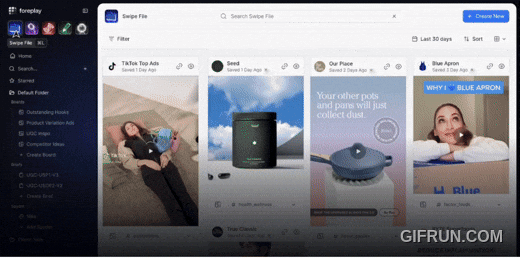
Testing helps you refine what’s already in front of you. But to keep producing fresh creative, you also need a steady stream of new ideas to test in the first place. That’s where inspiration comes in, and why building a swipe file is just as important as running experiments.
Good design doesn’t come out of thin air. The best creatives are collectors. They build swipe files — libraries of ads, screenshots, and clippings they can return to whenever they need ideas. If you’re not building one yet, now’s the time to start.
There are plenty of online tools to help:
Award libraries are another goldmine:
And if you want ongoing inspiration, design publications can help:
Finally, don’t underestimate your own observations. Photograph billboards when you’re out, save Instagram ads that catch your eye, and keep a folder on your desktop for screenshots. Tag everything by industry or objective so you can find “B2B lead gen” or “direct-to-consumer humor” when you need it.
The point isn’t to copy. It’s to build a personal library of sparks. Because when you sit down to design your next banner, it’s much easier to remix proven ideas than to start with a blank canvas.
Swipe files give you the sparks, and testing gives you the proof. Put the two together and you’ve got a system: collect ideas, test them, refine what works, and repeat. At that point, all that’s left is to step back and look at the bigger picture.
Most banner ads get ignored because they try to do too much or end up looking like everyone else’s. The examples we’ve covered show a different path: simplicity, clarity, and a focus on what really matters to the audience. Pair that with a solid testing habit and a swipe file of your own, and you’ll never have to start from scratch again.
The takeaway is simple. Great advertising design is part inspiration, part execution. You need the ideas to spark direction, and the discipline to refine them into banners that actually perform.
At its core, the advertising design definition is simple: clarity, simplicity, and creativity working together to get results.
So here’s your next step: apply the checklist, run experiments, and start building your own swipe file. And if you’d rather not go it alone, that’s what we’re here for.
Don’t settle for banners that blend into the background. Contact TodayMade and get advertising design that drives clicks, conversions, and growth.