Marketing & Ad Basics
24
min read
Ever noticed how a single word in the right font stopped you mid-scroll, made you laugh, or even sparked a superb idea for your next project? The magic of good typography in advertising is in transforming plain text into a visual message that sells, entertains, and inspires.
When used creatively, typography ads turn into a powerful message that stops you from mid-scrolling, sparks curiosity, and makes design memorable long after.
TodayMade designers are exploring fresh typography in ads that inspires, sets trends, and crafts standout campaigns.
Our new design article dives deep into the best uses of typography as a core creative element in communicating your marketing message. We are sharing some great examples and action-driven tips for your success in ad designs. We’ll also dig beneath what’s trending now,
Before we explore typographic insights and real-life examples, let's quickly figure out what good typography in advertising is.
Typography in advertising is a strategic use of type to communicate a message in a visually compelling way. It involves multiple details ranging from choosing fonts and layout to size, spacing, and style to evoke emotion, attract attention, and solidify the ad’s longstanding impact.
Typography in advertising isn’t just about making text legible, it’s about an unforgettable user experience - Dieter Rams
Typography is no longer a functional tool in web design trends and advertising. The best typography ads turn letters into visual experiences by using type as a powerful design element to:
Seeking inspiration on how to use typography in your next campaign? Let’s explore lead typographic techniques in 2025 advertising.
Whether it’s 3D lettering, hand-drawn scripts, or bold kinetic type, brands use typography to grab attention, convey emotion, and shape identity. Ad campaigns become more shareable, scroll-stopping, and instantly recognizable.
Typography-as-image delivers layered messaging, inviting the viewer to read, interpret, and react. It's especially effective in digital and social campaigns, where attention spans are short.

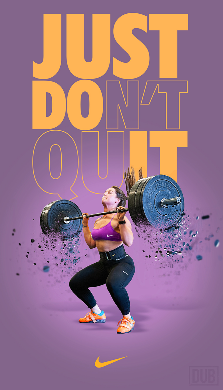
Nike’s ad exemplifies typography as an image technique, where the text is visually performative. The entire composition, crafted to look like it's made from clay or play-dough, turns words into sculptural, playful incorporating elements that mirror the tone and energy of the soccer player (Zambrotta), dynamic motion, and Italian pride.
In digital brand advertising, this approach conveys emotion, tone, and brand identity by playing with size, motion, distortion, layering and placement to communicate a message visually.
Physical materials and artisanal techniques bring typography to life. By using real-world materials that seem both realistic and high-end, designers give the letters a personal touch. The result is rich in texture, imperfection, and personality that adds a tactile, human feel.
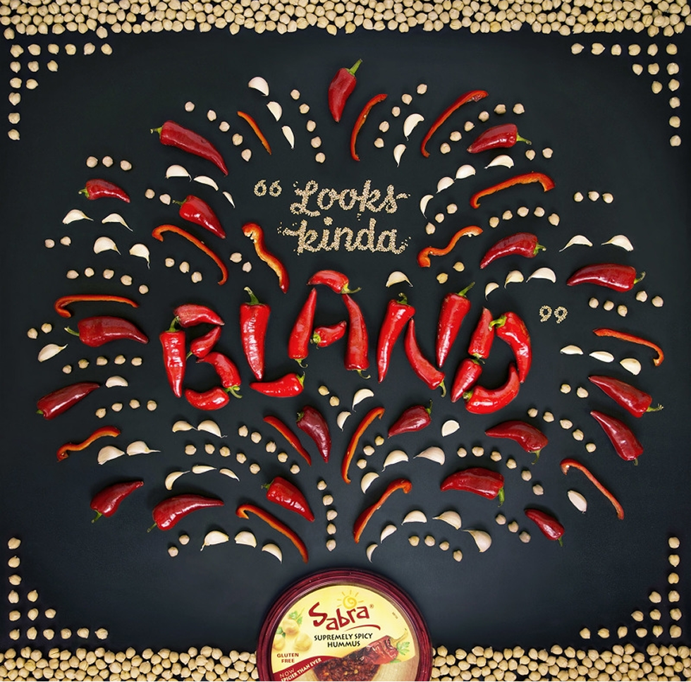
In this well-thought out visual for Sabra, Becca Clason dials up the heat to picture the bold flavor of Sabra hummus. A flood of fiery red peppers instantly signals intensity: you can almost taste the spice just by looking at it. But here’s the twist: the word “bland” is spelled out entirely with these flavor-packed chilies. It’s an ironic punchline that flips the meaning on its head. Add to that the explosion of ingredients bursting from the packaging, and the message is loud and clear. Eventually, this hummus is anything but bland: it’s bold, vibrant, and unapologetically full of flavor.
Material type and handcrafted typography bring a tactile, human feel to advertising by physically crafting letters out of real-world materials — wood, metal, food, fabric, or even everyday objects. The technique stands out because it adds texture, authenticity, and storytelling depth. It taps into the viewer's sense of craft, nostalgia, and uniqueness, making the brand feel more personal and approachable.
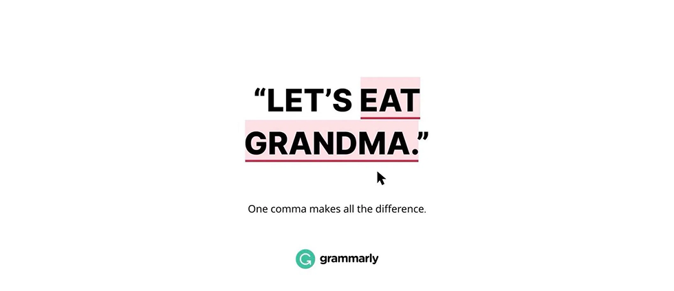
Through visual tricks like negative space, optical illusions, or layered meanings, designers embed hidden messages within the letterforms. It invites the viewer to look twice and rewards them with a satisfying “aha” moment when the hidden element is revealed.
People are thrilled to solve puzzles. It’s good when an ad makes consumers feel intelligent. "Figuring something out" generates a deeper brand connection and makes people recall it.
The ‘clever-hidden message’ technique is a smart tactic to increase engagement in ad-saturated spaces. It reflects a broader trend in typography-led advertising, where text becomes the visual centerpiece, acting as both design and message. The typographic style grabs attention, while the satirical punchline rewards closer reading.
The technique turns flat words into sculptural forms that leap off the page or screen. With 3D and textured lettering, type gains depth, dimension, and a physical presence. Shadows, highlights, and surface details like wood grain, metal, or fabric textures make the letters feel tangible.

The word "Ahhh" was shown in a bubbly, liquid, and effervescent 3D form that often poured out of a bottle, in the well-known "Ahhh" campaign for Coca-Cola. The font is visually showcasing what it is like to use the product. The design of the bottle triggers desire by making you want to drink it: the bubbles in the lettering help you feel the fizz of the drink.
2025 ad typography emphasizes bold, expressive, and highly tailored type trends. Emerging typography font styles and their best-fit applications will help you set a powerful brand voice and make your message land with impact.
Here are the hyping trends setting the tone for modern advertising:
Bold Serifs are trending across digital niches that value authority, elegance, and impact from fashion and DTC e-commerce to editorial platforms, luxury goods, and professional services like finance and law.
Here’s how a clean, modern Sans Serif font emphasizes clarity and professionalism.
Variable fonts offer unmatched flexibility, responsiveness, and performance. Unlike traditional fonts, a single variable font file can include multiple weights, widths, and styles, all adjustable in real time. This makes them ideal for responsive web design, interactive ads, and mobile apps.
Beyond aesthetics, variable fonts improve load times and allow for dynamic animations or transitions, helping brands create more engaging, adaptive, and modern experiences across digital touchpoints.
Variable fonts are trending in the digital-first niches where flexibility and interactivity matter most. They are widely used in interactive web ads, responsive websites, and app interfaces, allowing brands to adapt typography fluidly across devices and screen sizes.
As brands tap into nostalgia to create emotional connections, retro styling is making a powerful comeback in digital typography advertising.
Inspired by typefaces from the ’70s, ’80s, and ’90s, bold serifs, groovy curves, pixel fonts, and neon gradients, the booming trend blends vintage aesthetics with modern digital execution. Retro typography adds personality, cultural references, and a sense of fun in the digital space.
The style inspired by brutalist web design and constructivist art is both rebellious and full of energy. It pushes the limits and provides a unique, chaotic, and still purposeful appearance.
It’s especially popular in lifestyle, fashion, and tech campaigns targeting Gen Z and Millennials, who respond to the playful, ironic, or sentimental feel of throwback visuals.
Maximalism is bringing bold energy to digital product launches. In typography, this means oversized headlines, clashing fonts, layered visuals, and rich textures all working together to create visual drama and excitement.
For digital products in tech, fashion, and creative niches, maximalist typography builds hype, conveys confidence, and helps brands stand out.
The style is thriving among brands that project energy, excitement, and bold personality. With layered typography, vibrant colors, and busy, high-impact layouts, the trend is especially popular for product launches and entertainment brands where the goal is to grab attention fast and convey a sense of fun, creativity, and urgency.
Handwritten lettering evokes the sense that someone took the time to write it out, making the message feel more intimate and approachable. Especially in product launches, lifestyle brands, or wellness apps, the hyping style breaks the digital wall and connects with audiences emotionally.
This is when every stroke feels intentional, adding character, storytelling, and a sense of genuine voice:

Handwritten lettering is becoming a go-to typography trend for brands that want to convey authenticity, warmth, and human touch in their digital advertising.
Authenticity will be the ultimate winner in the typography ad future when material is generated by artificial intelligence. The brands that will leverage handwritten and custom-made types will engage their targets with personality and uniqueness.
With animated, moving text, kinetic typography is dominating modern digital ads by turning words into dynamic visual experiences. Instead of static slogans, brands are using motion to bring type to life: text that bounces, warps, scrolls, or reacts to user behavior.
This not only grabs attention in scroll-heavy environments like social media and mobile apps but also adds rhythm, emotion, and narrative energy to messaging:
From bold launches to micro-interactions in product demos, kinetic typography helps digital brands stand out, guide user focus, and communicate personality through movement. It's no longer just what you say, it's how your words move that makes the impact.
Motion, 3D, and interaction are transforming digital typography from static design to immersive experiences:
These techniques create dynamic, memorable ads that not only inform but also entertain and engage audiences on a deeper level.
Interactive typography takes the concept even further by including letters that respond to the input of the user, allowing viewers to actively participate.
Sustainable typography is emerging as a thoughtful trend in digital advertising, aligning design with eco-conscious values. Brands use minimal ink fonts, clean lines, and efficient typefaces to reduce printing impact while visually reinforcing sustainability messaging.
In digital design context, this translates to faster loading times and reduced energy consumption, while in print, it leads to lower material usage and production costs.
For detailed exploration, here are our 25 great graphic design examples that inspire visual communication.
Designing ads for SaaS products is about communicating value in seconds. Your ad should stand out, build trust, and guide potential users toward action. That’s why effective SaaS ad design combines clear messaging, bold visuals, and user-centered principles.
What makes SaaS ads truly effective:
We’ll now walk you through real-world SaaS industry samples to help your ads:
Before kickstarting your next typography ad, here are the key takeaways:
Aesthetics is completely meaningless if it is illegible to people within one and a half seconds. As for top-of-funnel (TOFU) advertising, when you only have a fraction of a second to grab someone’s attention, make the message simple and easy to grasp at an instant:
For TodayMade’s GPI Systems case, we came up with an instantly capturing design solution. Given that aesthetics without clarity are worthless in top-of-funnel ads, we used a futuristic yet approachable style, aligned with 2025 SaaS typography trends of bold simplicity, strong contrast, and legibility.

Typography stands for tone and trust. Each font has its own identity. A script font that is lively and fanciful could be a good choice for a new ice cream store, but it would be completely inappropriate for a legal firm.
Make your brand voice consistent with your corporate marketing typeface by choosing a font that complements the brand's style, voice, and corporate values:
Creating design for Refera, TodayMade designers used clear, visually emphasized typographic elements relevant for the healthcare industry:

Design hierarchy guides the eye and prevents confusion.
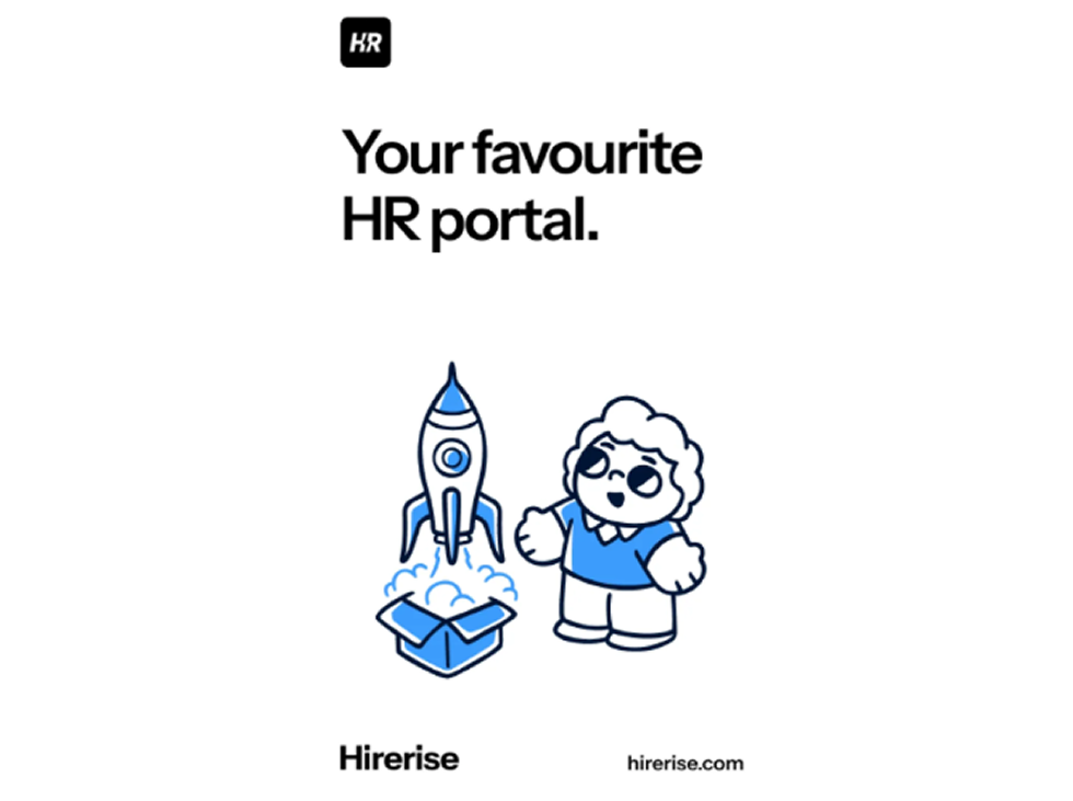
Hirerise typography design embraces clarity, bold simplicity, and accessibility, where text takes the lead role in communicating value and visuals play a supportive, illustrative role:
Contrast ensures enhanced readability and clear direction.
The whitespace concept, aka. negative space, allows your letters to have enough space to breathe and helps an eye to focus on the most critical point:
Don't over-style, tell a story. While it is OK to trespass design rules, do it with purpose. Beyond visual appeal, the most impactful typographic ads communicate the central idea:
For StakeSoft design, TodayMade designers followed 2025 typography trends in SaaS advertising for concise, high-contrast, authority-driven text that instantly communicates brand positioning.

While your ad may seem wonderful once printed on a billboard, it may look awful on a little mobile screen. What seems to be visually appealing on a billboard may not be relevant for an ad post in Instagram Story.
One of TodayMade’s featured projects LinkMagic embodies bold conversational messaging, gradient highlights for key terms, and minimalist layouts that scale seamlessly across devices:

Subtle brand reinforcement: The company logo and name at the bottom use consistent colors, tying the typography to the visual identity without overwhelming the headline.
Great design speaks to all. By using clear typefaces, thoughtful color choices, and inclusive practices, you ensure your message reaches every user.

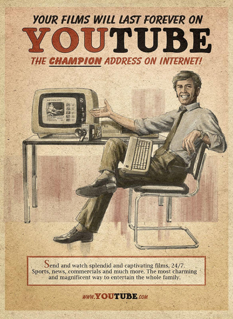
We are daily scrolling past the length of the ‘Statue of Liberty’ on Instagram, TikTok, and YouTube.
Because of visual overload, brands have seconds to capture our attention. And this is where typography concepts come into play.
Whether animated, illustrated, minimal, or maximalist, typography in advertising can stop the scroll, convey a message, and inspire a share.. This powerful tool evokes deep feelings, tells a story, and captures attention.
Typography makes a decisive impact on your final ad: the font displays the words and turns them into a lasting emotion.
Get smarter about illustrations cost. Discover how to budget like a pro and avoid hidden fees while still getting stunning visuals.


