Graphic design
13
min read
A great ebook in 2025 isn’t just well-written or well-designed; it’s the perfect blend of clear goals, engaging visuals, accessible formatting, and smart promotion. This guide walks you through every step, from structuring your content to choosing the right tools, so your ebook actually gets read and remembered. If you want no-fluff ebook best practices you can put to work right now, start here.
Ebooks are everywhere. Marketers love them, founders use them, and designers secretly judge them.
By the end of 2025, nearly 14% of the global population will be using e-books, yet most brands still distribute PDFs that look good but don’t convert.
The truth is, a great ebook isn’t just about sharp design or smart content. It’s about how those two work together. When they align, downloads rise, leads convert faster, and readers actually finish the book.
At TodayMade, we’ve seen it firsthand. This guide distills the ebook best practices, content, and accessibility in 2025 into practical steps that make your ebook worth the click. Let’s dive in.
Before you start picking fonts or hunting for stock photos, stop and think: Why are you making this ebook in the first place? Here is your starting point:
Every design decision depends on your goal. Not every ebook is a lead magnet. Some nurture current customers. Some build authority in a niche. Others break down complex topics so your audience trusts you more.
If you can’t answer the “what’s this for?” question in one sentence, you’re not ready to design.
Here are examples of your goals:
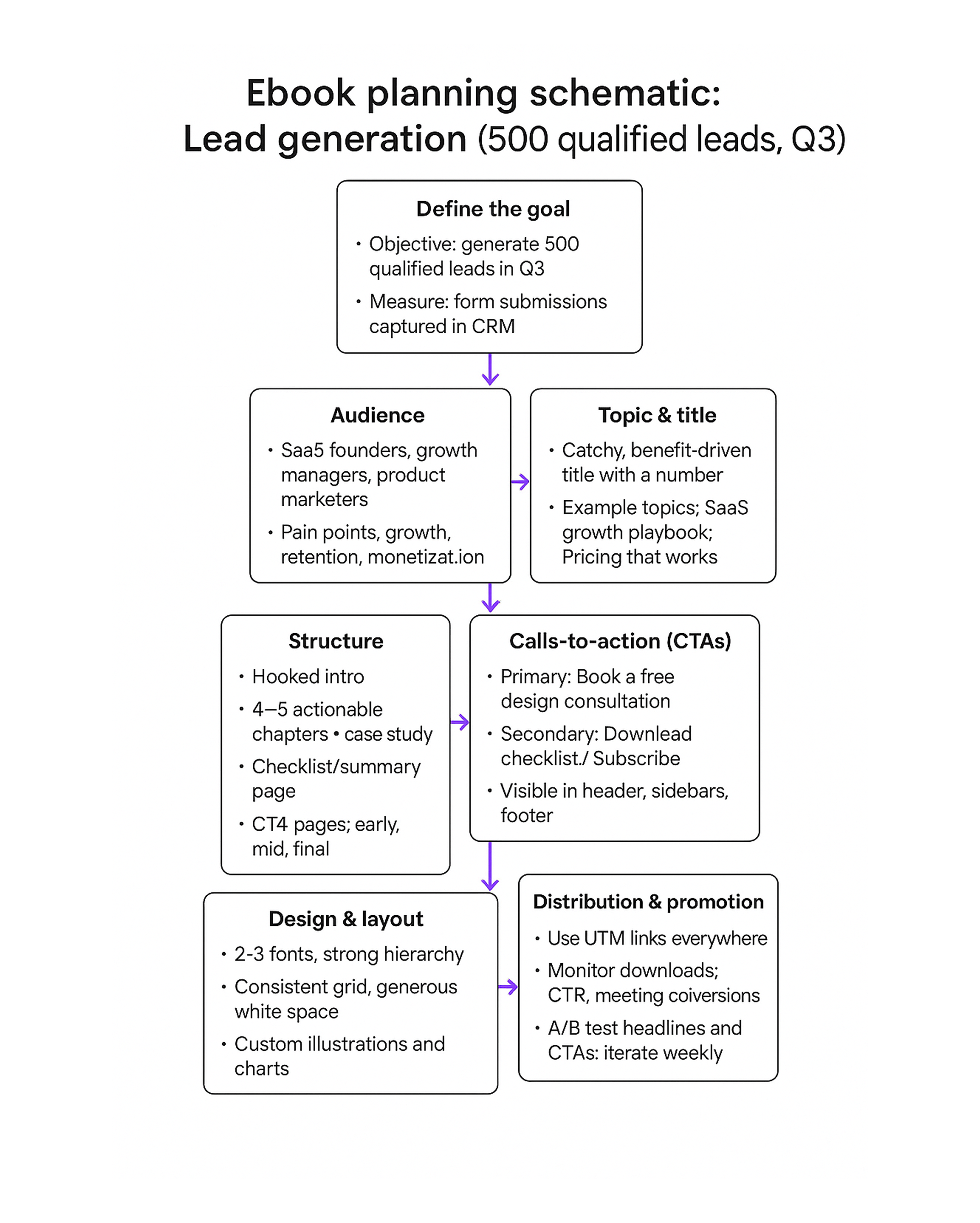
A simple schematic below shows how to plan an ebook with the goal of generating 500 qualified leads in Q3, from defining the audience to structuring content and CTAs.
Who are they really? A founder skimming on a MacBook between meetings? A marketer scrolling on a phone during a commute? Maybe a designer saving examples for inspiration? Understanding this context shapes everything from tone to layout.
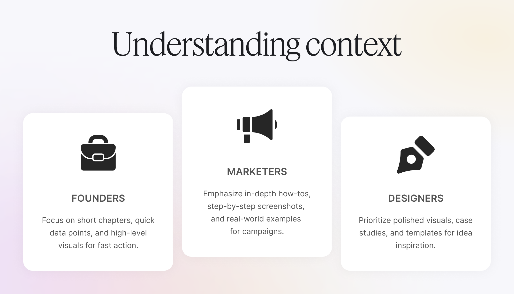
You’re not just designing for anyone. You’re designing for them.
If you’re targeting busy executives, a 120-page deep dive will collect more dust than downloads. If your readers crave detailed walkthroughs, five slides of vague bullet points will leave them frustrated. The key is striking a balance: offer enough insight to feel valuable, but package it in a format that’s easy to digest.
Think of it as designing with empathy, respecting your audience’s time, preferences, and goals. The more your ebook feels like it was written for them, the more likely it is to be read, remembered, and shared.

A messy ebook is a fast unsubscribe. Use:
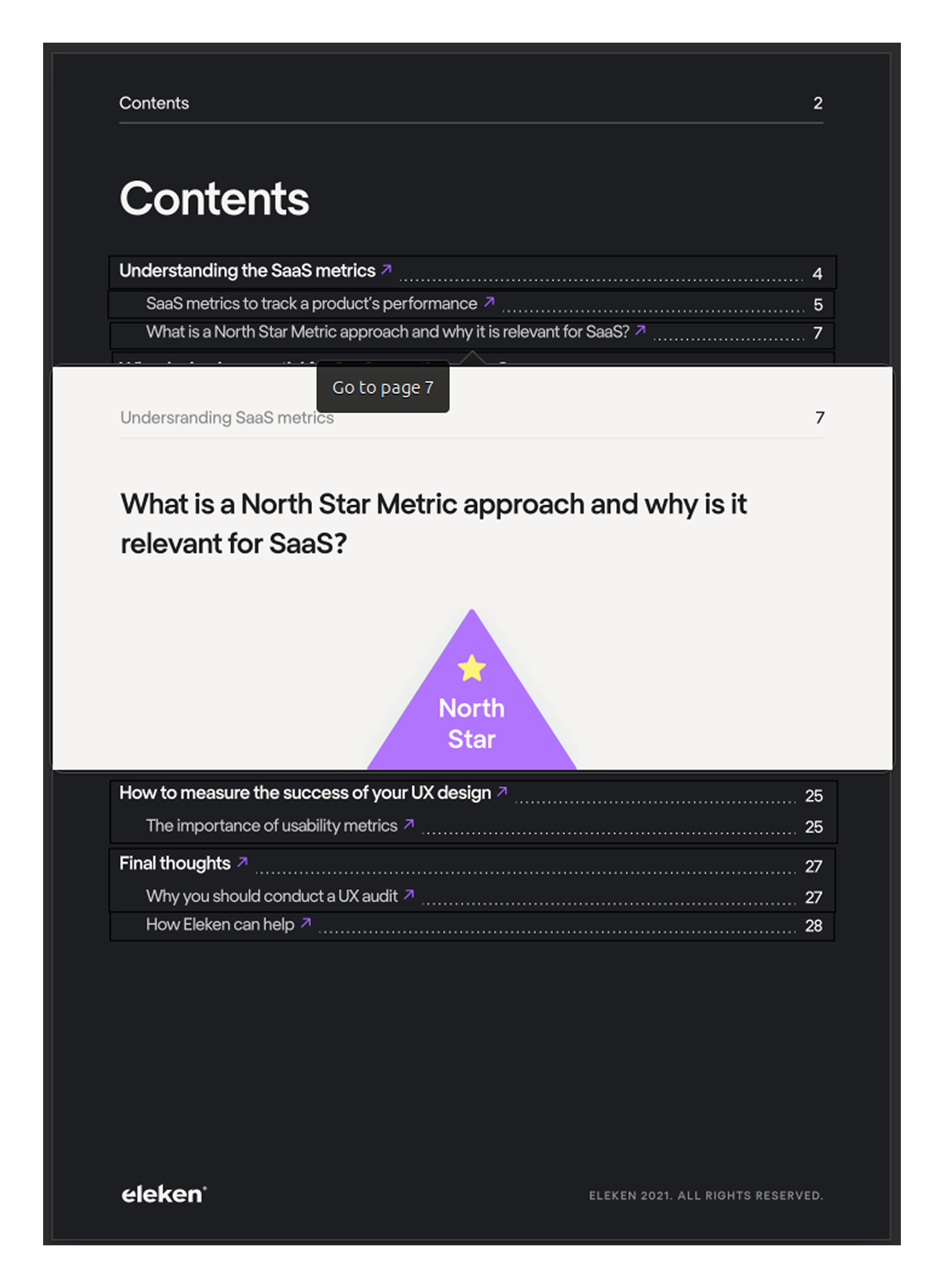
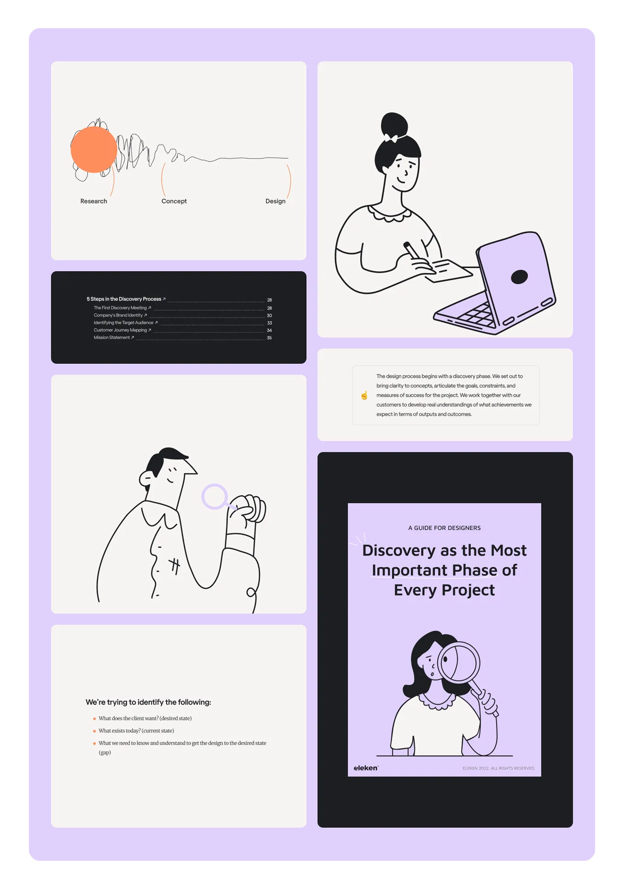
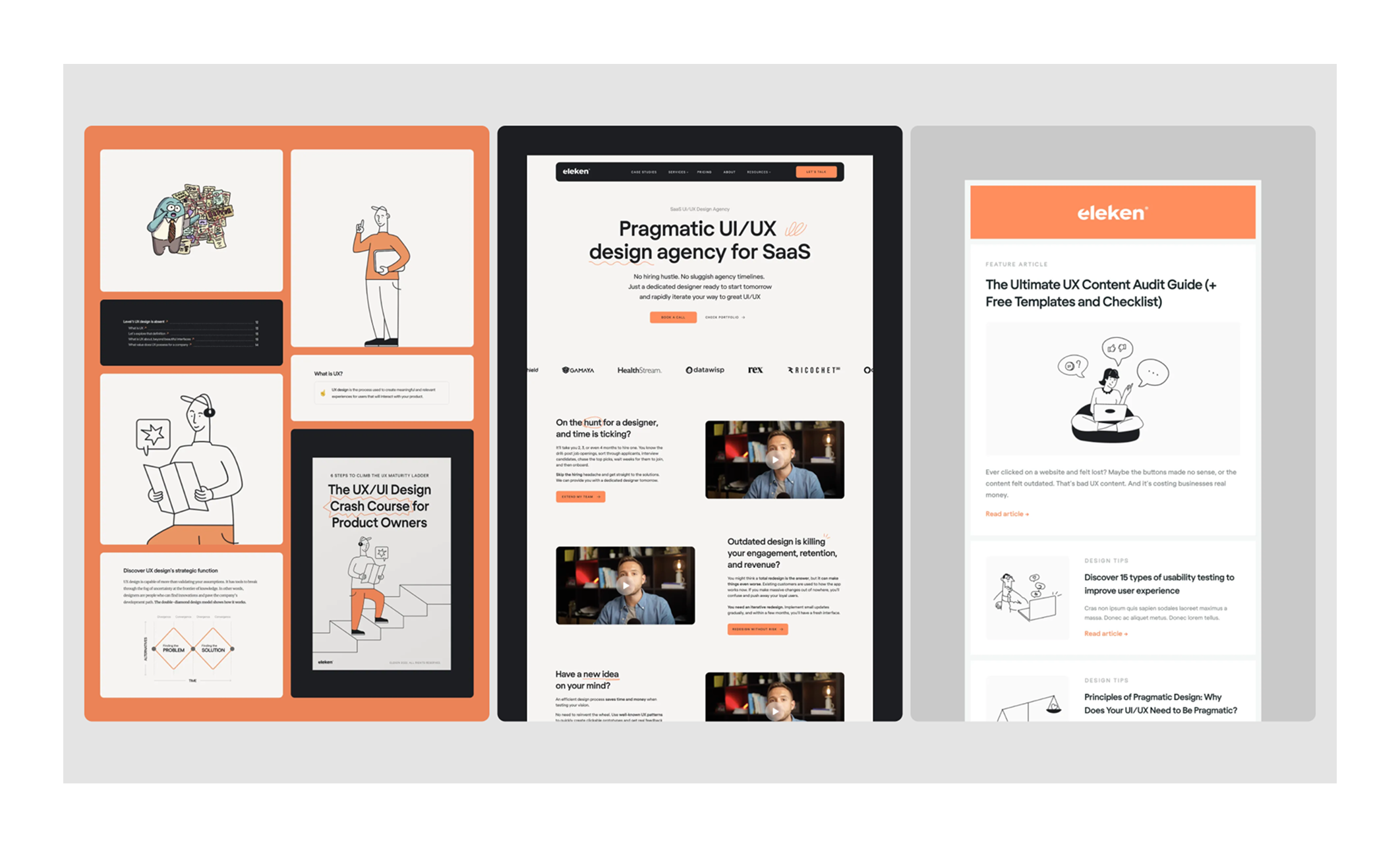
For example, when TodayMade designed ebooks for Eleken, we added a clickable table of contents. When you hover over a section, a short preview of that page appears, making navigation faster and more intuitive.
Pro ebook tips: Do all of this in a simple doc first. Fixing a clunky ebook structure is easy in the text version. Fixing it after you’ve designed 30 pages? Painful.
When you have a crystal-clear purpose, audience profile, and structure, design choices become more informed. Fonts, colors, layouts… They’ll all serve the content instead of competing with it. And that’s where the fun part starts.
Let’s talk about how to make your ebook look so good that people want to read it.
Good design is a delivery system for your message. The wrong font or cramped layout can make even the best content feel like homework. The right design can make complex ideas feel effortless.
Here’s how to write a successful ebook:
Good typography is what makes an ebook effortless to read. The right choices keep readers engaged, while the wrong ones make even the best content feel like a wall of text. It is good to:
In the Eleken ebooks, TodayMade designers used a single, clean typeface family with consistent spacing.
Readers loved the simplicity, downloads increased, and the ebooks were frequently shared on LinkedIn as a strong design example.

Color can guide attention and set the mood of your ebook, but overdo it, and it distracts more than it helps. The goal is clarity first, personality second. It is good to:
Strong layouts make an ebook easy to follow, even when the content is dense. Consistency is the rule here. Readers should never feel lost on the page, so:
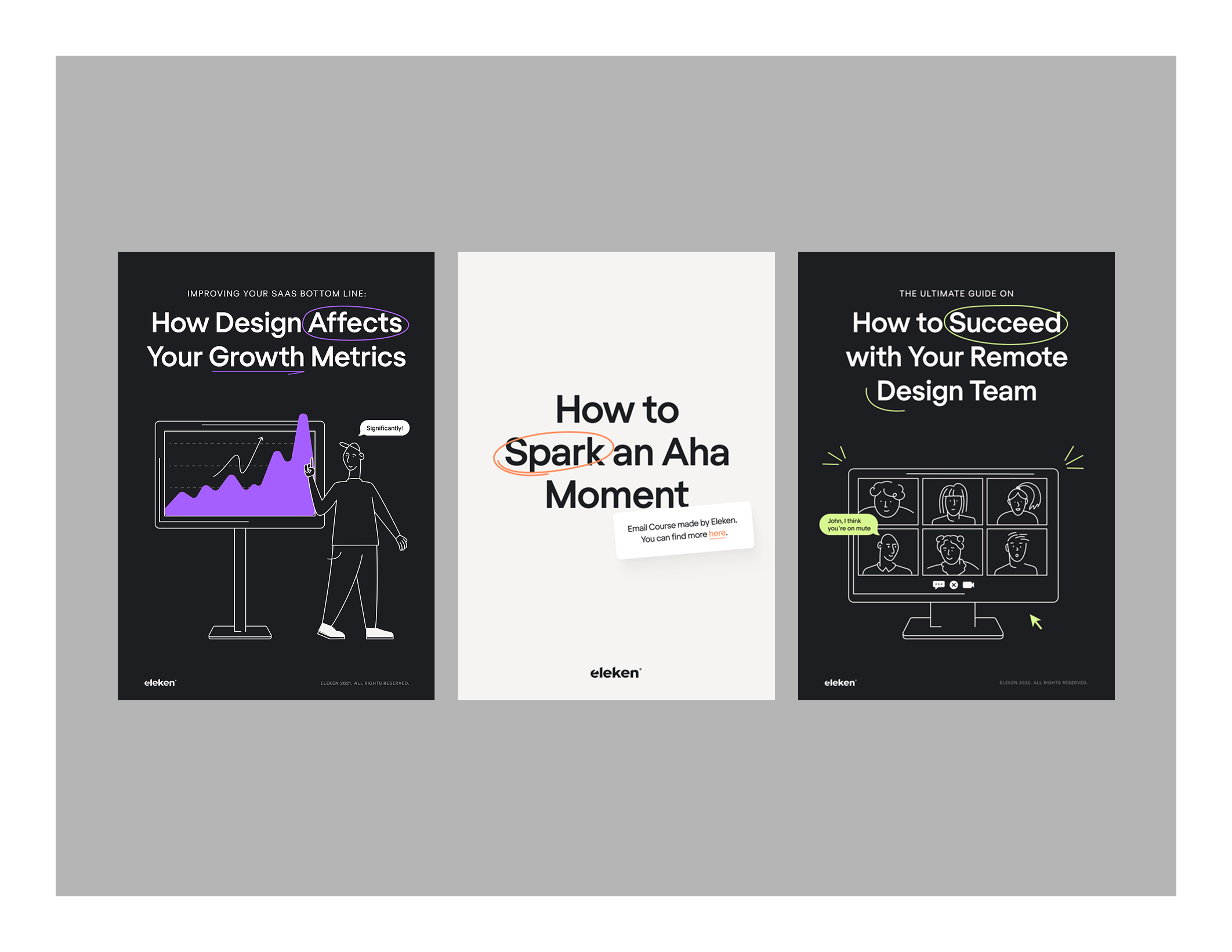
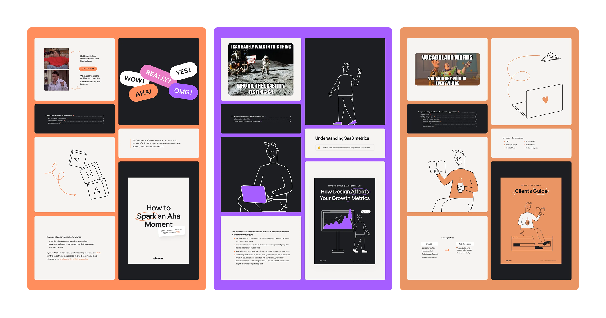
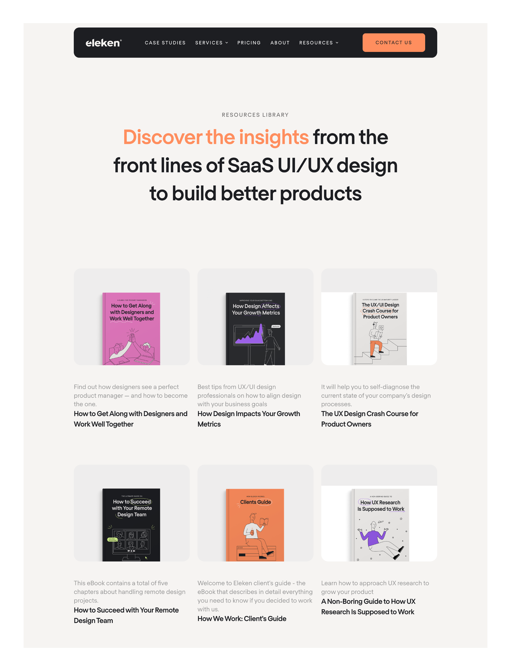
Let’s look at Eleken’s ebooks, such as 'How to Spark an Aha Moment' and 'How Design Affects Your Growth Metrics'. They show how consistent layouts make information flow smoothly.
Each spread balances text with illustrations or graphics, uses white space to avoid clutter, and highlights key points with callouts. The result: ebooks that feel structured, modern, and easy to skim, without overwhelming the reader.
Images and illustrations aren’t filler; they’re part of the message. They should clarify ideas and maintain a consistent visual tone throughout the ebook. Here are some extra tips:
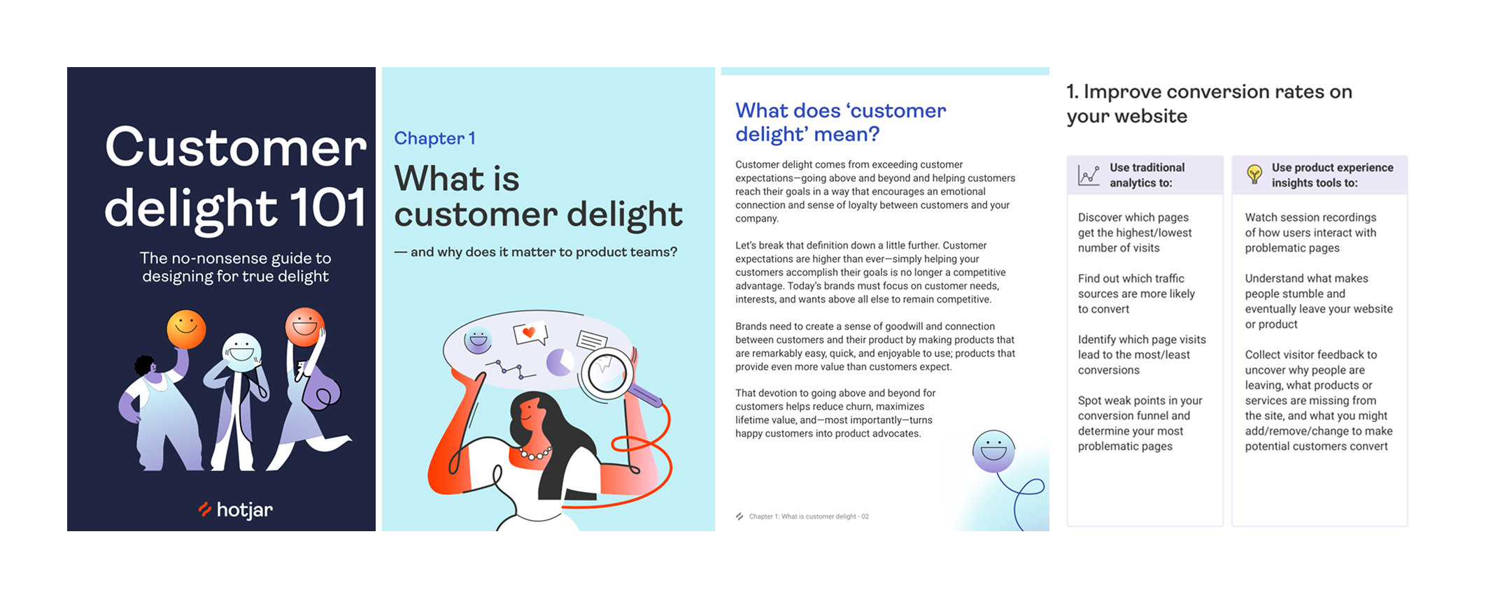
Take Hotjar’s ebook. It uses simple, consistent illustrations alongside charts and screenshots. The visuals highlight survey results, explain concepts, and break up text-heavy sections, making the ebook easier to digest and share.
Design is the part people notice first, but it shouldn’t live in its own bubble. It has to work in conjunction with the content so that readers follow your ebook from start to finish.
Next, we’ll examine how to blend content and design so that they complement each other, rather than competing for attention.
Inaccessible content turns away readers with disabilities, but it also frustrates anyone on a small screen, slow connection, or older device.
Here’s how to keep the welcome mat out for everyone:
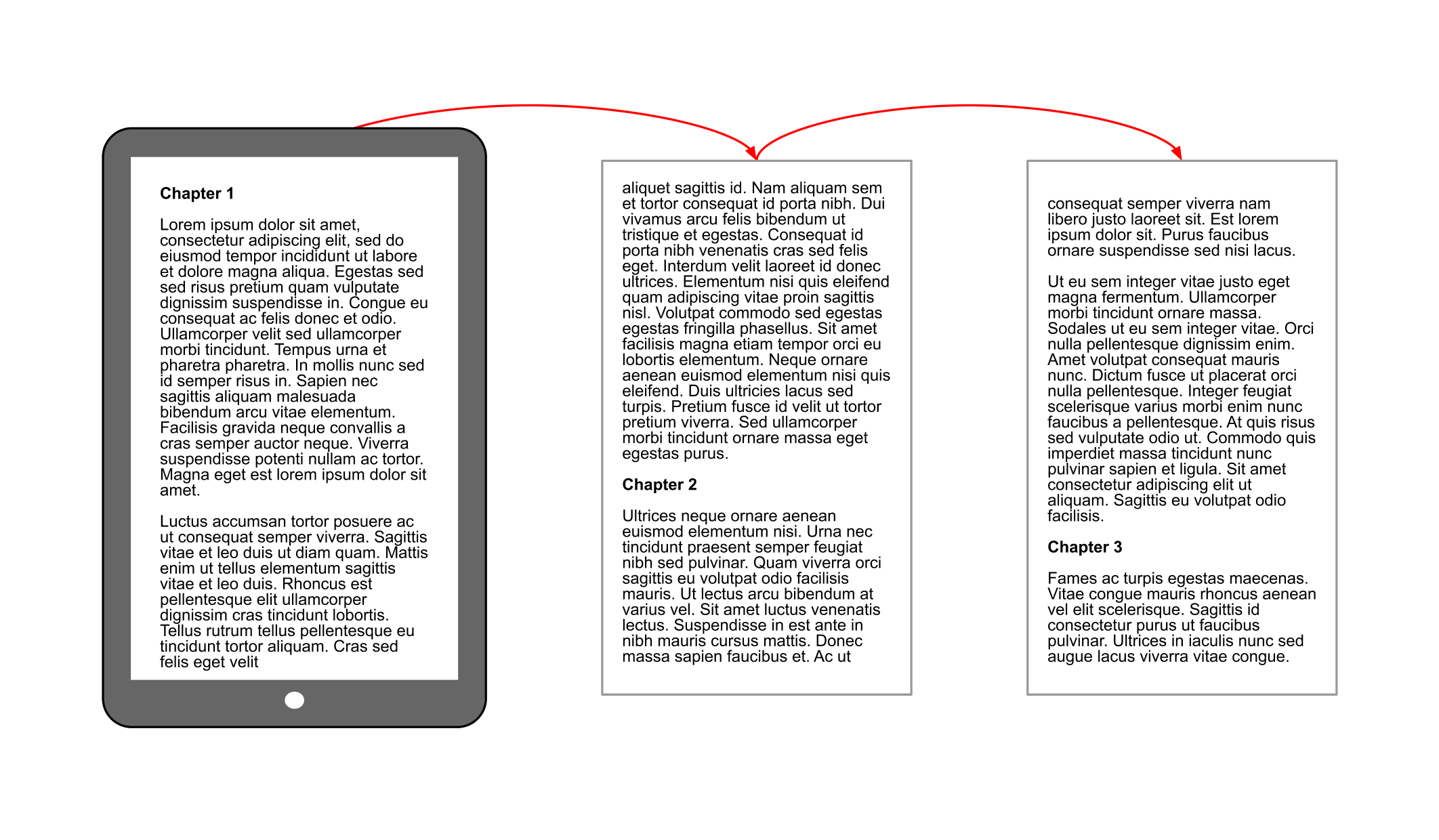
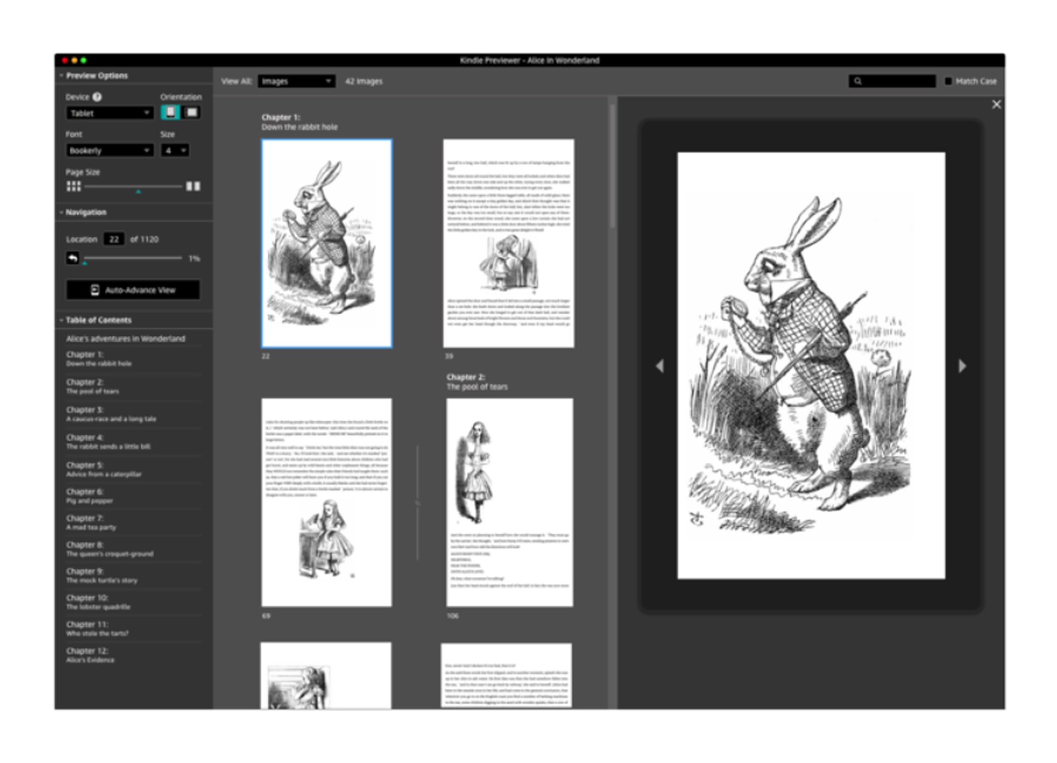
For a smooth reading experience, use EPUB3 for reflowable layouts that adjust to any screen size. Offer a PDF version as well, but keep in mind that PDFs can be harder to navigate on mobile. Whichever format you choose, ensure it's free of copy-paste restrictions and unnecessary DRM limits.
Focus on what’s essential to understand the content, not every design detail. Keep descriptions short: one or two clear sentences are enough.
Skip drop caps, stylized fonts, and justified text, as they hinder readability. Use flexible layouts that reflow easily on mobile screens.
When exporting from code-based tools, use semantic HTML for headings, lists, and tables. Tag the document’s language for assistive technologies, and write clear, descriptive link text, such as “Download the e-book,” instead of “Click here.”

Zoom text to 200% and make sure nothing breaks. Also, use the Tab key to navigate and confirm that all interactive elements can be reached.
Once your ebook is usable for everyone, the next step is choosing the format that delivers your content in the most effective way, without sacrificing the design and accessibility you’ve built in.
Your ebook file format decides how it will look, feel, and function on different devices. Choose wrong, and your beautiful design could turn into a scrolling nightmare. Choose right, and it’s smooth reading for everyone. Here is what to consider:
PDFs are ideal when you need pixel-perfect design control, making them great for short, visually rich content, like lead magnets or product guides.
As one Redditor put it, “If you need something to look exactly the same across every platform, you need to use an image-based ebook format such as a PDF. This is not what most people want, since PDF is hard to view on small screens. However, if you insist on a perfect look everywhere, PDFs or fixed-layout ebooks are your only option. It will limit your sales.”

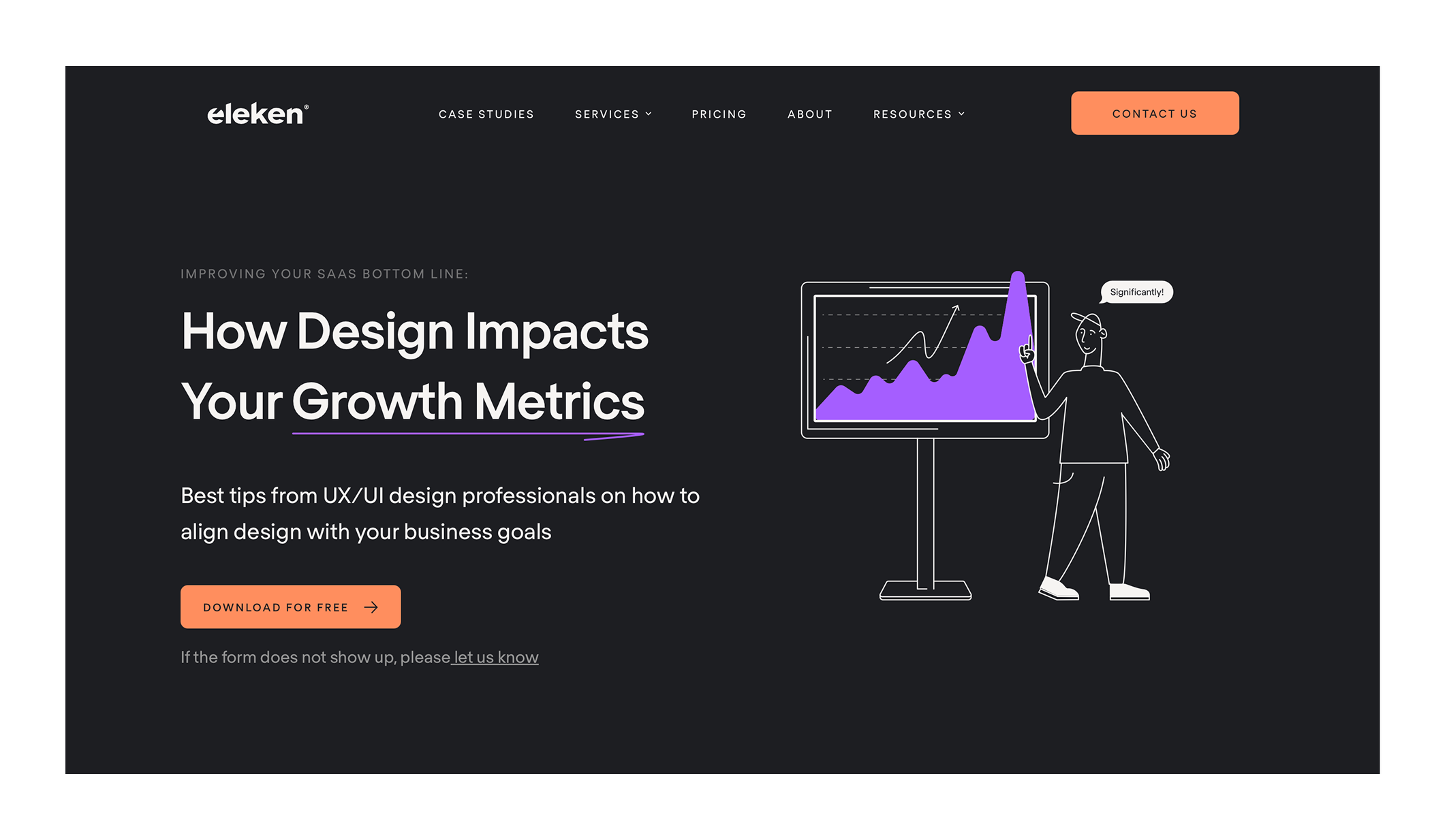
That said, PDFs often struggle on mobile unless designed with responsive layouts in mind. For example, our client Eleken chose PDF format to deliver a guide on aligning design with business goals, where visual clarity and layout precision were essential.
EPUB reflows to fit any screen size and works seamlessly with e-readers, apps, and accessibility tools. It’s ideal for longer content where readability and usability matter more than precise layout.
Interactive formats are perfect for embedding animations, videos, clickable maps, or branching paths. Great for education, engagement-focused, or marketing content, but they require more resources and are worth it only when interactivity delivers clear value.

Choosing a format is about where and how your audience will read. If most are on phones, EPUB wins. If you’re sending a visual-heavy report to investors, PDF makes sense. And if you want to wow with interaction? Go interactive, but budget accordingly.
Once you know the format, the next question is how you’ll actually create it. That’s where the right tools make all the difference.
Here’s a breakdown of paid and free business tools by stage so you’re not guessing where to start.

These tools streamline content creation, helping you write faster, clearer, and more collaboratively:

These tools help make the design smoother, speed up your workflow, keep visuals on-brand, and turn team feedback into real-time progress:

These tools help polish your content’s look and feel, ensuring it’s consistent, professional, and easy to read across formats:
The following tools ensure that your content is accessible to everyone, helping you identify barriers and create truly inclusive experiences:
These tools help you share content widely and efficiently, reaching the right audience through the right channels:
With the right stack, you can go from draft to polished, accessible ebook without pulling your hair out. Next comes getting that ebook in front of the right people and making sure it works on any device.
Once the ebook is ready, you need to get it in front of the right people and make sure it looks and works great everywhere they open it. Here is what you can do:
Keep your dedicated landing page clean and focused with a strong headline, a short pitch, and a clear call to action. Add a cover mockup and a few preview pages to build trust. If it’s a lead magnet, keep the sign-up form frictionless by asking only for essential information.
For example, TodayMade designed not just engaging ebooks for Eleken but also a branded landing page that’s simple, beautiful, and informative, making the resources easy to access and appealing to explore. Here is an ebook introduction example:
Add trackable links to see which content resonates most, and boost engagement by connecting readers to related blog posts, tools, or case studies. To keep momentum, include clear “next steps” at the end of each chapter, just as we did with Eleken’s ebook design.
Send a teaser and direct link to your email list, sharing bite-sized visuals or quotes on social media, and uploading to platforms like Kindle, Adobe Digital Editions, or Apple Books when relevant. You can also boost reach through co-promotion with influencers or industry blogs.
Never assume your beautifully designed PDF will behave as expected. Open it on:
Before publishing, verify that fonts display correctly, all links are clickable, and images load quickly without compromising quality.
Utilize PDF analytics tools, like Publitas, to track open rates and time spent on each page. Complement this with landing page tracking tools, like Google Analytics or Hotjar, to determine where visitors originate and how they interact with subsequent pages.
When your ebook is live and in circulation, the job’s not over. Every download is a chance to learn how to make the next one even better and keep this one working harder for you.
Publishing your ebook is the first lap. Once people start reading, you’ll get the data and insights you need to make it sharper, more relevant, and more effective.
This is the same principle that applies to writing a great blog, creating a killer FAQ page, or even improving your marketing strategy with better blogging; iteration is key. To achieve this, you should:
Ask new subscribers about their thoughts on the ebook in your welcome email. Additionally, consider adding a quick feedback form at the end of the ebook (Google Forms works well). Pay extra attention to comments from readers with accessibility needs. They’ll spot issues others miss.
As Danika Bloom suggests, you can boost the chances of getting reviews by clearly showing readers how important their feedback is to your launch’s success. The example below demonstrates how Danika invites reviews in her emails.

Track downloads over time. Are they steady, rising, or dropping off? Consider completion rates when using interactive or tracked formats. Check which links inside the ebook get clicks — that’s your reader’s “vote” on what’s most useful. These signals work like marketing KPIs, showing you what resonates most.
Refresh stats, screenshots, and examples every 6–12 months if your ebook covers evergreen topics. Revise sections that get skipped or cause drop-offs. If a chapter consistently drives engagement, consider expanding it into its own resource, such as an e-book, a webinar, or a blog post that explores content marketing history, scientific advertising, or marketing design principles.
Break key points into LinkedIn carousels or Instagram posts. Turn charts into standalone infographics. Use chapters as scripts for short videos or explore trending topics for social media to repackage insights for wider reach. Just see how TodayMade keeps design consistent and seamless across every format.
A great ebook is the harmony between design, content, and accessibility. When those three align, your ebook doesn’t just get downloaded, it gets read, remembered, and acted on.
We’ve covered everything from planning your goals and structure to designing for readability, making your content accessible, choosing the right format, using the right tools, promoting it effectively, and improving it over time.
If there’s one takeaway, it’s this: treat your ebook like a product, not a side project. Build it for the people who’ll actually use it. Test it. Refine it. Keep it alive.
And if you want your next ebook to look as good as it reads, without spending weeks wrestling with fonts and margins, well, that’s precisely what we do at TodayMade. Contact us, and we’ll design it for you.