Graphic design
21
min read
Looking for logo design inspiration that actually comes with strategy? This guide breaks down 60+ real-world logo examples by business goal and visual style — with expert tips on why each one works. Whether you're a startup founder, marketer, or logo designer, it’s packed with ideas and frameworks to help you craft a logo that looks great and performs.
Well-designed logos aren’t just decorative. They’re brand tools that build recognition, convey values, and help companies stand out. But for beginner designers or new business owners, it’s not always clear what separates a good-looking logo from one that actually works.
This guide brings you over 60 examples of good logos across industries and styles. More than just a collection of logo ideas, each example includes insights on why it works and how you can apply the same thinking to your own projects. You might also enjoy our graphic design examples for complementary creative ideas.
You’ll find logo examples grouped by:
Whether you’re a founder sketching out your first draft, or a graphic designer looking to build a system that scales, this article will help you move from logo design inspiration to execution, and get a logo that works as hard as your product.
Let’s begin by exploring the main types of logos used by brands today.
Not all logos follow the same formula. Some are text-based, others use symbols, and many combine both. Here are the seven essential types of logos, with real-world examples to help you spot the difference.

1. Wordmark
A logo that uses the brand name in stylized typography. Ideal for name recognition.
2. Lettermark
Initials-only, often used when a company name is long.
3. Pictorial Mark
An icon or symbol that visually represents the brand.
4. Abstract Mark
Shapes or forms that don’t depict real objects, but still evoke meaning.
5. Mascot
A character that represents the brand, adding personality and warmth.
6. Emblem
A text-inside-symbol design, often circular or badge-like. Common in education and heritage brands.
7. Combination Mark
A symbol and a wordmark used together. Often flexible enough to use either element on its own.
Now that you’re familiar with the main types of logos, let’s explore how these styles are applied in the real world. In the next section, we’ll look at logo design examples curated by the goal they support, from startups that need instant credibility, to legacy brands evoking emotion or trust. Each example highlights how smart design choices can reinforce a brand’s purpose, values, and audience fit.
A logo isn't just a design choice. It's a business tool that can build trust, signal emotion, or reinforce brand legacy. The following examples show how different companies use modern logos to match their goals — from earning credibility on day one to creating emotional resonance or standing out in crowded markets.
When you’re a new business with zero brand equity, your logo needs to work harder. These companies used clean, readable, and structured logos to signal polish and authority, even before they had a product. For any logo designer, this is where logo ideas turn into trust-building tools.
Slack’s original logo was vibrant but cluttered. Its 2019 redesign introduced a cleaner, four-color icon with rounded shapes and consistent geometry. It’s friendly yet polished — a perfect fit for team communication.

Design tip: If your logo doesn't scale or work on dark backgrounds, it’s time for a rework.
Linear’s logo is sharp, minimal, and engineered for speed. The gradient streak hints at momentum, while the structured typeface conveys control and clarity, which is exactly what developers want.

Design tip: Align your visual tone with how your users work and think. A simple logo can suggest power and precision.
The bold, boxed “N” evokes both retro publishing and modern tools. It’s one of the few serif monograms in tech, which helps it stand out and feel established.
Design tip: Style your typography to reflect your audience’s mindset, not just trends.
Figma’s colorful, layered icon cleverly forms an “F” while representing collaboration. It’s flat, friendly, and instantly recognizable on any background.
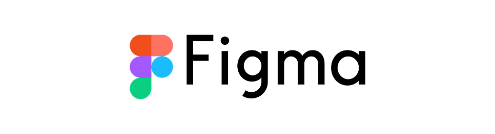
Design tip: Strong logos don’t just look good; they hint at what the product actually does. That’s how you move from concept to perfect logo design.
Intercom’s logo combines a speech bubble with a smiling face, reinforcing its mission: make customer communication feel human. It’s simple, memorable, and flexible.
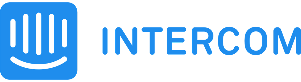
Design tip: Metaphors in logo design work best when they’re subtle and scalable. If you’re a logo designer, keep meaning embedded in the form.
Superhuman uses a stylized lightning “S” that feels sleek and fast, just like its product promise. The mark is abstract but confident, ideal for a premium tool.

Design tip: Use shape and angle to suggest speed or luxury without needing words.
Designed for an enterprise compliance startup, VertonEdge’s modular shield icon and clean logotype strike a balance between authority and approachability. It looks trustworthy before you even visit the website.

Design tip: When credibility is key, let structure, symmetry, and spacing do the talking.
Startups don’t have time to “grow into” their brands. A clean, readable, well-balanced logo helps you look serious from day one, even before your first customer signs up. These early-stage choices often inspire some of the best logo design examples we see today.
These logos connect through storytelling, personality, and color
Some of the most catchy and unforgettable logos don’t rely on trends. Instead, they tap into storytelling, personality, and color psychology to create deep connections. These examples of good logos show how emotional impact can drive brand loyalty across industries like food, travel, and lifestyle.
The Coca-Cola logo hasn’t changed much since the 1880s, and that’s part of its power. The flowing script feels nostalgic and joyful, instantly evoking refreshment and shared moments.
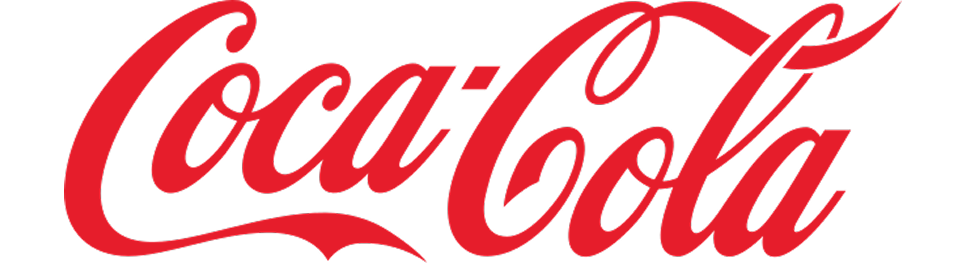
Design tip: If you’ve built emotional equity, don’t change your logo; evolve it gently and with intent.
Airbnb’s “Bélo” icon combines a heart, location pin, and human figure into one smooth shape. It symbolizes belonging, travel, and community, all in a friendly pink.
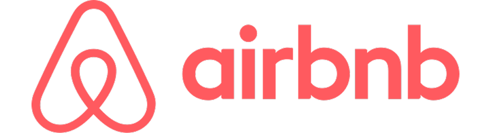
Design tip: Merge multiple brand ideas into one clean symbol to create deeper meaning.
Freddie the chimp gives Mailchimp its fun, offbeat personality. The hand-drawn style and bright yellow background help the brand feel approachable in a boring category.

Design tip: Don’t be afraid to show some character. Mascots can humanize a digital brand.
The Pringles logo features a mustached mascot that’s been simplified over time but always stays playful. It creates instant brand recognition on shelves and screams snackable fun.

Design tip: Consider how illustration and subtle tweaks to font or expression can increase recognition.
The green siren logo doesn’t scream “coffee,” but it tells a story. Rooted in Seattle’s maritime history, the mythical figure feels iconic, mysterious, and premium.

Design tip: Symbols don’t have to be literal, so choose imagery that aligns with your brand values.
With its chunky, hand-drawn type and cow illustrations, Ben & Jerry’s logo reinforces its activist roots and quirky voice. It feels homespun and ethical, just like the brand.
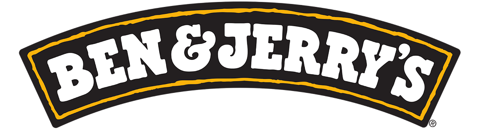
Design tip: Use imperfect lines, textures, or asymmetry to communicate authenticity and warmth.
The halo-topped smiley face on Innocent bottles is simple, cute, and easy to remember. It says “friendly,” “pure,” and “fun” all at once.

Design tip: If you want to achieve instant emotional recognition, keep your symbol minimal but expressive.
Logos that tap into emotion, nostalgia, and story can build deeper bonds. Focus on what your audience feels, not just what your product does, and you’ll be well on your way to creating award winning logos that last.
Where clarity, scalability, and trust matter most
In B2B SaaS, the logo isn’t just for marketing. It lives everywhere: dashboards, product UIs, onboarding flows, investor decks. These brands use minimalist forms and confident wordmarks to stay legible and credible at every touchpoint.
HubSpot’s logo combines a geometric “sprocket” with a rounded wordmark, reinforcing its platform’s role in automating and connecting marketing workflows.
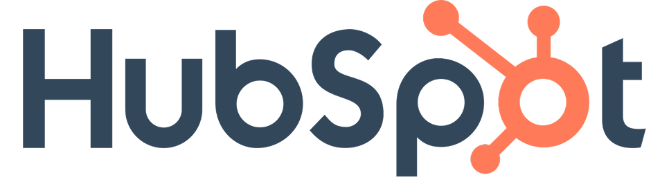
Design tip: Use simple mechanical metaphors (like gears or nodes) to suggest connectivity or systems thinking.
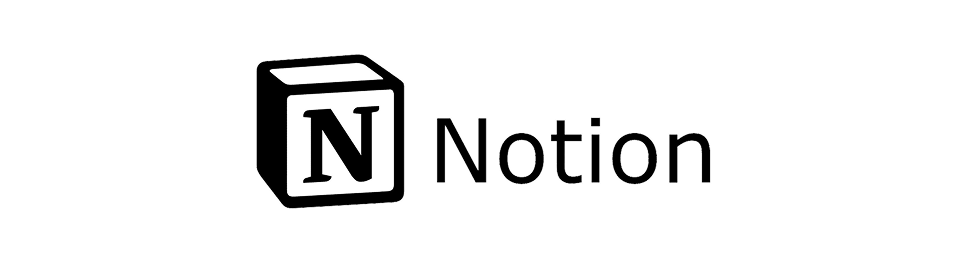
This colorful, shape-driven icon subtly forms the letter “M,” while also evoking workflow blocks or dashboards. It’s playful but structured, just like the product.
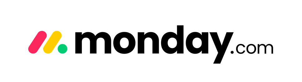
Design tip: If your UI is block-based or modular, consider echoing that shape language in your logo.
Segment’s logo, a trio of stacked arcs, suggests flow, data pipes, and movement. It’s abstract but purposeful, which aligns with its developer-centric audience.
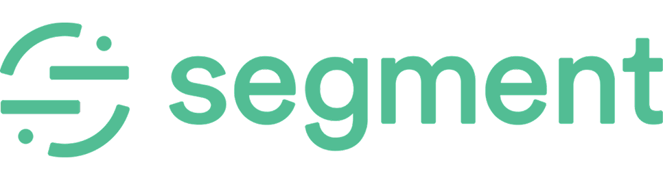
Design tip: Use curved lines or modular forms to signal data movement without overcomplicating the mark.
Asana’s three-dot symbol feels both minimal and collaborative. The soft gradients add warmth without sacrificing seriousness.
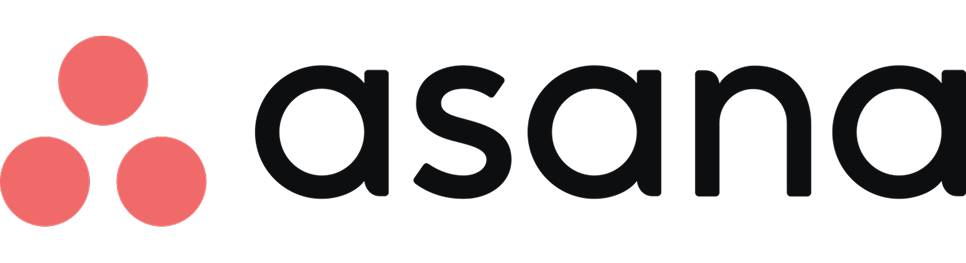
Design tip: Want to feel human without looking unserious? Round off your geometry and keep your palette warm.
Amplitude’s A icon forms a sine wave, nodding to the idea of signal, analytics, and behavioral data. It’s geometric, abstract, and deeply on-brand.

Design tip: You can use abstract marks if they visually tie back to your product’s core function.
B2B logos thrive on clarity, usability, and quiet confidence. Design for dashboards, not just hero banners. And always ask: does this scale down as well as it scales up? When done right, these logos become some of the best modern logos for tech-focused brands.
Blending nostalgia with modern precision
Some of the most powerful logos aren’t new — they’ve just been revived or reimagined. These brands lean into their roots to create timeless visuals that feel both familiar and fresh. Often, this blend of legacy and clarity results in good logo design that endures across generations.
Polaroid’s latest redesign brought back its classic rainbow stripe while introducing a geometric wordmark. It feels nostalgic yet modern, appealing to both vintage lovers and design minimalists.
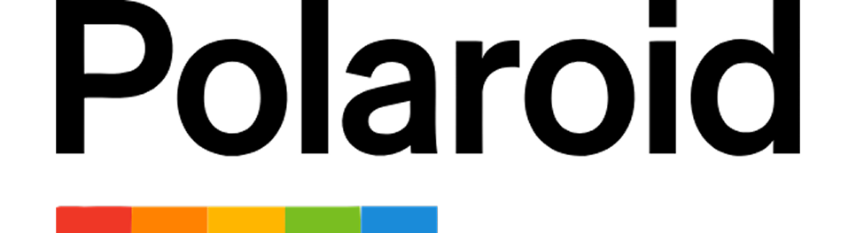
Design tip: Use bold, simple shapes to connect old memories to new audiences.
In 2021, Burger King dropped its glossy 3D logo and returned to a flat, 1970s-inspired mark. The redesign feels retro but confident, signaling a move toward authenticity and flavor nostalgia.
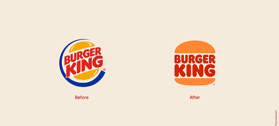
Design tip: A flat, retro revival can be powerful, as long as your core brand supports it.
The BBC updated its logo in 2021, and most people didn’t even notice. That’s the beauty of it. They moved from the old Gill Sans lettering to a custom typeface, BBC Reith, and refined spacing between the iconic black boxes. It’s a modern refresh that retains decades of brand equity.

Design tip: If your logo is already iconic, evolution > reinvention. Subtle tweaks can improve usability without sacrificing recognition.
Levi’s “batwing” emblem hasn’t changed much in decades, and that’s the point. The bold red badge paired with minimal typography speaks to heritage and simplicity.

Design tip: If your mark is iconic, resist change. Instead, reinforce it with consistency and context.
GE’s swirly monogram feels vintage, but its usage across web and product design proves its longevity. It balances industrial legacy with a touch of elegance.
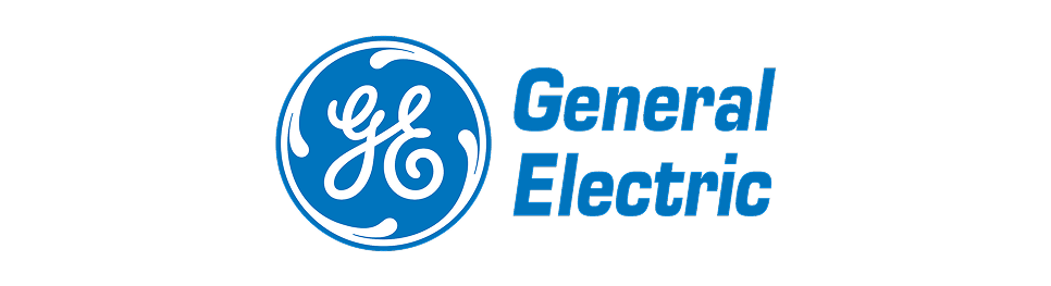
Design tip: Monograms can feel premium, especially when set in motion or paired with strong brand architecture.
Cadillac flattened its classic crest in 2022, removing chrome and gradients. The new version feels modern, but still honors the shape and pattern of its original.
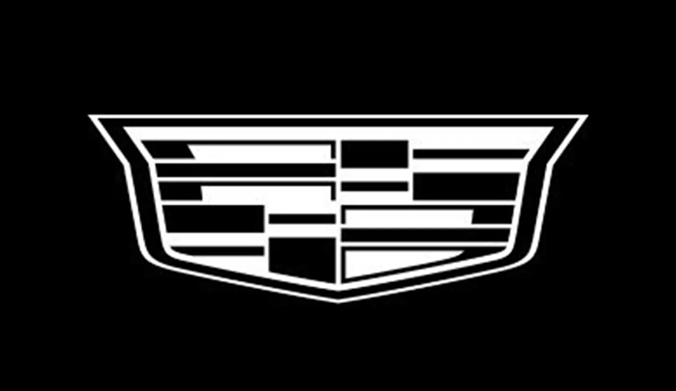
Design tip: To modernize a heritage logo, simplify the materials, not the structure.
Great logos don’t need to be reinvented, just refined. Honor your brand’s history by cleaning up what’s already working and making it versatile for digital use. These are examples of good logos that balance heritage with functionality.
Abstract, adaptive, and a little bit weird, but in a good way
Futuristic brands don’t follow traditional logo rules. Instead, they embrace abstraction, evoke motion, and often look like they belong in a sci-fi film. These logos feel cutting-edge because they challenge what a logo should look like, and that’s exactly the point. They often represent some of the most modern logo examples on the market.
The interlocking hexagon suggests complexity, collaboration, and infinite loops. It’s geometric yet organic, much like the AI systems it represents. The custom wordmark balances authority and friendliness.

Design tip: Use symmetry to communicate control, even when dealing with unpredictable tech.
Midjourney’s logo is a surreal sketch of a sailing ship with wings — part steampunk, part dream. It doesn’t look like a tech brand at all, and that’s why it works. It signals imagination over utility.

Design tip: If your brand is about creativity, lean into the unconventional. Let the logo spark curiosity.
Runway’s abstract “R” mark feels cinematic, like a motion blur or aperture. It’s subtle, dynamic, and fits perfectly within their AI + video editing space.
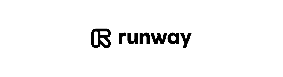
Design tip: For motion-first products, explore how your logo might feel animated, even when static.
Inflection uses a soft, swirling logomark that suggests conversation, intelligence, and continuity. It feels calm and human, a clear contrast to the usual hyper-tech aesthetic.
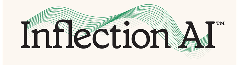
Design tip: Want your AI brand to feel less cold? Use organic curves and low-contrast palettes.
Character.ai uses a simple but playful wordmark with dots and minimalism that feel straight out of an indie comic. The brand leans into fun, community, and imagination, not just AI.

Design tip: In emerging categories, standing out visually is more important than fitting in.
Elon Musk’s brain-tech startup uses a sleek monoline “N” mark shaped like a neural pathway. It’s futuristic, clean, and a little unsettling — exactly the vibe you’d expect from brain-computer interfaces.
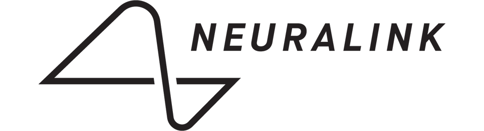
Design tip: Use visual metaphor carefully. Literal shapes (like circuits or neurons) can still feel sleek if executed minimally.
The future is abstract, and so are the logos. Let shape, movement, and metaphor carry your brand forward, especially when your product category is still evolving.
Not every great logo follows the same visual approach. Some rely on bold color, others on expressive detail, and some strip everything back to the essentials. In this section, logos are grouped by visual style to show how design choices shape perception, mood, and flexibility.
Doing more with less
Minimalist logos strip away everything unnecessary — no gradients, no shadows, no tricks. What’s left? Pure form. The best logo designs in this category feel confident, balanced, and made to live seamlessly across screens, packaging, and brand systems. These are some of the best logo designs that prove restraint is a creative asset.
The bitten apple is one of the most recognized logos on earth. It’s monochrome, perfectly balanced, and instantly identifiable even without the company name.
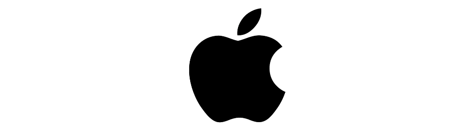
Design tip: A small, clever detail (like the bite) adds personality without sacrificing simplicity.
The luxury skincare brand uses nothing but an elegant serif wordmark — no icon, no color. It reflects trust, calm, and a sense of timelessness. Every inch of whitespace around it feels intentional.

Design tip: For premium brands, minimalism paired with restraint in layout can elevate perception instantly.
Framer’s F icon is geometric, flat, and razor-sharp. It’s composed of overlapping rectangles that imply movement and layers, fitting for a product built around interactive UI design.

Design tip: Minimal doesn’t mean boring. Use form to suggest motion or function.
Kin’s minimal logo is all about type and rhythm. A bold, wide sans-serif paired with subtle line work gives it presence without clutter. It plays perfectly with the brand’s calming, wellness-first aesthetic.

Design tip: Use contrast in line weight and spacing to create a logo that breathes, not shouts.
The interlocking S icon is sculptural and precise, suggesting design, symmetry, and modern craftsmanship — all key to its platform mission.

Design tip: Create a single mark that scales well, animates easily, and looks great in monochrome.
Minimalist logos succeed by mastering balance, whitespace, and reduction. They scale effortlessly, feel timeless, and leave space for the product or experience to shine.
When structure becomes story
Geometric logos are built from circles, squares, triangles, and grids, but they’re far from rigid. These designs use pure shape to create clarity, tension, or motion. The result is often modern, scalable, and surprisingly expressive.
Here are seven standout examples where geometry does the heavy lifting:
The red “worm” wordmark is pure typographic minimalism. No icon, no color variation, just a clean, bold sans-serif that still feels futuristic decades later. Recently revived for modern missions, it proves timeless design always lands.
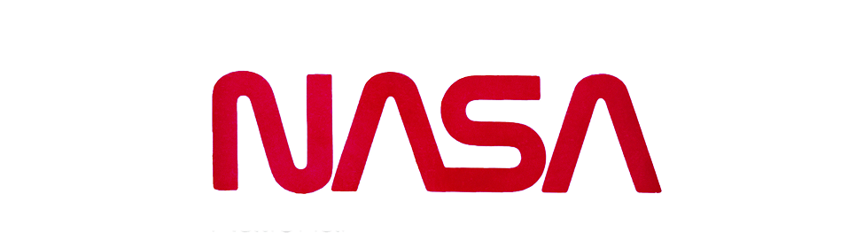
Design tip: A confident wordmark can become an icon, especially when backed by cultural relevance and consistency.
A triangle made of three folded shapes, each with its own color, forms the Drive icon. It implies storage, connectivity, and structure, all in one minimal symbol.

Design tip: Geometric forms become powerful when they combine metaphor with balance.
Zendesk’s logo is made from simple shapes: a tilted “Z” built from two triangle-derived forms. It feels friendly, approachable, and refreshingly un-tech.

Design tip: Use geometry to soften your brand — round corners or playful spacing go a long way.
This quirky handheld console brand uses a clean yellow square as its base with playful, modular typography. It’s a perfect fusion of form and fun.
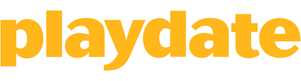
Design tip: Geometry doesn’t have to be sterile. Use color and type to inject warmth and personality.
Its newer logo features a set of symmetrical, tilted diamonds — a box opened up. It’s abstract yet familiar, and geometrically perfect for responsive design.

Design tip: Think in 2D and 3D simultaneously. The right angles can suggest depth without gradients.
This UK fintech’s “M” is formed by two overlapping chevrons in warm, trustworthy colors. It’s mathematically satisfying and emotionally balanced.

Design tip: Use symmetry to suggest reliability, and color to balance tone.
Beam’s visual identity uses a set of symmetrical dots and grid-inspired blocks that feel technical and clean. It’s minimalist, scalable, and fits right into futuristic SaaS design trends.

Design tip: Consider using repetition and spacing (like grid dots or modular blocks) to suggest tech without being literal.
Atlassian’s abstract “A” combines two folded planes to suggest collaboration and progress. It’s sharp, clean, and evokes the idea of rising or building — perfect for a tool used by teams and developers.
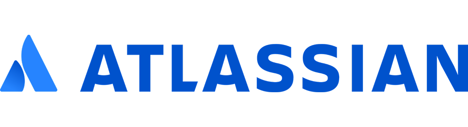
Design tip: Use geometric folds or angles to imply motion, growth, or layers without adding complexity.
Geometric logos are all about clarity, proportion, and modular thinking. When done right, they’re not just pretty — they’re functional, repeatable, and instantly memorable.
Design that breaks the grid, and sometimes breaks the rules
Organic logos use loose shapes, hand-crafted type, and exaggerated quirks to stand out. They’re ideal for brands built on emotion, rebellion, or play, and they often feel alive, like they were made by humans (not software).
Oatly’s rough, all-caps wordmark looks screen-printed or rubber-stamped. It feels anti-corporate, loud, and full of purpose — perfect for a brand that wants to disrupt dairy.
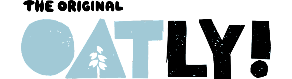
Design tip: If your brand is rebellious, make your logo feel like it came from the street, not the boardroom. And if your identity also uses custom artwork, keep in mind how illustrations cost might scale across touchpoints.
The heavy, off-balance typography was inspired by protest posters. It doesn’t “sit neatly,” and that’s the point. This is chocolate with a mission, not a smooth-talking luxury bar.
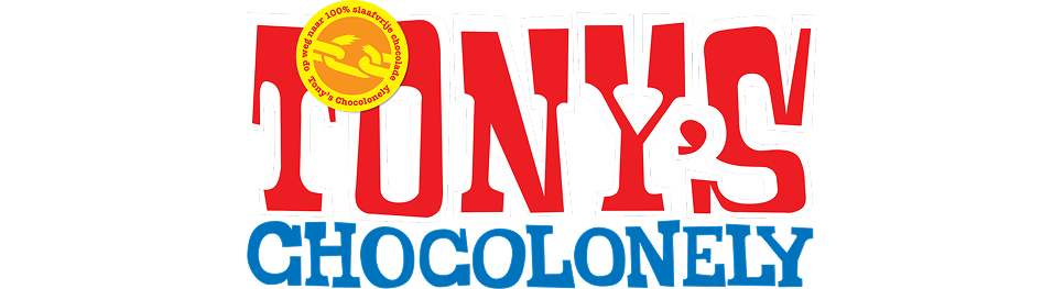
Design tip: When your message is loud, your logo can be too. Use bold spacing, irregular forms, and high contrast.
It’s water, but the logo looks like a death metal album. Gothic letterforms, sharp serifs, and a satirical brand voice turn hydration into rebellion.

Design tip: Subvert the category. If your product is mild, your branding doesn’t have to be.
Ugly embraces its name with a cartoon-like, slanted logotype. It’s wiggly, weird, and extremely recognizable, especially for Gen Z and streetwear-adjacent consumers.

Design tip: Humor and exaggeration can work, as long as the personality is clear and intentional.
This experimental fashion label uses a distorted, jagged, handwritten logotype that changes slightly in context. It feels like a drawing from a rebellious sketchbook — expressive, fluid, and anti-brand in all the right ways.
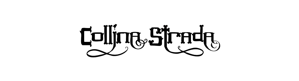
Design tip: If your brand is about fluid identity or creative chaos, don’t polish it — lean into the mess.
Brain Dead’s distorted, anarchic logotype and alien-head emblem feel like they came from an underground comic. It’s expressive, subcultural, and visually intense, and that’s the whole appeal.

Design tip: Expressiveness doesn’t need polish — just coherence. If your audience loves chaos, give them something to feel.
A now-discontinued sub-brand of Glossier, Glossier Play used a vibrant, liquid-style wordmark with swirly ligatures and a sense of motion. It was bold, loud, and wildly different from Glossier’s minimal main identity — a visual burst that said “fun lives here.”

Design tip: If you're launching a sub-brand or campaign, explore a more expressive logo style to signal a shift in tone. Playfulness can be a powerful branding tool, even temporarily.
These brands prove that expressive design is less about polish and more about presence. If your audience values vibe over vector precision, loosen up the grid and say something loud.
When the type is the logo
No icon? No problem. A well-crafted wordmark can be just as powerful as any symbol — sometimes more. These brands prove that typographic precision, tone-of-voice, and subtle custom tweaks can create logos that are distinct, timeless, and scalable across all mediums.
The wordmark is everything: tall, tight, and elegantly staggered. It feels premium without a single graphic element. Its vertical rhythm and tight kerning deliver unmistakable brand tone.

Design tip: Structure your wordmark like a layout — not just a name. Alignment, spacing, and line breaks all create tone.
At first glance, it’s just bold sans-serif text. But look closer and you’ll see the famous arrow hidden between the E and x — a perfect metaphor for speed and precision. It’s proof that detail can elevate the ordinary into genius.

Design tip: Use negative space to add meaning — a subtle tweak can become your logo’s defining feature.
Drama, tension, and elegance — all in three characters. The sliced “2” and “4,” plus ultra-tight kerning, make this film studio’s wordmark feel cinematic and sculptural.

Design tip: Use negative space and contrast to imply energy — not just legibility.
This wordmark literally points you in the right direction with arrow terminals in the “S” and “Y” reflecting the movement and transit roots behind the brand’s name. It's simple, bold, and full of momentum.

Design tip: Embed movement or metaphor into letterforms to turn your brand story into a visual cue.
The Tate wordmark uses a blurring, dot-fade effect to create a sense of motion and impermanence. Despite the distortion, it remains readable, capturing the energy of contemporary art without leaving the grid entirely.

Design tip: Let texture and abstraction live inside your type — clarity and creativity can coexist.
Zara’s logo breaks rules with overlapping serifs and claustrophobic spacing that screams high fashion. It’s visually dense, and that’s the point. You’ll see this echoed in recent typography trends across luxury and editorial brands.

Design tip: Legibility isn’t everything. In luxury, attitude and recognition often matter more than readability.
Wordmarks win when they feel intentional, not defaul, just like a bold job title can set the tone before you say a word. Custom type, clever spacing, and restraint can turn a name into a distinctive brand, no icon required.
Designed to change, not just scale
Modern brands don’t live in one place. They move across screens, adapt to themes, and show up in motion, dark mode, social, packaging, and more. Static logos can feel rigid. That’s where dynamic logo systems come in.
These logos are designed to shift in shape, color, or layout without losing recognition. See them in action on real brands in these landing page examples. Think of them as visual ecosystems, not just marks.
Google’s logo is just a wordmark, but the dynamic system of dots and G icons around it allows it to morph into loaders, animations, and voice assistants without breaking recognition. It’s modular, scalable, and optimized for interaction.
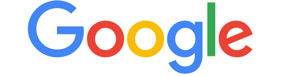
Design tip: Build a design language around your logo — motion, sound, and system cues matter just as much as the logo itself.
Designed by Neville Brody, the “4” logo breaks into animated blocks, recombining into different shapes and sequences. It reflects creativity, variety, and British weirdness across all screen formats.

Why it works: A modular logo system that feels like motion branding at its best.
MIT Media Lab’s modular logo system generates unique marks for each department using overlapping shapes and algorithmic rules. It's a brand identity made of logic — every mark is different, but the DNA is the same.
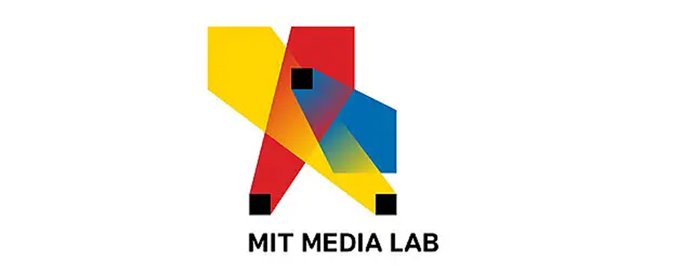
Design tip: For large or diverse organizations, create structure that invites variation. A generative system lets each sub-brand shine while reinforcing the whole.
The “M” is a sharp, angular symbol that shifts colors, fills, and textures based on where it’s used from digital to print to signage. It feels like a living symbol, not a frozen logo.
Design tip: Responsive identity doesn’t need to be flashy. Shape consistency + fill variation = versatile branding.
Her typographic logo adapts colors, line height, and grid positioning based on where it appears. It feels more like an editorial design system than a static logo.
Why it works: An example of personal branding built like a dynamic magazine cover — flexible, rich, smart.
A dynamic logo system doesn’t abandon consistency — it builds consistency through variation. When motion, environment, or context is part of your product, your brand identity should move with it.
This logo changes with the weather. Literally. It pulls live data to shift direction and color based on wind and temperature in Norway’s Arctic. Built to feel alive — like the place it represents.

Design tip: Real-time inputs (like weather or location) can turn static logos into living experiences.
The best dynamic logos don’t just scale — they respond. Whether driven by motion, data, or context, flexible identity systems let brands live in the real world, not just the brand book.
Whether you're creating a brand from scratch or evolving an existing one, pair your logo with a website design that reinforces your brand’s purpose. What audience were they trying to reach? What emotion do they trigger? What platform are they optimized for?
When in doubt, test your own logo in the same conditions — small sizes, grayscale, on dark mode. The best logos aren’t just beautiful. They work, and they can influence everything from recognition to marketing KPIs.
Inspiration is just the beginning. The best logos don’t just look good in a Figma frame — they scale across platforms, speak to the right audience, and support the brand's bigger message.
Before launching yours, ask:
✅ Does it scale to 16px?
✅ Is it legible in black and white?
✅ Does it reflect your product’s tone and audience?
✅ Will it hold up in dark mode, print, UI, and social?
If you’re not sure, that’s okay. Most logos take iteration and testing to truly click.
At TodayMade, we help brands move from early sketches to fully integrated identity systems. Whether you're refining a wordmark or building a flexible visual ecosystem, we focus on one thing: making sure your logo performs wherever it goes.
Our framework — Goal → Constraint → Concept → Result — helps ensure every decision supports a larger brand purpose. From sketching in black and white to testing responsiveness across dark mode, UI, and print, we design with both flexibility and consistency in mind.
In the end, a well-designed logo isn’t just visually strong. It becomes a tool for growth, recognition, and clarity, built to evolve with your brand, not hold it back.
Want to refine your current logo or start from scratch? Get in touch with TodayMade — we’ll help you turn an idea into a system that’s built to scale.