Graphic design
14
min read
Styles change. Scroll moves fast. But good design makes people stop. This guide breaks down 10+ modern graphic design styles and shows you when and how to use each effectively.
According to McKinsey, businesses that invest in design grow revenues nearly twice as fast as those that don’t. And what makes that design effective? Its style.
From year to year, graphic design shifts with unpredictable twists. But strong brands don’t panic. They know how to adapt, and they do it without losing who they are.
The thing is, you can do the same. All you need is a bit of theory and some inspiration, which you’ll find in this guide. So, sit back, scroll on, and let’s find modern graphic design styles that fit you (and your brand) best.
Researchers point out that design is embedded in cultural studies, anthropology, and even sociology: it’s “a mirror to society’s changing values and innovations”.
Take the example of the International Typographic Style (aka Swiss Style) of the 1930s‑50s. Designers sought clarity, order, and universality because that’s what global business and post-war optimism demanded. Fast forward to today, and we see echoes of that same clarity in minimalist fintech brands.
Technology is the second big engine of change. When tools, materials, or platforms evolve, design styles adapt (and sometimes are born).
Just like industrialization gave us Bauhaus, and mechanical printing opened the door for bold typography posters, today’s tools create their own visual language. Generative AI, AR filters, web3 aesthetics, and ultra-fast mobile UIs reshape how we think about styles of graphic design, though not everyone’s excited about it.
.webp)
.webp)

After all, different graphic design styles rarely appear out of nowhere. They almost always build on what came before. So even the most “modern” styles you’ll see in 2025 are often just reimagined through the lens of today’s culture and tools.
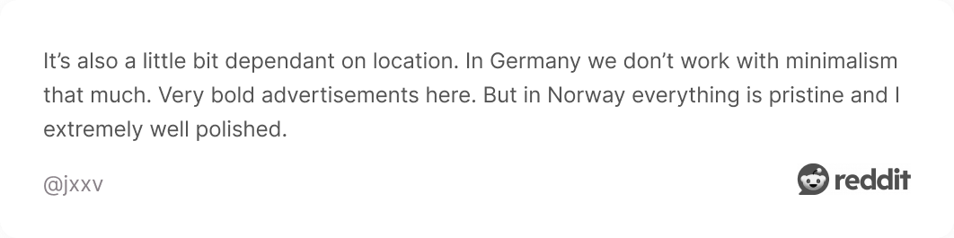
Design trends come and go faster than ever. One minute, your feed is full of candy-colored gradients and AI-glitched typography, while the next, everyone’s pretending they never touched it. As one Redditor nailed it:
.webp)
Still, ignoring trends isn’t an option either. As our lead designer, Dasha, says, “Keeping up with the trends is every designer’s responsibility. But style should be chosen based on the goal, not the hype.”
So, let’s find out what style might be good for you.
Minimalist design style is about stripping away the non-essential so that what remains is sharp, clear, and purposeful. Its roots trace back to mid‑20th‑century design movements like De Stijl, the Bauhaus school, and Japanese Zen.
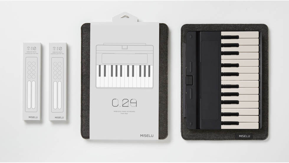
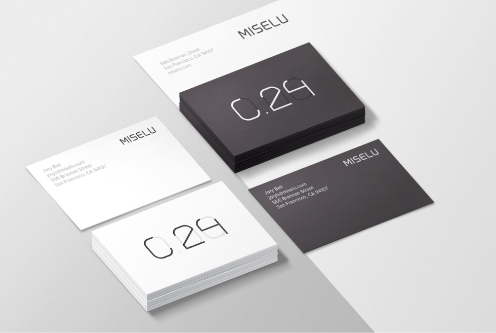
This design keeps your message uncluttered and your viewer’s attention exactly where you want it. Miselu brand, for example, greatly uses its minimalist identity across all digital and physical touchpoints, building trust and recognition.
Here’s a list of minimalism’s key characteristics:
Minimalist design is ideal when your brand wants to communicate clarity, trust, and premium quality. If your product or message is strong enough to stand on its own without distractions, minimalism might be the best way to let it shine.
Maximalism is the polar opposite of minimalism, which throws “less is more” out the window. This style revels in bold, saturated colors, rich textures, and an abundance of graphic elements. Put simply, it fills the space instead of leaving it empty.
Designers are rediscovering maximalism as a way to create expressive visuals that stand out in a crowded digital space. For inspiration, take a look at Paula Scher’s layered compositions, which have left a lasting mark on the design world.

To recognise or apply maximalist design, here’s a helpful checklist:
Use maximalism when your brand or project wants to be bold, expressive, and memorable. It works especially well when your product or story has multiple layers and you want the design elements to reflect that richness and complexity.
Art Deco emerged in the early decades of the 20th century, particularly after the 1925 Exposition Internationale des Arts Décoratifs et Industriels Modernes in Paris. It was an optimistic design movement that celebrated modernity and craftsmanship.
If your goal is to communicate elegance, heritage, or a sense of high-end drama, Art Deco might be a perfect fit. Just be careful — lean too hard into retro motifs without modernizing them, and your design can quickly slip into being outdated.
Key characteristics of Art Deco style include:
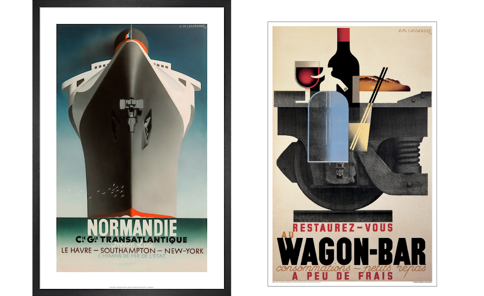
Among graphic design art styles, Art Deco stands out through visually striking geometry, streamlined forms, and bold ornamentation. Its most iconic contributor is A.M. Cassandre, whose poster designs still feel remarkably timeless today.
The Swiss Style emerged in the 1950s, primarily in Switzerland, as a design system built around readability and structure. In 2025, when digital experiences demand clarity across devices and screen sizes, its mindset is more relevant than ever.
At TodayMade, we leaned into this approach while designing for 8K Academy. We combined a clean Swiss layout with strong grids, crisp typography, punchy color accents, and bold highlights that echoed the look of neon markers.
You’ll usually recognize Swiss Style by these core principles:
Swiss Style is a great fit for editorial layouts, annual reports, or any system where information hierarchy is essential. It also works well in corporate branding and B2B interfaces, situations where clarity matters more than visual flair.
Psychedelic design style exploded in the mid‑1960s as the visual voice of counterculture. It’s bold, emotional, and expressive. For brands that want to be noticed rather than invisible, this design offers a route.
The key is to use it with intention, and American designer Peter Max knew exactly how. A quick scroll through his artworks and you’ll feel it instantly — distorted forms and kaleidoscopic colors merging into one mesmerizing visual experience.
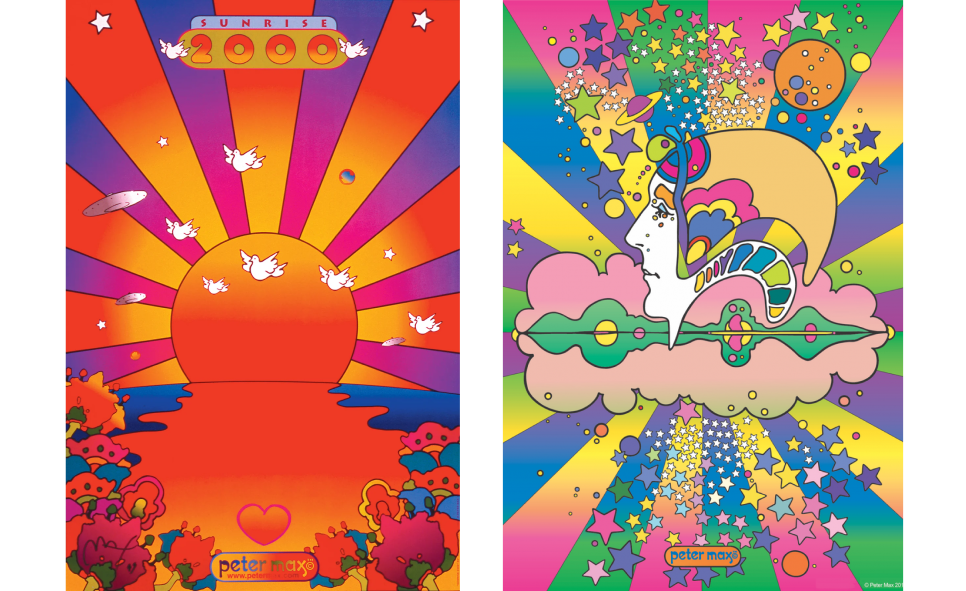
These are the signature traits of a well-executed psychedelic look:
This graphic design style is most suited for campaigns, posters, album artwork, events, or packaging where you have the space to lean into expression rather than require immediate clarity.
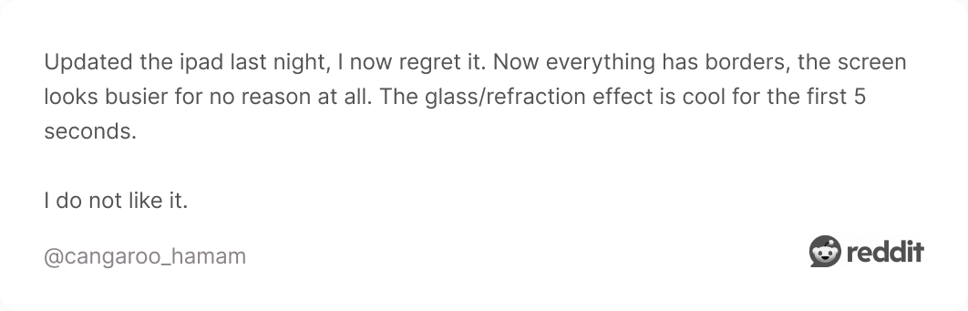
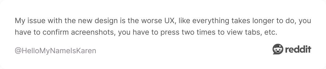
Glassmorphism is a modern visual style that gives interface elements the look of frosted or translucent glass. It’s a refreshing departure from completely flat design, adding depth, hierarchy, and a sense of sophistication to digital visuals.
Here’s a checklist you can use when identifying or applying this style:
Today, many major platforms have adopted glassmorphism in their interfaces, with Apple among the most prominent examples. In its latest iOS release, the company layered blur effects and translucent cards across various UI elements.

But not all users were happy with the result. Some criticized the changes for reducing readability and complained that the new design puts style before usability.
Flat design is a style rooted in minimalism and clarity. It uses two-dimensional (2D) elements, bright colors, and simple typography, while avoiding shadows, textures, gradients, or any effects that create depth.
In essence, flat design says: skip the embellishments, keep it clean, keep it functional. If you’re looking for inspiration, head over to Behance. There you’ll find plenty of designers whose work leans heavily on this modern approach.
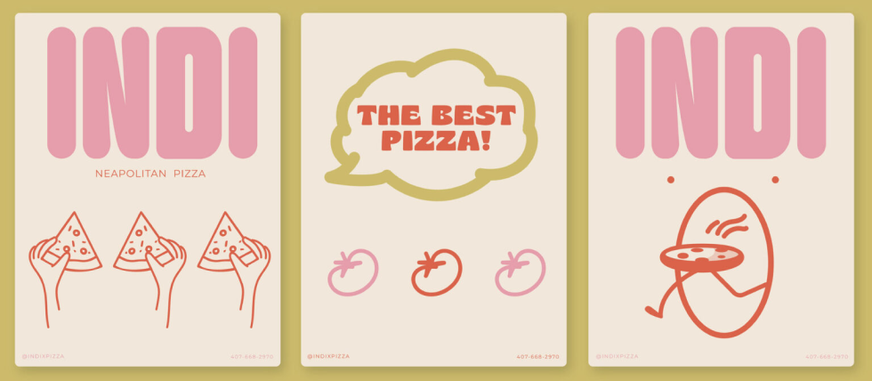
Core characteristics of flat design to look out for:
If you want your message to be immediately clear and your interface to load fast across devices, flat is still a smart choice. Just make sure your simplicity doesn’t come at the cost of personality.
The grunge style emerged in the late 1980s and found its voice in the 1990s, fueled by underground music scenes, rebellious culture, and a raw DIY ethos. One glance and you’ll get that it is a direct refusal to follow “perfect” design norms.
This gritty style shows up across posters, zines, album covers, and other print ephemera. One classic example is Ray Gun Magazine, with cover designs by David Carson that look chaotic, expressive, and impossible to ignore.
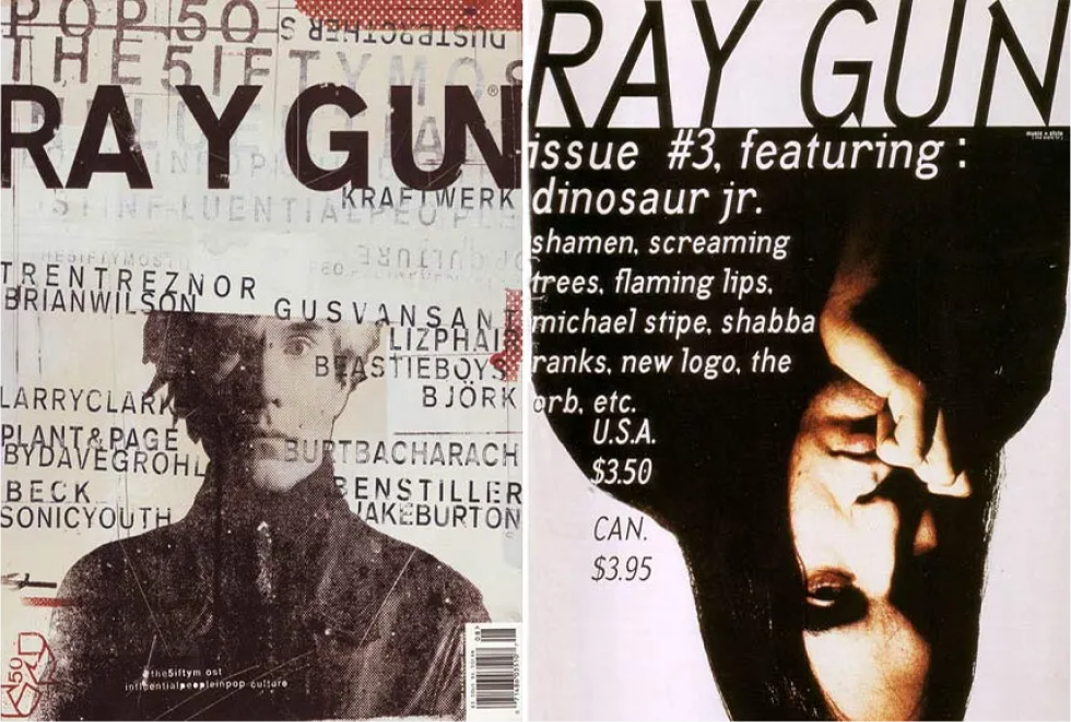
You’ll typically spot grunge design by these key traits:
Use grunge graphic design aesthetic when your project is meant to challenge convention — a visual rebellion against polished, corporate sameness. Done right, it reminds people why the rules existed in the first place.
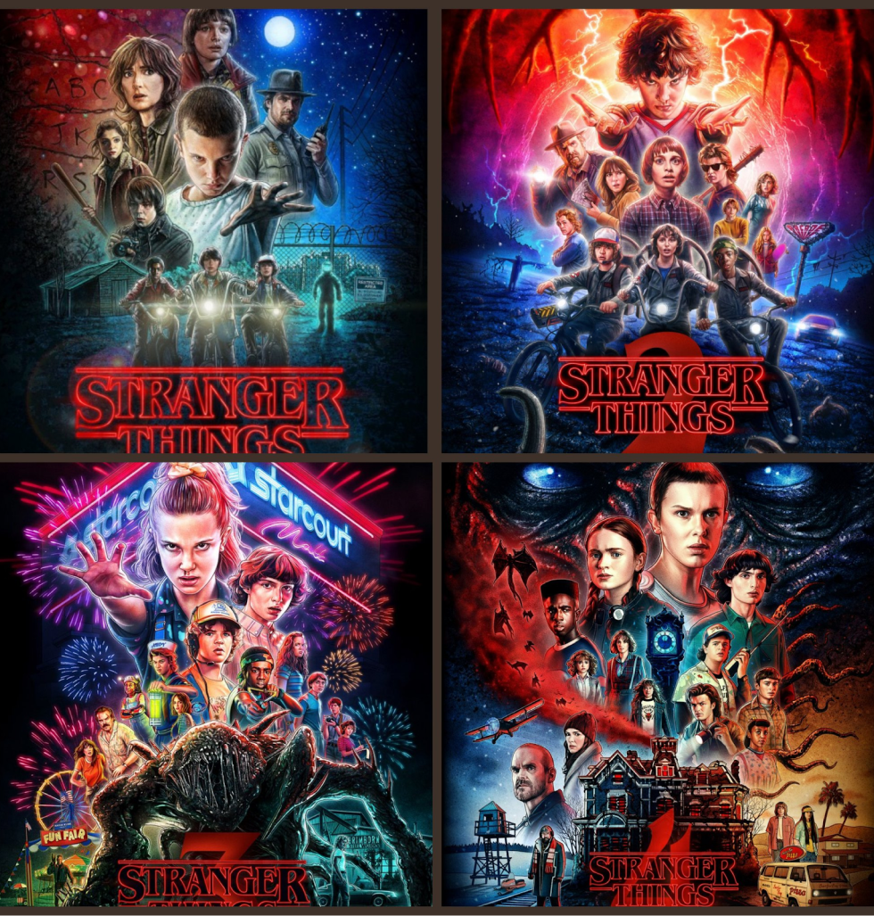
Retro style taps into the visual cues of the 1950s through the 1980s, reusing familiar elements to evoke nostalgia, personality, and cultural flair. Among all types of graphic designs, retro stands out for its emotional weight.
When working with retro design elements, keep legibility in mind. Some vintage font styles or textures might look great, but if overused, they can compromise usability. So, choose carefully and keep readability a priority.
Key elements that give retro design its nostalgic edge:
Designers and brands use this aesthetic to spark familiarity and bring a little warmth. One standout example is the Stranger Things series’ posters and promotional content, packed with carefully crafted retro vibes.
Three-dimensional design in graphic contexts uses realistic lighting, depth, shadows, and sculptural form to make visuals immersive. In recent years, it’s become a major contemporary graphic design style thanks to technological advancements.
As a result, many brands now lean into this approach to create visual impact. One common trend is combining 3D elements with real-world objects. This is something brands like L’Oréal and Maybelline do especially well in their promotional campaigns.

These are the visual cues that give 3D design its distinct depth and realism:
What’s interesting is that your entire brand identity doesn’t need to revolve around a 3D look. Most companies use it for a product launch, campaign, or packaging design, because it grabs attention and makes people wonder: is it real, or designed?
When browsing design threads on Reddit, we noticed two distinct types of designers.
On one side are creatives who’ve developed a strong signature style over the years and are hired for that style. On the other side are those who thrive on adaptability, shifting fluidly between styles depending on the client’s needs.

.webp)
Both approaches work, but your job is to figure out what feels closer to you and how to choose (or even blend) styles intentionally rather than accidentally.
Here’s how to make that call.
Step 1. Start with your brand’s emotional core.
First, go deep on your brand’s emotional core. You should analyze what you want people to feel when they encounter your design.
Once you’re clear on the emotion, bring your audience into the picture. A great way to do that is by conducting user interviews and observing what feels right to them visually. Often, what resonates most in design is tied more to emotion than logic.
Step 2. Map design styles to business outcomes.
Once you have inputs, map design styles to your business goals. Be intentional here, as not every style fits every purpose. Minimalism might communicate clarity, maximalism signals boldness, while retro taps into emotional connection.
As mentioned earlier, you don’t need to chase trends. The key is knowing which aesthetic supports the message you want to communicate right now and designing in that direction.
Step 3. Decide whether to stick, switch, or mix.
With outcomes and context in hand, decide whether to stick with your current style, switch it entirely, or create a smart blend of both. If your existing visual identity aligns with your brand and audience, there’s no need to change for the sake of change. But if it feels outdated or misaligned, a redesign could be in order.
That said, some of the best results come from thoughtful combinations, like pairing a minimalist layout with hand-drawn typography, or mixing retro color palettes with modern sans-serif fonts.
When you’re looking to sharpen your design skills or deepen your understanding of style, you need strong sources to rely on. To help with that, we’ve gathered a few trusted directions to keep your growth consistent and meaningful.
Start with books that challenge your thinking. For example, The Graphic Design Exercise Book by Jessica Glaser and Carolyn Knight offers 256 pages of creative briefs across branding, packaging, music graphics, and screen design.
Another classic worth reading is A Smile in the Mind: Witty Thinking in Graphic Design by Beryl McAlhone & David Stuart. It’s a graphic design book packed with visual style examples that show you how concept and style interlock.
.webp)
If you prefer structured learning, there are outstanding online options. Visit platforms like Coursera, Udemy, Domestika, or even Canva Design School, and explore courses that match your skill level and design goals.
Also, we advise you to look around when you’re outside. Payattention to posters, flyers, billboards, product packaging, and anything in your environment. Some of the best ideas come from spotting what already works in the wild.
.webp)
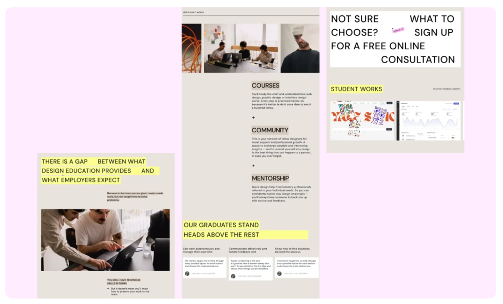
Beyond formal resources, regular practice is essential. The truth is, even 15–30 minutes of design drills each week dramatically improves fluency and decision‑making speed.
Here are three hands-on exercises worth trying:
If you open any other article about types of graphic design styles, you’ll probably see the same names over and over again. But there are also visual styles that fly just below the radar. These “quiet” categories don’t make headlines but still shape how designers experiment and create.
Who knows, maybe one of them will spark your next big inspiration.
Elemental folk draws its inspiration from regional craft traditions and folk art. With this graphic style, designers make visuals that feel warm, rooted, joyful, and human, while still keeping a modern structure and clarity.
By blending storytelling, local heritage, and craft sensibility with contemporary design principles, this style works well for lifestyle, food & beverage, hospitality, or any brand that wants to convey authenticity and emotional depth.

These are the design characteristics of elemental folk style:
While this style brings warmth, it can feel overly decorative or nostalgic if executed without constraint. Also, if your brand needs ultra clarity, minimalism, or tech‑forward expression, leaning too heavily into craft and ornament might dilute the message.
Digi‑Cute brings a playful, sweet, and sincere aesthetic to graphic design by combining elements like kawaii‑inspired characters, pixel‑art motifs, and toy‑like shapes with contemporary layouts, bright gradients, and clean typography.
This style taps into nostalgia but executes with modern clarity, helping brands connect emotionally. The trend aligns with broader moves in UX, and there’s even research that explores how “cute” elements can create positive emotional responses.

Here are key features that define this style:
Choose Digi‑Cute when your brand wants to feel friendly and digitally native. It works well for youth‑oriented products, gaming or tech accessories, children’s brands, or any project that wants to spark joy while staying visually fresh.
Candid Camera Roll turns a digitally perfect aesthetic on its head and replaces it with something real. Instead of slick, air‑brushed visuals, this style leans into the grainy, slightly off‑kilter look of everyday snapshots.
What makes this trend stand out is its sincerity. Brands using this style aren’t hiding behind facades, they’re inviting you in. All the details help the visuals feel grounded, personal, and just a touch rough around the edges.
Core traits that give this trend its raw and personal feel:
If your brand wants to feel authentic, Candid Camera Roll gives you that warm aesthetic. But one word of caution: this style works when it feels genuine. Forced “mistakes” or random filters won’t cut it.
Trends come and go, but style is a reflection of what you stand for and how you choose to show up in the world. There’s no single “right” answer, no universal definition of pretty or not, just choices. And now, it’s time to make yours.
Start where it feels honest. And if you ever need a creative partner who understands both the strategy and the soul of design, we’re always here to chat.