Graphic design
12
min read
The colors you choose matter more than you think. This guide helps you pick them with intent (not panic) and build palettes that amplify your brand. Read on to explore color generators, best practices, and real examples.
In fact, 16% of consumers say color is the first thing they notice about a brand. Once that impression is formed, it’s hard to undo.
Considering such an impact, it’s tempting to make your brand look as flashy or iconic as possible. And that’s exactly where many designers go wrong. Because every color palette sparks a specific feeling, the real challenge is choosing the right one.

At TodayMade, we’ve worked with brands across industries and stages, and we’ve seen how the right color in graphic design can elevate a brand’s voice. Or completely drown it out. In this article, we’ll cover all that (and go even further).
If color is the first thing people notice about a brand, what exactly are they noticing?
From a psychological perspective, when someone sees a color, neurons fire. It triggers a subconscious response, meaning people are already forming an impression of your brand before they even read a word. And certain hues are practically wired into our perception to evoke different feelings.
Blues, for example, are often tied to feelings of stability and calm. That’s why you’ll see them in tech and banking. Red, on the other hand, sparks urgency and power. While earthy greens tend to feel balanced, grounding.

Of course, feeling only goes so far if the mechanics fall flat.
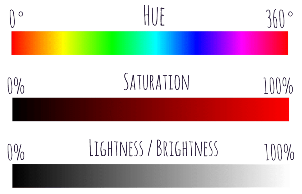
Even the most perfectly emotional color can turn into visual noise if it clashes with its surroundings. That’s where the structure comes in: hue, saturation, and value.
Together, these dimensions form the HSL model, a more intuitive, design-friendly alternative to RGB. And when you know how to use it, you can start building tints, tones, and shades that look good and feel cohesive.
Trends come and go. And in the middle of all that shift, your mission is to capture a color scheme graphic design that reflects your brand. To help you choose wisely, let’s take a look at the top color trends shaping branding today.
In 2025, the future is shimmering. The sharp, flat tones of years past are making space for hues that shift and glow. We are talking about iridescence, metallic sheens, and holographic gradients.
When AI, augmented reality, and digital interfaces dominate how people interact with brands, static color starts to feel limiting. That’s where these fluid tones come in. They hint at technology feeling elevated, futuristic, and just slightly magical.
These palettes do heavy lifting in one glance:
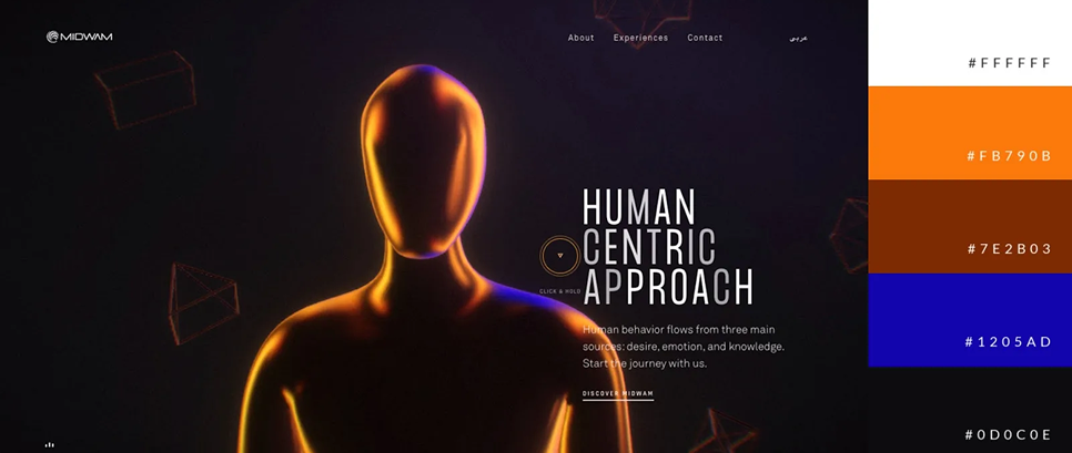
A great example is Maui Studios Aotearoa, a creative agency from New Zealand. Their homepage reflects that creativity with iridescent hues that blend and shift. The colors move constantly, creating a hypnotic effect that keeps your eyes locked in.
There’s a quiet strength in the earth tones. They evoke soil, stone, forest floors at dusk, and dunes at golden hour. As the digital world accelerates, more brands are reclaiming graphic design color palettes that feel rooted, calm, and real.
You see this especially where brands want to build trust through subtlety. In Adobe’s survey, 36% of consumers expect earthy color palettes to dominate branding this year, a clear signal that people are looking for visuals that feel grounded.
That’s what makes neo-organic palettes so compelling:
A beautiful example is the Adrian Brinkerhoff Poetry Foundation website. The design features multiple shades of brown that blend seamlessly into the overall image. And right at the center, a large nature photograph pulls everything together.

The digital brutalism trend is loud, confrontational, and purposefully raw. In 2025, it’s making a comeback through high-contrast palettes that grab attention and refuse to let go. Often, these colors sit together without any obvious logic.
This approach rejects the idea that colors must blend or complement. Instead, it embraces contrast as a tool of visibility, energy, and tension. It evokes emotion through imbalance, and when done right, it creates a kind of visual electricity.
These graphic design color combinations demand attention, and here’s why:
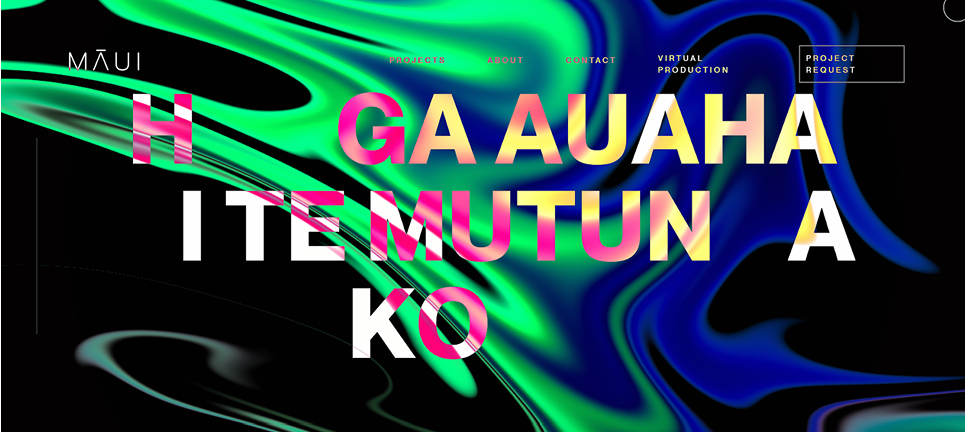
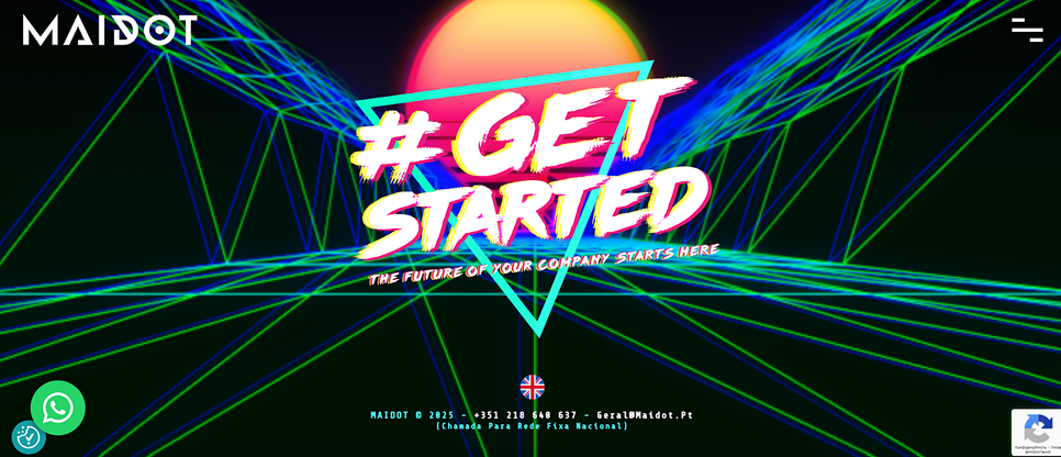
You can spot this trend on the MAIDOT website. The moment you land, you’re greeted by a neon background that shifts and evolves. Bright colors change fluidly, creating a sense of depth, almost like you’re falling deeper into the screen.
Rather than locking yourself into a fixed set of hues, adaptive living color palettes subtly shift based on context, time of day, user preferences, or even the interface's mood. Their goal is to respond, resonate, and feel alive.
According to Adobe, 3 in 10 consumers expect brands to use adaptive graphic design color schemes. And many brands already do. Soft, warm light tones might greet you in the morning, while cooler, muted shades take place in the evening.
That’s part of what makes adaptive palettes such a smart choice:
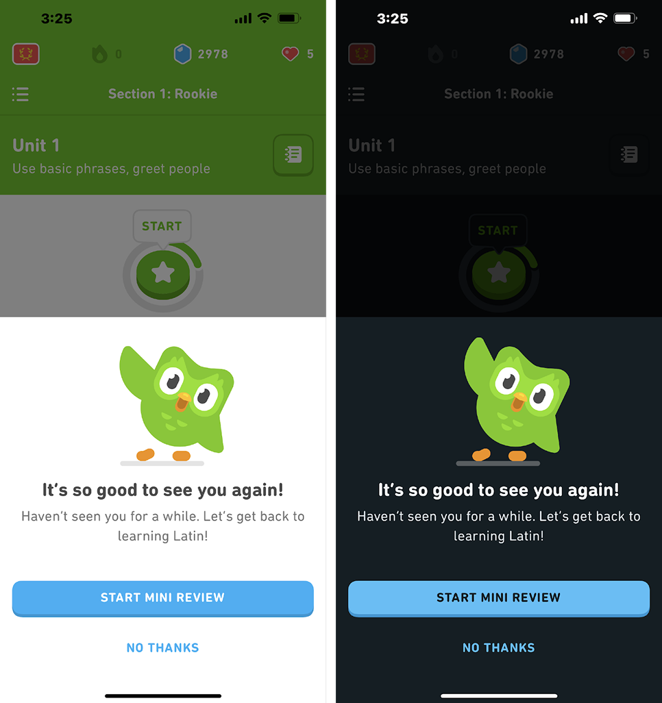
A great example of this is Duolingo. The app offers users the ability to switch between light and dark themes based on their preferences. There’s nothing dramatic about the change, and that’s exactly the point.
We’re seeing brands bring back saturated mustards, dusty teals, burnt oranges, and avocado greens as emotional signposts. These are retro color palette inspirations that nod to the past while staying clean, intentional, and readable on screens.
This approach gains popularity for one big reason: in times of uncertainty, consumers lean into what feels familiar. Nostalgic colors that evoke childhood packaging or vintage posters trigger subconscious trust and comfort.
Retro revival pallets feel so arresting for the next reasons:
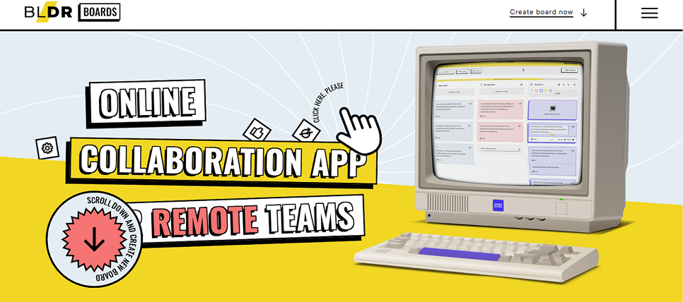
A great example is Boldare Boards. The website design leans into a 70s color scheme, combining warm oranges, muted yellows, and dusty blues. The illustrations echo that same era, feeling like they’ve stepped out of a vintage textbook.
Someone picks “the blue”, and from that moment, everything else begins. But building a strategic color palette for graphic design demands planning ahead. You need structure, flexibility, and a few tried-and-true best practices that we cover next.
Before you ever pick that perfect blue, the smarter move is to define what each color will do in your system. One color should tell stories, another highlight action, and another support background elements. When those roles are clear, your palette becomes a toolkit.
Here’s what that looks like in practice:
Modern design systems like Material Design 3 assign color roles like “primary,” “secondary,” “surface,” “on‑primary,” etc. These help designers and developers map colors consistently across light/dark themes and ensure contrast.
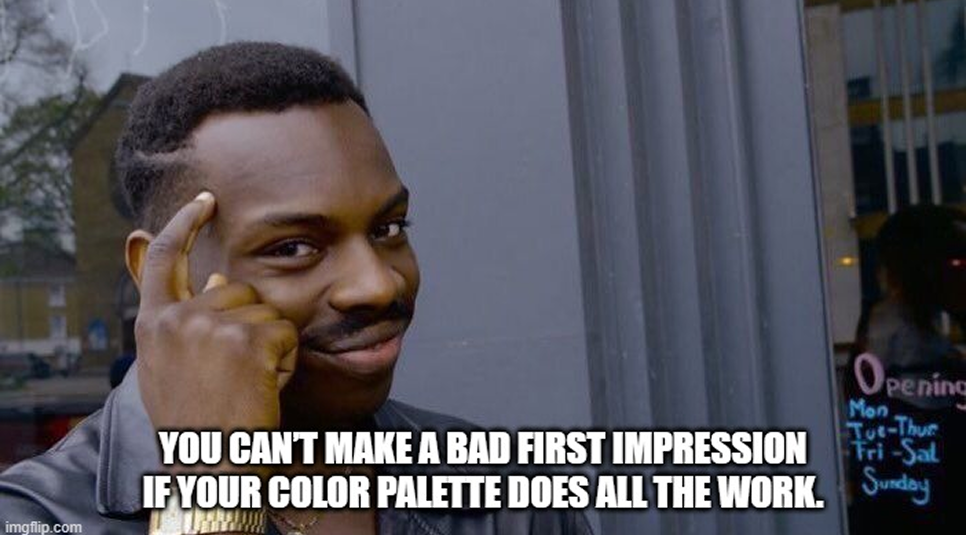
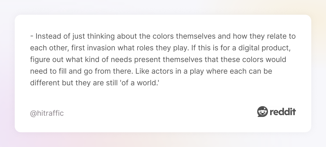
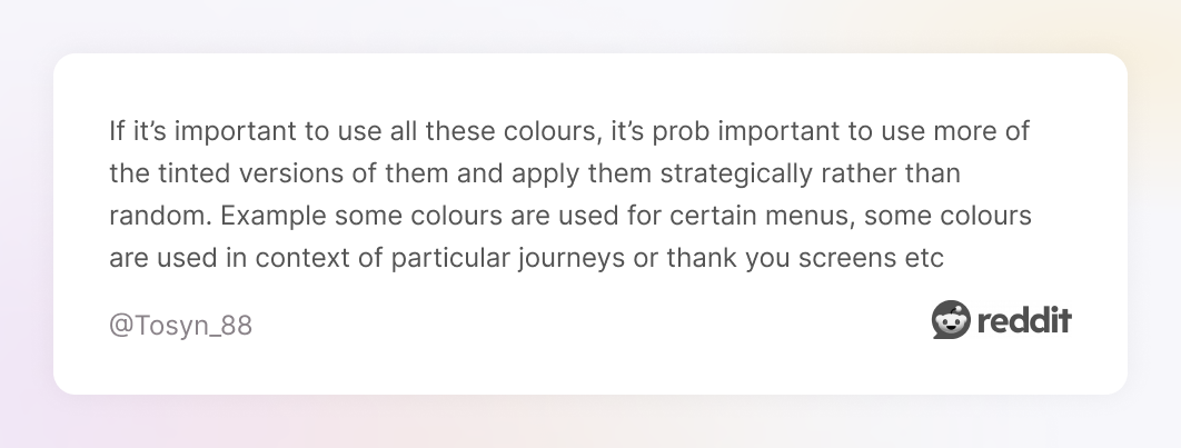
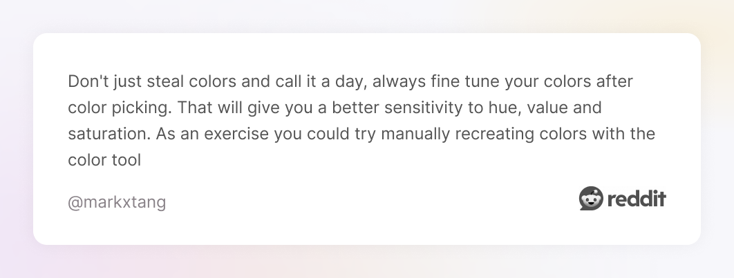
And if you get stuck, don’t panic. Here’s a great piece of advice from one Redditor:
.webp)
Once roles are defined, you need a map for how much each should show up. In this case, you can rely on the 70/30/10 rule (some designers also use 60/30/10, depending on context). The idea is that your dominant hue takes the largest share, your secondary color supports it, and your accent color is reserved for impact.
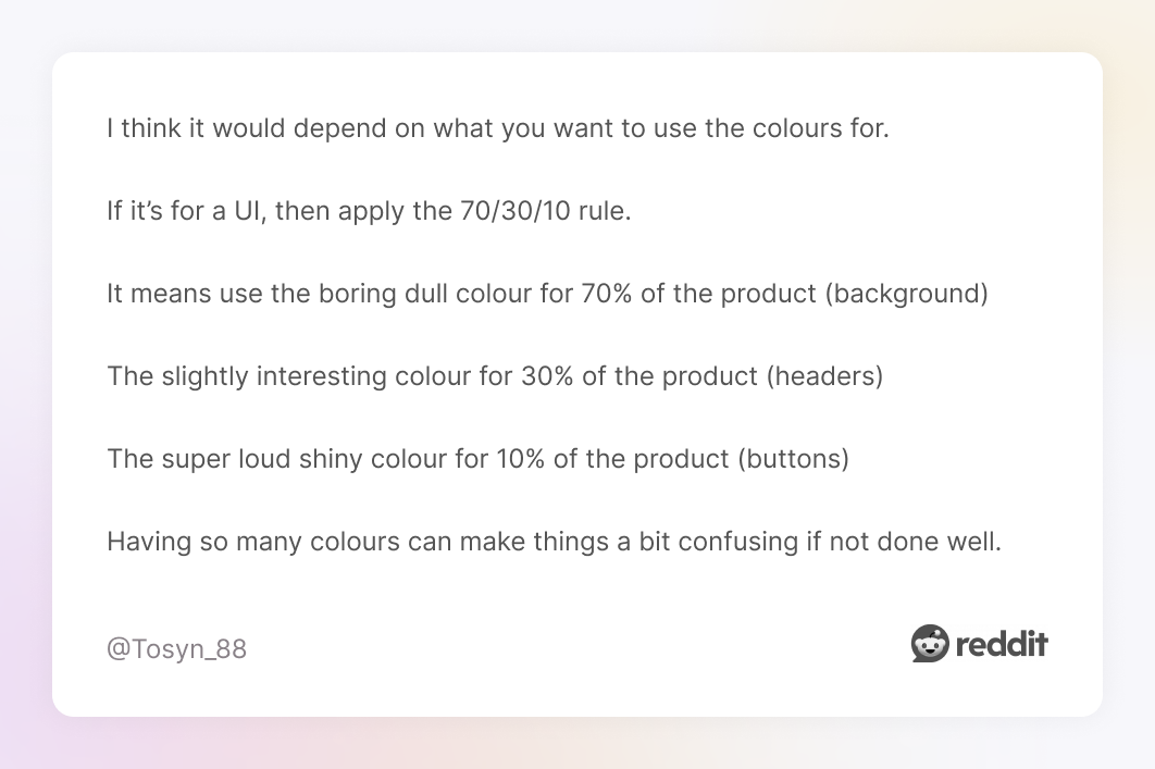
When applied with intent, the rule breaks down like this:
Such an approach gives your visuals hierarchy, balance, and focus. It ensures you’re not fighting yourself with too many bold colors everywhere.
You could pick the most beautiful hue in the world, but if its brightness (luminance) doesn’t work with everything else, it fails. In color combinations graphic design, luminance is the thing our eyes read before hue or saturation.
It helps ensure that no single color overpowers the rest, and that each one fits into the system. Two shades might be wildly different in hue, but if their luminance levels match, they’ll feel like they belong together.
This becomes even more important when it comes to contrast. According to WCAG guidelines, regular text needs a minimum ratio of 4.5:1 to be considered accessible. Large text has a lower bar — 3:1 — but that still requires deliberate color planning.
When luminance and contrast are intentional, your palette becomes dependable. Accent shades will always stand out. Text will always read clearly. And your brand’s voice won’t get lost, even as the environment shifts around it.
Among different design practices, an interesting one is to strip away the color and work in pure grayscale first. It sounds counterintuitive (shouldn’t color be first?), but designing in grayscale forces you to see structure, hierarchy, balance, and contrast before the emotional layer of hue enters.

When you remove color, the design starts talking in fundamentals. You see where your layout breathes, where edges are too close, where text fights for readability. You realize which elements carry visual weight and which are dead zones.
Designers who use this method often say it saves them time. Instead of relying on trendy color palette ideas in graphic design and tweaking every color because something “feels off,” they build a strong monochrome foundation first.
This is especially important in digital contexts where contrast, legibility, and user accessibility matter. If your design fails the grayscale test, it can’t reliably survive color.
Color that looks perfect on your high-end monitor might turn into mush on a budget smartphone at dusk. That’s why graphic designers test across contexts.
First, you try different devices. Desktop, laptop, tablet, phone — see how your palette behaves when screens vary in brightness, gamma, and display technology. A button that pops up on a Mac may flatten on an Android screen.
Then you change environments. Look at it under daylight, in dim rooms, in night mode. Colors shift under different ambient light, and what feels readable in a sunny office might lose contrast in a dark subway ride.
You also need to see how colors hold up in real interface situations, like charts, overlays, image backgrounds, hover states, and more. Text on gradients, icons over photos, these are where even perfect palettes can reveal their weaknesses.
And here are a few ways to push testing even further:
By testing colors in multiple real-world contexts, you catch subtle failures before your users do. Your brand stays consistent, legible, and expressive.
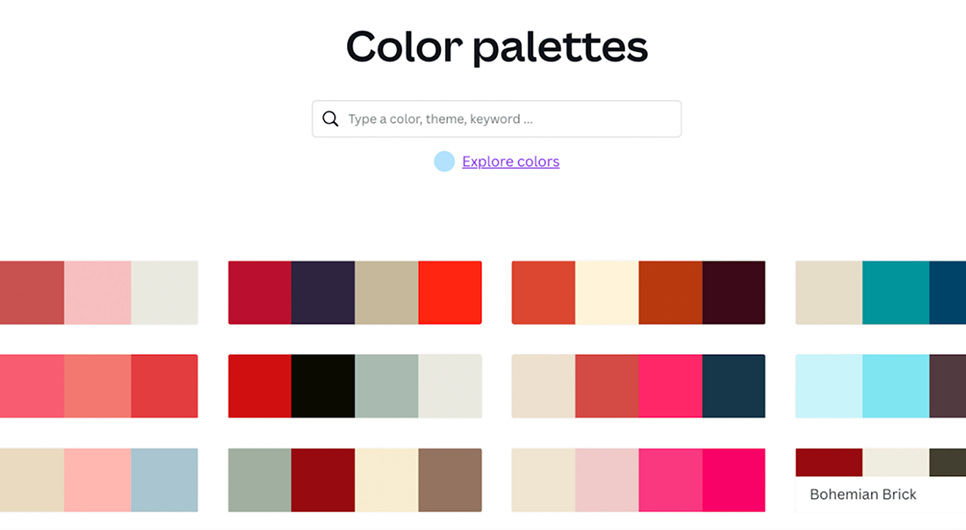
These days, building a color scheme is easier than ever if you’ve got the right tools. You just need one that fits your workflow, generates the right tones, and helps you actually use them in real graphic design. So to save you the scroll and guesswork, here’s a curated roundup of the best palette tools for 2025.
Coolors is one of the most talked‑about tools in the community to generate color palettes for designers. You can click a button (or press the spacebar) to get an instant 5-color combination. If you have a specific color in mind, simply enter its HEX code and “lock” it, then hit space to generate colors that harmonize with it.
Coolors also lets you fine-tune each color’s hue, saturation, and brightness. A great bonus is the ability to browse thousands of palettes created by others.

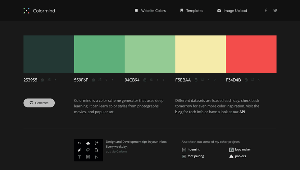
Colormind is an AI-driven color palette generator that learns from real-world visuals. Its algorithm is trained on a large dataset of photos, movies, and popular designs. As a result, Colormind suggests palettes that feel contemporary and well-balanced, sometimes with surprising combinations you might not have thought of.
One of its coolest features is that it also shows a mockup of a UI design (e.g., a sample website or mobile app interface) colored with your palette
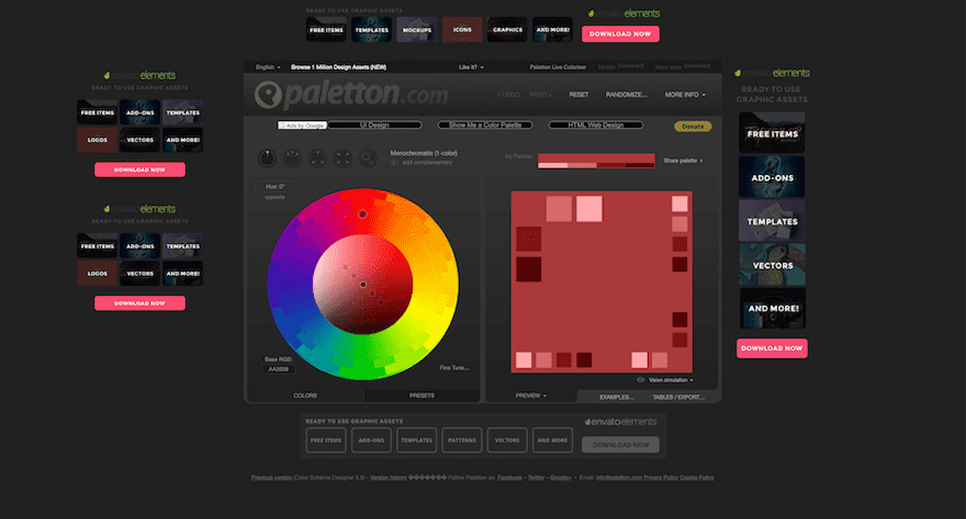
Paletton is a classic tool for deeply exploring color harmony on the color wheel. It allows you to choose different scheme types — monochromatic, analogous (adjacent colors), triad, tetrad (four-color schemes), and more — and then tweak the angles and variations to get the perfect combo.
As you adjust, Paletton displays live previews of sample graphics (like example webpages or abstract art) using your chosen colors.
Adobe Color is a comprehensive palette tool that leverages color theory principles. It features an interactive color wheel with harmony rules like analogous, monochromatic, triadic, complementary, and more. You can start with one base color and let Adobe Color suggest the rest to form a harmonious scheme.
Here, you can use the Extract Theme function. You upload an image, and Adobe Color automatically generates a color palette from the image’s most prominent hues.

Canva’s Color Palette Generator is a beginner-friendly tool, especially useful if you have an image to start with. You can upload any photo, and Canva will extract its main colors to create a palette. Alternatively, you can explore different combinations based on preset harmony rules, similar to Adobe Color.
Plus, this tool integrates with Canva’s design platform. After generating a palette, you can click “Create a Graphic” and see templates that use those colors.
There’s a moment in every design process when the colors come into play. You scroll, you shuffle, you try things. And then you see how colors shape your brand's mood long before the words do.
That’s why our lead designer has a rule: “Don’t leave your color palette up to luck.”
Not because you need to overthink every shade, but because the right choice rarely comes from a random generator or a passing trend.
It comes from knowing what your brand is trying to say.

