Most readers do judge a book by its cover. This guide gave you 32+ ebook cover examples by category, the design principles behind them, and a toolkit to either create your own or hire a pro. The right cover is your first and best marketing tool. Treat it like it matters.
Your ebook cover has one job: stop the scroll.
A cover is your elevator pitch, distilled into a single image. In seconds, it tells potential readers whether your ebook is worth their time or if they should move along to the next shiny thing. According to a study, 57% of readers admit they judge a book by its cover. And the other 43%? They’re lying.
This guide isn’t just a pretty-picture gallery (though we’ll have plenty of that). We’ll break down 32+ examples into categories, pull apart why each design works, and give you the tools to make your own, whether you’re a DIY Canva wizard or someone ready to call in the pros.
So, let’s dig in. First up: real-world ebook cover examples, sorted by category, because a romance novel and a cybersecurity whitepaper should never share the same wardrobe.
32 great ebook cover examples by category
There’s no single recipe for the best ebook covers, but some patterns definitely work. Below, we’ve rounded up ebook cover examples by category, with notes on what makes each one scroll-stopping.
PDF, visual books, lead magnets, reports
PDF ebooks and reports are the workhorses of content marketing. They’re often free, meant to attract leads, and they need to look valuable enough for someone to hand over their email address. If your lead magnet looks like a bad Word doc, it’s going straight to the recycle bin, both digital and mental.
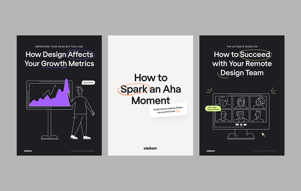
Example 1: TodayMade design for Eleken
This ebook series for Eleken uses bold typography, subtle humor, and a modern layout system to convey clarity and creativity without overcomplication.
Layout and imagery: Each cover features a clean, centered layout with a strong focal point, such as a bold chart, a Zoom-style illustration, or a minimalist title on a white background. Custom line-art illustrations add a human touch while reinforcing the content.
Typography: Large, confident sans-serif titles take center stage. Strategic highlights (underlines, circles, tooltips) draw the eye and add a playful tone without cluttering the design.
Color scheme: Primarily monochrome with vibrant accent colors—purple, green, and orange—used sparingly for emphasis. The restraint makes each highlight pop.
Branding: Even without dominant logos, the consistent font choice, tone, and visual style make this unmistakably Eleken. The minimal aesthetic matches the brand’s UX-focused, product-minded approach.
Why it works: It’s clean without being sterile. Each cover effectively communicates the topic while employing subtle visual storytelling, such as a growth chart for metrics or a team call for remote collaboration. It feels modern, confident, and made by designers who understand business.
Example 2: Mailchimp industry reports
Mailchimp’s report design is both vibrant and methodical, using bold visuals to make serious insights feel more accessible.
Layout and imagery: The layout mimics an architectural blueprint, reinforcing the “blueprint” theme with line art and a grid background. Content zones are divided like rooms in a floor plan, guiding the eye with clear structure.
Typography: The serif title typeface lends elegance and authority, while the sans-serif supporting text maintains a modern and digestible feel. Font weights are used strategically for hierarchy.
Color scheme: A bright, saturated yellow dominates the cover, contrasted with navy text and blueprint-style line work. The high-contrast palette is bold but balanced.
Branding: The Mailchimp brand is clear through color, tone, and layout, not just the logo. The use of humor, clever design, and strategic whitespace aligns perfectly with Mailchimp’s visual voice.
Why it works: It makes a complex marketing strategy feel structured and visual. The blueprint metaphor is literal and effective, while the bold color and type choices make the report feel alive, not another boring PDF.
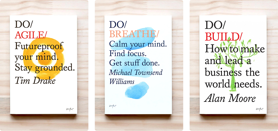
Example 3: Do Book Co. series
The Do Book Co. series blends simplicity with soul; each cover feels handcrafted, purposeful, and entirely human.
Layout and imagery: Center-aligned layouts with hand-drawn, watercolor-style illustrations behind the title. The visual element is minimal but expressive, giving each book a unique character.
Typography: The contrast between the bold “DO/” wordmark and the elegant serif/subtle script fonts below creates a clear hierarchy. Author names are italicized or handwritten, adding a personal touch.
Color scheme: Clean white backgrounds with a single accent color per book—yellow, blue, green—used in the illustration and header highlight.
Branding: The formula is consistent across the series, with the same structure and typography rules, and a different visual accent for each topic. It makes the series instantly recognizable without feeling templated.
Why it works: The imperfect, analog feel of the illustrations contrasts beautifully with the sharp typography. It’s an approachable, artistic way to package serious ideas, making business and self-help content feel more personal and less corporate.
Example 4: Adbusters magazine-style covers
Adbusters doesn’t design covers; they stage visual protests. Each issue is a graphic rebellion, breaking design rules with purpose and intensity.
Layout and imagery: Unpredictable and often chaotic, think distorted photography, collage, glitch art, and satire-driven illustrations. Every composition dares you to look twice.
Typography: All-caps sans-serif titles, often overlapping visuals or pushed to the edges. Some issues abandon traditional hierarchy altogether, letting imagery lead.
Color scheme: High-contrast black, red, and white dominate, but some issues explore surreal color palettes, like melted neons or grayscale shock imagery.
Branding: The brand is the chaos. No need for consistent placement or style. The attitude is unmistakable. It’s a visual signature built on disruption.
Why it works: These covers challenge the viewer. For audiences that lean anti-establishment or art-driven, this approach doesn’t just attract attention; it builds loyalty through shared values.
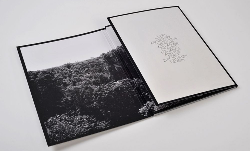
Example 5: September Industry design showcases
September Industry’s covers blur the line between editorial layout and modern art, more gallery wall than bookshelf.
Layout and imagery: Full-bleed photography dominates the design, often in black and white, with careful attention to framing and negative space. Many ebook covers feel like minimalist posters or film stills.
Typography: Sparse, refined, and often pushed to the margins. When text appears, it’s secondary to the image, like a quiet caption rather than a headline.
Color scheme: Typically monochrome or grayscale with rare, intentional use of a single accent color. The lack of saturation draws attention to form and detail.
Branding: Branding is nearly invisible by design. The aesthetic itself—clean, stark, curated—is the brand.
Why it works: These covers elevate the content through restraint. They don’t shout to get attention; they trust the viewer to lean in. It’s a confident approach that suits high-design, high-concept publications.
Example 6: Semrush – The State of Content Marketing 2023 (Global Report)
Semrush’s 2023 report strikes a balance between energetic visuals and professional polish.
Layout and imagery: A collage-style design with a cut-out figure and geometric overlays on a vibrant background, eye-catching and dynamic.
Typography: A bold sans-serif title commands attention, while clean supporting text ensures readability throughout.
Color scheme: Punchy brand colors, such as purple, green, and yellow, create contrast and energy.
Branding: No oversized logo needed, consistent colors, layout, and tone make this unmistakably Semrush.
Why it works: The energetic collage layout and bold colors convey excitement about the topic, while consistent branding maintains a professional tone. It feels both fun and credible, a tough balance to strike.
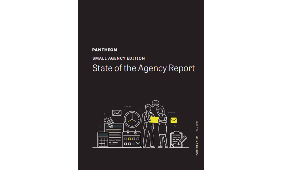
Example 7: Pantheon – State of the Agency (Small Agency Edition)
Pantheon leans hard into contrast and bold visuals to deliver authority.
Layout and imagery: A striking black background with bright yellow line art illustration commands attention.
Typography: Uppercase sans-serif titles in white or yellow give strong contrast and clarity.
Color scheme: Black, white, and Pantheon’s signature yellow make this cover pop without overdoing it.
Branding: Clean lines, minimalist graphics, and clear data layout reflect Pantheon’s technical identity.
Why it works: The high-contrast color palette and clean layout convey confidence and professionalism. It makes a strong first impression and positions Pantheon as a bold, authoritative voice.
Pro tip: PDF covers need to work both as a standalone visual (in social media shares) and as part of a document. Keep file size small enough for email delivery, but don’t skimp on resolution; pixelated graphics scream “unprofessional.”
Modern branded ebook cover examples
Branded ebooks have evolved far beyond white papers and PDFs with logos slapped on the top corner. These ebook examples from leading SaaS companies demonstrate how smart layout, consistent branding, and bold visuals can make even the most data-heavy content feel fresh and engaging, making it more scroll-worthy.
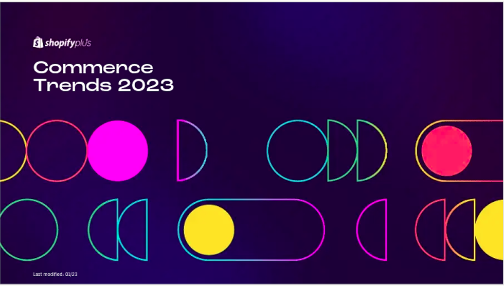
Example 8: Shopify – Commerce Trends 2023
This ebook cover embraces bold, futuristic energy with neon geometry and a dark, immersive backdrop.
Layout and imagery: Abstract, glowing shapes (circles, capsules, and semi-circles) arranged in a rhythmic pattern suggest movement and innovation. The layout is asymmetrical but balanced, guiding the eye without a traditional frame.
Typography: A bold, geometric sans-serif font complements the visual style. The white title text pops cleanly against the dark gradient background for high readability.
Color scheme: Neon pink, yellow, teal, and purple glow against a dark violet base, creating a high-contrast, tech-forward feel that screams “next-gen.”
Branding: Shopify’s logo sits quietly in the corner, but the signature boldness, cleanliness, and product-led vibe are unmistakable. The playful minimalism is a strong extension of the Shopify Plus brand.
Why it works: This design captures attention fast with its bright neon palette, then holds it with clarity and rhythm. It reflects innovation without becoming visually overwhelming, making it perfect for a trend-forward, data-driven publication.
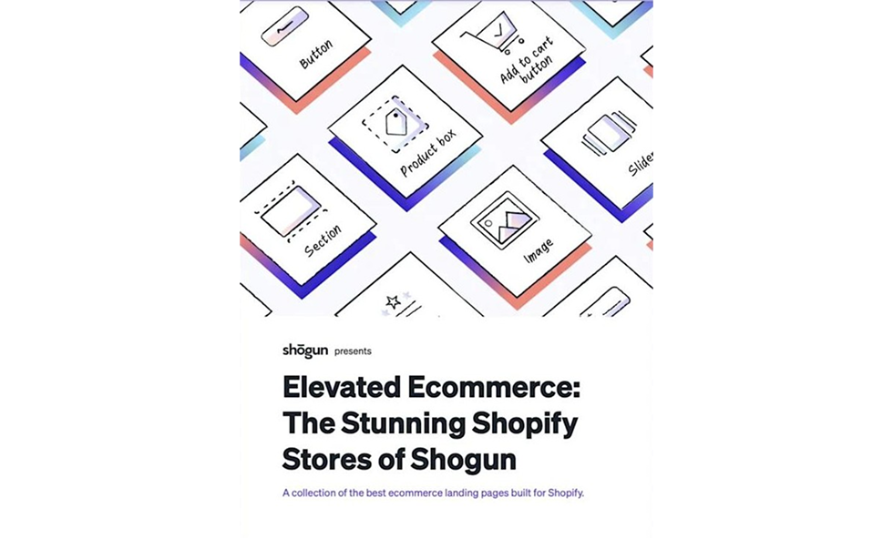
Example 9: Shogun – Elevated Ecommerce
Shogun’s ebook design is a playful nod to ecommerce UI; clean, organized, and purpose-built for the design-savvy reader.
Layout and imagery: Modular, icon-style illustrations of e-commerce components (such as buttons, sliders, and product boxes) are arranged in a diagonal, layered grid. The imagery immediately communicates the content’s focus: building sleek online stores.
Typography: The bold sans-serif title contrasts with the lighter, more compact subtitle. The typographic hierarchy is clear and modern, easy to skim without losing detail.
Color scheme: Clean white background with pastel gradients and accents in purple, pink, and blue. The mix adds depth while maintaining a light and accessible tone.
Branding: Shogun’s design system is present in every element, from the layout structure to the color accents and simplified ecommerce icons. The minimalist frame and restrained text placement give the brand a polished and confident feel.
Why it works: It’s visually structured like a landing page: clever, given the topic. The use of UI building blocks as visual metaphors makes the ebook’s purpose instantly clear, while the overall aesthetic is clean, creative, and conversion-friendly.
Example 10: HubSpot + 10Web – 2023 AI Trends for Marketers
HubSpot’s AI ebook cover feels smart and strong without being flashy.
Layout and imagery: A centered AI-themed illustration grabs attention immediately, surrounded by well-balanced text and logos.
Typography: Clean and consistent, bold title up top, with lighter supporting text for contrast.
Color scheme: Deep blues and oranges create contrast and recall HubSpot’s brand palette.
Branding: Consistent icons, colors, and layout choices give the whole ebook a polished, professional feel.
Why it works: A striking central image and strong title placement create immediate impact, while the clean layout supports fast reading. The design feels authoritative without losing visual appeal.
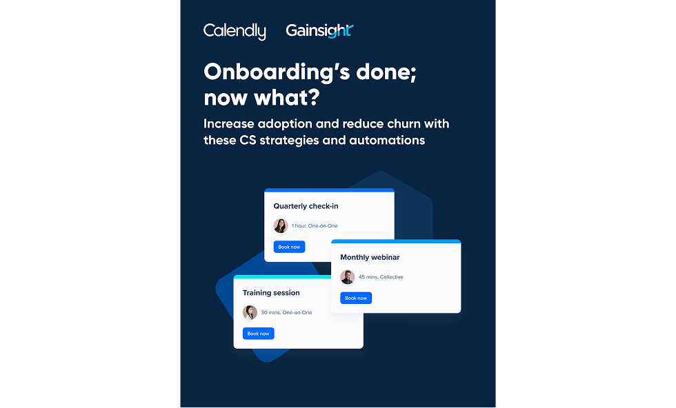
Example 11: Calendly + Gainsight – Onboarding’s Done; Now What?
This co-branded ebook delivers a polished SaaS aesthetic while clearly visualizing its customer success message.
Layout and imagery: A structured dark background supports layered UI-style elements (cards for webinars, checklists, and training). The floating cards mimic real product interfaces, creating a sense of interactivity and modern workflow.
Typography: A clean sans-serif typeface keeps things crisp and skimmable. The main title uses a conversational, lowercase tone, while the subtitle provides immediate value through benefit-driven language.
Color scheme: A deep navy blue base gives a professional, tech-forward tone. Bright accents in Calendly purple and Gainsight cyan highlight key elements, balancing the visual weight.
Branding: Each brand is subtly present, with logos at the top, shared color use throughout, and UI elements reflecting both platforms’ design systems. It feels unified without being overbranded.
Why it works: The layout mirrors a product experience, which strengthens the guide’s focus on customer automation and success. The clear structure and techy visuals make it digestible and trustworthy, ideal for a B2B audience focused on efficiency and retention.
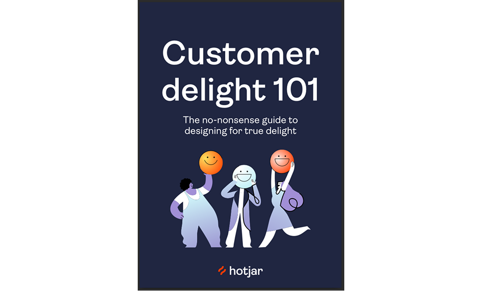
Example 12: Hotjar – Customer Delight 101
Hotjar’s cover brings joy to UX content, blending simplicity, warmth, and clarity into a visual that feels both informative and genuinely delightful.
Layout and imagery: A central illustration of three characters holding up emoji-style faces instantly communicates emotion and engagement. The visual takes center stage without crowding the layout, keeping the composition clean and accessible.
Typography: A friendly, round sans-serif typeface leads the title, reinforcing the guide’s approachable tone. The subtitle is smaller but legible, adding context without overwhelming the design.
Color scheme: A deep purple background makes the colorful characters and emojis pop. Warm gradients and subtle highlights throughout the illustration reinforce the theme of delight and ease.
Branding: Hotjar’s logo appears clearly but unobtrusively. The authentic branding comes through in tone, playful, user-first, and rooted in empathy. The cover sets expectations for a practical, human-centered read.
Why it works: This design nails emotional resonance. Instead of feeling like a dry UX guide, it welcomes the reader with expressive visuals and a no-nonsense title. It’s a perfect ebook example of brand tone and design working in sync.
Example 13: Zendesk – Delivering transformative messaging experiences to your transportation, travel, & hospitality customers
This guide feels more like a boutique travel mag than a B2B ebook.
Layout and imagery: Flat-lay photography of travel essentials over a soft pastel background creates context and warmth.
Typography: Large, bold titles layered over the image in simple sans-serif fonts.
Color scheme: Warm tones with Zendesk’s brand green woven subtly throughout.
Branding: Sophisticated yet approachable, Zendesk’s values come through in both visuals and message.
Why it works: The thematic photography and pastel color palette create an emotional connection. It’s visually appealing and communicates exactly who it’s for before you even read the title.
Example 14: ServiceTitan – The Power of ServiceTitan + Hatch AI
This cover strikes a smart balance between product visuals and clean design, making a technical subject feel both actionable and precise.
Layout and imagery: A background blur of a scheduling interface gives subtle real-world context without stealing focus. Layered on top are faint UI icons—chat bubbles and outlines—hinting at automation and messaging features. A slanted white content block frames the title, giving the layout a dynamic, modern edge.
Typography: The bold sans-serif title is broken into digestible lines with strong hierarchy. Supporting copy is minimal and benefit-focused, reinforcing clarity.
Color scheme: A mostly white canvas is accented by Hatch’s bold purple and ServiceTitan’s grayscale UI elements. The touches of color highlight CTA zones and structural lines without cluttering the design.
Branding: The Hatch logo and bold pink accents instantly identify the brand. ServiceTitan’s influence is more subtle in the visual references to scheduling tools and field service UI.
Why it works: By integrating just the right amount of product imagery and iconography, the design clearly communicates its purpose without overwhelming the viewer. It’s visually engaging, brand-aligned, and framed in a way that feels more like a modern software landing page than a standard guide.
Example 15: Databricks – Four Forces Driving Intelligent Manufacturing
This one seamlessly blends the industrial and digital worlds into a sleek, tech-forward ebook.
Layout and imagery: Abstract geometric overlays meet monochrome photography, visually hinting at data + manufacturing themes.
Typography: Sans-serif, strong, with key phrases highlighted in bright Databricks orange.
Color scheme: Dark backgrounds with orange accents and occasional cool grays, creating a modern and high-tech aesthetic.
Branding: Everything from layout to CTA styling reflects Databricks’ identity: smart, structured, and innovative.
Why it works: The sharp, geometric layout, paired with a muted industrial aesthetic, creates a smart blend of data and the physical world —a perfect metaphor for the ebook’s theme. It looks intelligent and serious, without being sterile.
Fiction (genre breakdown)
Fiction covers are all about emotional shorthand. In half a second, they need to tell the reader, “This is your kind of story.” If you mess that up, you’re marketing a romance novel to thriller fans, and they’ll swipe left.
Romance
Romance covers are all about instant chemistry. Whether it’s soft pastels, steamy poses, or playful script fonts, your goal is to make hearts flutter before the first page is ever read.
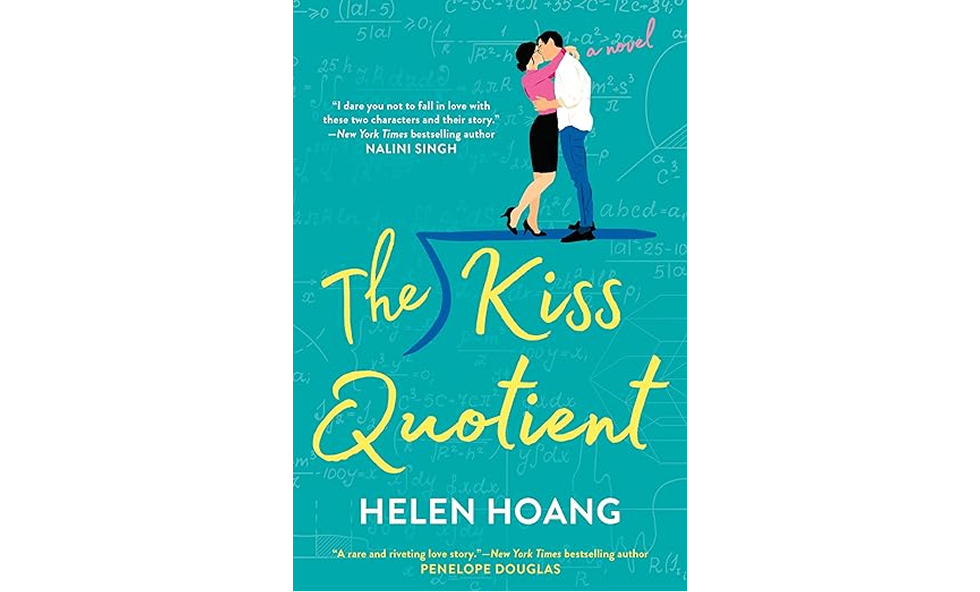
Example 16: The Kiss Quotient by Helen Hoang
This cover wraps a math-inspired love story in a package that feels bright, flirty, and instantly romantic.
Layout and imagery: The composition is simple and centered, featuring a cute illustrated couple standing on a mathematical square root symbol, which ties back to the book’s title and theme.
Typography: The title uses a lively, handwritten script that adds warmth and personality. The author’s name and tagline use clean, legible sans-serif for balance.
Color scheme: A teal-green background dominates the design, giving it a fresh and friendly tone. Yellow script and pink accents create a vibrant contrast that catches the eye.
Branding: The cover perfectly signals genre (rom-com) with its illustrated couple, playful title font, and cheerful palette. It's a great example of genre signaling through design.
Why it works: It communicates tone at a glance: romantic, lighthearted, and character-driven. The combination of soft colors, whimsical typography, and cute illustration hits all the right notes for contemporary romance fans.
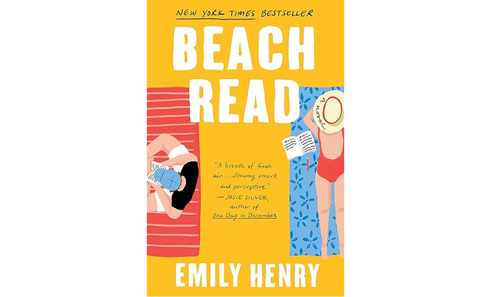
Example 17: Beach Read by Emily Henry
This cover flips the script on traditional romance palettes, delivering a bold, beachy vibe with big personality.
Layout and imagery: Two illustrated characters lounge on beach towels, each in their own world, mirroring the story’s dual perspective. The top-down composition has a casual and intimate feel.
Typography: Thick, all-caps serif lettering dominates the cover, with the title stacked for maximum impact. It’s bold, highly legible, and balances the illustrations without getting lost.
Color scheme: A vibrant mix of yellow, red, blue, and soft pink makes this cover truly stand out. It’s a sunshine-infused palette that perfectly fits the title and mood.
Branding: The illustration style and high-energy palette have become signature elements across Emily Henry’s covers, giving her books strong visual recognition even across different titles.
Why it works: It breaks out of the “pastel romance” mold with high-contrast color and bold type. The layout is clean but fun, and the illustrations hint at depth beneath the feel-good exterior, just like the story inside.
Thriller
Thriller covers should evoke a sense of unease in a good way. Think bold contrasts, shadowy figures, and typography that practically screams “something’s not right here.”
Example 18: The Girl on the Train by Paula Hawkins
This thriller cover uses distortion and speed to build tension before you’ve even read the blurb.
Layout and imagery: The blurred background evokes the sensation of a train rushing past, setting both the physical and emotional pace of the story. There’s no focal image, just atmosphere and implication.
Typography: Wide, all-caps sans-serif type is stacked vertically, creating a cinematic presentation. The spacing and alignment add unease and urgency.
Color scheme: Dark greens, blacks, and light streaks mimic city lights at night through a foggy window. The palette is moody, tense, and deeply psychological.
Branding: No frills, no excess. The design signals genre (domestic thriller) with clarity and restraint, easily recognized in bookstores and screen thumbnails alike.
Why it works: The motion blur and cold tones visually echo themes of disorientation and unreliable perception. It's a perfect example of genre-aligned design that sells mood over detail.
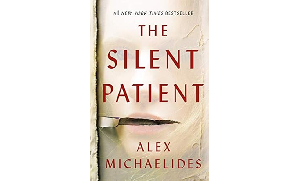
Example 19: The Silent Patient by Alex Michaelides
This cover says everything with very little: controlled, clinical, and deeply unsettling.
Layout and imagery: A partially obscured face peers out from behind a torn canvas or paper, immediately evoking mystery and psychological tension. The rip itself becomes the focal point, suggesting hidden trauma or truth.
Typography: Clean, all-caps serif type in red gives the title a sharp, arresting presence. The spacing is generous, allowing the starkness to breathe.
Color scheme: Muted whites and creams dominate, with only the red type providing contrast. This restraint adds to the book’s haunting stillness.
Branding: The visual tone is genre-perfect: minimalist, psychological, and clinical. There’s no need for extra imagery. The vibe alone does the marketing.
Why it works: The torn paper effect and washed-out palette draw the viewer in, prompting them to search for answers, mirroring the reader's experience. It’s a masterclass in using subtle design to create suspense.
Fantasy
Fantasy covers are where you can let your imagination run wild. Magical symbols, ornate borders, and rich textures set the stage for epic worlds long before the first dragon shows up.
Example 20: The Priory of the Orange Tree by Samantha Shannon
This cover is a fantasy feast, rich, ornate, and dripping with lore before you’ve turned a single page.
Layout and imagery: A coiled dragon climbs a medieval tower against a glowing sky. The illustration is lush and hyper-detailed, immediately signaling an epic, high-fantasy setting.
Typography: Elegant serif type with subtle flourishes adds gravitas and balance. The title is tiered and centered, creating a strong focal point amidst the visual complexity.
Color scheme: Fiery oranges and golds dominate the background, contrasted with deep blues and purples in the tower and dragon. It’s vibrant, mythic, and visually arresting.
Branding: While not part of a visual series, the cover defines the book’s identity, distinctive enough to stand out on fantasy shelves and iconic enough to be instantly recognizable.
Why it works: It’s a perfect blend of world-building and design. The rich illustration draws fantasy readers in, while the clean type ensures the title remains readable. It promises scale, magic, and ancient power, all at a glance.
Example 21: A Court of Thorns and Roses by Sarah J. Maas
This cover seamlessly blends fantasy and danger through bold typography and intricate texture, making it perfect for a story full of secrets and seduction.
Layout and imagery: Centered, all-text layout layered over a detailed, hand-drawn background (often featuring vines, thorns, or feathers depending on the edition). The illustration is subtle but rich in atmosphere.
Typography: The title is dominated by a sharp, serif typeface in vivid contrast. Each word is carefully stacked and aligned to create a sense of drama and elegance.
Color scheme: Deep crimson red paired with acid-yellow lettering creates intensity and visual tension. The dark background illustration adds depth without distracting.
Branding: The bold color, mythic type, and detailed linework have become signatures of the ACOTAR series. Even with minimal imagery, fans recognize the brand instantly.
Why it works: It uses restraint in layout but leans into rich color and texture. The result is a fantasy cover that feels luxurious and dangerous, drawing readers into the world before they’ve opened the book.
Literary and memoir
Literary and memoir covers thrive on subtlety. They rely on typography, symbolism, and quiet confidence, inviting readers into deeply personal or thought-provoking stories without drawing attention to themselves.
Example 22: Educated by Tara Westover
This cover distills a powerful story into one striking visual metaphor, simple, thoughtful, unforgettable.
Layout and imagery: A giant pencil, rendered in warm earth tones, also reads as a mountain range, subtly blending education with personal ascent. The silhouette of a lone figure at the base adds emotional scale.
Typography: Classic serif for the title, with author and subtitle set in crisp, balanced fonts. The type is understated, letting the central image speak first.
Color scheme: Beige, red-orange, and charcoal combine to create warmth and contrast. The minimal palette allows the metaphor to shine without visual noise.
Branding: No flashy elements, just concept. The cover’s strength lies in its restraint, aligning perfectly with memoir conventions while standing out for its depth.
Why it works: The pencil-as-mountain metaphor captures the book’s themes of self-transformation and struggle for knowledge. It’s proof that a single, smart idea, executed with care, can say everything.
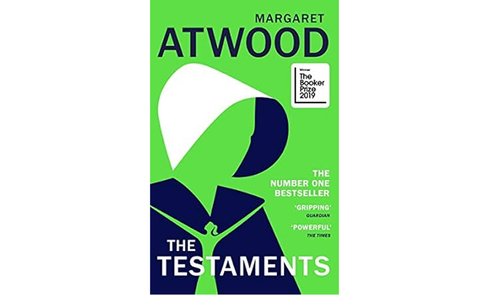
Example 23: The Testaments by Margaret Atwood
This cover is graphic, iconic, and unmistakably Atwood, designed to command attention with minimal effort.
Layout and imagery: A simplified figure in a handmaid’s cloak and bonnet rendered in bold, flat shapes. There’s no facial detail, only form, instantly readable and highly symbolic.
Typography: Clean sans-serif type is used throughout, with Atwood’s name oversized at the top, anchoring the cover as much as the illustration. The title is secondary but still bold.
Color scheme: Electric green, navy, and white form a high-contrast trio. The unusual palette helps the book stand out while staying on-brand for a dystopian tone.
Branding: The visual callback to The Handmaid’s Tale is clear, but the design stands on its own. Atwood’s name, paired with the minimalist figure, creates a powerful, instantly recognizable combination.
Why it works: The stark minimalism allows the author and concept to speak loudest. It’s a masterclass in branding and restraint, stripping the design down to essentials without losing impact.
Pro tip: In fiction, genre conventions are a starting point, not a cage. Know the visual language your readers expect, then find one way to subvert it just enough to stand out.
Business and self-help
Business and self-help covers have one job: look like they’ll change your life or at least your quarterly results. Readers expect clarity, authority, and maybe a hint of inspiration. This is not the place for mysterious symbolism that makes people squint.
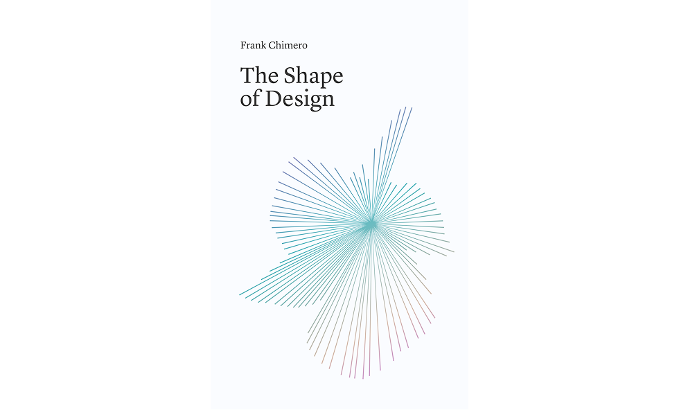
Example 24: The Shape of Design by Frank Chimero
Quiet, cerebral, and beautifully minimal, this cover invites reflection before a word is even read, making it a standout among modern graphic design examples that prove less really can be more.
Layout and imagery: A single abstract line graphic radiates from the center, visually interpreting the concept of “design” without literal references. The composition is balanced, with generous whitespace anchoring the visual.
Typography: A refined serif typeface gives the title literary weight. Small, left-aligned text creates a gentle rhythm and invites a slower, more thoughtful read.
Color scheme: Soft gradients in cyan, lavender, and pink create a delicate contrast against the white background. The color palette feels modern but meditative.
Branding: There’s no logo, no slogan, just thoughtful design. The restraint is the brand, appealing to an audience that values design thinking and clarity.
Why it works: It’s not flashy, and that’s the point. The cover trusts the audience to appreciate nuance, making it feel like a personal invitation rather than a pitch. It’s confident, conceptual, and quietly unforgettable.
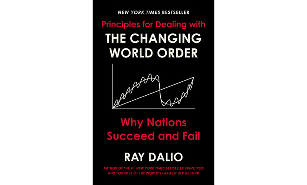
Example 25: Principles by Ray Dalio
This cover doesn’t whisper; it declares. Clean, bold, and deeply authoritative, it sets the tone before the foreword.
Layout and imagery: The minimalist layout puts all focus on the text and the central line graph illustration. The visual suggests data, trendlines, and cycles, perfect for a macroeconomic topic.
Typography: All-caps red and white sans-serif text anchors the design. The title is oversized and centered, with clear hierarchy and maximum legibility.
Color scheme: A stark black background makes the red and white type stand out vividly against the page. It’s classic “business authority” styling: minimal color, maximum contrast.
Branding: Dalio’s name is large, and the typography mirrors his other books in the Principles series, building recognition through repetition.
Why it works: It’s bold and direct, mirroring the book’s thesis-driven content. The black-and-red combo evokes seriousness and urgency, making this a cover that commands shelf space and attention.
Example 26: The Lean Startup by Eric Ries
Simple, bold, and kinetic, his cover captures the energy of innovation with just one powerful visual move.
Layout and imagery: A thick, hand-drawn circular brushstroke dominates the center, representing iteration, agility, and momentum. It’s a direct visual metaphor for the book’s core idea: build–measure–learn cycles.
Typography: All-caps sans-serif in white and blue provides a sharp contrast. The title is stacked and centered, making it instantly legible even at thumbnail size.
Color scheme: High-contrast blue and white with a subtle touch of yellow for emphasis (notably in the author's name). It’s clean and modern, mirroring the lean methodology itself.
Branding: The circular icon has become almost synonymous with the Lean Startup movement, recognizable far beyond the book itself. The cover’s clarity and focus make it an enduring design.
Why it works: The circular brushstroke adds movement and concept in one stroke, while the clean layout ensures the message is never lost. It’s a minimal cover that still crackles with energy, perfect for startup readers.
Example 27: Atomic Habits by James Clear
Clean, structured, and visually aligned with its core message, this cover promises order and clarity from the first page.
Layout and imagery: No central illustration, just a tight, typographic layout surrounded by a pixelated dot pattern. The subtle dotted texture hints at accumulation, reflecting how small actions build over time.
Typography: Bold, friendly serif for the title contrasted with a lighter serif for the subtitle and author. There's a clear hierarchy that leads the eye through the key selling points.
Color scheme: A soft beige backdrop with warm, neutral tones in the text. It’s inviting and unflashy, which fits the practical, no-hype tone of the content.
Branding: The design is as disciplined as the content—no gimmicks, just a clever use of space, repetition, and clarity. The visual consistency mirrors the book’s behavioral science foundation.
Why it works: It looks exactly as the content reads - organized, methodical, and impactful. The dotted background and neat text structure reinforce the message that small things, done consistently, compound into significant results.
Pro tip: For business and self-help ebooks, test your cover in grayscale to ensure it's visually appealing. If the hierarchy still works without color, you’ve nailed the structure.
Kids’ ebook cover examples
Designing a kids’ ebook cover is about sparking curiosity at a glance. Bright colors, playful characters, and bold fonts do the heavy lifting. But great kids’ covers also respect their audience: they’re fun, engaging, and age-appropriate without being chaotic.
Here are a few standout examples and why they work:
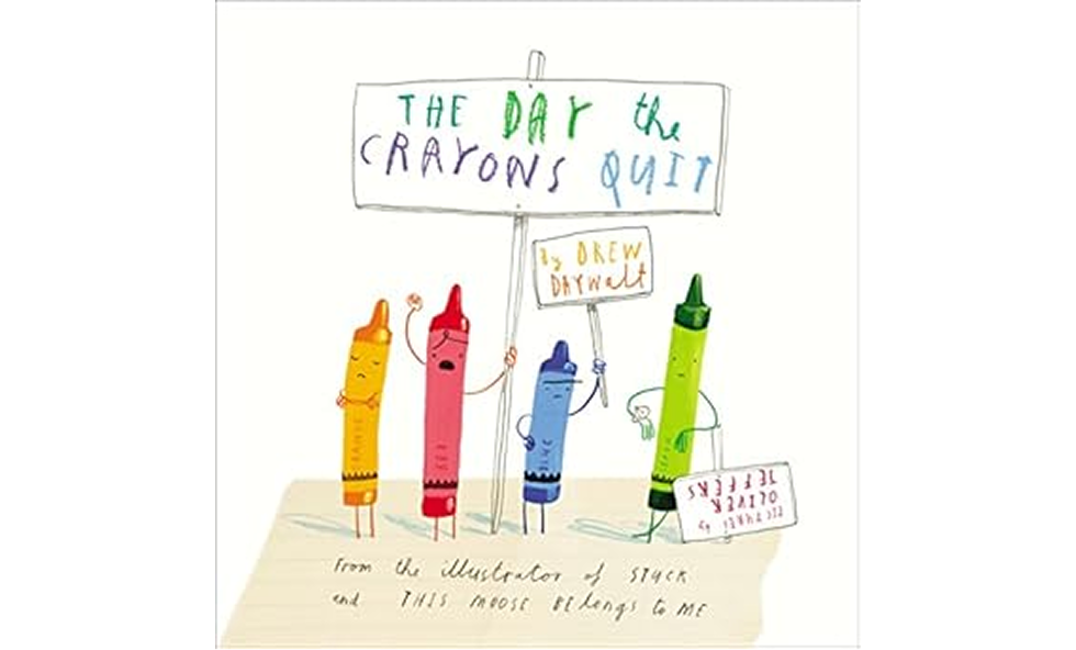
Example 28: The Day the Crayons Quit by Drew Daywalt
Playful, clever, and perfectly in tune with its audience, this cover looks like it came straight from a kid’s desk.
Layout and imagery: A white background showcases crayon characters holding handmade protest signs. Their expressions and poses instantly convey emotion and humor, drawing kids (and adults) in.
Typography: Each word in the title is rendered in a different handwritten style and color, mimicking how a child might actually use crayons. The author's name appears on a scribbled paper scrap, adding to the playful vibe.
Color scheme: Every major crayon color gets a moment—orange, red, green, purple, and more—bringing joyful chaos to the white space. The palette is both functional and thematic.
Branding: The illustration style and hand-drawn lettering immediately connect with the book’s core concept. It sets a fun, slightly rebellious tone that perfectly reflects the story inside.
Why it works: It feels like part of the story before you’ve opened the book. The homemade aesthetic reinforces the theme and speaks directly to the creative mindset of young readers and nostalgic adults.
Example 29: Dragons Love Tacos by Adam Rubin
Silly, snack-filled, and impossible to ignore, this cover sets the table for fun before you even crack the spine.
Layout and imagery: A massive red dragon sprawled across the scene, belly-up and surrounded by tacos, immediately tells the story. The whimsical illustration style is full of character and movement.
Typography: Bold, childlike block letters in various colors match the story’s energy. “LOVE” is emphasized in red, underscoring the book’s core theme in both tone and content.
Color scheme: Warm reds, sunny yellows, and soft grays create a cozy, inviting palette. The combination feels both appetizing and playful, just like tacos.
Branding: The offbeat title paired with quirky ebook cover art makes this instantly recognizable in the children’s book world. The cover’s humor perfectly mirrors the story’s tone.
Why it works: It doesn’t overthink it. The humor is visual, the theme is obvious, and the mood is playful. Kids don’t need to read the title to know this book is fun, and that’s brilliant design.
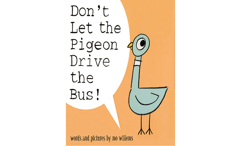
Example 30: Don’t Let the Pigeon Drive the Bus! by Mo Willems
Minimalist but full of mischief, this cover feels like the start of an inside joke between the book and the reader.
Layout and imagery: A single pigeon, drawn in signature Willems style, looks straight at the viewer while a speech bubble takes up half the page. The composition is clean but expressive.
Typography: The speech bubble employs casual, uneven hand lettering, lending it an animated, spoken feel. The title reads like a command, not a label.
Color scheme: Soft orange backdrop with pale blue for the pigeon and just a touch of yellow for the beak. The palette is limited but effective.
Branding: Willems’ distinctive art style and dry humor are instantly recognizable. Even without the author’s name, fans know who’s behind this book.
Why it works: It invites participation from the start. The pigeon’s expression, the imperative title, and the direct eye contact make kids feel like they’re part of the story already.
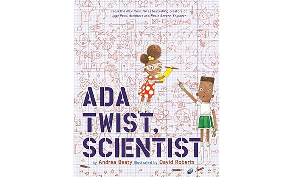
Example 31: Ada Twist, Scientist by Andrea Beaty
A lively blend of STEM and storytelling, this cover makes learning look like an adventure.
Layout and imagery: The central figure, Ada, is in motion, scribbling on a background filled with scientific doodles. The graph paper backdrop gives it a classroom feel while still feeling fun and light.
Typography: Bold, uppercase lettering anchors the bottom of the cover. The font is clean and modern, offering contrast against the hand-drawn illustrations.
Color scheme: Purples, reds, and chalky neutrals give it a slightly retro vibe while staying approachable. The palette feels smart but not stuffy.
Branding: This is part of a larger series (Rosie Revere, Engineer, Iggy Peck, Architect), and the visual style, featuring a grid background, bold title, and action-oriented kids, is consistent and instantly recognizable.
Why it works: The cover visually celebrates curiosity. It’s educational without being boring, scientific without being sterile. Perfectly balanced for a book that aims to inspire young minds.
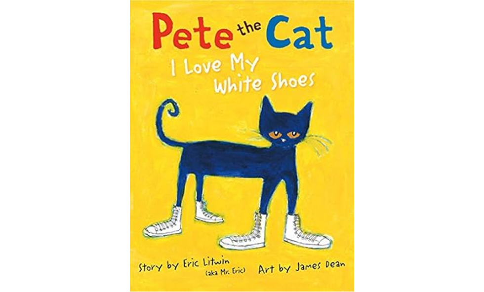
Example 32: Pete the Cat: I Love My White Shoes by Eric Litwin
Cool, colorful, and brimming with personality, this cover walks the walk in white shoes, of course.
Layout and imagery: Pete, tall and chill, struts across a lemon-yellow background with his now-iconic white sneakers. The focus is all on him—character and shoes—no clutter necessary.
Typography: Crayon-style hand lettering gives it a casual, kid-drawn vibe. The title plays with size and color to create a visual rhythm, adding fun.
Color scheme: A punchy trio of primary colors—blue cat, yellow backdrop, red and white accents—keeps the palette eye-catching but straightforward.
Branding: Pete the Cat is a visual brand unto himself. His distinctive shape, expression, and tone are instantly recognizable, even without a heavy logo or series badge.
Why it works: The art oozes attitude. Pete looks unfazed and fun, which mirrors the book’s core message: keep walking, no matter what. It’s a character-driven cover design at its best.
Pro tip: If you're designing a kids’ ebook cover, test it with an actual kid. Ask them what the book is about based on the cover. If they get close or laugh, you’re on the right track.
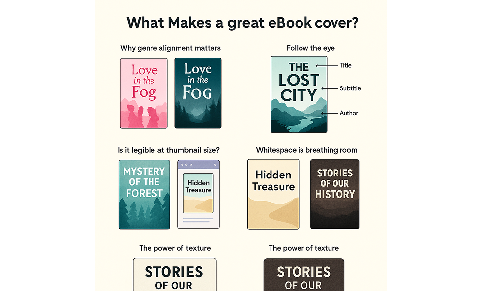
What makes a great ebook cover?
You’ve seen the examples. Now let’s break down what’s happening under the hood. Great covers aren’t happy accidents; they follow a handful of visual rules that help them connect with readers fast. Whether you're building one yourself or working with a freelance graphic designer, these principles are non-negotiable:
Genre alignment
If your cover doesn’t match reader expectations for the genre, you’re in trouble. A romance with a horror-style cover will confuse and lose your audience before they even read the blurb. Know the visual language: script fonts for romance, dark palettes for thrillers, ornate borders for fantasy, clean typography for business or email marketing designs. These expectations are deeply rooted in the history of content marketing, where visual clarity is a key driver of conversion.
Visual hierarchy
Your title comes first, followed by the subtitle, and then your name. That’s the order the eye should naturally follow. If your author name jumps out before your title and you’re not Stephen King, you’re doing it wrong. An effective visual hierarchy is one of the most common traits shared by strong graphic design examples, and a poor hierarchy is one of the fastest ways to lose credibility.
Legibility at thumbnail size
Most ebook sales happen online. That means your cover needs to look good, approximately the size of a large postage stamp. Test it at 100px high. If you can’t read the title, neither can your readers. This is especially important if you're using trendy fonts combinations, cool type is great, but clarity comes first.
Whitespace and margins
Crowding every inch of space makes your cover feel cheap. Give your text and imagery breathing room. Whitespace isn’t wasted space; it’s what makes the rest of your design pop. Many marketing designers intentionally use generous margins to frame the content and guide the reader’s eye.
Textures and overlays
A subtle paper grain, a semi-transparent color overlay, or a light vignette can add depth and polish to an image. But keep it light. If the effect draws more attention than the title, you’ve gone too far. Typography trends come and go, but subtlety never goes out of style.
Pro tip: Design principles aren’t here to limit you. They’re here to make sure your creativity works for the audience you’re trying to reach. Break a rule only when you know exactly why you’re breaking it.
DIY vs. hiring a pro: what’s right for you?
Your budget, skills, and patience will determine whether you should tackle your own cover or hire a designer. Both options can work, but each has clear trade‑offs, especially when considering the cost to hire a graphic designer versus the time investment required for DIY. Here is what to consider:
Sometimes, going DIY makes perfect sense. If you have a good eye for design, know your way around tools like Canva or Figma, and you’re creating a short-term asset, say, a lead magnet or MVP-style ebook, you can absolutely get the job done yourself. DIY is also ideal when you're testing concepts and don’t want to sink budget into something that might pivot next quarter.
But if you’re creating an ebook you plan to promote or sell for years, investing in a professional is a smart move. Beyond just knowing how much illustrations cost, you’ll get guidance, strategy, and experience baked into the final product.
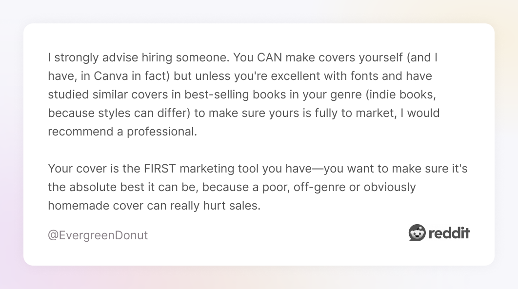
As one Redditor put it, “I strongly advise hiring someone. You CAN make covers yourself (and I have, in Canva in fact) but unless you're excellent with fonts and have studied similar covers in best-selling books in your genre (indie books, because styles can differ) to make sure yours is fully to market, I would recommend a professional. Your cover is the FIRST marketing tool you have—you want to make sure it's the absolute best it can be, because a poor, off-genre or obviously homemade cover can really hurt sales.”
We couldn’t agree more. At TodayMade, we’ve seen firsthand how much difference the right cover can make. A professional designer can craft a cover that not only looks good but also aligns tightly with your brand and stands out in a sea of sameness. Especially when you need polished, print-ready files in multiple formats, a designer can save you serious time and eliminate second-guessing.
Whether you're working with an in-house team or exploring graphic design outsourcing, the key is aligning your cover with your strategy. Our team specializes in transforming dense or technical content into lead magnets that convert, utilizing thoughtful layouts, a clean visual hierarchy, and on-brand design that keeps readers engaged and ready to act.
Of course, deciding to hire a designer is just the first step. The next? Finding the right one.
Tips for hiring the right designer
Hiring a designer is about elevating your ebook cover design ideas into something polished and professional. The right designer will understand your story, your audience, and how to translate both into a scroll-stopping cover ebook.
To make sure you’re choosing the right person for the job, keep these tips in mind during the hiring process:
Ask for relevant samples: If they’ve never done your genre, they may miss the visual cues your audience expects.
Be clear in your brief: Include genre, target audience, mood, and examples you like.
Check licensing: Make sure you own the rights to all stock images used.
Watch for red flags: Designers who recycle the same template for multiple clients or who can’t provide high‑resolution files.
Pro tip: If you’re not ready for a full custom ebook cover design, some professionals offer a “design polish” service, where they refine your DIY attempt. It’s cheaper, faster, and often gets you 90% of the benefit.
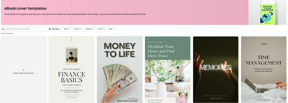
How to choose your tool
Not all design tools are created equal, and the best one for you depends on what you're trying to achieve, how quickly you need it, and how deeply you're willing to delve. Here’s a quick guide to help you pick:
Need something fast and beginner-friendly?Canva is your best bet. You’ll get a decent-looking cover in under an hour using drag-and-drop templates.
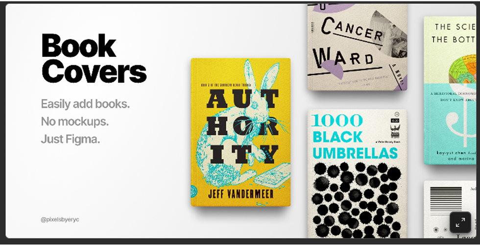
Want full control over layout and typography? Figma or InDesign lets you fine-tune every pixel, making it great for designers or anyone with a keen eye for detail.
Planning to illustrate your own cover? Procreate is perfect for digital drawing and creating your own images. You’ll need to export your final artwork to another tool for text layout, but it excels at creating custom visuals.
Pro tip: If you're designing in one tool and handling layout in another, export your files at high resolution (300 DPI) to keep everything crisp.
Even if you use tools, keep a lightweight version of your cover in Canva or Figma for quick reference. It’s easier for quick updates later, like adding “New Edition” or “Award‑Winning Author” badges.
Your cover is more than a pretty face
A good ebook cover both looks nice and works hard. It grabs attention in a crowded marketplace, sets the right tone, and convinces someone to click “Download” or “Buy” without them even realizing why.
The formula isn’t complicated:
Inspiration: Study covers in your genre. Learn what works and why.
Tools: Select the design platform that aligns with your skills and timeline.
Execution: Apply the core design principles. Or hire someone who will.
Whether you DIY or go pro, the goal is the same: create a cover that stops the scroll and earns the click. And if you want expert eyes and hands on your project, TodayMade has you covered.
Got questions?
Your title, a subtitle (if you have one), your name, and strong visuals that match your genre. That’s it.
Bonus points if the design makes someone stop scrolling and think, “Ooh, what’s this about?”
Not at all, especially if you’re working with a professional who delivers custom design, licensing, and print-ready files.
For a book you’ll promote or sell for years, $400 is actually a mid-range price. Just make sure you’re paying for quality, not just flashy mockups.
It depends on your genre, but bright, high-contrast colors like yellow, red, and turquoise tend to grab attention fastest.
Just don’t forget to balance bold with readable—no one clicks what they can’t read.
Avoid low-res stock photos, hard-to-read fonts, and every idea you had all at once. Overcrowding kills clarity.
And unless you’re world-famous, don’t make your name the biggest thing on the page.