Explore 17+ fresh email design ideas, inspiring real-world examples, and powerful tools to help you create campaigns that stand out in any inbox. Whether you need a quick visual refresh or a complete redesign, this guide will give you actionable tips to boost engagement and click-through rates.
When was the last time an email actually stopped you mid-scroll? Probably not often. Most inboxes are crammed with dull subject lines, recycled templates, and layouts that feel more like background clutter than meaningful communication. But every now and then, you stumble on one that pops — the kind of email that feels less like marketing and more like an experience. And that's what great email design can do.
From bold visuals and clever typography to seamless mobile layouts and storytelling-driven copy, the right design transforms an ordinary send into a brand-building moment. And in 2025, email marketing is still one of the highest-ROI channels, delivering up to $36-$40 for every $1 spent.
So whether you’re a marketer chasing conversions, a designer hunting fresh layouts, or a business owner tired of “meh” newsletters, the best inspiration comes from studying what works and why.
In this guide, we’ll show you:
Where real marketers go for inspiration
Visual examples and swipe-worthy designs
How to create your own swipe system to reuse great ideas
Design trends to watch and what’s fading out
By the end, you’ll not only know what a good email looks like. You’ll also have the workflows, tools, and tricks to turn inspiration into high-performing campaigns. And if you’re looking for the step-by-step rules behind what makes them work, check out our guide to email marketing designs, where we break down the best practices and principles.
Curated email inspiration by campaign type
To make this guide more practical, we’ve grouped inspiration by campaign type. That way, you can quickly zero in on the designs that match your goals — whether it’s selling, educating, onboarding, or winning customers back.
a. Marketing & promo emails design
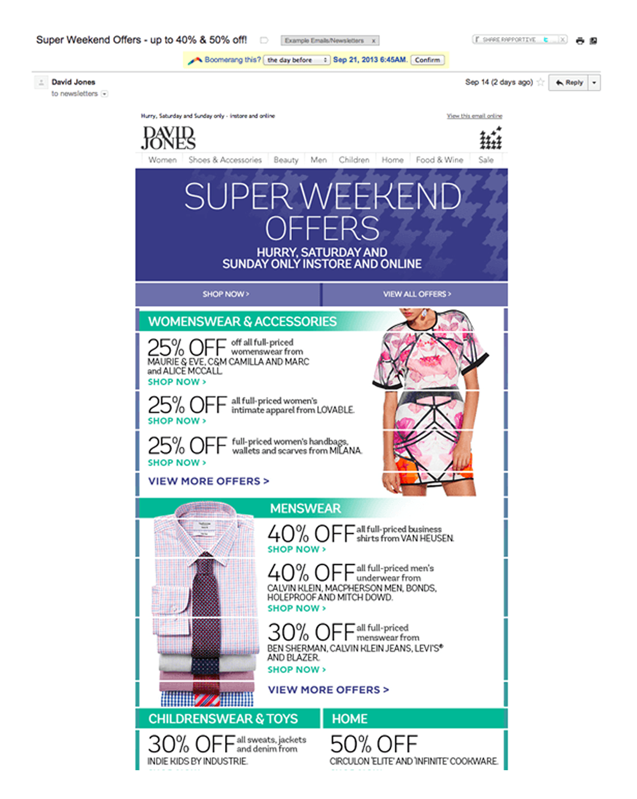
Different campaigns call for different styles. What works for a welcome series might not work for a seasonal promo. So let’s dive into some examples, starting with the always-popular promo emails.
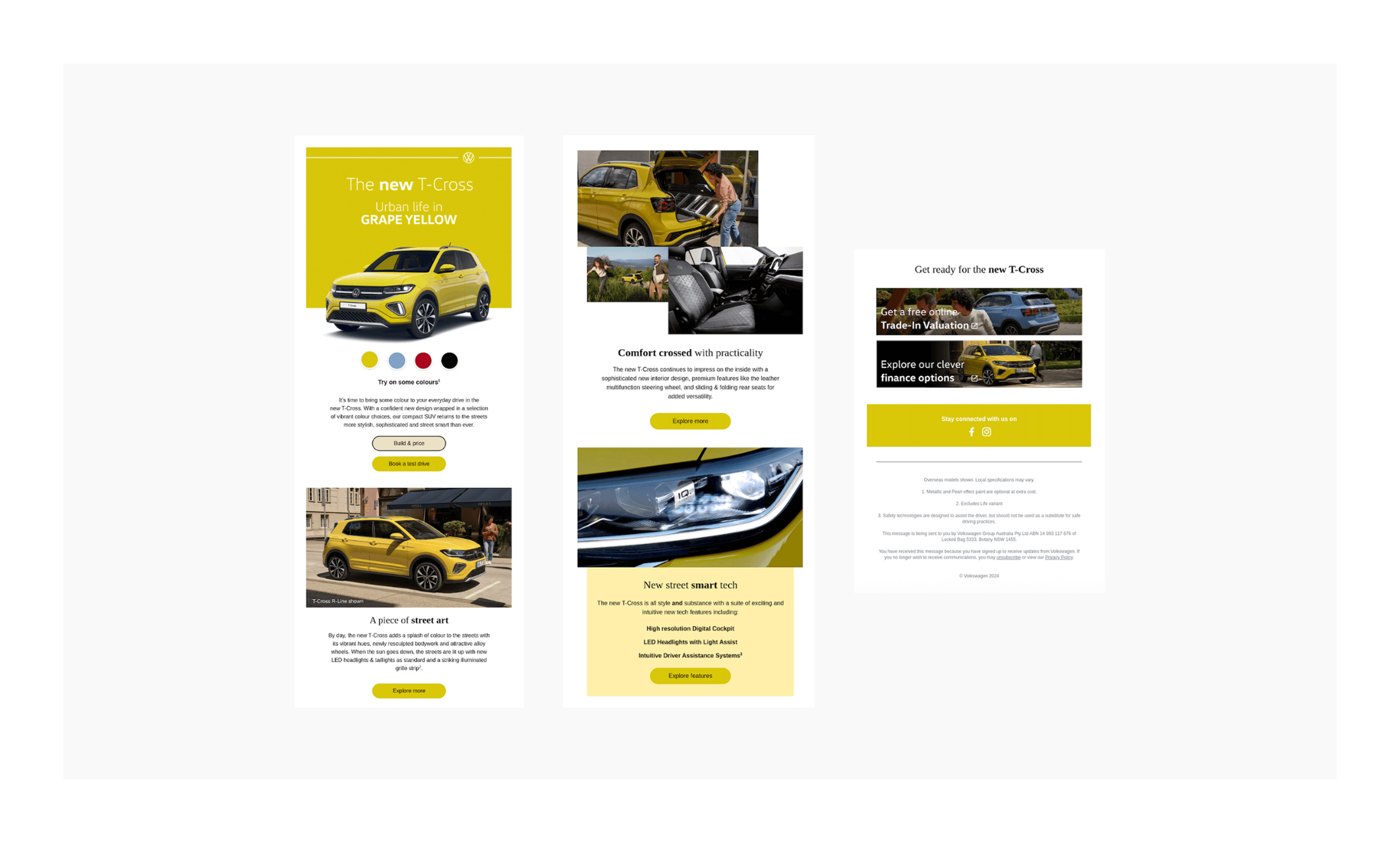
Clear, repeated CTAs. “Available inventory,” “Learn more,” “Book your test drive”. Each CTA matches the stage of interest a buyer might be at.
Brand consistency. Neutral colors, minimal text, plenty of white space — aligns with Polestar’s premium, Scandinavian design aesthetic. You’ll notice the same fundamentals echoed in many graphic design examples, where consistency and clarity matter just as much as creativity.
What to borrow
Lead with a bold benefit → If your product has a clear, eye-catching advantage (price, feature, time-saving), highlight it in the first headline.
Use contrasting color for key numbers → Makes savings, percentages, or deadlines instantly noticeable.
Block structure = easy scanning → Keep sections modular so readers can skim (especially on mobile).
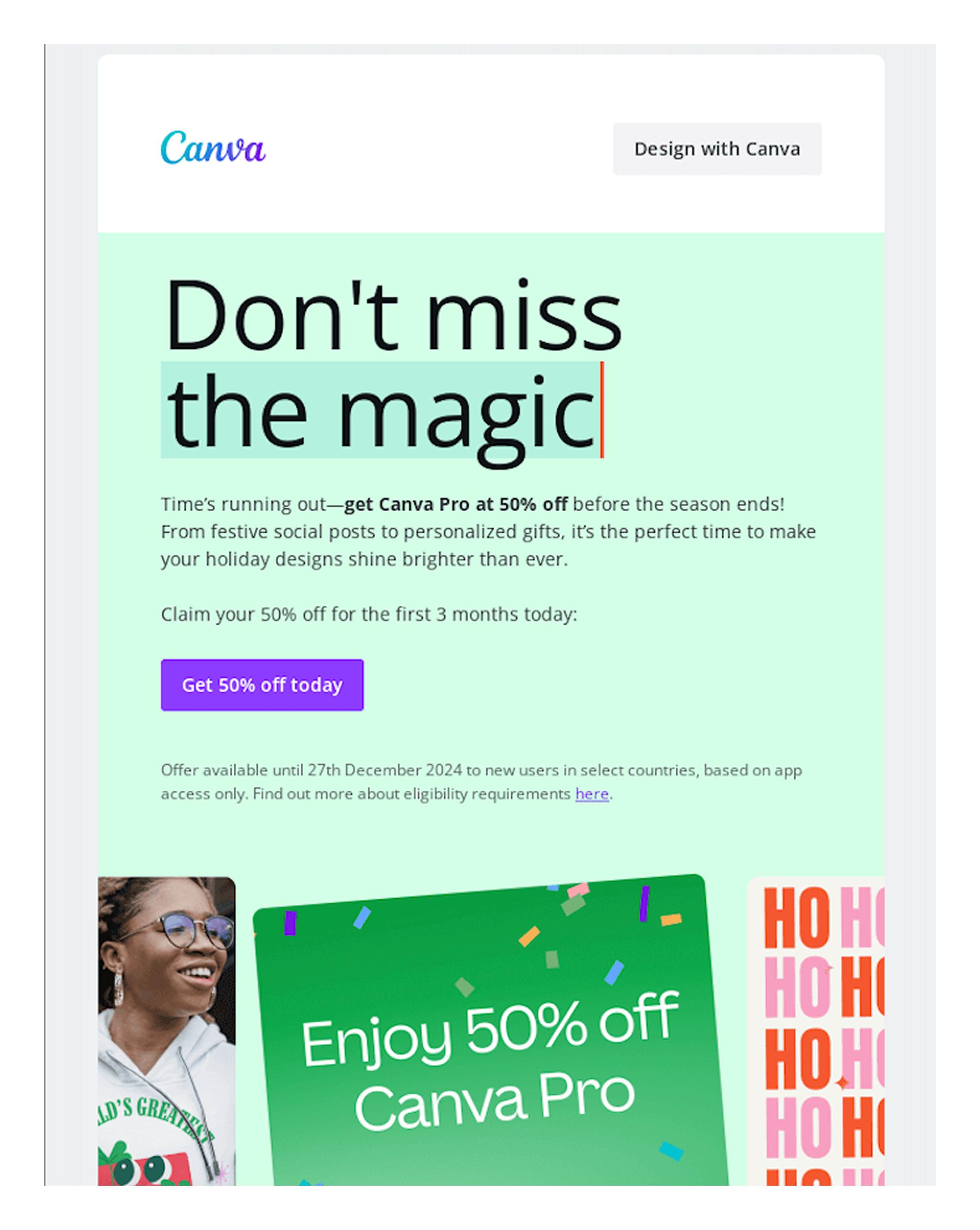
Urgency-driven headline. “Don’t miss the magic” paired with “50% off” creates both FOMO and a clear value hook. Short, emotional, and benefit-forward.
Vibrant color blocking. The mint green hero background with bold black type immediately grabs attention and stands out in the inbox.
Bold CTA button. “Get 50% off today” in a strong purple CTA button makes the next step unmissable.
Seasonal relevance. Holiday positioning (“time’s running out”, festive promos, “HO HO HO” graphics) ties the discount to a clear, limited timeframe.
Visual reinforcement of offer. The big tilted card graphic with “Enjoy 50% off Canva Pro” doubles down on the value prop, making it impossible to miss.
Step-by-step instructions. The numbered list (1–5) in the second block lowers friction by showing exactly how to redeem and use Canva Pro.
Balanced mix of product + lifestyle imagery. Smiling face (emotional), festive mug mockup (practical), and branded design assets keep it fun yet functional.
What to borrow
Lead with emotion + urgency → Open with a phrase that triggers curiosity or fear of missing out.
Highlight the offer visually AND textually → Repeat the discount in headline, graphic, and CTA.
Seasonal anchoring → Tie promotions to holidays or events to make the offer feel timely.
Instructional design → Use numbered steps to simplify redemption and encourage follow-through.
CTA clarity → Keep the button copy action-oriented and benefit-driven (“Get 50% off today” vs. “Learn more”).
Fun brand personality → Use playful graphics (confetti, “HO HO HO”) to reinforce brand voice while keeping it festive.
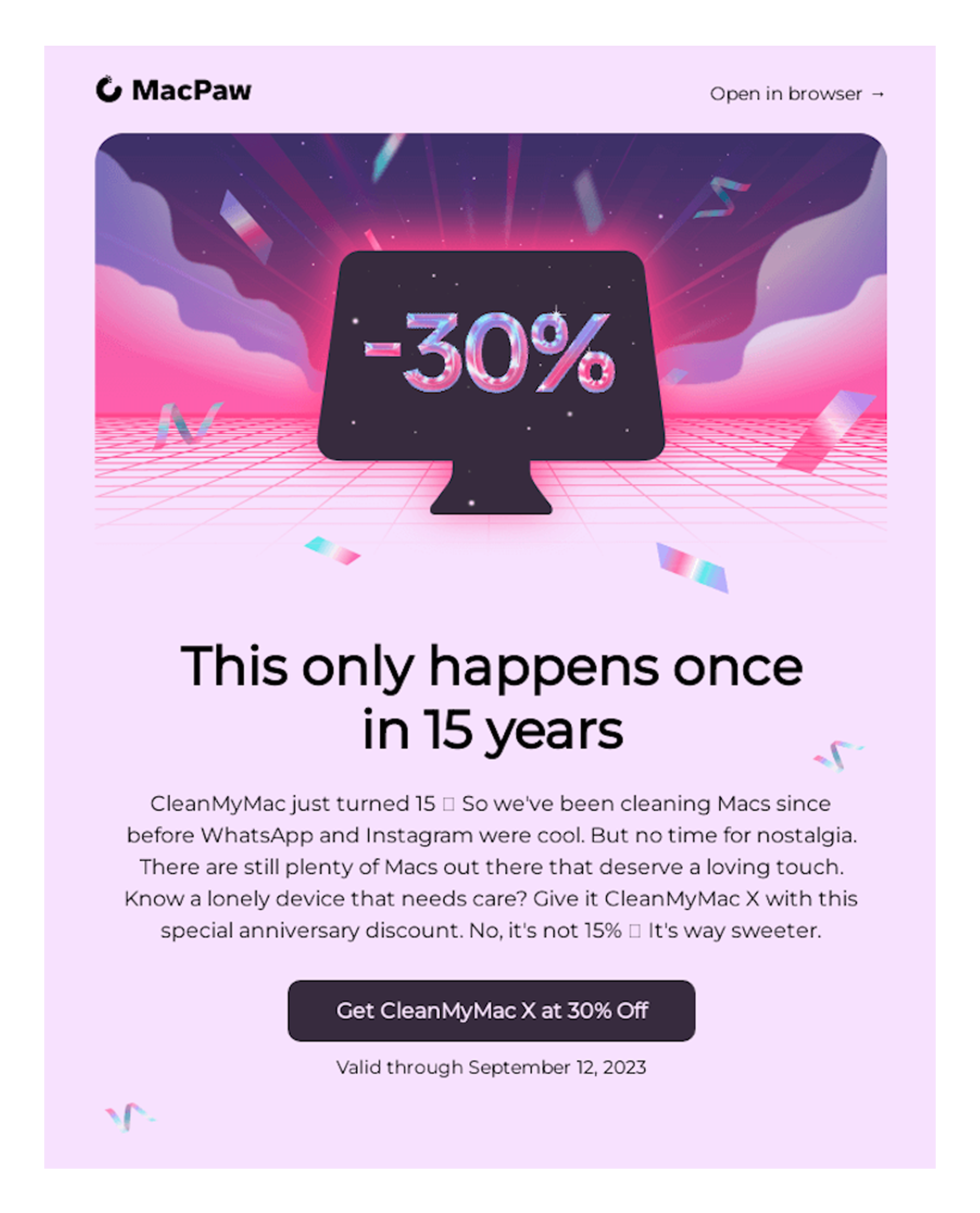
Playful hero image. The retro, neon aesthetic immediately grabs attention and feels different from typical SaaS emails. It leans into nostalgia while still being fun.
Anniversary hook. “This only happens once in 15 years” is a strong headline that sparks curiosity and emphasizes rarity. Scarcity = urgency.
Personal storytelling. The copy references how long they’ve been around (“since before WhatsApp and Instagram were cool”) — builds trust and credibility.
Clear, bold offer. “Get CleanMyMac X at 30% Off” stands out in a big button, repeated in both the hero graphic and the CTA.
Interactive idea: time capsule. The email isn’t just about a discount; it invites readers to “write an email to your future self”. That interactive twist builds engagement and emotional connection.
What to borrow
Tie promos to milestones → Birthdays, anniversaries, product launches — make the offer feel special and time-bound.
Use nostalgia to stand out → Retro graphics or references to “back when” moments create emotional resonance.
Add an interactive element → Beyond the discount, give people something fun to do (like a time capsule).
Reinforce credibility with longevity → SaaS brands can lean on years in the market as a trust-builder.
b. Newsletters design
Newsletters are longer by nature, but that doesn’t mean they should feel overwhelming. The best ones break content into clear sections, highlight only the most important updates, and make everything scannable at a glance. Think of them as curated digests — easy to skim, with clear paths for readers who want to dive deeper on your site or inside the product.
Clear edition framing. Right at the top: “July 2025 Edition” + “Zapier’s latest”. Readers know this is a recurring update, which sets expectations and builds familiarity.
Modular block design. Each section (“What’s new”, “Product updates”, “Spotlight", “New apps”) is visually separated with background colors and icons, making the content easy to skim.
Strong hierarchy. Zapier leads with “What’s new” (high interest), then “Product updates”, then community/spotlight. Priority is clear.
Balanced mix of media. App icons, illustrations, and photography keep the newsletter visually engaging without clutter.
Multiple CTAs, contextually relevant. Instead of one generic “Learn more”, each block has its own action (e.g., “Get the template”, “Register for free”, “Explore integrations”). This increases the chance of clicks.
Brand consistency. Neutral, tech-inspired colors and simple typography align with Zapier’s modern SaaS identity.
What to borrow
Frame newsletters as “editions” → This sets up a repeatable series readers can expect.
Modular sections = scannability → Use color blocks, headlines, and icons to help readers skim and choose what matters to them.
Prioritize content hierarchy → Lead with the updates most likely to spark excitement (new features, big launches).
Contextual CTAs → Tie each CTA directly to its content block for higher engagement.
Mix visuals for interest → Alternate between icons, graphics, and real images to keep the flow dynamic.
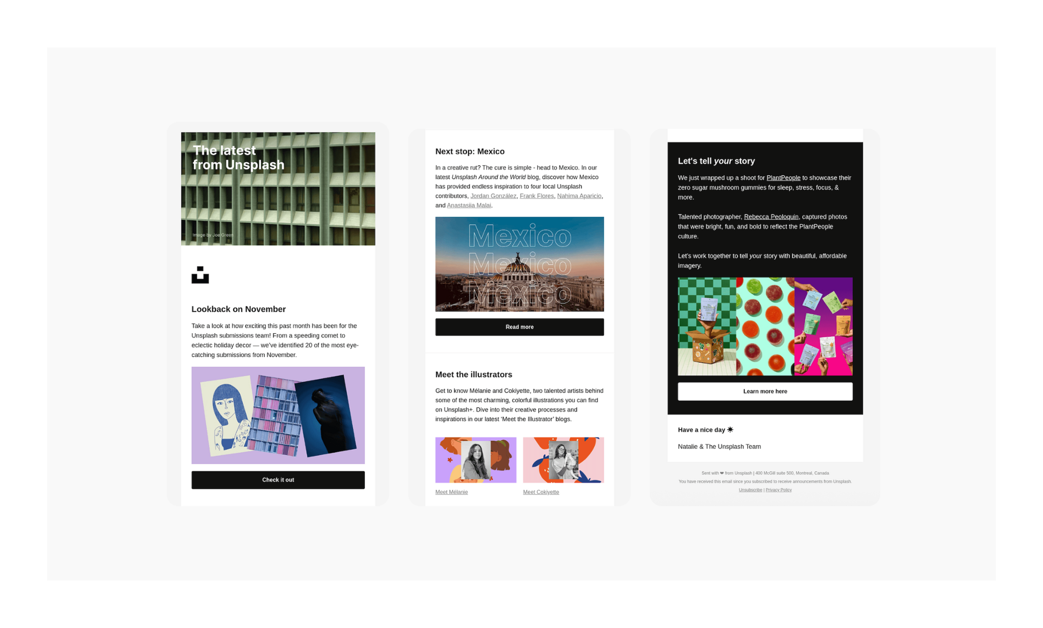
Editorial feel. From the title “The latest from Unsplash” to the big hero image, this feels more like a magazine or creative digest than a sales pitch.
Story-driven sections. Each block tells a mini-story: “Lookback on November”, “Next stop: Mexico”, “Meet the illustrators”. This makes the email feel like curated content, not just announcements.
Strong use of visuals. True to Unsplash’s brand, images dominate. Every section is anchored by striking photography or illustration, keeping the design visually rich.
Simple, consistent CTAs. Each block has one clear CTA (“Check it out”, “Read more”, “Meet Mélanie”) in black buttons — no confusion, just clean next steps.
Community spotlight. Featuring contributors and illustrators makes the email personal and reinforces Unsplash’s identity as a creative community, not just a platform.
Personalized sign-off. “Have a nice day ✹ – Natalie & The Unsplash Team” adds a human touch that makes the brand feel approachable.
What to borrow
Treat newsletters like mini-magazines → Use storytelling headlines and sections that encourage curiosity.
Feature your community/customers → Highlight creators, partners, or user stories to humanize your brand.
Keep CTAs consistent and simple → Same style across sections makes the newsletter easy to navigate.
Lean into your brand’s strength → If you’re a visual-first brand (like Unsplash), let images do the heavy lifting.
Add a human sign-off → A named sender or team note can make even large brands feel personable.
Clear headline framing. “What’s New in Miro” instantly sets the expectation: this is a product update email, where readers will learn about features.
Personalization touch. Starts with “Hi Smiles Davis” and a note from the Head of Product Marketing. This gives the email a personal, direct feel rather than a faceless update.
Modular feature blocks. Each feature (Tables, Blueprints, Slides, Focus mode) gets its own section with headline, visual, short description, and CTA. Easy to skim and click.
Visual hierarchy. Screenshots are clean, minimal, and always paired with short copy. The balance between text and visuals keeps the email engaging.
Multiple entry points. Each block has a relevant CTA (e.g., “See how Tables work”, “Stay in the zone”). The footer also adds extra actions (watch launch video, add to wishlist).
On-brand design. White background, subtle grid texture, and playful iconography reflect Miro’s creative/productivity vibe.
What to borrow
Make product newsletters predictable → Use a recurring headline like “What’s New in [Tool]” so readers know what to expect.
Add a human intro → A short note from a named team member makes SaaS updates feel less robotic.
Keep feature updates modular → Break them into bite-sized blocks, each with its own CTA.
Balance screenshots with short copy → Don’t overwhelm readers with walls of text — let visuals do the heavy lifting.
Offer multiple CTA paths → Different users are at different stages; give options (learn, try, watch, wishlist).
c. Welcome series & onboarding emails
Welcome flows set the tone for the entire customer journey. A good onboarding email doesn’t just say “hi” — it guides new users step by step, making setup feel simple, rewarding, and even fun. The trick is balancing motivation with clarity so people actually take the actions that get them invested in your product.
Motivational headline. “Let’s do this!” sets an energetic, action-oriented tone that makes onboarding feel exciting.
Progress tracker at the top. The visual “progress bar” creates a sense of momentum and gamifies the process, encouraging users to complete their setup.
Personalization. The email calls out the recipient by name (“Hey Andrew”) and references their current progress (“Your checklist is 0% complete”). That reminder nudges action by showing what’s missing.
Task-based structure. Instead of overwhelming users, each task is broken down into a clear, actionable step: link mailbox, create a sequence, connect CRM, etc.
Gamified incentives. Credits are attached to each step (“Earn 100 credits”), turning onboarding into a reward system rather than just setup work.
Strong CTA placement. The “Continue onboarding” button at the bottom ties the whole flow together, giving users a clear next step after scanning.
What to borrow
Gamify onboarding → Use progress bars, checklists, or points to make setup feel like a game.
Show progress (or lack of it) → Highlight completion percentages to nudge users into action.
Break onboarding into micro-tasks → Easier for users to digest and complete.
Reward completion → Attach small incentives (credits, discounts, badges) to each step.
Keep tone motivational → Use encouraging, energetic copy to reduce friction and make the process feel fun.
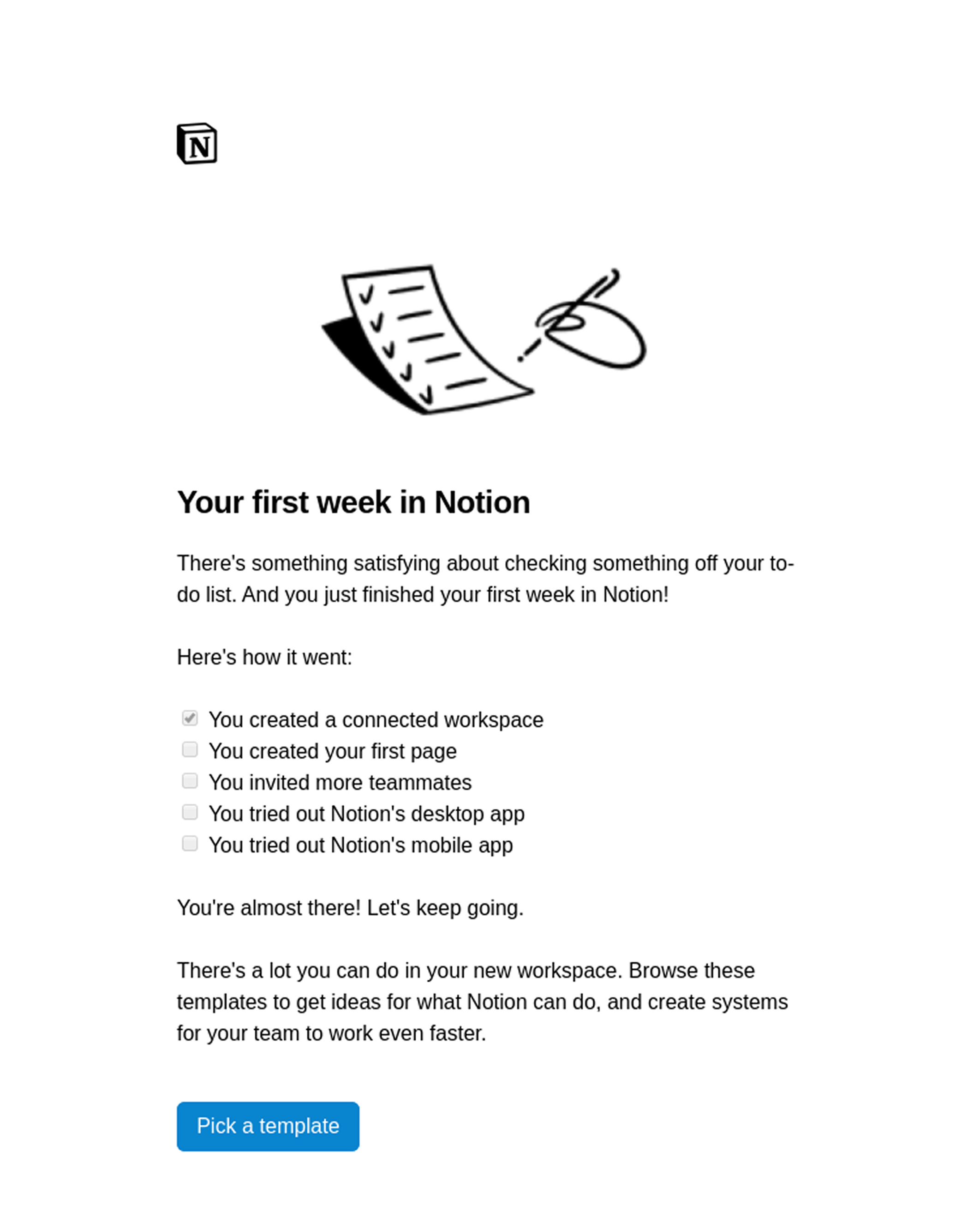
Progress framing. The use of a checklist alongside the subject line “Your first week in Notion” signals that onboarding unfolds step by step, not all at once.
Visual checklist. Using ticked and unticked boxes makes progress feel tangible. Readers can instantly see what they’ve accomplished and what’s left.
Psychological nudge. By showing “You’re almost there!” Notion leverages the Zeigarnik effect (the brain’s desire to finish incomplete tasks).
Minimalist design. Black-and-white illustrations and sparse text reflect Notion’s clean, distraction-free brand aesthetic.
Contextual CTA. Instead of a generic “Get started”, the CTA is tied to the next logical step: “Pick a template”. That’s practical and actionable.
Personal yet scalable tone. The copy is friendly and motivational, but doesn’t require deep personalization, making it scalable across users.
What to borrow
Show onboarding as a journey → Use timelines, checklists, or progress updates to remind users where they stand.
Highlight completed tasks → Reinforces success and motivates the next step.
Use psychology to nudge → Phrases like “You’re almost there” encourage follow-through.
Keep the design aligned with brand voice → If your product is minimalist, let your onboarding emails reflect that.
Tie CTA to the next logical step → Guide users forward with specific, contextual actions.
Warm, inviting headline. “Come on in” feels welcoming and conversational, setting the tone for a brand introduction.
Immediate brand immersion. A collage of design imagery paired with a mobile preview shows exactly what AD is about: visual inspiration.
Personal welcome from leadership. A note from the Editor in Chief adds credibility and makes the email feel personal, even though it’s mass-sent.
Content-first approach. Instead of pushing product features, the email curates articles, interior tours, and inspiration, showing immediate value.
Clear content hierarchy. “Get Inspire”, “Open Door”, and “Unique Spaces” break content into digestible themes, making it easy for readers to browse.
Simple CTAs. Black “Read Now” and “Watch Now” buttons keep the design consistent and easy to act on.
What to borrow
Lead with a warm greeting → Start with a friendly, human headline instead of corporate jargon.
Immerse readers in your brand instantly → Use images or previews that reflect what your product/content is all about.
Include a leadership welcome → A personal note from a CEO/Editor/Founder adds authority and builds trust.
Curate starter content → For publishers or content-driven brands, show new users what’s worth exploring right away.
Keep CTAs consistent and bold → Uniform buttons make the experience smoother and more professional.
d. Product updates & feature announcements
Product update emails can be tricky to get right. They need to share what’s new without overwhelming readers with too much detail, and they should highlight the benefits in a way that feels clear and useful. The strongest examples strike a balance: they explain what changed, why it matters, and give users a simple next step to try it themselves. Done well, these emails build trust by showing that your product is evolving, and that you care enough to keep customers in the loop.
For Refera, a healthcare referral platform, we designed a weekly report email that delivers real value without overwhelming readers. Instead of long paragraphs or heavy visuals, the layout is clean and modular: key metrics upfront, followed by clear breakdowns by doctor, specialty, and top referrals. The use of simple color coding (+/- percentages) makes trends instantly recognizable at a glance.
Why it works
Clear headline. “Weekly Report” immediately tells the reader what this email is about.
Important data at a glance. Key metrics (referrals sent, scheduled, completed) are highlighted in boxes with percentage changes, making trends easy to scan.
Visual hierarchy. Important stats are at the top, followed by breakdowns (by doctor, specialty, office). The structure flows logically.
Clear and actionable CTA. “See full insights” button encourages readers to dig deeper in the app if they want more detail.
Professional, minimalist design. Lots of whitespace, soft colors, and clear typography give it a credible, dashboard-like feel.
What to borrow
Lead with the purpose → Put a clear title at the top so users know what they’re looking at.
Make data scannable → Use boxes, percentages, or highlights to surface the most important numbers.
Organize content logically → Start with key stats, then drill down into more detail.
Provide a next step → A CTA that points to deeper insights or reports makes the email actionable.
Keep the design clean and professional → Minimalist layouts build trust for data-heavy emails.
At TodayMade, we design emails like this to do more than inform — they build trust, reinforce brand identity, and encourage users to return to the product. If you need weekly reports, product updates, or automated flows that are actually read, our team is ready to help.
Bold headline promise at the beginning. “Now you can Airbnb more than an Airbnb” reframes the brand, signaling a major evolution rather than a small tweak.
Sequential storytelling. The email flows like a mini product tour: Services → Experiences → App redesign. This order builds excitement and gradually expands scope.
Device mockups for clarity. Each section uses a phone screenshot that grounds the update in real UX, so readers can instantly visualize what’s new.
Concise, benefit-first copy. Instead of long explanations, each block pairs a short headline with a user benefit (book a chef, find hidden gems, organize trips).
Clear, contextual CTAs. Every feature gets its own CTA (“Explore Airbnb Services”, “See everything announced”), letting readers dive into what interests them most.
Consistent minimalist design. Lots of white space, black CTAs, and sleek visuals keep it polished and aligned with Airbnb’s modern aesthetic.
What to borrow
Frame updates as a transformation → Don’t just say “new feature”; position it as part of a bigger vision.
Guide readers through features sequentially → Tell a story that builds from one update to the next.
Use product visuals → Screenshots or device mockups make features concrete and scannable.
Keep copy benefit-driven → Focus on what users can now do rather than just what changed.
True interactivity. Unlike static product updates, this email lets readers play with the car’s colors directly inside the inbox. That hands-on element immediately boosts engagement.
Personalization through choice. By letting users experiment with colors, the email feels personalized — the car adapts to their preference.
Novelty factor. Interactive features in email are still relatively rare, so this stands out instantly compared to static designs.
Higher dwell time. Clicking through different colors keeps users engaged longer, which increases recall and brand impression.
Seamless user flow. After playing with the customization, the CTA likely directs to a landing page where users can configure or book a test drive, making the transition from inspiration → action smooth.
What to borrow
Add interactivity where it matters → Not everything needs to be interactive, but product customization is a natural fit.
Turn email into an experience → Instead of passively reading, let users do something in the inbox.
Use interactivity as a hook → Features like carousels, color pickers, or quizzes can transform a “scroll and forget” email into something memorable.
Pair interactivity with clear CTAs → Give users a next step once they’re engaged, so the fun turns into action.
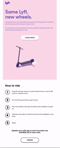
Animated hero. The scooter spins and jumps subtly, creating a sense of interactivity and instantly drawing attention to the new feature.
Minimalist design. Lots of white space, a clean pastel background, and straightforward typography keep the focus on the product and message.
Clear headline and subcopy. “Same Lyft, new wheels.” Simple, playful, and benefit-driven. Readers immediately know what’s new.
Step-by-step guide. The numbered “How to ride” section breaks down the user journey into five easy actions, making onboarding frictionless.
Strong single CTA. Instead of overwhelming users with options, Lyft keeps it focused: Update the app. This aligns with the email’s purpose.
What to borrow
Use motion to stand out → Even simple animations can make an email feel more alive and interactive.
Keep it minimal → When announcing a single product update, don’t clutter; let the core message shine.
Guide users with steps → A quick checklist/tutorial can reduce friction and encourage adoption.
Stick to one clear CTA → Focus the reader’s attention on the key action you want them to take.
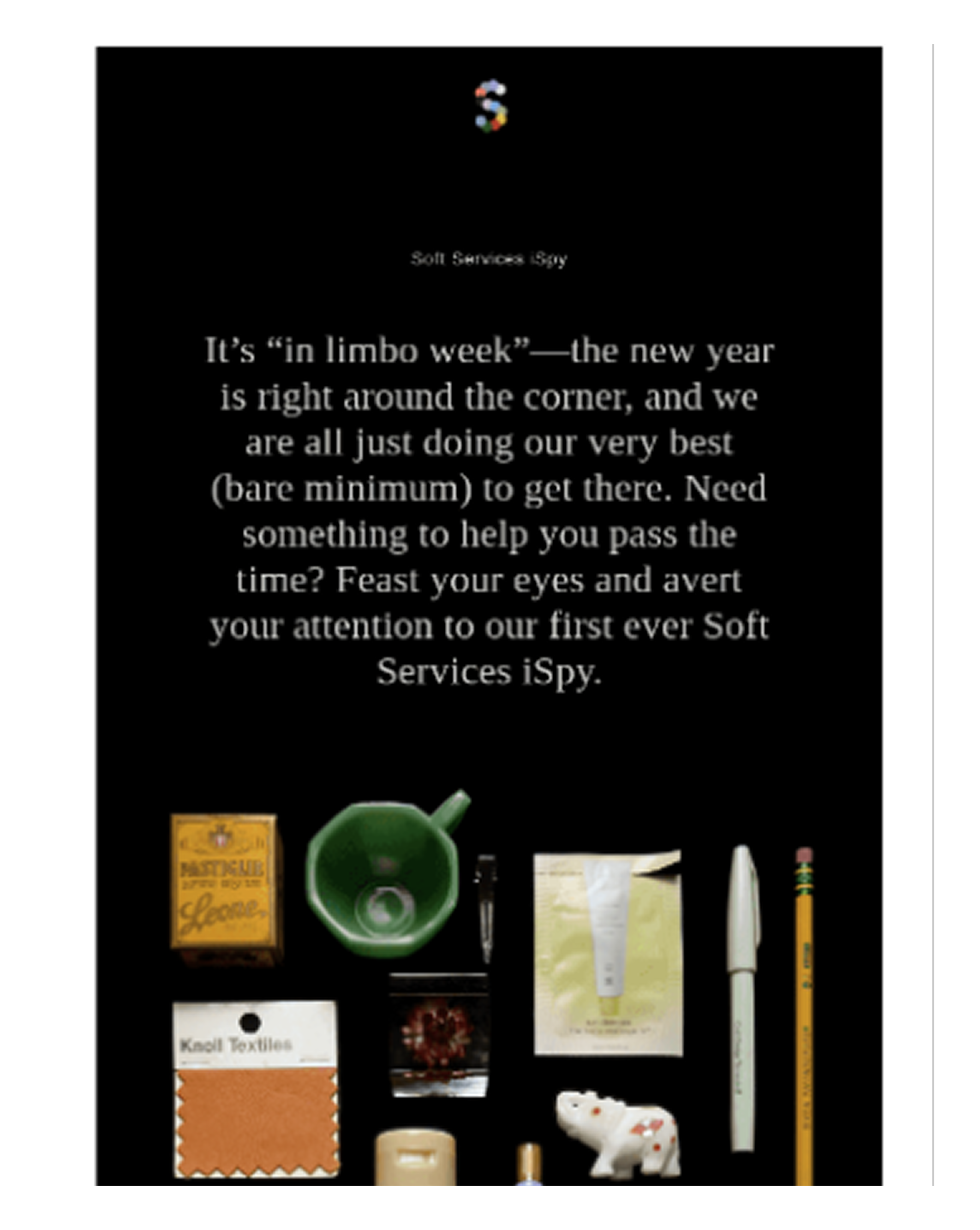
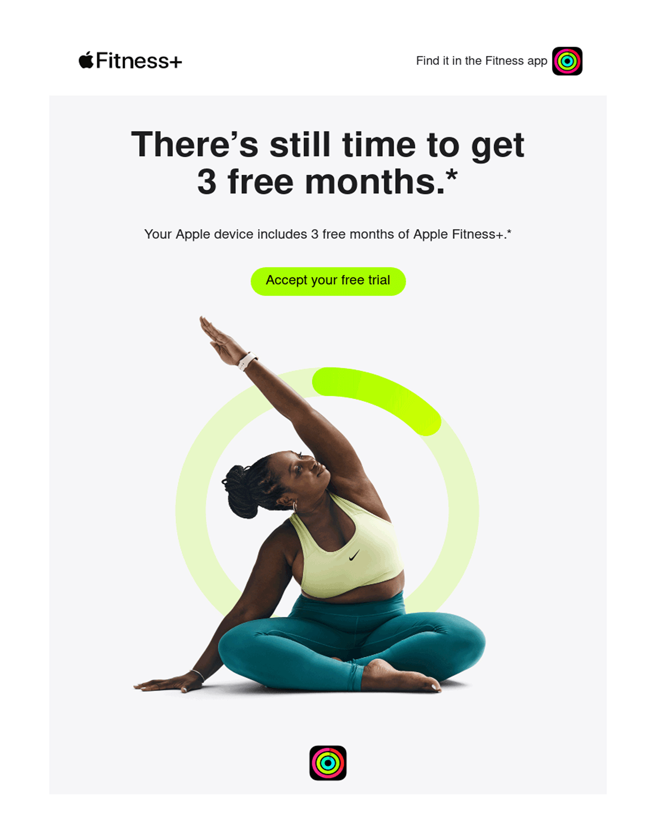
e. Winback, reactivation & nurture
Not every subscriber needs a discount to come back; sometimes, they just need a little nudge. This category covers all the emails designed to re-engage: from classic winback campaigns (“we miss you”) to nurture flows that guide users toward the next step. Think Netflix suggesting what to watch after you’ve finished a series, or Grammarly reminding you why a premium upgrade might be worth it. The goal is the same: keep momentum alive and remind users why your product matters.
Personalized hook. The subject and hero lead with a direct tie to viewing behavior (“What to watch after Stranger Things”). It feels custom, even if it’s automated.
Curation as value. Instead of overwhelming users with the full library, Netflix handpicks recommendations, reducing decision fatigue.
Strong visual focus. Hero images of shows dominate the design, letting the content (movies/series) sell itself.
Minimal copy. Netflix knows the images do the talking. The text is short, just enough to guide without distracting.
Retention-focused strategy. By keeping users binging, Netflix strengthens habit loops, making churn less likely.
What to borrow
Personalize recommendations → Use customer behavior or past interactions to guide them toward the next logical action.
Reduce choice overload → Curate a handful of tailored options instead of dumping the full catalog.
Use visuals as the hero → In content or product-driven emails, let the product sell itself with imagery.
Keep text minimal → If your product is visual, avoid cluttering with long paragraphs.
Nudge continuous engagement → Nurture emails should focus on keeping the customer active, not always selling something new.
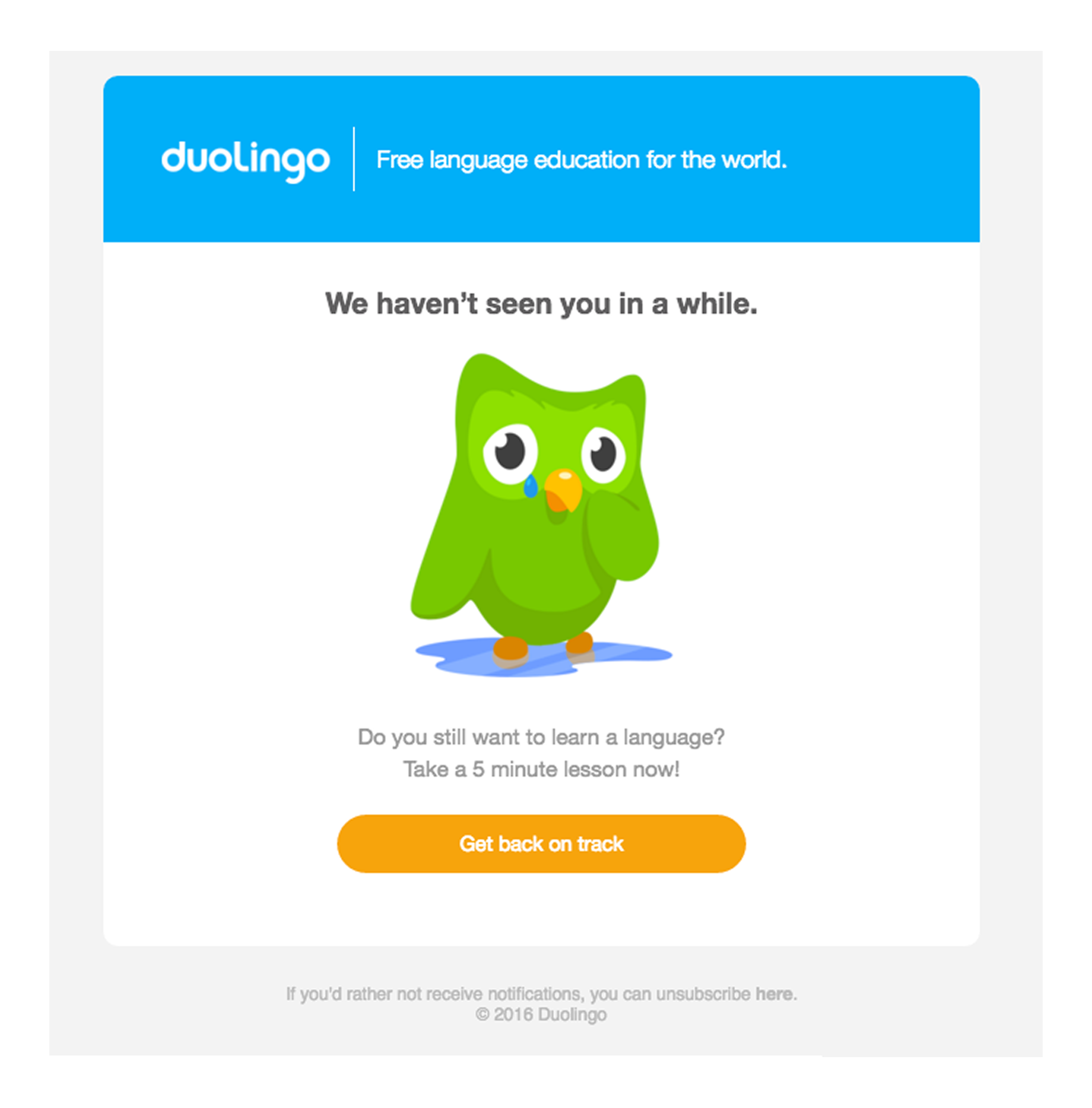
Playful emotional appeal. The sad owl illustration taps into humor and empathy, making the reminder feel lighthearted.
Straightforward copy. “We haven’t seen you in a while” is direct, human, and easy to grasp at a glance.
Low-friction CTA. “Get back on track” encourages immediate action without overthinking.
Brand voice consistency. Duolingo’s quirky, fun tone makes the email feel friendly, not pushy.
Simplicity. Minimal text, one image, and a single CTA keep the focus clear and actionable.
What to borrow
Use emotion + humor → A lighthearted nudge can re-engage users without feeling pressured.
Keep reactivation frictionless → One clear CTA sometimes works better than multiple options.
Stay on brand → Align imagery and tone with your product’s personality.
Don’t overcomplicate → A simple “we miss you” email can be just as effective as a longer nurture flow.
Make it relatable → Use language that feels conversational and human.
Design trends & patterns that work in 2025
Email design in 2025 is all about clarity, interactivity, and user respect. With inboxes more crowded than ever, the best-performing emails aren’t just “pretty” — they’re purposeful, accessible, and tailored to the reader’s context. So, let’s have a look at some trends that are defining modern email campaigns this year!
1. Minimalist, clean layouts
Less is more. The best emails in 2025 strip away distractions and focus on one clear message. Expect:
Single-column layouts with generous white space
One dominant hero image or graphic paired with short copy
A single primary CTA that stands out
This stripped-down aesthetic makes emails easier to skim — perfect for readers juggling information overload. Think calming, clutter-free design that guides the eye exactly where you want it to go.
Static, lifeless emails are fading away. Subscribers want something they can do, not just read. That’s why interactive elements — like quizzes, polls, sliders, carousels, and spin-to-win wheels — are becoming common in 2025. These touches transform an email into a mini-experience, giving readers instant feedback or rewards when they engage.
Trivia questions, personality quizzes, or playful discount wheels add a layer of entertainment that encourages clicks while making the brand feel more approachable. As one retention marketing director put it: “In a sea of static sends, interactive email will help you stand out”.
But interactivity works best when it supports the core message. A poll can spark conversation for a community-driven brand; a slider can showcase product variations in a way static images can’t. The trick is balance: too much animation or unsupported code risks breaking in certain email clients.
Moderation and testing are essential to ensure the interactive layer enhances, rather than overshadows, the content. When done right, these elements create a fun, memorable impression that trains subscribers to look forward to that feeling of fun each time they see you in the inbox.
3. AI-powered personalization & dynamic content
Gone are the days when personalization meant just slapping someone’s first name in the subject line. In 2025, people expect emails that actually feel made for them. Thanks to AI, brands can now tailor content down to the tiniest detail — showing products based on browsing history, surfacing deals tied to local weather, or even updating the email in real time with fresh info.
Think of it like this: if you’ve been shopping for running shoes, your next email might not only highlight new arrivals but also offer a timely discount right when your old pair is wearing out. And that kind of perfect timing makes people feel like you get them, instead of just spamming their inbox.
4. Mobile-first & responsive design
Since more than half of emails are opened on a phone, designing for small screens first is non-negotiable. The best mobile-first emails usually stick to:
Simple single-column layouts that don’t force endless side-scrolling
Text that’s big enough to read easily (think 14–16px or larger)
Large, thumb-friendly buttons that make tapping effortless
And here’s the key: put your most important CTA near the top, because people on mobile won’t always scroll all the way down. A responsive design then does the heavy lifting, making sure your email looks great whether it’s opened on an iPhone, an Android tablet, or a desktop screen.
With the rise of dark mode across apps and devices, people expect their emails to look good whether they’re opening them at noon on a laptop or midnight on a phone. The problem? Not every design survives the switch.
A bright logo that looks great on white can vanish against a black background, or an image with a hard edge can show up as an awkward white box. That’s why more brands are paying attention to the details — using transparent PNGs, swapping out harsh pure black for softer dark grays, and double-checking that their logos and icons work in both light and dark settings.
At the same time, color is pulling in two very different directions. On one side, we see brands embracing ultra-minimal palettes. On the other, some are cranking up the vibrancy with neon gradients, duotones, and high-contrast accents that pop off the screen.
Both approaches work, but the common thread is intentionality. Because colors aren’t just decorative, they actually set the mood and ensure the design holds up no matter how or where someone opens the email.
6. Bold typography & hero sections
When typography goes big, attention follows. Oversized fonts and striking hero sections dominate the screen from the first second. And when those bold choices meet creative imagery that reflects the product, the result is higher clicks and campaigns people don’t forget.
7. Micro-animations for subtle dynamism
Subtle animations are the new big thing in emails. Instead of flashy, attention-grabbing graphics, the focus is now on small "micro-animations" that add dynamism without being distracting. For example, a "Call to Action" button might have a gentle pulse or a slight hover effect, drawing the eye and making the email feel more interactive.
These subtle touches, like a product image that slightly rotates or a progress bar that fills up, guide the reader's attention and can really boost engagement. One company even saw a 25% increase in click-through rates just by adding a subtle hover animation to their "Add to Cart" button.
The key is to keep it minimal. By using lightweight CSS animations or simple GIFs, these effects load quickly and work well on mobile, making the email more engaging without slowing it down.
Design trends that are fading out in 2025
Just as important as knowing what’s hot is knowing what’s not. Some design patterns that were common in the past have fallen out of favor due to poor performance or changing user expectations. And here are several email design practices now considered outdated or “not cool” (and why you should avoid them):
1. Image-only emails
Relying on a single big image (or a flyer-style image full of text) with little actual text is a bad idea in 2025. It’s not just uncool, it’s risky. Such emails often load slowly and may display as blank if images are blocked – leaving the user with nothing but perhaps an alt tag or an unsubscribe link.
They’re also inaccessible (screen readers can’t interpret images of text). Instead, modern emails use a balanced mix of text and visuals. Today’s best emails balance text and visuals, making sure the message still lands even if the images don’t.
If your design breaks on a phone, you’ve already lost half your target audience. Multi-column, fixed-width layouts that require pinching and zooming scream 2010. Mobile-first is the expectation now — anything less feels archaic.
3. Cluttered layouts and too much content
The “everything and the kitchen sink” approach to emails is outdated. Cramming a newsletter with dozens of different sections, products, or calls-to-action will only overwhelm readers.
Think of those old-school promotional emails with hundreds of tiny product thumbnails, ten different colors, and multiple “Click Here!” buttons – they’re chaotic and ineffective. In fact, having different font sizes, a rainbow of colors, and tons of buttons in one email is a sure way to get sent straight to the trash.
Today’s best practice is to keep it focused: one main message or a few well-organized sections. If you have many updates, use clear sections or consider a series of emails instead of one giant missive. Readers have short attention spans; an email that tries to do too much will end up accomplishing nothing.
It’s the same logic that guides the best landing page examples: strip away distractions so one message shines through.
4. Inconsistent or excessive fonts/colors
Early HTML emails were a wild west of clashing fonts, rainbow palettes, and flashing banners. While that might’ve caught eyes back then, today it looks unprofessional and spammy. Too many typefaces or mismatched colors make an email harder to read and far easier to ignore.
Modern design thrives on restraint. Sticking to one or two fonts and a brand-consistent palette keeps emails polished, accessible, and recognizable. Bold colors can still play a role, but they should be intentional accents — not a circus of mismatched tones.
5. Ignoring dark mode & accessibility
Dark mode isn’t a niche preference anymore; it’s the default for millions of users. If your email disappears into a black background or your logo shows up with awkward white edges, it’s a clear sign the design wasn’t tested properly. Add in poor contrast ratios or missing ALT text, and you’ve alienated an entire group of readers.
Accessibility is no longer optional. From color-blind users to those relying on screen readers, emails need to work for everyone. Overlooking these basics in 2025 doesn’t just make a brand look behind the times — it also risks legal issues in some regions. In 2025, not being inclusive in your email design is definitely “not cool”.
6. Generic “batch-and-blast” emails
There was a time when sending the same email to your entire list felt efficient. But in today’s world of personalized feeds and AI-driven recommendations, “Dear Customer” subject lines and generic promos feel cold and outdated. Audiences expect at least a nod to their preferences, behaviors, or past interactions.
Personalization doesn’t need to be overly complex; even small touches like using someone’s name, referencing their last purchase, or suggesting content they’d actually care about can make a difference. Batch-and-blast emails, by contrast, come across as lazy. And lazy marketing won’t earn engagement in 2025.
7. Skipping testing
Old-school email designers might assume an email that looks fine in one place (say, Gmail on Chrome) will look fine everywhere – but this has never been true, and it’s especially risky now with so many apps and devices. Failing to test your design across major email clients (Gmail, Outlook, Apple Mail, mobile apps, etc.) can result in broken layouts or funky rendering that screams “amateur.”
For example, an email heavily styled with CSS might display perfectly in modern apps but completely fall apart in older versions of Outlook. Always use testing tools or previews to catch these issues before sending. Likewise, not testing for things like image loading (e.g., viewing with images off) or not checking that your text is still readable in dark mode are pitfalls to avoid. The polish of a well-tested email is expected now; anything less can make your campaign look outdated or unprofessional.
And now that we’ve covered both the do’s and the don’ts, let’s move on to the fun part: where to actually find the best email marketing design inspiration.
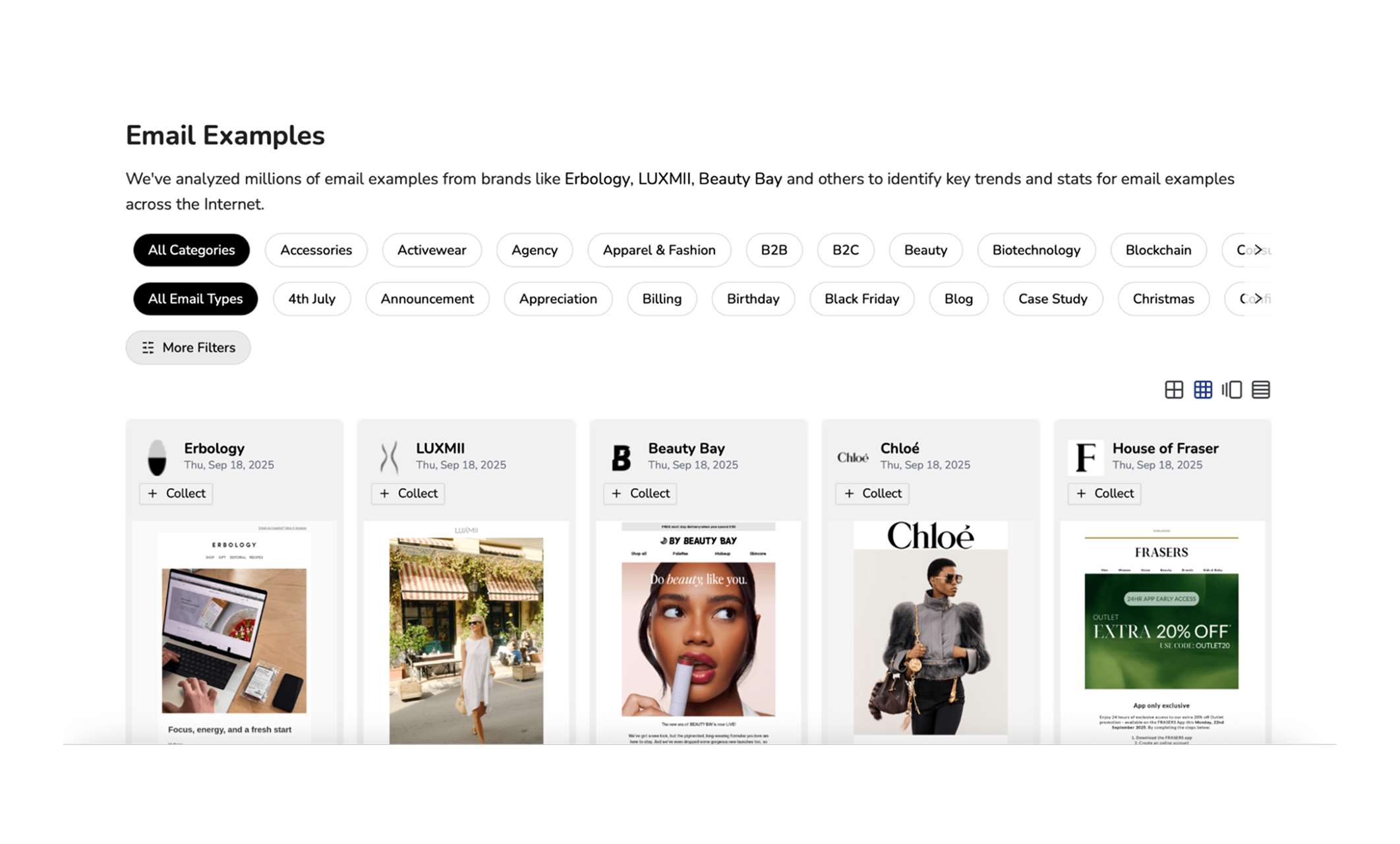
Best email design galleries
Scrolling your own inbox for ideas only gets you so far. The good news? There are dedicated galleries and platforms where email nerds (like us) collect the best campaigns. Each has its own strengths, so here’s a quick guide to where you should go when you’re hunting for inspiration:
Tools to save, organize & reuse ideas
Finding email design inspiration is step one. Step two is making sure you don’t lose it in a sea of bookmarks, screenshots, or forgotten emails. That’s where having a personal swipe filecomes in handy — a curated library of good emails examples you can quickly pull from when it’s time to design your next campaign.
Different people prefer different tools, so here are a few ways to build your own system:
If you already subscribe to a bunch of brand newsletters, why not use your inbox as your email marketing inspiration vault? With a tool like Spotmar, you can tag, filter, and search campaigns directly in Gmail. It’s a simple way to turn everyday browsing into a swipe file without leaving your inbox.
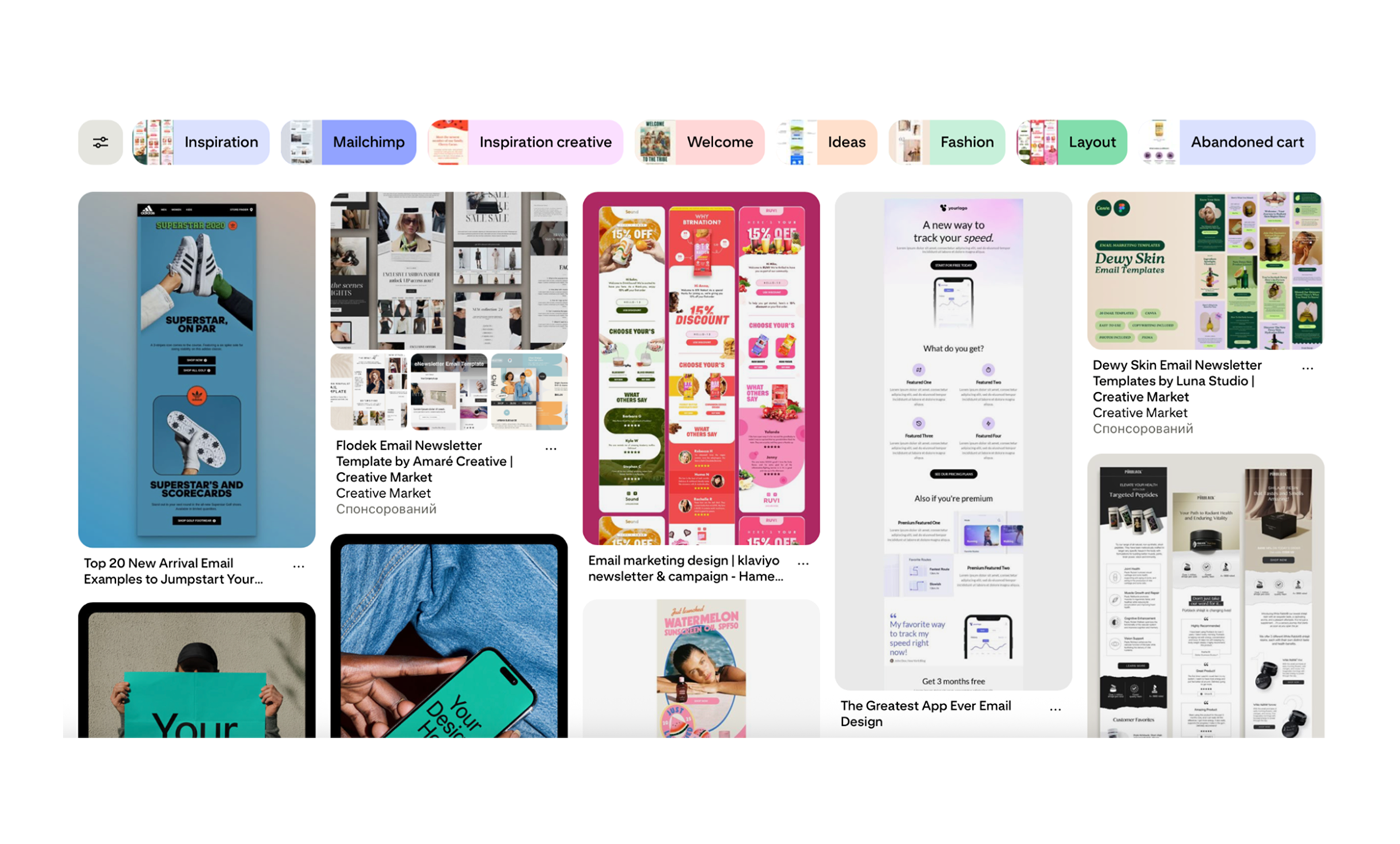
Pinterest or Figma
Visual thinkers love these. Pinterest lets you pin examples into boards (think “great CTAs” or “welcome flows”), while Figma is perfect if you want to actually lay out and compare designs side by side. Both make it easy to see patterns and share ideas with your team.
Notion / Airtable
For marketers who like structure, Notion and Airtable are hard to beat. You can build a database of inspiring emails, then tag them by layout, CTA type, campaign goal, or brand. For example, you might have filters for “single-column newsletter”, “seasonal promo”, or “interactive design”. When you need ideas, you just search by tag and instantly find the right fit.
This kind of organized database makes it easier for your team to brainstorm, and if you ever hire a graphic designer, it gives them a ready-made starting point. Instead of guessing at your taste, they can see the styles and layouts you’ve already collected.
Hot tip: tag emails not just by brand, but also by campaign type and CTA. That way, you can instantly pull examples when you need to design, say, a winback email with a discount”.
The key isn’t which tool you pick — it’s building a system you’ll actually use. Even a simple setup makes a huge difference. Instead of scrambling for ideas when deadlines hit, you’ll already have a ready-made library of proven inspiration to spark your next campaign.
AI-powered idea starters
Sometimes the hardest part of email design isn’t the layout — it’s breaking out of a creative rut. And thank God we’ve got AI on our side in 2025. Tools like ChatGPT or MailsAI are basically brainstorming buddies on demand — perfect for when you’re stuck staring at a blank page. They won’t write the final masterpiece for you, but they’ll crank out variations, spark new angles, and make the messy first-draft stage way less painful.
So, here are a few practical ways to put AI to work:
Subject lines
Ask AI to spin up 10–15 options around the same theme — playful, urgent, formal, or casual. Even if you don’t use them as-is, they’ll spark angles you might not have thought of. Here’s a prompt you can try for your Black Friday marketing campaigns.
Prompt example:
“Give me 10 subject line ideas for a Black Friday sale that feel friendly but not pushy, and keep them under 45 characters”.
CTA variations
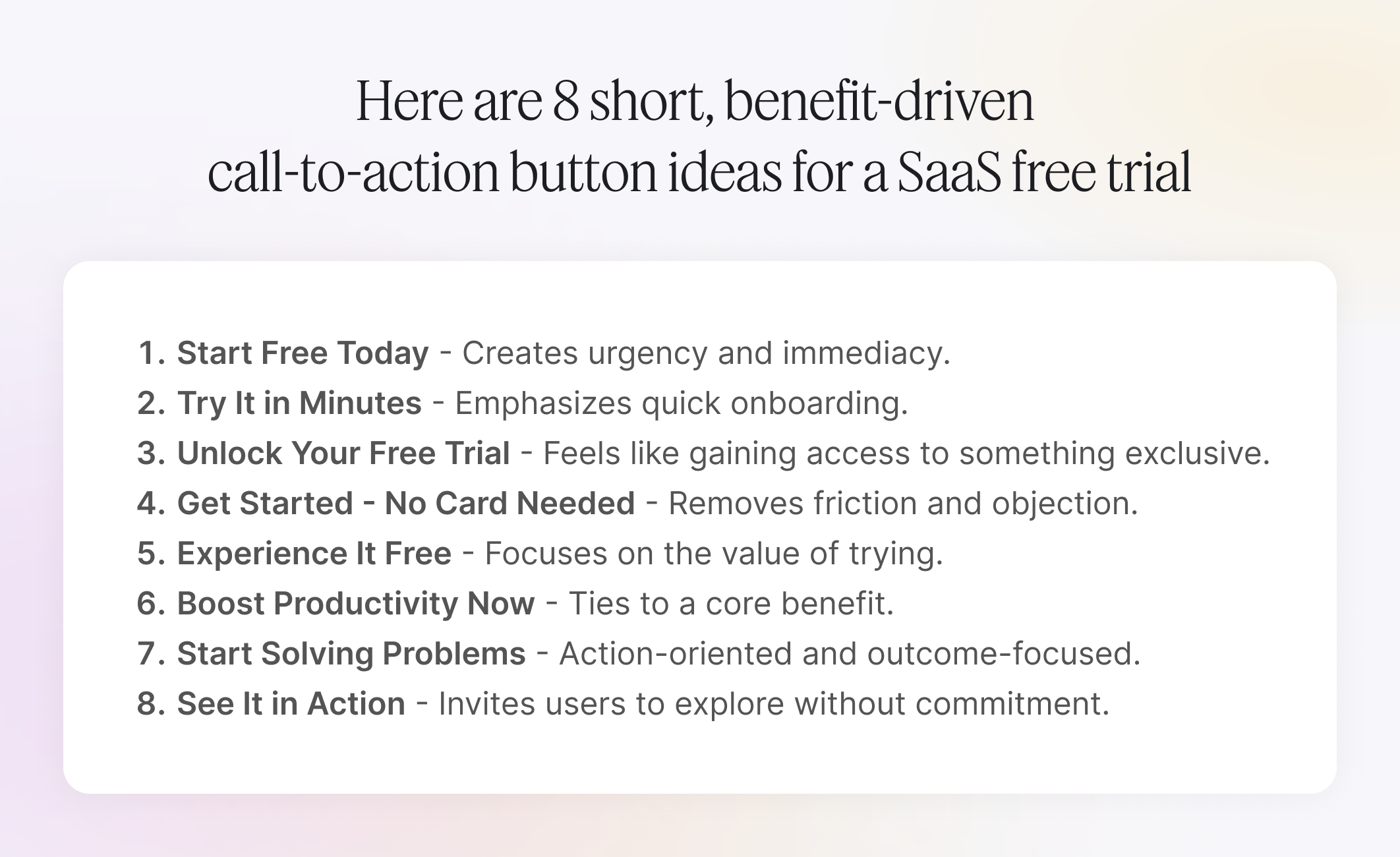
Struggling with button copy? Instead of settling for another “Learn More”, you can brainstorm fresher, more action-oriented ideas.
Prompt example:
“Suggest 8 call-to-action button texts for a SaaS free trial. Keep them short, punchy, and focused on user benefit”.
Layout & content blocks
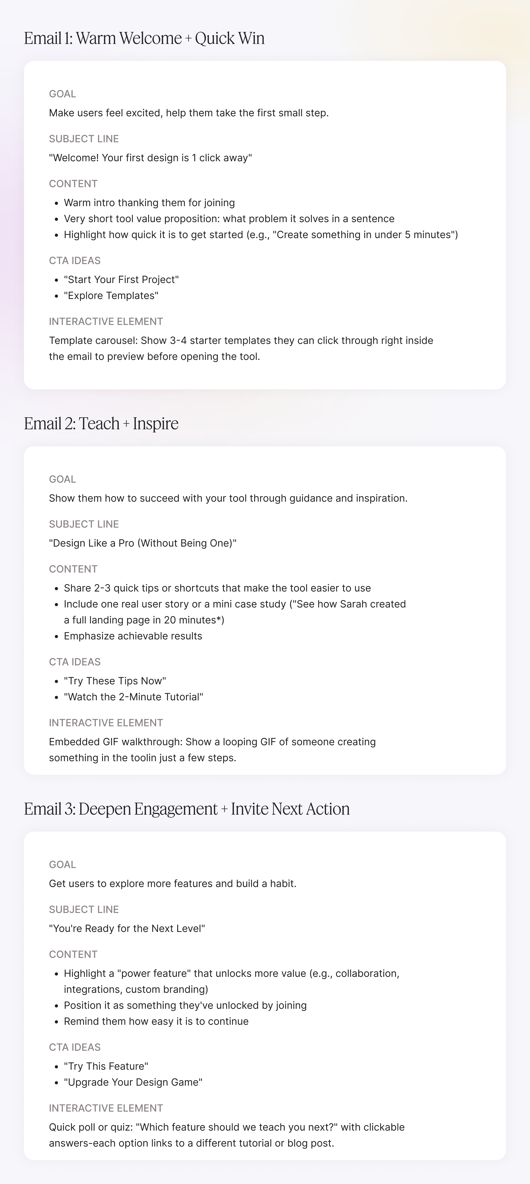
Not sure how to structure an onboarding flow or product update? AI can outline a skeleton for you.
Prompt example:
“Outline a 3-email welcome series for a design tool. Include suggested headlines, CTA ideas, and one interactive element in each email”.
Tone & style tweaks
Need to adjust the voice of your email copy? AI can reframe the same content in different tones — from playful and fun to formal and professional.
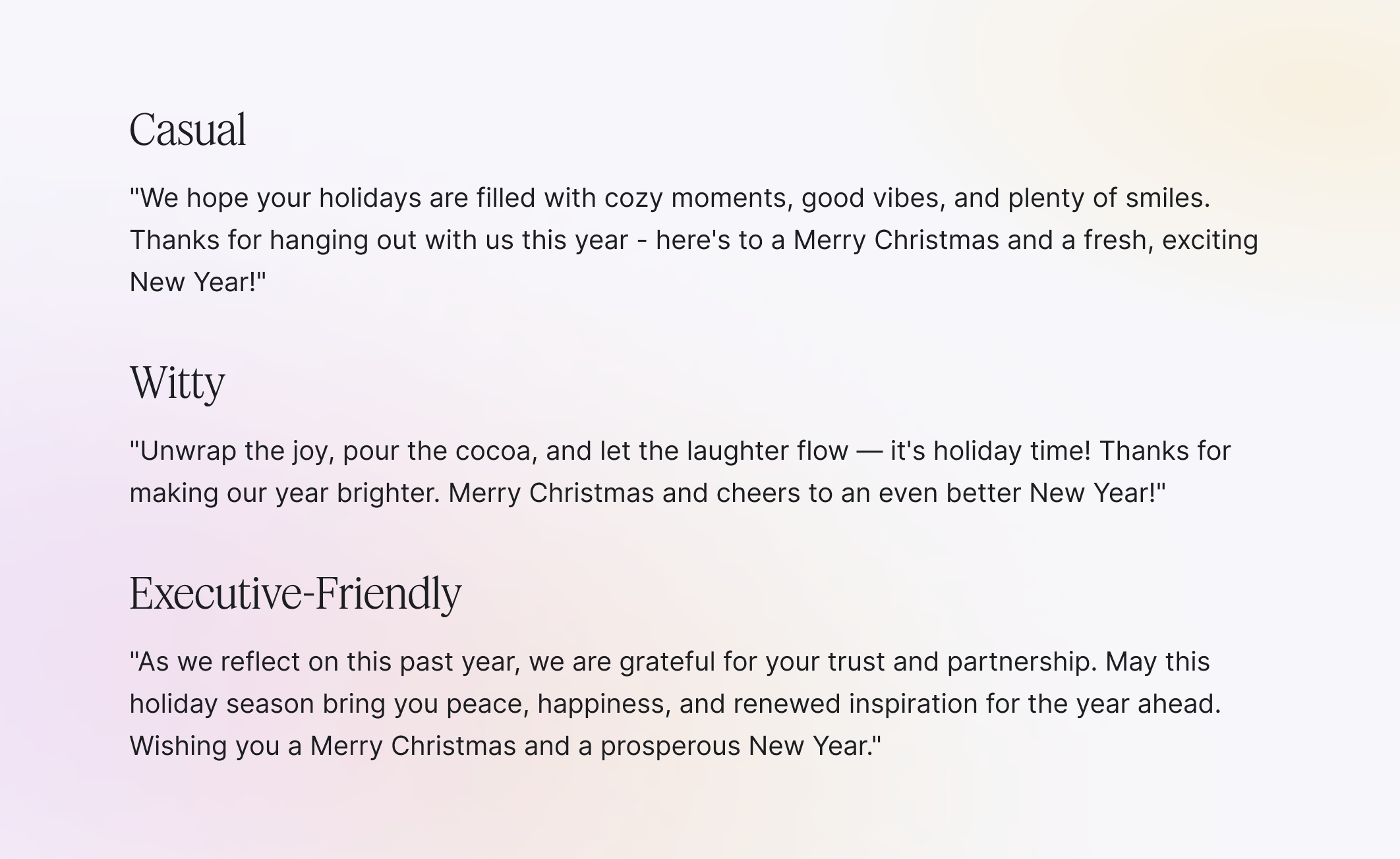
Prompt example:
“Rewrite this email intro in three different styles: casual, witty, and executive-friendly”.
The Christmas marketing ideas above can be adapted to different tones, ranging from playful and fun to formal and professional, to suit your brand’s personality.
AI won’t replace testing or brand intuition, but it can dramatically cut down on blank-screen time. Use it to expand your options, then refine the best ones into emails that feel uniquely yours.
Community-sourced tips from Redditors
Not all inspiration comes from polished galleries or big brand campaigns. Sometimes the best marketing ideas (or at least the most relatable ones) show up in community threads. Reddit has a surprisingly active email marketing crowd, where marketers trade their favorite tools, show off campaigns, and vent about the same struggles you’re probably facing.
From these threads, a few themes pop up again and again: people swear by platforms and business tools like Email Love, Mailboard, and PromoArchives for quick browsing; they complain about inbox overload and the pain of finding “that one email” they vaguely remember; and they wish there were better ways to organize inspiration across channels. In other words, you’re not alone if you feel overwhelmed — and Reddit is a good reminder that every marketer wrestles with the same challenges.
Your action plan: go from inspiration to execution
It’s one thing to scroll through inspiration; it’s another to actually use it. To make sure all those saved screenshots and bookmarked galleries don’t go to waste, here’s a simple workflow you can follow:
Pick your campaign type → Promo? Newsletter? Onboarding? Start by clarifying what you’re sending.
Browse curated examples → Look at similar campaigns and email template inspiration in galleries or your swipe file to spot patterns.
Brainstorm with AI → Use prompts to spin up subject line variations, CTA ideas, or draft layouts.
Apply your own twist → Pull what fits, drop what doesn’t. Adapt inspiration to your brand’s voice and audience.
Test key design elements → A/B test subject lines, CTA buttons, or layouts to see what actually moves the needle, and track those results against your core marketing KPIs so you know which ideas truly perform.
Track & reuse → Save the campaigns that worked into your swipe file so you can repeat success faster next time.
This approach keeps you from drowning in “pretty emails” and helps you build campaigns that are not just inspiring but effective.
Conclusion: just roll with what works
We’ve covered what a good email looks like, from standout email examples and design trends to swipe-file tools, AI idea starters, and even a peek at what fellow marketers are saying on Reddit. Hopefully, that gives you enough inspiration to spark your next campaign.
But remember: inspiration is only the starting point. The best designs are the ones you adapt to fit your brand, your audience, and your goals. Thankfully, we’re in an era where inspiration is everywhere — galleries, communities, and AI are all just a click away. The only thing left to do is roll with what works for you.
And if you’d rather not go it alone? That’s where we come in. At TodayMade, we help companies, startups, and tech brands turn ideas into high-performing designs — from email campaigns to full creative strategies. If you’re ready to take your email design to the next level, get in touch with us!
Got questions?
Email design inspiration is a collection of creative ideas, layouts, and examples that help marketers craft beautiful, effective emails.
It can include color palettes, typography, layouts, and interactive elements that spark new approaches for future campaigns.
Good design increases open rates, click-throughs, and overall engagement.
A well-designed email grabs attention, guides the reader through the content, and makes it easier for them to take action — whether that’s clicking a CTA, making a purchase, or signing up for an event.
Use a clear hierarchy, mobile-friendly layouts, and plenty of white space to improve readability.
Include compelling visuals, strong CTAs, and a consistent brand style. Don’t forget accessibility — use alt text, proper contrast, and easy-to-read fonts.
Browse curated email galleries, sign up for competitor newsletters, and explore design showcases like Really Good Emails or Pinterest boards.
Studying real-world examples can help you see what’s trending and what performs well in your industry.
Tools like Figma, Canva, Stripo, BeeFree, and Mailchimp’s built-in editor let you design visually appealing, responsive email templates.
You can also use inspiration libraries and prebuilt templates to speed up the design process.