Email design
23
min read
Tired of sending emails that get ignored? This guide provides you with real-world email marketing ideas, plug-and-play templates, and a smart framework (RTFP) to help you write emails that people actually want to open and click. Whether you're running a one-person shop or a fast-moving team, you’ll find the best marketing email examples, strategy, and creative sparks to level up your email game fast.
Email marketing is one of the highest-ROI channels in your toolkit. According to First Page Sage, B2B emails convert at 2.4% and B2C at 2.8%. That might not sound like much until you compare it to organic social (0.71%) or paid display ads (0.46%). Suddenly, email appears to be the quiet, reliable one at the party.
In the meantime, most email advice falls into two extremes: either it’s painfully vague ("just personalize!") or it’s so tool-specific you need to be a power user of six platforms just to send a welcome email.
This guide sits in the middle. Backed by TodayMade’s experience designing high-converting email campaigns, it’s packed with practical ideas for email marketing, real examples, and a simple framework we call RTFP to help you understand what makes great emails work.
Let’s break down what’s actually working, why it works, and how you can send something better than “Your weekly newsletter.”
Before we jump into specific creative email marketing ideas, we need a lens to evaluate them. A way to look at an email and know why it worked, not just that it did.
That’s where RTFP comes in. Yes, we made it up, but it helps you break any email into four core elements that actually matter.

Did this email feel like it was written for me? Relevance is about smart segmentation, behavioral targeting, and timing.
For example:
→ Sending a cart reminder to someone who never added anything to the cart? Irrelevant.
→ Sending a loyalty bonus to someone who just hit 6 months as a customer? Bang on.
Was the message sent at the right moment in the customer journey? Timing includes triggered flows (such as welcome or renewal messages), seasonal sends, and action-based nudges.
It’s not just when you send it, but why it makes sense now.
Examples:
→ A welcome email sent immediately after signup? Great timing.
→ A reactivation offer sent after 30 days of inactivity? Smart nudge.
→ A discount code dropped a week before Black Friday? Seasonally spot-on.
Is it effortless to understand and act? One CTA. One goal. One job to be done. No multi-column layouts. No seven competing buttons. No loading GIFs that never load.
You’d be shocked at how often emails fail to capture a click simply because the CTA is buried or the copy is 14 paragraphs of fluff.
Is there any reason to trust what’s being said? In email, social proof builds confidence and urgency. This could include customer reviews, user-generated content, loyalty statistics, earned badges, or even a founder's quote.
Now that we’ve covered the framework, we’ll use it to evaluate every example that follows. For each one, you’ll get a quick RTFP score, a test idea, and a wireframe you can adapt to your own campaigns.
Let’s jump into 12 battle-tested email campaign ideas you can steal and start using right away.
Each example in this gallery breaks down what the campaign is, when it works best, and why it works, using the RTFP framework. You’ll also get a plug-and-play template, one test idea to try, and, where relevant, a real-world example to bring it to life.
Let’s start strong.
This is the very first message your subscriber sees after signing up, your chance to make a strong first impression. It works best when sent immediately after signup, whether for a SaaS product, an ecommerce store, or a newsletter.
Using the RTFP lens:
Here’s a simple template to get you started.
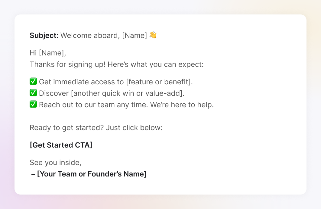
Test to run: Try a subject line A/B test: Clarity vs. Curiosity. For example, compare a straightforward “Welcome to [Brand]” with a more intriguing “You’re in. Here’s what’s next…” and see which one drives more opens.
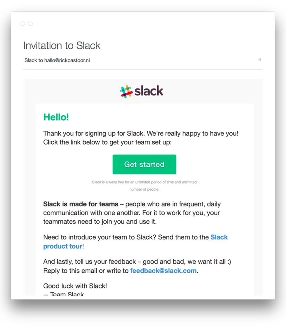
A great reference is Slack’s welcome email, which nails the tone: warm, conversational, and reassuring. It uses a single clear CTA and helps new users feel at ease, even if they’re not yet sure how Slack works.
An email that helps new users connect the dots between your product’s features and the outcomes they care about.
It is best to send within the first 3–7 days of signup, after the welcome email, once they’ve had a little time to poke around.
Why it works (RTFP):
Here is a template example (Plain-text style):
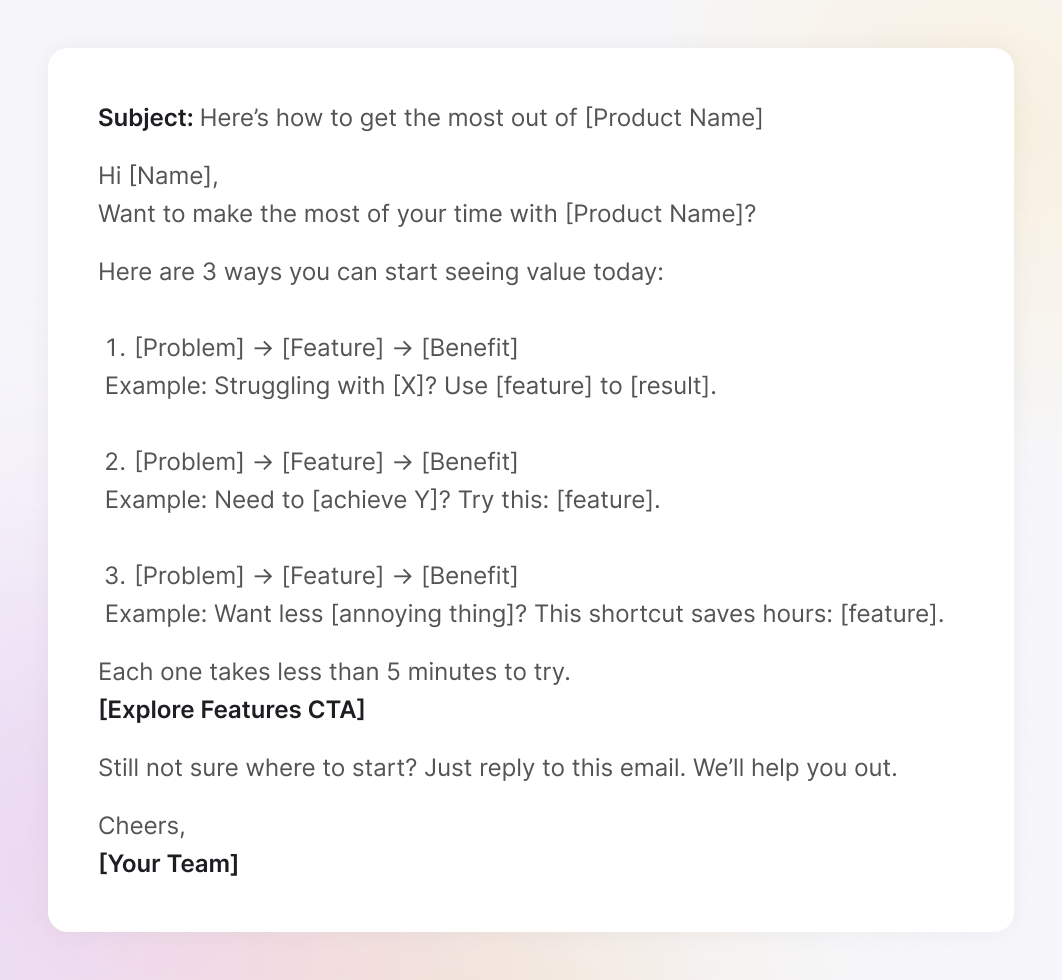
Test to run: Experiment with layout style: full-block sections vs. icon-based visual summaries. Alternatively, try replacing a static bullet list with a short interactive video walkthrough to boost engagement.
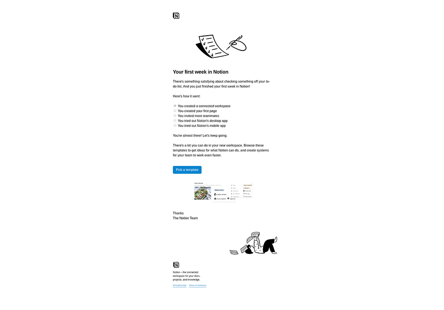
A strong example comes from Notion’s onboarding drip, where they send a “Your first week in Notion” email. It shows users how to structure their workspace using templates. The email is clean, focused, and outcome-driven, everything a great teaching email should be.
An email that suggests specific products or features based on what the user has viewed, clicked, or purchased.
It’s especially effective after a user browses your site or app, makes a purchase, but hasn’t re-engaged since. Works great for e-commerce, SaaS upsells, and even newsletters with curated content.
Why it works (RTFP):
Template (Plain-text style):

Test to run: Try highlighting a single top pick versus a curated trio of recommendations to see which drives more clicks. You can also increase Proof by adding star ratings or user-generated photos.
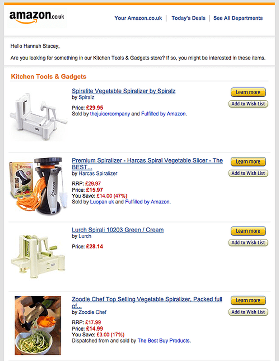
A classic example: Amazon’s post-browse emails. You check out a keyboard once, and for weeks, you’re getting “Customers also bought…” suggestions. Annoying? Maybe. Effective? Absolutely.
A subtle nudge is sent after a user views a product or category but doesn’t take action. Think of it as cart abandonment’s more polite cousin.
It is effective 1–24 hours after someone browses a key product or category page and leaves. Works best for e-commerce, marketplaces, and freemium SaaS products.
Why it works (RTFP):
Template (Plain-text style):
Test to run: Adjust the timing of your browse abandonment emails—try sending one 1 hour after the session vs. 24 hours later. Also test FOMO language: does “Only 3 left in stock!” drive more clicks, or does a calmer tone perform better?
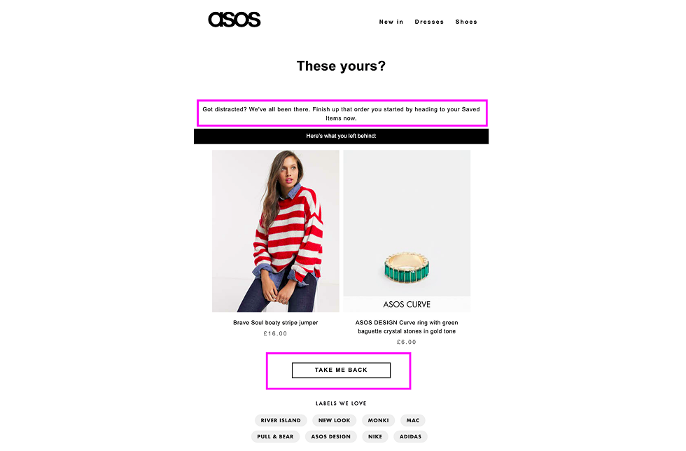
ASOS does a great job here. Their browse abandonment emails often say something like, “These yours?” with just two clean product cards and a bold CTA. It’s friendly, helpful, and not pushy.
A follow-up email is sent to users who added items to their cart but didn’t complete the checkout.
It is effective after 1–3 emails spaced out over 24–72 hours. This is one of the highest-converting email flows, especially when urgency or incentives are layered in.
Why it works (RTFP):
Template (Plain-text style):
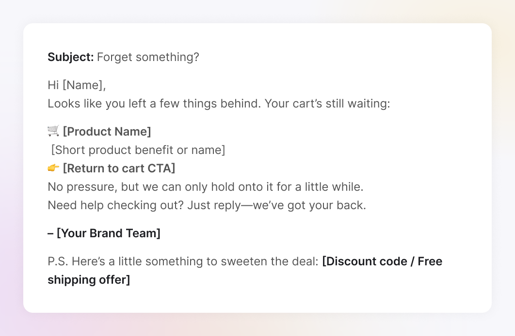
Test to run: Compare an offer-first approach (“Here’s 10% off”) with a reminder-only nudge (“You left this in your cart”). You can also A/B test plain-text versions against graphic-heavy ones to see which feels more personal and converts better.
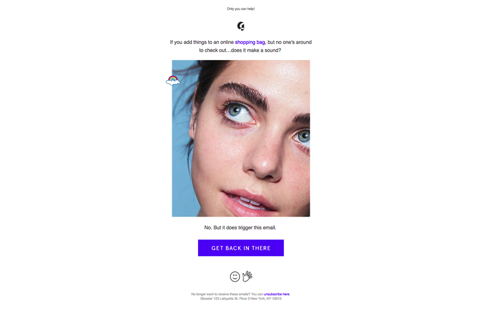
A great example comes from Glossier. Their cart reminder emails are ultra-minimal, almost like a casual text from a friend: “If you add things to an online shopping bag… does it make a sound?” There are no bold banners or clutter, just human, direct, and surprisingly effective.
An email (or a short sequence) designed to bring back inactive users, lapsed customers, or ghosted subscribers.
It is sent after 30, 60, or 90 days of inactivity. Especially useful for SaaS, newsletters, and ecommerce with repeat-buy potential.
Why it works (RTFP):
Template (Plain-text style):
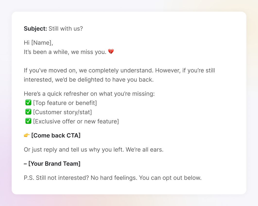
Test to run: Try a feedback-first approach (“Tell us why you left”) versus an offer-first hook (“Here’s 15% off to return”). Also test tone: a plain “We miss you” versus a more engaging “Here’s what’s new since you left.”
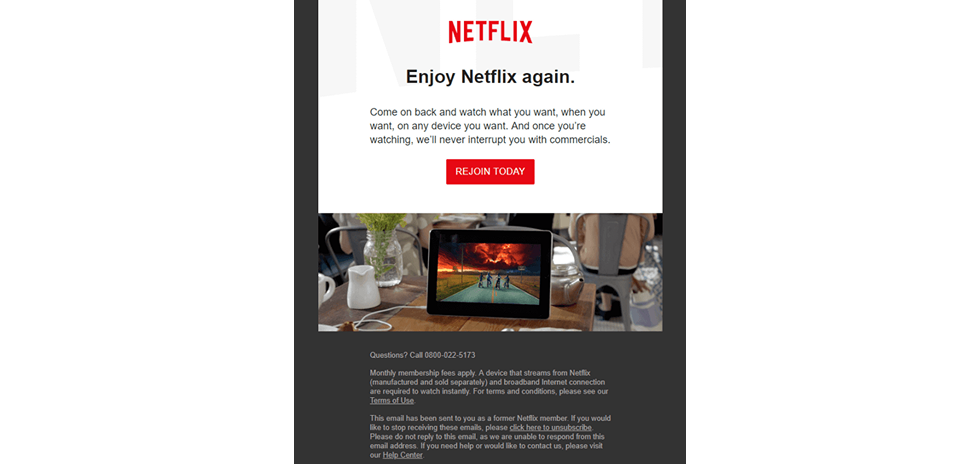
Netflix does this brilliantly. Their re-engagement emails showcase fresh, buzzworthy titles with eye-catching thumbnails. It’s visual, personal, and taps into just enough FOMO, without sounding desperate.
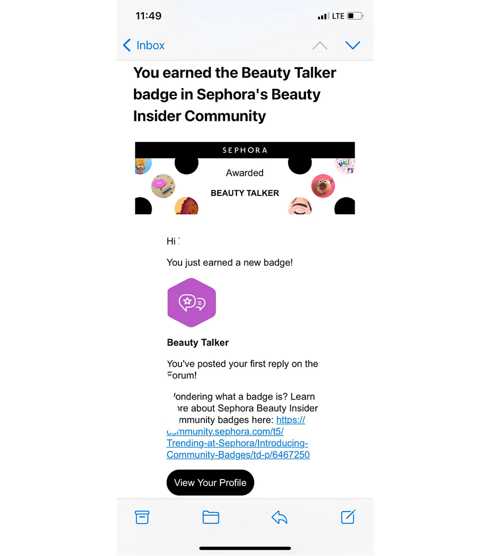
An email that reminds customers about their reward points, VIP status, or loyalty perks, often used to nudge re-engagement or drive more frequent purchases.
Best for loyalty programs, subscriptions, or any brand that tracks user milestones, like anniversaries or lifetime spend.
Why it works (RTFP):
Template (Plain-text style):
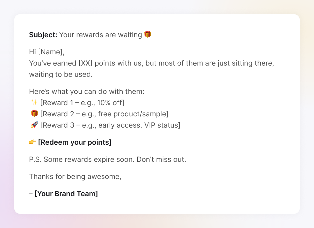
Test to run: Compare urgency-based messaging (“Your points are expiring”) with an aspirational angle (“Unlock your next tier”). You can also add a referral bonus, like “Earn 50 points for inviting a friend”—to boost Proof and drive engagement.Sephora’s Beauty Insider program is a masterclass here. They regularly send point reminders with new reward drops and clear “redeem now” buttons. Bonus: They sneak in exclusivity, such as early access or limited-time gifts.
A themed campaign built around holidays, events, or cultural moments. Halloween marketing ideas, Valentine’s Day, Black Friday marketing, and Earth Day, pick your favorite.
It works best when planned ahead, but it is still powerful even as a last-minute push. Ideal for sales, gift guides, special product drops, or just brand visibility.
Why it works (RTFP):
Template (Plain-text style):
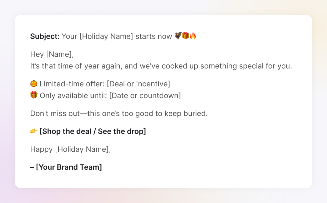
Test to run: Create urgency with a countdown timer, or go the other way and test early access exclusivity (“You’re in early”). Also, compare themed subject lines (“Pants-melting Black Friday deals”) with more straightforward ones.
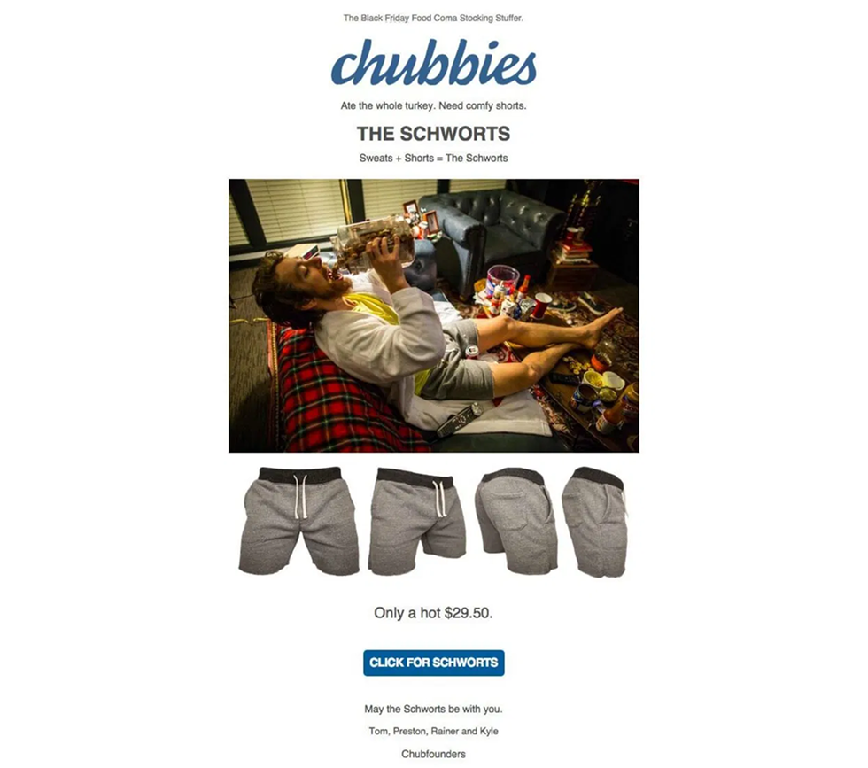
Chubbies crushes holiday emails with wild product names like “The Schworts” and fully commits to the theme, from the over-the-top imagery to cheeky copy. It feels chaotic, but the real secret is structure: a clear offer, one product, strong urgency (“Only a hot $29.50”), and a single, focused CTA: “Click for Schworts.” Ridiculous? Yes. But ridiculously effective.
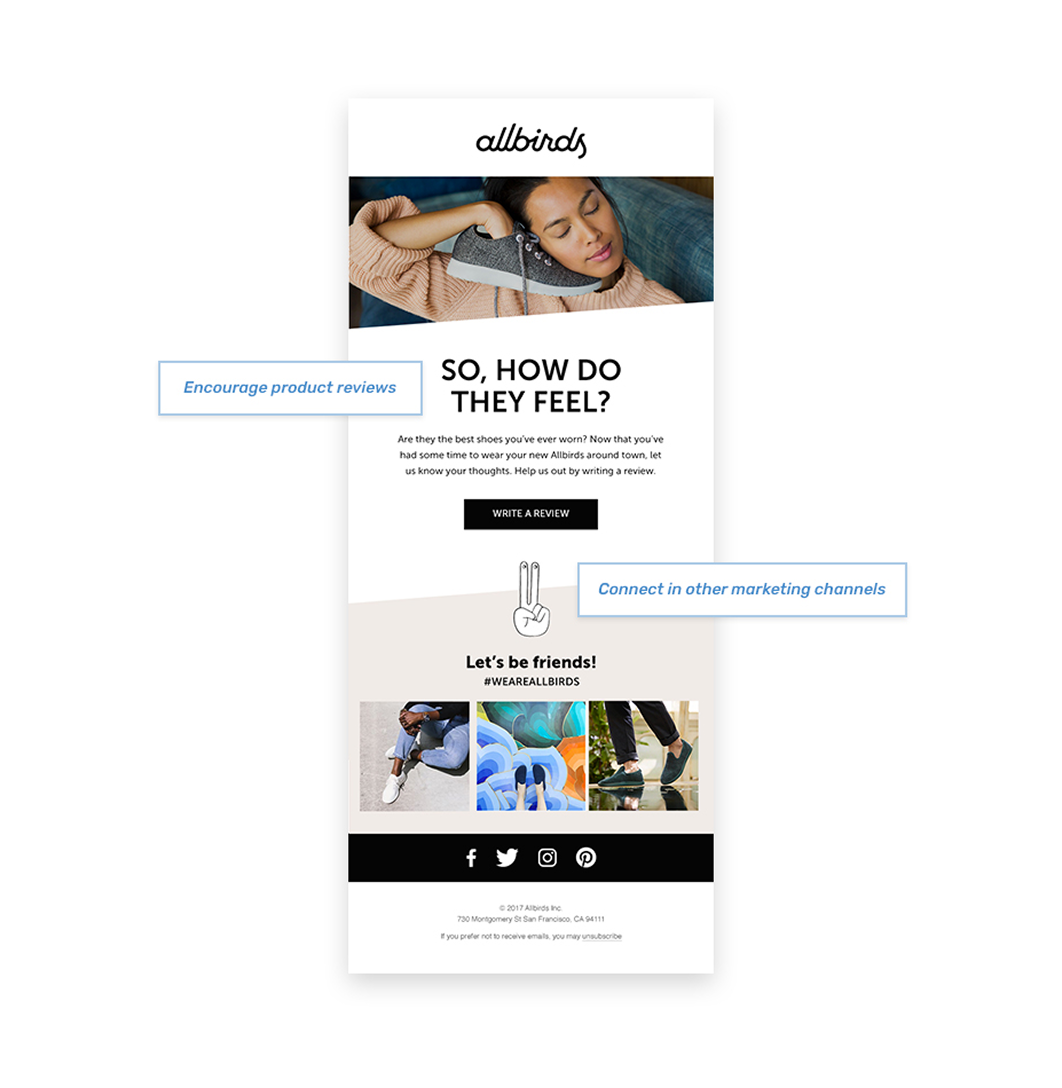
A follow-up email asking users to leave a review, submit a photo, or share their experience with your product or service.
It works a few days after delivery (for e-commerce) or a few weeks after onboarding (for SaaS or service-based products).
Why it works (RTFP):
Template (Plain-text style):
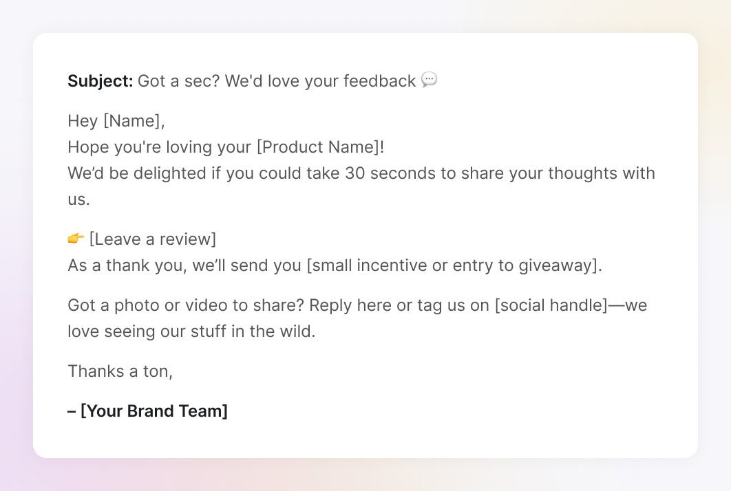
Test to run: Compare a review request with an incentive (“Get 10% off your next order”) versus a no-incentive ask. You can also test a review platform link against a more personal touch, such as a direct reply with a photo.
Allbirds does this well with a soft-touch post-purchase email. They simply ask, “So, how do they feel?” and include a gentle prompt to leave a review, without pressure, like a friend who nudges in a way that fits their brand voice perfectly.
An email that suggests a related or upgraded product based on the customer’s previous purchase or usage behavior.
It works shortly after a conversion, especially once value has been delivered. Think: “You bought this, now complete the set” or “Time to upgrade?”
Why it works (RTFP):
Template (Plain-text style):
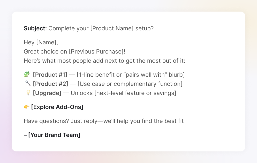
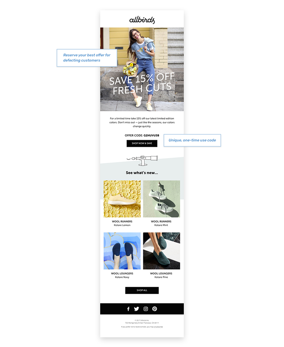
Test to run: Compare offering a strong incentive (like 15% off new arrivals) versus a no-discount re-engagement nudge (“See what’s new”). You can also test unique, one-time codes against general offers to measure the impact of exclusivity.
Allbirds, again, executes this perfectly with their “Fresh Cuts” campaign. The email pairs a bold 15% discount with the launch of limited-edition colors, creating urgency and excitement. A one-time code adds exclusivity, while a product gallery showcases multiple styles so there’s something for everyone. It feels fresh, personal, and persuasive, exactly what a win-back offer should be.
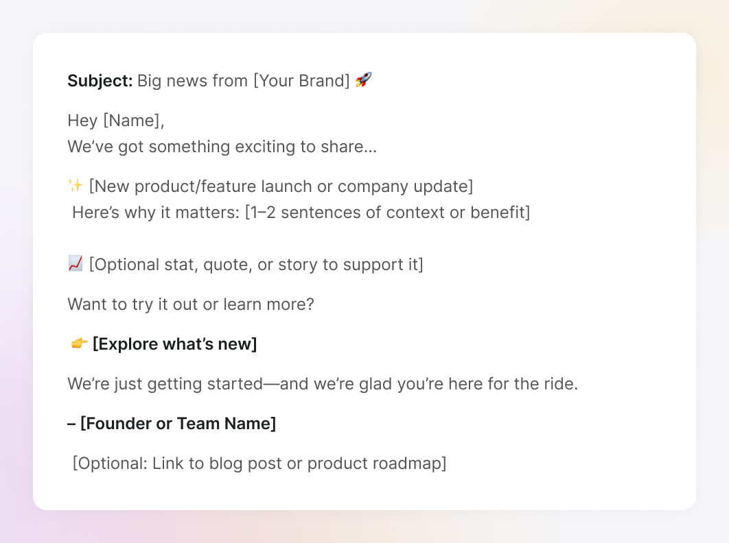
A newsletter-style email sharing company milestones, feature releases, or behind-the-scenes updates. The goal isn’t a direct sale; it’s connection and transparency.
It is perfect for SaaS, startups, and founder-led brands. Use it after launching something new, closing a funding round, hitting milestones, or making a strategic shift.
Why it works (RTFP):
Template (Plain-text style):
Test to run: Experiment with founder voice vs. brand voice to see which feels more authentic in weekly reports. You can also boost engagement by adding an early-access link or beta invite for upcoming features.
We at TodayMade designed these Weekly Reports for our client, Refera, turning what could have been a dry data dump into a clean, engaging snapshot of performance. Every element, from hierarchy to typography, is designed to make complex metrics instantly understandable. It’s a great example of how thoughtful design transforms routine utility emails into a tool users actually look forward to opening.

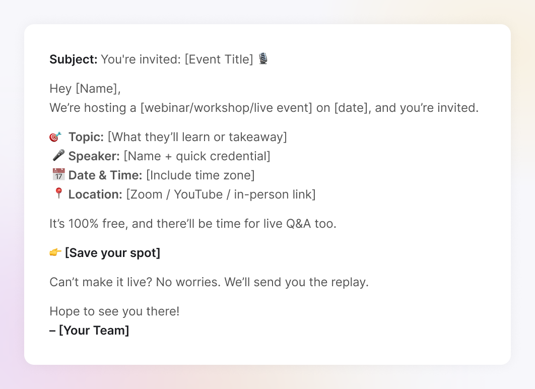
An email (or sequence) promoting an upcoming live or virtual event, like a webinar, AMA, workshop, or product launch.
It works leading up to the event, ideally sent as a 2–3 part drip: announcement → reminder → last chance → replay.
Why it works (RTFP):
Template (Plain-text style):
Test to run: Try short vs. long-format webinar invites to see what drives more sign-ups. Also test CTA phrasing—“Save your seat” vs. “Reserve my spot” vs. “Watch the replay.”
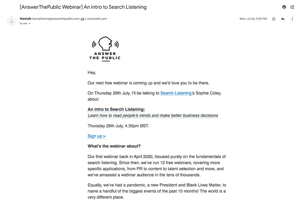
AnswerThePublic nails this with clean invites that highlight the speaker, make the value proposition clear, and keep the focus on one bold CTA. It’s simple, visual, and effective, exactly what a webinar invite should be.
The best email marketing examples show what great email marketing designs and copy can do on a campaign level, but to keep winning consistently, you need more than clever email marketing campaign ideas. That’s where you can boost your marketing strategy.
Now that you’ve got a gallery of high-performing email ideas, here’s how to make them work at scale, without blasting the same thing to everyone, every time. The same principles that apply to content marketing for small business or even writing a great blog apply here: relevance, timing, and continuous testing.
You don’t need a full CDP to segment your list. You just need to stop treating it like a list.
Here are five low-effort, high-impact segments almost any tool can handle:
You don’t need to build 10 versions of every email; just two or three thoughtful forks in the road go a long way.
Think of it like curating trending topics for social media. You wouldn’t post the same message on every platform in the same way, and your emails deserve the same treatment.
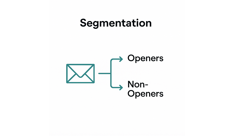
Microtest email marketing idea: Segment openers vs non-openers, then try different subject lines or send times.
Automation means showing up at the right moment without thinking about it.
Here’s a starter automation stack to build around:
If your email service provider (ESP) lets you build behavior-based triggers, start there. If not, even a simple drip campaign will put you ahead of 80% of other brands.
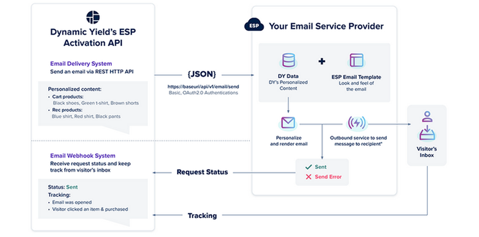
For instance, Dynamic Yield enables users to connect their existing ESP and trigger behavioral emails through its activation API, making personalization possible without requiring a switch to new platforms.
More than 60% of emails are opened on mobile. That means your beautifully designed desktop email? It might never get seen the way you intended.
Here’s how to make mobile your default:
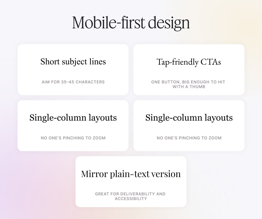
Design tip from TodayMade: Design emails like a landing page. One goal per email = higher clicks.
Open rates don’t pay your bills, but they do tell you if you’re getting ignored. Benchmarks provide clarity, just as tracking marketing KPIs helps you measure broader success.
Here’s what decent looks like:
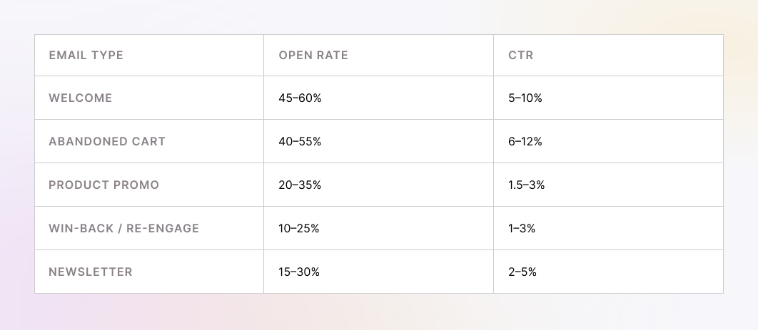
Bonus metric: reply rate on plain-text emails. If it’s >2%, you’re writing like a human. Keep it up.
Up next, we’ll cover Creative Engine: the email marketing ideas for small business, prompts, and systems that keep your emails from going stale. As the history of content marketing demonstrates, consistency and adaptability, not volume, are what keep audiences engaged in the long term.
Even the best marketers hit the “I’ve got nothing left” wall. If you’ve sent five promos in a row and everything’s starting to sound the same... this section’s for you.
These systems are designed to spark fresh ideas, beat email fatigue, and keep things feeling human, even at scale.
Story-based frameworks give your emails a natural flow, transforming cold copy into narratives that engage readers and guide them toward your offer. Here is what you can use:
1. Hook → Story → Offer
Classic and effective. Start with a curiosity gap, drop a relatable story or customer insight, then lead naturally into your CTA.
Example subject: “What a goat farm taught us about retention…”
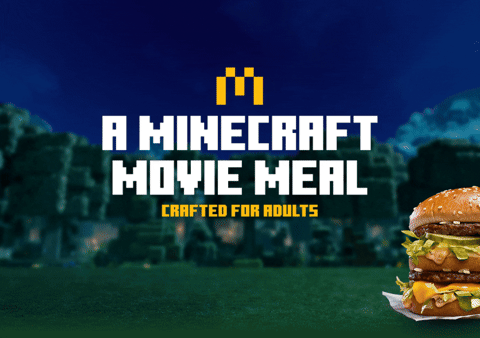
Marketers love this approach because it’s memorable. As one Reddit user said after seeing a McDonald’s/Minecraft crossover email, “I saw this McDonald's/Minecraft one a few days ago, I thought it was pretty good.”
Another chimed in, “Wow, this one is epic. I don't know how this thing even works in an email.”
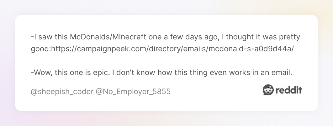
That’s the power of a storyю. It makes people stop, notice, and talk.
2. CJN framework: Challenge → Justify → Need
Open with a problem, explain why it matters, then offer your product as the solution.
Example: “You’re not getting ignored. Your subject lines are.”
3. “Customer of the month” spotlight
Share a real customer win. These build social proof and emotional connection. Bonus if you include a photo or quote.
Tip: Keep a running document of interesting moments, customer quotes, and product successes and failures. It’s your story bank.
Interactive emails increase engagement, but also risk higher friction. Use them when they help, not just to be fancy. Always include fallback text or links for accessibility.
Low-lift interactive ideas:
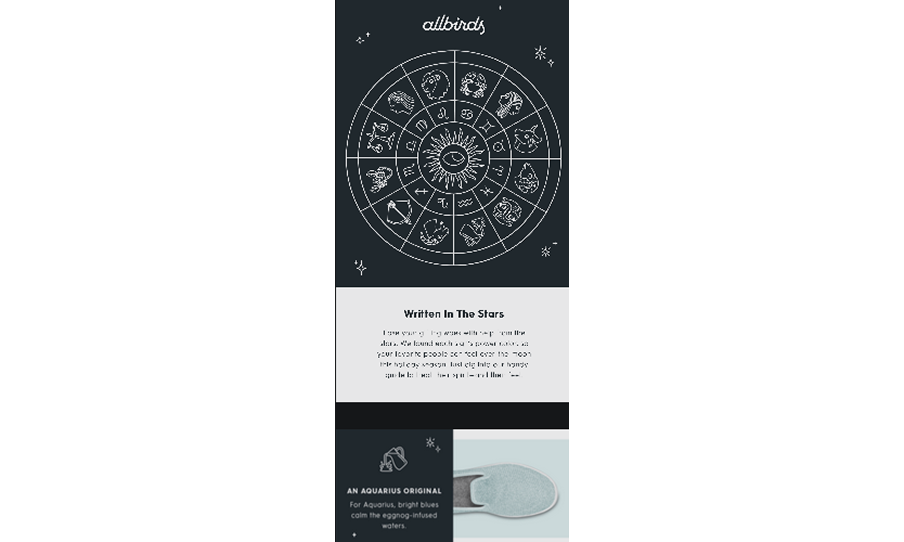
A standout example is Allbirds’ horoscope campaign. Instead of a static product promo, they tied recommendations to zodiac signs—adding a playful, personalized touch that feels interactive even without complex coding. It’s proof that creative framing alone can make an email feel fresh and engaging.
Humor works. But only when it matches your brand voice and the moment. Nobody wants a dad joke in a re-engagement email titled “We miss you 😭”.
Here are playful subject lines that work:
There are moments when to skip the jokes, namely:
If you’re a small team or a team of one, here are some minimalist, free business tools:
Here’s a mini swipe vault you can pull from any time you’re stuck or just want to speed things up without sacrificing quality.
Here are ready-to-use examples, organized by tone and intent, to help you match the right message to the right moment.
Curiosity-driven
Urgency-focused
Benefit-led
Social proof-powered
This pack provides swipeable examples, organized by tone and intent, so you can select the right one without hesitation.
Value + action:
Risk reversal:
Conversational/friendly:
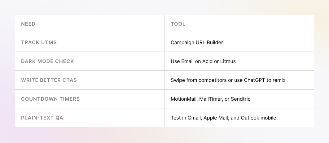
Before you hit send, run through this quick QA checklist to catch mistakes, avoid deliverability issues, and make sure your email is ready to perform:
Here’s a simple sheet you can drop right into your guide:
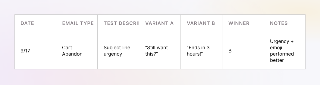
Keep a running doc like this. It helps your team stop guessing and start iterating.
You don’t need to send 100 emails a month. You just need to send better ones.
Start with two or three campaign types from the gallery that match your funnel. Automate the obvious ones (such as welcome messages and cart abandonments), then experiment with story-driven or seasonal ideas to keep things fresh.
And always, always test. Even small changes, such as a shorter subject line or a single CTA, can mean the difference between a click and a scroll past.
Here’s your action plan:
Need help designing emails that don’t just look good but actually drive clicks and conversions? That’s kind of our thing.
We blend marketing strategy with functional design to build email flows that match your voice and hit your KPIs. Let’s talk about email design.