Presentation Design
18
min read
Great business presentations tell stories that stick. These 12 examples prove it and give you the tools to create decks that win attention and buy-in. Along the way, you’ll also discover templates, resources, and tips to sharpen your own presentation skills.
The difference between a good idea and a winning idea often comes down to how well you present it. A brilliant strategy, product, or business case can fall flat if your audience can’t follow the story or see its value. That’s why mastering business presentations is the key to getting buy-in.
And no, it doesn’t mean cramming flashy animations or every fact onto a slide. A presentation design can take many forms (which we’ll discover today!), but all share one goal: to inform, persuade, and inspire action.
In this guide, we’ll walk you through professional business presentation examples. You’ll see what makes them effective, learn proven design frameworks, and discover templates and tools you can adapt for your own work.
Once you walk into a room full of decision-makers, your task is to catch their attention and hold it. Fail that mission, and you’ll see eyes glaze over, polite nods, and little real buy-in. The gap between being “heard” and actually moving people to act often comes down to how the presentation is built.

Here are the traits that can help you bridge that gap:
The starting point is your audience. If you try to design for “everyone,” you’ll connect with no one. So, before you design slides, ask: What does my audience care about? What decisions will they make after this presentation? After this, tailor examples, data level, and language accordingly.
Executives and busy stakeholders don’t have time to dig for your point. That’s why consultants and military communicators use the BLUF method — stating the main conclusion or ask right at the start. If your core message is buried in slide 10, you’ve probably already lost the room.
Even the most persuasive data feels random without a narrative arc. Effective decks follow a logical sequence: problem → impact → solution → next steps. Frameworks like Monroe’s Motivated Sequence can also help when your goal is to persuade.
Most professionals are guilty of “slide dumping” — pasting every insight into one frame. But design principles like contrast, alignment, repetition, and proximity help organize content so your audience’s eyes know where to go first (just like we did when working on Kipsi’s presentation).
Numbers alone rarely move people. It’s the context and story that make them persuasive. Instead of dumping a table of figures, visualize trends, highlight key comparisons, or show how metrics connect to outcomes. Then add a personal story to make the numbers memorable.
First impressions set the tone, and last impressions stick. Open with something that grabs attention: a provocative question, a surprising statistic, or a relatable story. Close with a clear ask or an actionable takeaway. Leave people with exactly what you want them to remember.
Reading word-for-word drains energy, while rushing signals a lack of preparation. Rehearse until your slides become cues. Check your timing. Anticipate questions. And remember that voice, pacing, and pauses shape how your content is absorbed.
For professionals at the beginning or middle of their careers, these fundamentals are the fastest way to stand out. You may not have years of stage experience or a design team behind you, but if your slides are easy to digest, you’re already ahead.
It’s time to see the theory in action. Below, we’ve gathered business presentation examples that show how different contexts demand different approaches.
Some decks secured millions in funding, others helped startups become global companies, and some continue to strengthen brand presence. Either way, these are the kinds of presentations you’ll be glad to study and borrow ideas from.
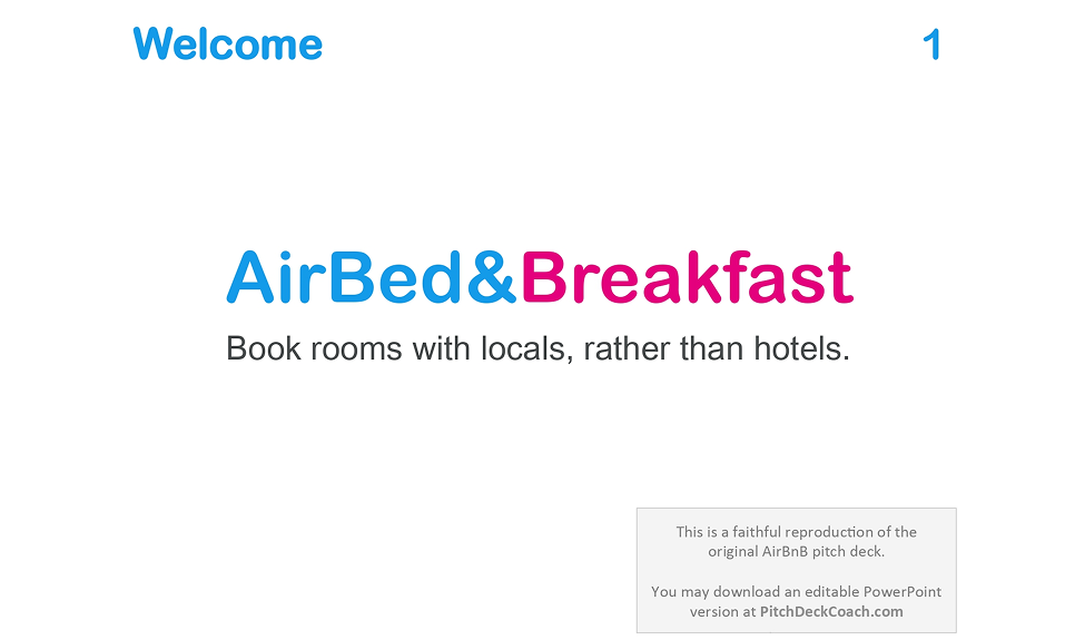
When Airbnb’s founders stepped into a room in 2008 to raise $600,000 in seed funding, their deck wasn’t flashy. It didn’t rely on fancy graphic design, long feature lists, or dense data dumps. What it did have was razor-sharp clarity, simple storytelling, and a focus on what mattered most to investors.
View the full presentation.
After taking a look at this business presentation, we can highlight the following:
Their first slide says simply: “Book rooms with locals, rather than hotels.” It’s a value proposition that immediately tells you what they do, why it’s different, and who it serves. No startup jargon, no industry lingo. Just clarity.
Airbnb’s problem slide reminds you what’s already familiar: hotels are expensive; they lack local authenticity; booking alternatives are hard to access. And from each problem comes a benefit that the platform offers.
Airbnb used data from platforms people already know — Craigslist and CouchSurfing — to show that there is demand. Then they layered in market size estimates (TAM / SAM / etc.) to show how big the rewards could be.
The deck doesn’t waste words, features, or visuals. Every slide serves a purpose. It’s clearly targeted at investors, with projections, commission percentages, and a simple revenue model that makes the business easy to understand.
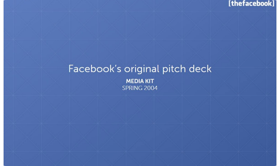
In 2004, Facebook’s founders stepped into the digital field with just one asset: user obsession. When they raised $500,000 in seed funding, the business presentation they showed was strategic. They leaned hard into what was real: growth, community, and what people already did.
Here’s what made it appealing:
Facebook presentation opens with a quote from The Stanford Daily about how students at Harvard were “addicted” to the platform. That kind of social validation early on gives you credibility without sounding like a pitch.
Once they capture your attention, Facebook shows what Thefacebook.com is, how it works, and what people can do. It avoids overwhelming the audience with jargon. It explains product features in terms that people can picture.
Rather than theoretical “market size” claims upfront, Facebook walks through a rollout plan: “schools we’ve launched at,” expansion to more campuses, and user growth. They show momentum, and they tie it to concrete, date-driven goals.
As you can see, the slides were mostly text plus simple visuals or screenshots. They relied on clean messaging, sharp contrasts between main points and supporting detail, and let growth metrics do the heavy lifting.
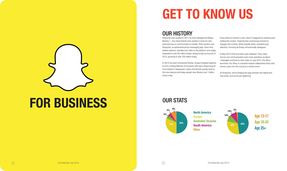
In a crowded social media world dominated by polished profiles and permanent posts, Snapchat’s founders leaned into something risky: messaging that disappears. That idea of “here-now, then gone” felt counterintuitive, but it was exactly what many users, especially young people, secretly craved.
The deck highlights a few key elements:
Snapchat opens its “For Business” deck with bold color (their signature yellow), their ghost logo, and minimal text. Right away, you know whose deck this is. There’s no over-explaining. The visual identity carries weight.
One of the early slides is “Philosophy”. It asks: “Why are we different?” And answers: “Delete is our default”. That principle — ephemeral communication — frames every feature, every usage stat, every growth story.
Snapchat deck shows users snapping, chatting, and creating Stories. These screenshots, user behavior stats, and other visuals give concrete proof of real engagement. Seeing actual content and usage makes their promise valuable.
As the deck unfolds, it shifts smoothly from consumers to businesses. It shows how brands can join, use Stories, advertise, and benefit, all supported with early adopters, practical tips, and usage stats.
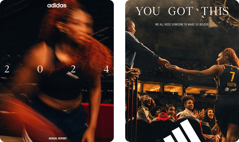
Annual reports are not your typical pitch decks, but they are high-stakes business presentations designed to win trust, reassure investors, and show the company’s direction. Adidas’s 2024 annual report is a strong example of how a corporate presentation can blend transparency, storytelling, and design.
Here’s what stands out on a closer look:
The report opens with a purpose and mission, outlining Adidas’s priorities: product innovation, digital acceleration, sustainability, and strengthening brand appeal. This framing sets the right narrative upfront.
Early in the report, Adidas presents a structured table of key metrics: Targets – Results – Outlook. This format demonstrates accountability: here’s what we aimed for, here’s what we achieved, and here’s what comes next.
The report uses Adidas’s signature typography, bold black-and-white palette, and sharp layouts. Charts are clean, visuals are purposeful, and photography reinforces brand culture (athletes, events, product launches).
This report is massive — 492 pages — but for good reason. It’s presented as a combined publication for investors, stakeholders, and anyone interested in Adidas’s activities, weaving financial results with strategy and brand storytelling.
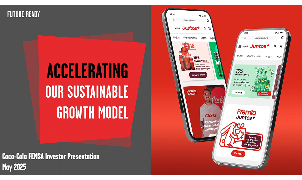
Investor decks are a different breed of business presentation: they’re built to earn trust, show resilience, and signal project growth. Coca-Cola FEMSA’s May 2025 investor presentation does this with discipline, blending scale, strategy, and sustainability into a story investors can believe in.
Let’s break down the highlights:
The presentation immediately puts scale on display: 276 million people served, 56 plants, 256 distribution centers, and over 11,500 trucks in 10 countries. Alongside the figures is a map, making the company’s operational footprint instantly clear.
The heart of the presentation is its six-pillar strategy breakdown. Each pillar is tied to practical enablers and recent wins, signaling to investors that this isn’t an aspiration, but a systematized model of execution.
Many companies relegate ESG to the appendix. Coca-Cola FEMSA puts it in the middle of its story. A dedicated slide shows initiatives in recycling, water efficiency, and community engagement, reinforcing the brand’s core mission.
Throughout the presentation, visuals dominate: oversized metrics, bold maps, clear icons, and crisp charts. Text is stripped back, forcing the story to ride on data and visuals. For an investor audience, this clarity is exactly what works.
When Disney presents its earnings, it frames performance in a way that shows strategy, momentum, and relevance. Their Q1 FY 2023 presentation (and accompanying reports) demonstrate how a large business can keep investors aligned, informed, and optimistic without getting lost in its own size.

Here’s what makes Disney’s earnings overview effective:
Disney divides its empire into three core units: Disney Entertainment, ESPN, and Disney Parks, Experiences and Products. Supporting slides show performance across each segment, helping investors quickly see what’s achieved.
The deck relies on bar charts and simple tables for revenue, operating income, subscriber counts, and ARPU. Text is minimal, but annotations clarify trends and highlight the company’s trajectory at a glance.
Even while highlighting losses in streaming, Disney uses the presentation to frame change: cost-cutting initiatives, focus on core IP (Marvel, Pixar, Star Wars), and efficiency moves. Disney knows the challenges and is taking action.
From an investor’s perspective, this is a well-structured presentation packed with essential metrics and forward-looking initiatives. And despite the sheer volume of information, the slides remain visually consistent with Disney’s brand identity.
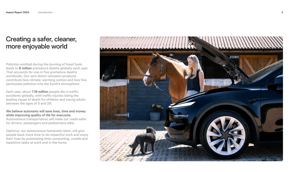
Tesla’s 2024 Impact Report is a statement of how the company sees its role in transforming energy, transportation, and resource use. The report highlights efforts such as scaling battery technology, cutting emissions in production, expanding recycling programs, and rolling out renewable energy products.
Let’s take a look at the exact highlights:
Tesla demonstrates achievements through hard numbers. For instance, the 2024 report states that customers avoided nearly 32 million metric tons of CO₂e. That figure is presented as proof of Tesla’s scale and relevance.
Tesla also acknowledges challenges, particularly the emissions tied to production and supply chains. It explains how these are being reduced over time through smarter material sourcing, decarbonized operations, and closed-loop recycling.
The visuals are clean, with infographics, charts, and bold metrics that highlight what Tesla wants you to focus on. Big numbers, clear contrast, and less text make the story digestible even with lots of technical content.
This presentation is a great example of stakeholder-oriented communication. What we liked most is that it connects past challenges, current progress, and future initiatives in a way that builds credibility and confidence.
McKinsey presentations have a reputation: dense, data-rich, and laser-focused on decision-making. Their Transportation and Warehousing Sector Analysis (for Washington, DC, 2020) is a good case study in how consulting decks handle complexity while keeping a sharp story.

What this presentation does well:
Right from the start, the deck establishes context. It explains the relative size of the transportation and warehousing sector in DC, highlights its modest role in overall employment, and outlines the pressures it faced during the pandemic.
McKinsey spotlights the people side: top transportation jobs in DC employ a majority Black workforce, but are also among the most at risk of automation. This frames transit as a social and equity issue, an angle many business presentations miss.
The deck lays out trends like declining employment, pandemic shocks, and automation risks, then pivots to opportunities: investing in infrastructure, supporting transit ridership, and workforce retraining.
True to consulting form, slides are packed with charts. But they maintain discipline: one insight per slide, consistent labeling, clear sources, and footnotes. Even when the data is heavy, the reader isn’t lost.
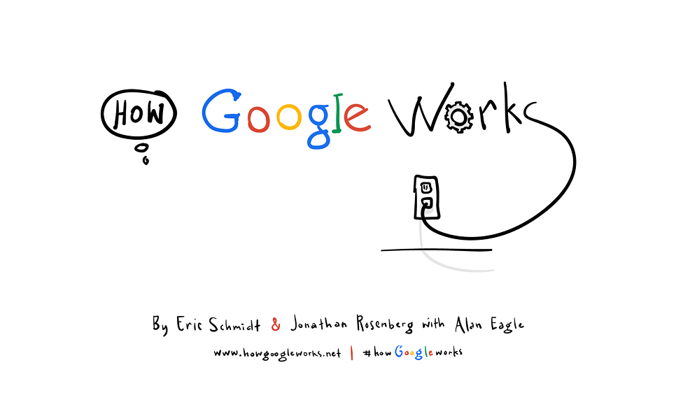
How Google Works by Eric Schmidt is more of a manifesto, weaving strategy, management philosophy, and culture into a presentation of why Google succeeded, not just what it did. Its strength lies in turning complex internal processes into lessons any organization can use.
Here are some insights from the presentation:
This business presentation example treats Google’s corporate culture as a central pillar of its strategy. Google promotes work environments where employees feel empowered to innovate, share openly, and take risks.
Google’s model puts a lot of weight on recruiting people who are skilled, creative, curious, and willing to experiment. The authors call these people smart creatives, and the presentation emphasizes how much value they drive.
One of the presentation’s big strengths is embedding lessons in real, sometimes small, internal examples — projects that succeeded because of the culture, experiments that failed but taught something, decisions that changed direction.
And we can’t pass by the design side. The slides are visually light, filled with strong visuals, quotes, and concise text. Storytelling runs consistently throughout, supported by hand-drawn illustrations that keep the tone engaging and human.
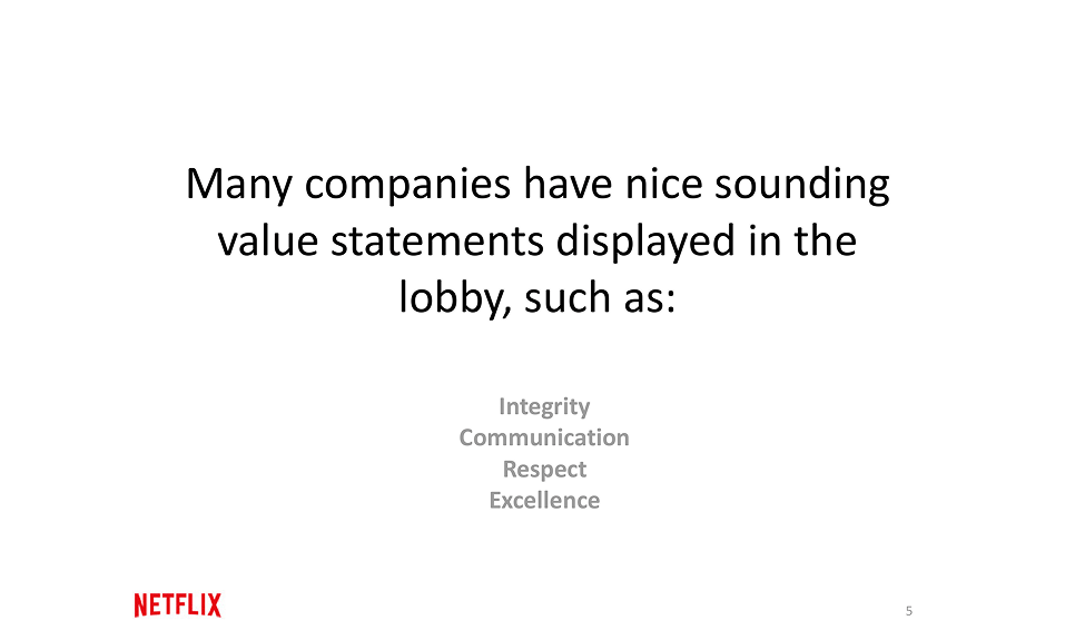
Netflix’s culture deck is one of the most famous corporate presentation examples. Back in 2009, co-founder Reed Hastings published a 125-slide PowerPoint outlining Netflix’s philosophy. Fast forward 15 years, and Netflix has continued to iterate on this presentation, releasing the latest version shaped by feedback from employees.
Here are a few highlights worth noting:
Slides describe Netflix as a professional sports team. The message is clear: only top performers stay, and every role must be filled by the “best available player.” It sets a very high bar for performance, communicated without sugar-coating.
Another section points out Netflix’s belief that rules slow companies down. The slides even highlight that Netflix has no vacation policy and no formal expense policy, trusting people to use good judgment.
The deck acknowledges that Netflix thrives on change. Success requires employees who are comfortable experimenting, taking risks, and adapting quickly. The slides frame uncertainty as a feature of the culture, not a bug.
One of the most striking slides puts it bluntly: “We suck today compared to where we want to be.” It’s a powerful way to express the company’s obsession with continuous improvement and resilience.
Business presentations don’t always have to be slide decks or annual reports. Sometimes, a product demo video can be the most powerful way to show what you do. Notion’s demos are a great example of this, as they are clean, focused, user-centered, and designed to show value fast.
Here’s what Notion’s demo videos do well:
Notion’s demo videos walk you through all the necessary features. You see exactly how people build templates, track progress, customize views, etc. The audience gets concrete examples they can picture right away.
The demo videos are usually just a few minutes long, with crisp visuals of the UI, clean transitions, and minimal distractions. Notion doesn’t try to wow with cinematic effects. They focus on clarity and make sure viewers can see what to do next.
Even though they’re short, the videos follow a clear arc: problem → tool + customization → outcome. That structure keeps the audience engaged and makes each feature’s value obvious.
Many of Notion's videos show templates that are already built (e.g., for PRDs, marketing campaigns, or issue tracking) with pre-set views and tags. This helps viewers overcome the “blank page” problem and see how quickly they can start.
Google “Ready Together” goes beyond the traditional business PowerPoint presentation examples and uses video and motion to build a case study. In this deck, client stories, stats, video clips, and challenges are interwoven to show how a product actually solves real business problems.
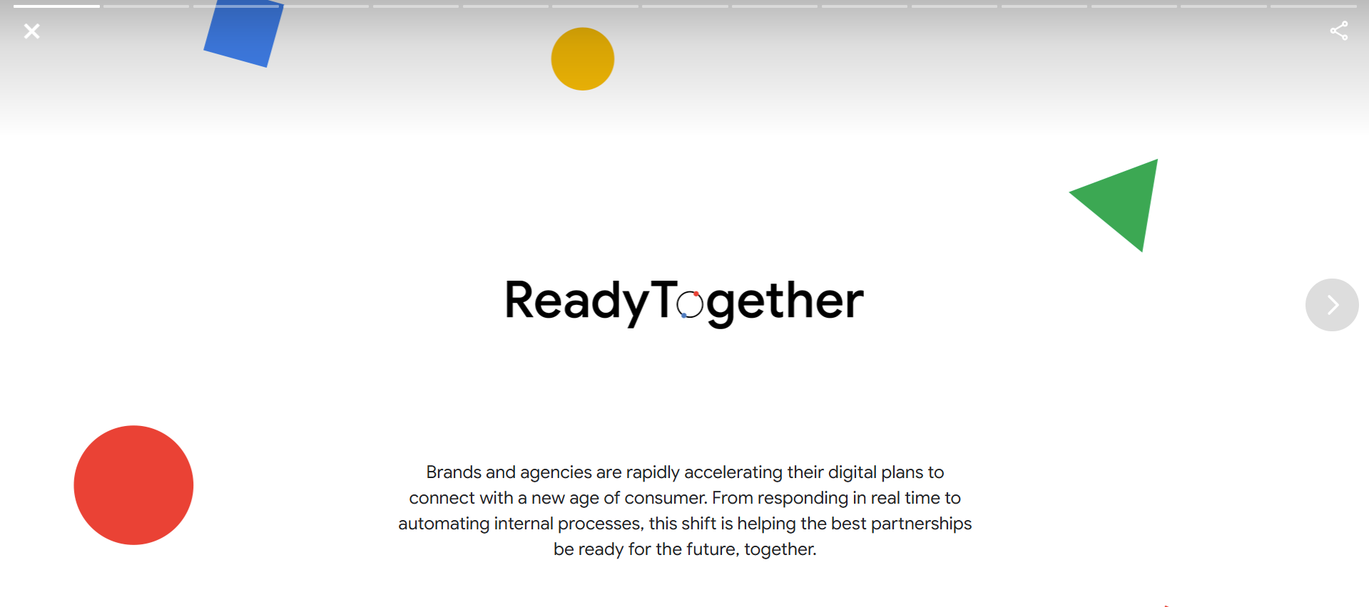
What makes this presentation format work well:
One of the first things you see is a short video from a Google client — in this case, 7-Eleven. In their own voice, they explain how they used Google’s marketing technology, automated operations, and tracked results.
After the video clip, Google inserts what problems businesses similar to 7-Eleven are facing right now, what marketing automation trends look like, and what gaps exist. These slides help the audience understand broader pain points.
Later slides let the 7-Eleven CMO speak to how Google’s tools helped overcome those gaps. Because that voice is from someone using the product, it feels more credible and grounded.
In this presentation example, the video provides the story and emotion, while the slides deliver data and structure. And if you’re planning to create this kind of mixed-format deck, our motion design services can help you bring it to life.
When you’ve found your inspiration and are ready to sit down and create your own business presentation, the right tools can make all the difference. Well-designed templates and strong design systems can save you hours of effort.
(p.s. If you don’t have an in-house design team, working with a business presentation company can help you polish your message and keep it sharp.)
Here are some of the best places to find them:
Considering how many templates are out there, it’s easy to get lost. Our main advice is always to start by matching the template structure to your content. A template should support your narrative flow, not force you to twist your ideas to fit its slides. And if something doesn’t feel right, expand or tweak the design.
There’s also the aspect of skills. You can jump straight into creating a business presentation with no prior practice, or you can take a moment to learn from resources first. Either way, no matter your current level, here are some tips and tricks that will help you build better decks.

Before you build a slide or write a word, think: Who will see this? What do they already know? What do they care about most? It’s a common fact that tailoring your message to your audience’s existing knowledge, priorities, and even pain points can help you boost retention and engagement.
Raw numbers bore unless they’re connected to something meaningful. Use narrative arcs: introduce the challenge, show what you discovered (your insight), then show how it matters. Data storytelling experts recommend selecting only the data points that push your narrative forward.
Charts, graphs, and icons help, but only if they aid clarity. In Kaluto’s presentation, for example, our designers selected visuals based on what the client wanted the audience to notice. We kept a strong contrast, a limited color palette, and minimal text, all crafted for clarity.
People tend to remember what happens at the start and the end of a presentation the most. The “audience memory curve” concept shows an attention/retention drop in the middle. So hook them early (surprise, provocative question, key number) and close with something actionable or emotionally resonant.
Even brilliant slides won’t land if delivery is flat. Rehearse until you don’t need to read the slides. Work on pacing, pauses, tone, and even body language. If possible, record your run-through or present it to someone for feedback. Feedback helps spot things you miss (pace, clarity, slide transitions).
After every presentation, spend time reviewing what worked and what didn’t. Collect feedback (formal or informal), especially on slides that people say were confusing or boring. Compare what you promised vs what the audience took away. Over time, you build muscle for clarity, conciseness, and impact.
We’ve covered plenty of presentation examples, but what if you want more? Maybe you’re looking for decks that match your industry, style, or topic. With a few smart search tricks below, you can uncover other business PowerPoint examples to study and get inspired.
Type queries like “pdf investor presentation”, “pptx annual report”, or “shareholder deck”. If you know a ticker symbol (e.g., NYSE: CRM investor presentation), add that. These searches help you find original slide decks from established companies.
Many big companies publish their investor presentations, earnings decks, and strategy updates on their IR website. Analyst Day decks are especially rich because they tend to include deep breakdowns, projections, and roadmap slides.
This one is underrated. Search using keywords + image filters. Thumbnails can quickly show you layouts, use of visuals, typography, and white space, letting you spot decks with styles you like before downloading whole files.
Analysis decks or sector studies are publicly available and often packed with well-designed charts, frameworks, and slide layouts. Because these are intended for decision-makers, they tend to use polished narrative structure + rigorous visuals.
The truth is, most presentations are forgotten. The few that stay with people are the ones that make them feel something, understand something, or want to take the next step. Keep that in mind, and you’ll already be ahead of most.
And if you ever need help, remember that a Todaymade design partner is only a few lines away. We know how to turn presentations into opportunities to inspire, persuade, and move people, and we can do the same for you.