Ebook Design Inspiration That Actually Works: 15+ Layouts, Tools & Pro Tips

Even the best content can fall flat if your ebook design doesn’t hold attention. This guide walks you through 15+ real-world ebook layout styles, the best tools for every skill level, and expert tips to help you create engaging, on-brand ebooks that generate leads, build trust, and actually get read. Whether you’re creating your first lead magnet or building a full ebook library, this is your blueprint for standout design.
Your content might be solid. But if the design falls flat, most readers won’t make it past page one, even if it’s a lead magnet ebook designed to generate leads.
Harsh? Maybe. True? Definitely. Adobe found that 38% of people stop engaging with content if the layout looks bad. The same goes for ebooks. If your design is cluttered, bland, or hard to follow, people bounce before the value lands.
Design isn’t just about looks. It’s about trust, clarity, and flow. A clean layout makes content easier to digest. Smart spacing gives it room to breathe. And intentional visuals, even simple stock images, help guide your reader from start to finish without friction.
It also signals effort. A well-designed ebook makes people assume the content is polished too, which boosts credibility and conversions. Especially when you’re asking for an email, a signup, or a sale.
That’s where TodayMade comes in. Ebook design is one of our core services, combining creativity with structure to make your content look and perform better. People come looking for layout inspiration, graphic design examples, and practical tips — and that’s exactly what this guide will help you create.
Here’s what you’ll get:
• Real-world visual inspiration (not just pretty covers)
• Proven layout ideas from designers who’ve been there
• Tools and templates that work, even if you’re not a designer
Let’s create your ebook — the one people actually finish.
Most people dive into creating an ebook with a blank Canva file and a vague idea. That’s usually a mistake.
Designing an ebook isn’t just about making it look good — it’s about making it work for your business, your customers, and your goals. And that starts way before picking different font combinations or dragging in images. It starts with understanding your format and asking the right questions.
Let’s break down the two things you absolutely need to nail before opening any design tool: the technical format and the creative direction.
Most creators default to PDF. It’s easy, familiar, and works almost anywhere. But depending on how your ebook will be consumed — desktop vs mobile, casual reader vs Kindle user — the format you choose can make or break the experience.
Here’s a quick comparison to help you get it right the first time:

Many people don’t even realize there’s a difference between EPUB and PDF formats. They assume uploading a nice-looking file is enough until they hit unexpected limits.
You’re not alone. That confusion is one of the most common reasons ebooks get delayed, redesigned, or quietly abandoned halfway through, especially when creators don’t think through how they’ll promote or deliver the final ebook online.
Even if you’re going with a simple PDF, you still need to design with intention. And that starts by getting clarity on five things:
Are you trying to generate leads, build trust, teach something, or sell? Your ebook’s purpose affects everything from layout style to CTA placement.
Design for their expectations. A startup founder expects clean and direct. A creative freelancer? More visual flair. Know your audience before you choose your templates or images.
Are people downloading this from your website? Reading it on a tablet? Getting it via email? Your delivery method shapes how the ebook should be formatted, optimized, and promoted.
Is it mostly text? Charts? Screenshots? Is it a piece of long form content or a quick checklist? Layout decisions depend heavily on content type and density.
Brand colors, logo, and tone give your ebook a unique touch and help it feel like it truly belongs to your business, not just something slapped together with free stock images.
A lot of people jump straight into Canva without asking the basics:
What’s the goal? How long is it? Is there branding? What’s the deadline?
If you’re asking those upfront, you’re already ahead of most. Start there, not in the design tool. You’ll save hours of edits, avoid mismatched pages, and create an ebook that actually delivers what it promises.
Now that you’ve nailed the formats, goals, and specs, let’s see what good ebook design looks like in action. Below are six layout styles, each backed by real examples, to help you find the one that fits your project best.
The best ebook designs aren’t just beautiful — they’re built with purpose. A smart layout helps readers absorb important information quickly, stay engaged, and remember what matters. These real-world examples show how effective ebook layout design can support your message, highlight your marketing goals, and connect with your customers.
This layout leads with strong type, bold color, and intentional negative space. It’s ideal for content where the message itself is the design — no stock images needed.
You’ll see this often in B2B marketing ebooks where authority matters and words do the selling. Brands like Unbounce, UXPin, and Intercom create clean, scalable ebook designs that stand out without clutter. They use different fonts, white space, and color strategically to make sure the title is the hero.
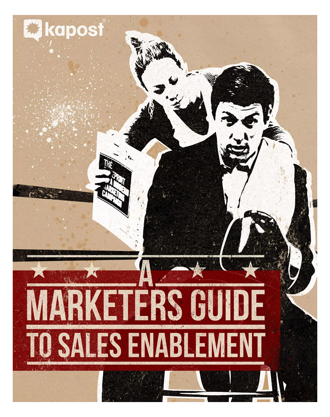
Kapost takes it even further with A Marketer’s Guide to Sales Enablement, using oversized type and a gritty illustrated backdrop that mimics a vintage boxing poster. It’s a great example of how bold type can make your lead magnet ebook feel confident and memorable without a single photo.
Use this when your ebook title makes a strong claim — the layout should make it land.
Minimal layouts thrive when your content is packed with important information. They organize text using clear hierarchy, strategic spacing, and thoughtful color blocks.
Dropbox’s Business Deployment Guide, much like many great SaaS landing page examples, is a textbook ebook layout design. It blends generous spacing with bold headers and color-coded sections. This format is excellent for long-form content, how-to guides, or detailed ebook ideas that need to stay scannable.
And it directly responds to a common Reddit complaint: “Too much text = fatigue.” A clean layout doesn’t try to impress — it helps people create clarity.

Not every idea fits inside bullet points. Sometimes, the most effective way to promote your ebook’s message is through a strong story, and that’s where illustration-led ebook layout design shines.
Ebook illustrations aren’t just decoration. When used with purpose, they guide attention, simplify complex topics, and connect with visual learners more naturally than stock images ever could.
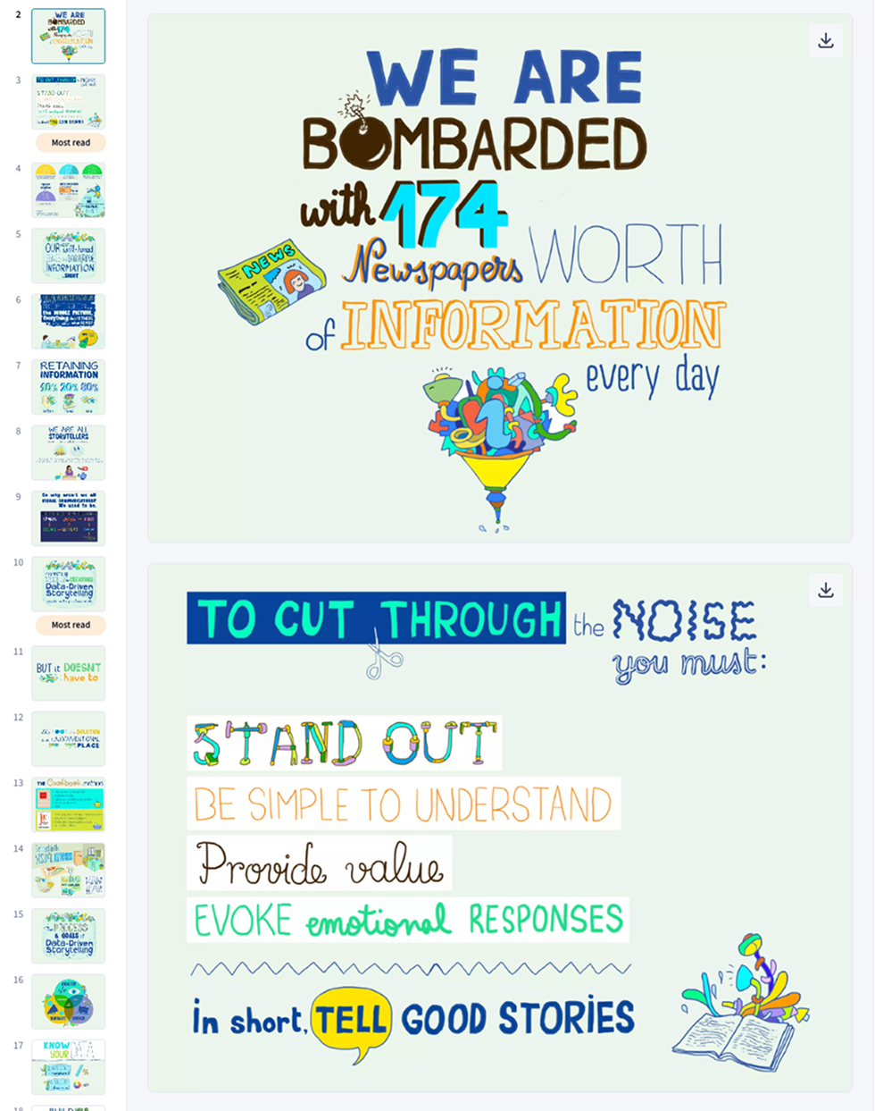
Take The Joy of Data-Driven Storytelling by Leslie Bradshaw. This lead magnet ebook uses expressive drawings, layered typography, and playful metaphors to create an engaging narrative around data, transforming what could have been dry long-form content into a rich story experience.
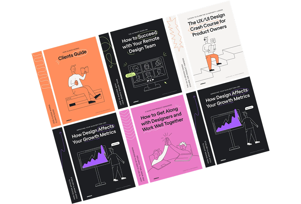
A more grounded example? TodayMade’s work on Eleken’s business ebooks. These combine clean structure withriendly ebook graphics, subtle illustrations and consistent brand colors — a mix that’s approachable yet polished. It's a layout that respects the reader’s time and attention while still adding a unique touch.
Use this approach when your ebook explains something abstract or needs to balance dense content with visual interest. Just make sure your layout stays structured and your message doesn’t get lost in the art.
Some ebook designs communicate better through images than words. If your content highlights people, places, or results, strong photography can give it a polished, human feel.
Take LinkedIn’s Data Driven Recruiting as a great example. Full-bleed photos, clean overlays, and minimal text make the layout feel modern and trustworthy — ideal for business or B2B marketing content.
This approach works best for lead magnet ebooks, recruiting guides, or brand storytelling. Just avoid generic stock images. High-quality, intentional visuals will do more than decorate — they’ll help you create connection.

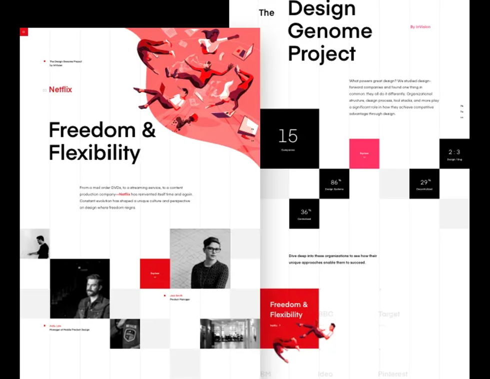
If you’re designing for a creative audience or want your content to stand out visually, this ebook layout is for you.Instead of the typical column structure, it uses different fonts, blocks, and modular patterns to add energy, perfect for coaches, creators, and brands that follow web design trends.
InVision’s Design Genome Project nails it. The layout shifts as you scroll, guiding the eye without losing structure. It’s dynamic, interactive, and feels more like a microsite than a static ebook.
Want to create something similar? Use bold colors (like a sharp blue color), a grid-based framework, and consistent spacing, or even take cues from Brutalist web design to create something unexpected. You’ll keep it legible while giving it a unique touch that’s memorable for your customers.
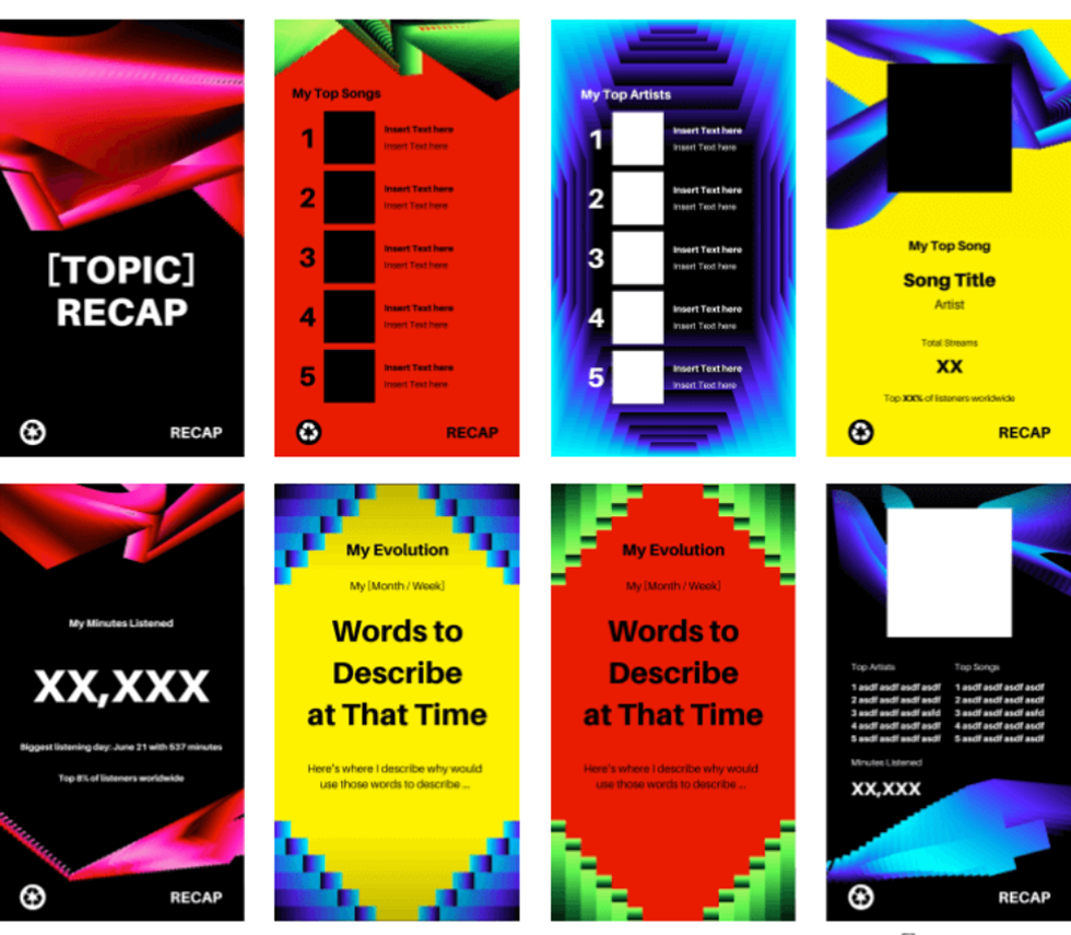
Not all ebooks live as static PDFs. Some are meant to be tapped, swiped, and shared, especially if your ebook design leans toward visual learners or data-driven storytelling.
Think Spotify Wrapped. Its animated slides, bold gradients, and modular storytelling have inspired dozens of remixable templates built in Canva, Figma, or web-based tools like Tome.
These formats are ideal for recap content, audience reports, or content you want to promote online. They're engaging, mobile-first, and built to deliver important information with flair.
Just a note: EPUB3 and e-ink devices may not support these formats well. But if you want to create something dynamic for the web or social media, this is one of the most interesting and effective ways to go.
Each layout above solves a different problem, whether it’s clarity, emotion, engagement, or conversion. Choose the one that fits your content best, and let your ebook designers bring it to life.
Inspired by the layouts above but not sure how to actually build them? Your tools will make or break the process. Whether you’re working solo, with a team, or on a deadline, the right platform depends on your design skills, goals, and how much control you need. Let’s break it down.
You don’t need to be a designer to create a beautiful, functional ebook. But choosing the wrong tool can slow you down, or worse, compromise the layout and experience.
So before you jump into Canva (or panic-Google “EPUB layout tutorial”), pause and ask:
Different tools serve different purposes — some prioritize speed, others give you pixel-level precision. Choosing the right platform comes down to your content type and preferred ebook layout design.
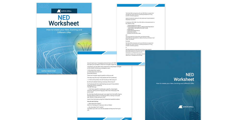
Not every ebook needs custom design. If you’re making a quick lead magnet, checklist, or explainer PDF, the best tool is the one that lets you move fast and still look polished.
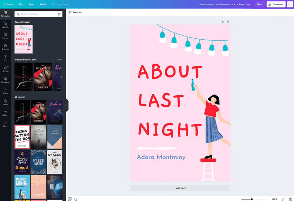
Canva is best for quick marketing content and branded PDFs. It offers an intuitive drag-and-drop interface, a wide selection of templates, and fast export, perfect for getting polished content out quickly without design experience.
Visme works well for infographics and data-led PDFs. It’s ideal for turning statistics or reports into clean, visual layouts, even if you have zero design skills.

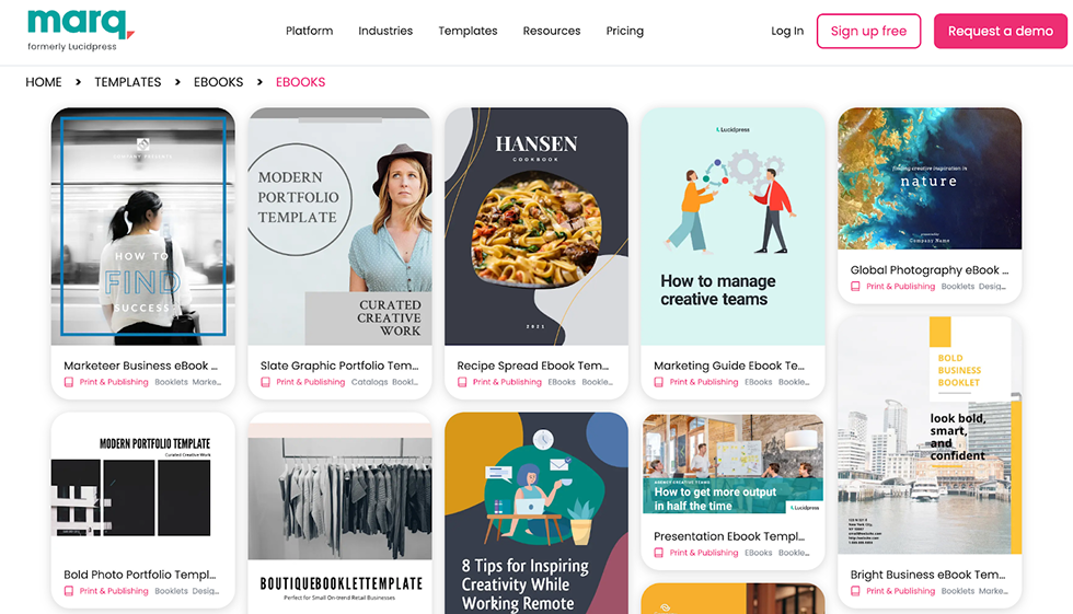
Marq, formerly known as Lucidpress, is great for team-ready content. It allows you to lock in brand elements and reuse layouts, making it especially useful for businesses producing repeatable formats.
Designrr is built for blog-to-ebook repurposing. It can pull content directly from Word documents, Google Docs, or even URLs and format it into an ebook in minutes, saving tons of time on layout.
Pro tip: Templates are great for speed, but if you’re juggling tight deadlines, need multi-format output (PDF, web, interactive), or manage design across multiple ebook designs, a subscription-based tool like TodayMade can save you time without sacrificing quality.
Once you’re comfortable moving beyond templates, these tools offer a happy middle ground — more flexibility, without the steep learning curve of pro publishing software.
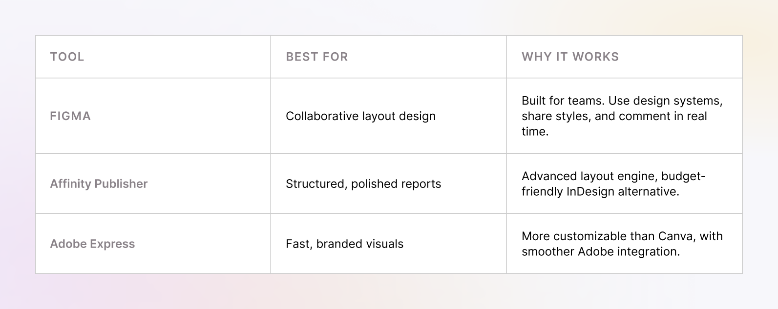
These are ideal if you’re designing longer guides or exploring more creative ebook ideas, but don’t want to dive into InDesign just yet.
Some ebooks demand more than drag-and-drop. If you're publishing a fixed-layout EPUB, selling a Kindle book, or designing a long-form PDF with complex formatting, you'll want tools that give you full command over structure, export formats, and design.
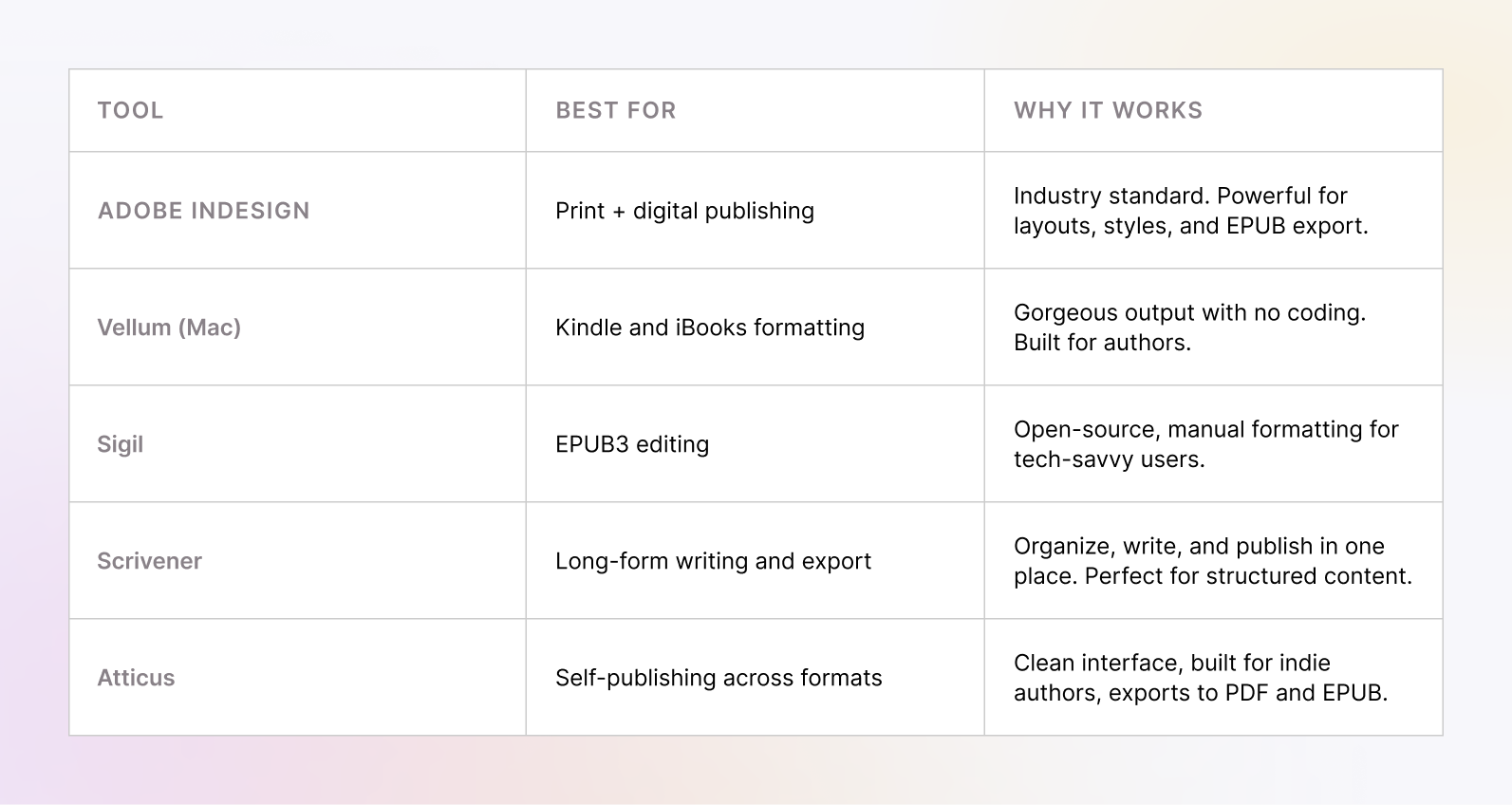
If you're serious about the publishing process or aiming for the best ebook design possible, these tools give you professional-level control and output.
Not every ebook needs to be a PDF. Some brands are turning their ebooks into web-based experiences, hosted guides, or embeddable lead magnets.
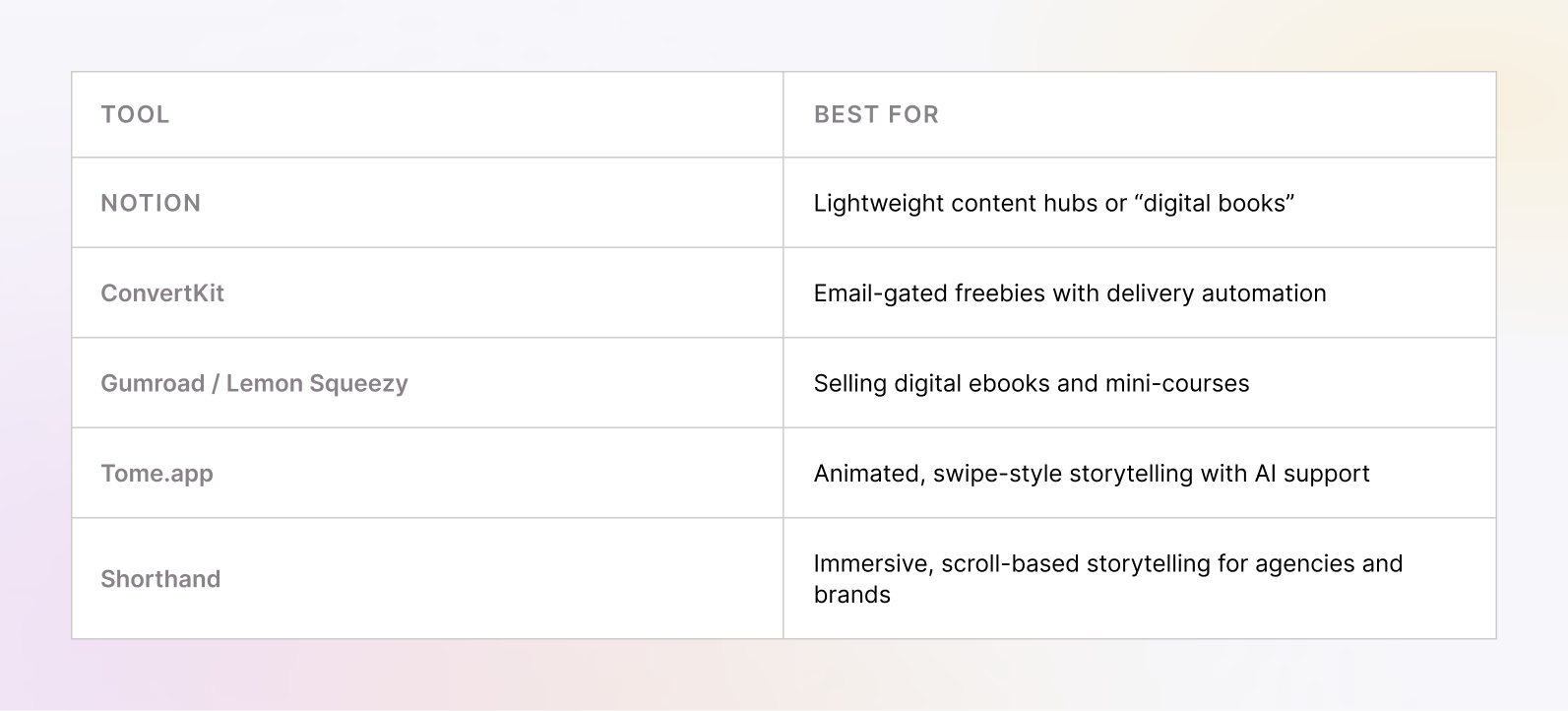
These are especially useful if your ebook is part of a funnel, a product, or an ongoing content ecosystem, and you care more about experience than format. You don’t need the fanciest tool — just the one that fits your content and workflow.
Once your tool is set, shift focus from how it looks to what it does. If your ebook is built to sell or convert, layout choices matter. Here’s how to design with results in mind.
Most ebooks don’t fail because of bad content — they fail because the layout doesn’t guide readers toward the next step. Whether you're trying to generate leads, promote a product, or support a sales funnel, your ebook design has to move people, not just inform them.
Great sales layouts are built to move people. That starts with:
Chapter endings, for example, are prime real estate. Readers just absorbed something helpful — that’s your moment to slide in a link, upsell, or next step.
Reddit users had real-world success here. One creator gave away a 5-page “mini ebook” with a single call-to-action at the end, and it generated $3,600 in sales.
Why did it work?
Other proven tactics include using branded callout panels (bold text, strong contrast, and value-driven language) all rooted in smart design tips. Tools like Canva and Venngage make these ridiculously simple to create.
As one creator on Reddit put it:
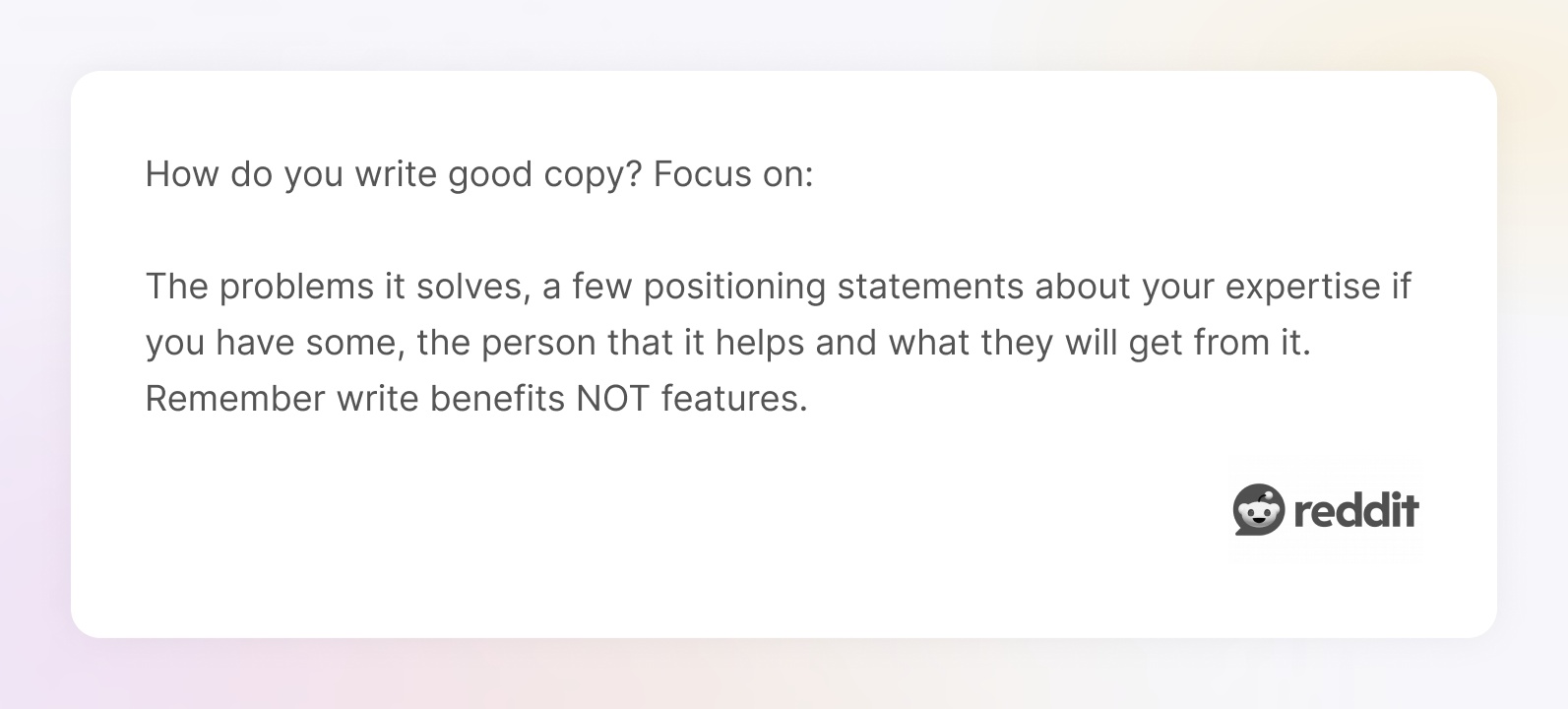
That’s the heart of effective ebook marketing, and the reason good design can quietly outperform a hard sell.
Whether you’re sharing your own ebooks, helping customers understand your product, or just testing out new ebook ideas, design with the reader’s next step in mind.
Every design decision should answer one question: “What’s the next logical step for the reader?”
If the answer is “click,” “buy,” or “sign up,” your layout should make that effortless, and almost inevitable.
Smart layout can turn a passive reader into an engaged one, or even a customer. But good design doesn’t stop at CTAs. It’s about creating a reading experience that feels intentional from start to finish. Let’s wrap with a few final thoughts on making your ebook truly worth reading.
Good design isn’t about perfection — it’s about intention.
You don’t need to be a professional designer to create something polished, useful, and even beautiful. You just need to start with the right questions: Who is this for? What should they take away? What action do I want them to take next?
With the right layout, tools, and a little bit of inspiration, your ebook can be more than a content dump. It can become a product, a lead magnet, a thought leadership piece — something that lives beyond the scroll.
Whether you’re crafting your first ebook or exploring graphic design outsourcing to build a whole library of high-performing content, remember this: great design isn’t decoration — it’s strategy. It’s what turns a static PDF into something people actually want to read.
Ready to turn your next ebook idea into a design people actually read? Our team at TodayMade is here to help.


