Graphic design
17
min read
You’re a designer and know how to present other people’s work. But when it comes to your own? Cue the blank stare. Should you keep it minimal or go wild? How many projects are “enough”? And is anyone actually reading the “About me” section?
If you’re just starting, or still figuring things out as a junior designer, the pressure to make something “portfolio-worthy” can feel... a bit much, but inspiration from great graphic design examples can help ease the stress.
That’s why we made this guide.
It’s not just packed with 20 designer portfolio examples (though yes, there’s plenty of eye candy). Here, you’ll find a practical walkthrough of what actually works, with modern graphic design trends and even a few AI tricks to speed things up.
So grab a snack, open that Figma file, and let’s get your portfolio looking as good as your ideas. You’ve got this, and we’ve got your back.
Before examples, there’s one important thing we need to talk about first: What’s the point of a graphic design portfolio, anyway?

At its core, a portfolio is the representation of your design voice, thinking process, and potential. It’s like a personalized gallery that convinces someone to hire you, collaborate with you, or at least remember your name — a role often played by motion graphic examples in the industry.
Put simply, if you’ve done it right, you win a ticket to getting noticed. And once you have that ticket in hand, here’s what else you can get:
It proves you can solve problems.
Managers and clients aren’t hiring you just because you have a cool color palette. They want to see how you think, how you approach the problem, and what constraints you work with, all of which play a role in determining the cost to hire a graphic designer.
It shows your personality.
We’re not saying you need to turn your site into a meme museum (unless that’s your thing). A good “About” page, or a short note about your process, says, “Here’s who I am and what it’s like to collaborate with me” — something clients also look for when exploring graphic design outsourcing solutions.
It gives your career direction.
Even if you’re not looking for a job right now, the act of creating a portfolio forces you to reflect: What kind of work excites you? Who do you want to design for? What do you not want to do again? This way, you build your own career strategy.
Before you create (or revamp) your own portfolio, it helps to see what great ones look like — especially those enriched with graphic illustration. For this, we’ve handpicked 15 good graphic design portfolios that actually do the job.
You’ll find a mix of individual styles, and will definitely catch some inspiration. Borrow examples of graphic design portfolios, play with formats, remix layouts, and see how these creators show off their strengths in unconventional ways.

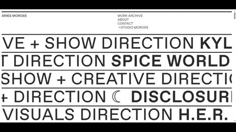
This portfolio grabs you the second it loads. It’s monochrome, bold, and playfully offbeat in the best way. Alexandre mixes hand-drawn graphic illustrations with clean type and clever motion, making you smile and instantly trust the designer.
What really stands out is the smart use of hover effects. As you scroll, you see the project thumbnails that look desaturated at first. But as soon as you move your cursor over the previews, they come to life in full color.

David’s portfolio opens with a stream of colorful images rolling behind two versions of his name in different fonts. The text wiggles, a scrolling banner shouts out his book recs, and acid green and deep red hit you in rapid succession.
Despite all that chaos, the site somehow stays usable. The structure is weird but consistent, and you always feel like you’re being guided somewhere. That kind of controlled unpredictability makes the site memorable.
This portfolio welcomes you with scrolling lines of text gliding from right to left. Hover over them, and you’ll realize: they’re clickable. Click one, and you’re dropped into a vibrant project page that proves the intro wasn’t just for show.
Scroll down, and the layout shifts into something more familiar — a block-style grid of projects. Some are animated, others are static, but each adds a splash of color and movement to the otherwise black-and-white canvas.

Mike’s portfolio has mastered minimalism. There are no motion graphics or transitions, just a clean grid of projects that speak for themselves. It’s the kind of layout that doesn’t distract from the work, but puts it front and center.
When you click on a project, it doesn’t load a new page. Instead, a neat panel slides in with a short description — what the task was, how Mike approached it, and of course, plenty of visuals to show the result.
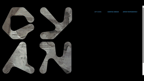
This digital designer portfolio looks like it’s hiding something. The screen is pure black, with the artist’s name in a stylized font. The projects and text are missing until you click the “graphic design” button. Then the lights come on, and the story begins.
Instead of a traditional grid or menu, Cyan guides you through the work in a scroll-based flow. Each project rolls into the next like a visual narrative. You don’t pick what to view, you experience it all, one scroll at a time.
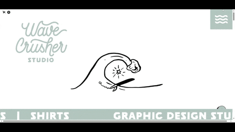
Among creative portfolio examples, this one wastes no time in showing personality. You’re greeted by a cheeky little ghost riding cartoon waves — a playful nod to the studio’s name, Wave Crusher. Here, even the navigation menu is shaped like waves!
What’s especially user-friendly is how you can filter the projects by category. Click on anything that catches your eye, and you’ll land on a dedicated project page where the graphic design firm walks you through the full process.

Versal is a studio that believes “boring is bad for business,” and their portfolio clearly walks the talk. The homepage hits you with a mix of bold serif and playful cursive fonts, bright colors like neon yellow and bubblegum pink.
As you hover over project images, subtle animations kick in — pictures wiggle, the cursor transforms, and every element begs to be clicked. All of this feels fun, confident, and interactive without being over-designed.

Roos’ is one of the memorable graphic designer portfolios out there, showing what happens when clean design meets a quirky sense of humor. The site features lots of sharp shapes and bold contrasts, adding personality in every corner.
Her contact section invites you to click “The coffee button” — a fun twist that instantly humanizes the experience. Even the services page is visually engaging, using abstract shapes filled with bright colors to highlight her offerings.
At first glance, Alex’s portfolio feels built on graphic design basics and focused on the work. But scroll a little, and you’ll notice something special. Every project tile moves at a slightly different speed, depending on where it’s placed on the screen.
The left-aligned projects scroll slowly, while those on the right pick up speed, adding a dynamic flow to the rigid block layout. Click on any project, and you’ll open full-screen view where you can explore the work from multiple angles.

From the very first slide of the portfolio, you’re introduced to the designer’s illustrative alter ego, who guides you through the work. Each page is full of personality, and the color palette adds even more character, pulling you into a playful atmosphere.
Right upfront, the designer shares a quick but informative overview: who they are, their experience, skills, and education. After you explore a vibrant showcase of projects, paired with a brief description and the challenge it aimed to solve.

This portfolio looks like it was sketched over a grid-paper notebook. It gives off this hand-crafted vibe, but with a stylish twist. Over the background, the designer layers in deep red (almost burgundy) type, which pops enough to catch the eye.
Each project is packed with images and the right amount of text. To take things up a notch, some works even include short videos. Knowing this is marked as the designer’s first portfolio, that’s seriously impressive.

This example of a graphic design portfolio doesn’t need animations to make a statement. It grabs attention with a set of fonts that somehow work perfectly against a black background. The use of bold graphic accents keeps it from feeling static.
The structure is classic: an “About Me” section, contact info, experience — everything you’d expect. But what keeps it from feeling static is the use of bold graphic accents and subtle color pops that add rhythm as you scroll.

Retro styles show up in many portfolio graphic design examples, but this one takes it further with an 80s–90s Barbie-inspired aesthetic. There are pink hues, sparkly accents, and adorable UI elements that feel nostalgic.
Each project is neatly presented with its title, a short description, visual style, and even a list of tools used to create it. That’s a smart move, as it helps potential clients instantly understand the designer’s workflow and tech stack.

This designer kicks things off with an illustrated self-portrait, injecting personality into the portfolio right from the start. Paired with a clean blue-and-white color palette, the whole presentation is fresh, approachable, and carefully curated.
What really stands out in this portfolio’s graphic design example is the level of structure and detail. The artist walks you through the full creative process of each project, supported by color palettes, typography choices, and graphic assets in use.

Mousey’s portfolio blasts you with glitch-core chaos right out of the gate. The homepage feels like a beautifully broken TV screen, filled with a giant, all-caps header and featured logos like Nike, YouTube, and Google.
Scroll down, and the chaos gives way to smartly sorted projects, each with a little counter showing how many pieces live inside. Keep going, and you’ll find something unexpected: his online store filled with graphic-design-infused merch.

The best graphic design portfolios prove that you don’t need a massive archive to make a strong impression. Laura’s site takes a split-screen approach: a fixed sidebar on the left provides all the essentials, while the right side showcases her works.
Each project may seem simple at first glance, but click in and you’ll find a deeper story. The author walks you through her process with sharp copy, strong visuals, and thoughtful details like specific color palettes and typefaces used in each design.

With a name like Be Kind Design, you’d expect something soft, friendly, and human — and that’s exactly what this portfolio delivers. The pale pink background sets the tone, while subtle scroll animations bring each project to life.
There are also doodles of smiley faces and mountains that add a personal touch. Plus, lines like “It’s nice to meet you” and “Turning frowns upside down since 1986” are sprinkled throughout the site, making you feel like you’re in good company.
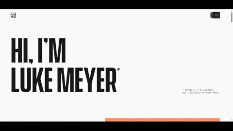
This portfolio looks ultra-minimal: tons of white space, a bold black headline on the left, and a tiny joke tucked in that gives you a quiet chuckle. But don’t let the simplicity fool you — Luke’s site hides some clever tricks up its sleeve.
Hover over any project, and the entire gray background lights up with a unique color, different for every single one. It’s a small detail, but it creates an instant connection between visual identity and project mood.

If you’re looking for something outside the box, Emre Özbek’s portfolio is a standout. Instead of the typical visual design portfolio examples, he’s taken a different route, presenting his entire portfolio as an interactive booklet.
As you flip through, the layout mimics the structure of a real printed book with clean spreads, thoughtful pacing, and detailed narratives. Creator walks you through each project with a blend of visuals and context, giving you a clear view of the results.
Once we’ve seen graphic design portfolio examples, let’s talk about how you can do it.
The truth is, even the most creative freelance designers freeze up when it’s time to showcase their own work. And if that’s where you’re at, take a deep breath. Your portfolio doesn’t need to be perfect. But it does need to be intentional.
Before you drag everything into a template and hit publish (or rush to design outsourcing), it’s worth stepping back and thinking things through. By explaining the tips below, we’ll walk you through each step to help you build the best graphic design portfolio that works hard for you.
Prior to opening Figma or picking a template, take a moment to plan what you actually want to show. To start off on the right foot, follow the steps below.
1. Showcase a diversity of work.
Especially for novices, it’s often beneficial to demonstrate that you have experience in various graphic design areas. As one Reddit user wisely advised, “A range of different types of graphic design is good, as well as a range of styles.”

Include logos, posters, UI mockups, packaging, and editorial to show that you can tackle different design challenges. However, be careful. Diversity in the type of project is great, but you still want a thread of consistency in quality and style.
One way to tie diverse projects together is through your presentation format. For this, you can use the same background or graphic design template for project images, or a consistent tone in the project descriptions.
🔥 Pro tip: It’s better to have 4 great projects than 10 average ones. Your portfolio is only as strong as your weakest piece, so be ruthless when curating.
2. Tailor portfolio to your goals.
While showing range is good, you also need to focus on the kind of work you want to be hired for. For this, you can tailor your portfolio for a certain role or niche and emphasize relevant projects.

For instance, if you’re aiming to become a marketing designer, it makes sense to include projects that highlight campaign work, such as social media graphics, ad creatives, email design, or landing pages.
Conversely, if you’re eyeing a website designer role, you’d want to showcase homepage redesigns or landing page builds. It’s fine to have other things too (it shows you’re multidimensional), but lead with what aligns with your desired niche.
Once you find a gap (say, you want to do packaging design but have no packaging in your portfolio), consider doing an individual project to fill it. You can label it as a personal or student project, what matters is demonstrating the skill.
3. Let people get to know you (and your thinking).
When curating a professional graphic design portfolio, take time to organize two main sections — “About me” and “Projects.”

Treat each project as a mini case study. Include a brief description that covers problems you aimed to solve, challenges, and unique ideas you came up with. All of this transforms a pretty picture into a demonstration of your thinking and process.
Also, consider adding a few slides or images of your work-in-progress: sketches, mood boards, wireframes, draft iterations. Clients love to see this because it lets them peek into your approach and how you handle real-world constraints.
When working on the “About me” section, share who you are as a designer. If you’re a novice, think of adding a short bio, what you’re currently doing, and your design interests or philosophy.
It doesn’t have to be very long. In fact, a friendly intro with a few fun facts often works best. You can also infuse personality here by adding a smiling photo and writing in first person with a casual tone.
Designing the portfolio itself is a project on its own (and a fun one at that!). You get to be your own client and apply your design skills to showcase, well, your design skills.
4. Choose the platform that works for you.
These days, you don’t have to code a website design from scratch to create a beautiful portfolio (unless you want to). There are plenty of tools that make this process easier. Here are some popular options, each with its pros:
5. Use AI to save time and stress.
Your portfolio should reflect you, but that doesn’t mean you have to do everything manually. In these cases, AI can be a surprisingly helpful creative assistant (not a cheat code, but a smart collaborator).
Let’s say you’re stuck writing the “About Me” section or a case study description. Instead of staring at a blank doc, drop a few bullets into ChatGPT and ask it to help shape a draft. You still edit it to sound like you, but saving hours of struggling with wording.

The same goes for layout inspiration. Tools like Framer or Wix’s AI builder can give you a starting point based on your answers, just enough to get past that dreaded blank-canvas feeling and into something visual you can tweak — something many graphic design firms integrate into their creative process.
Polishing your visuals with AI is a quick way to remove the background, crop the image, or make some touch-ups. If you need to show how a poster looks hanging in a real space, mockup generators or AI image creators can help build that environment.
6. Keep design principles in check.
Regardless of platform, applying some of the next design principles will make your portfolio more effective:
If you have huge 10MB PNG screenshots, use a tool to reduce them without quality loss. Fast loading is good for user experience, and it ensures a hiring manager doesn’t close the tab out of impatience.
Many people will view your portfolio on their phones or tablets. So, before publishing it, open the site on your phone and see if images and text scale nicely, and that navigation is easy (no tiny buttons that are hard to tap).
Stick to intuitive labels like “Work,” “About,” and “Contact.” If using a single-page scroll format, make sections clearly separated and maybe provide a top menu that scrolls to each section (anchor links).
Ensure your site itself doesn’t overshadow your work. Fancy animations and weird layouts might look cool, but ask: do they help showcase my projects? Great graphic design portfolios accentuate the content.
Double-check spelling and grammar in your text. This might sound nitpicky, but numerous design leads have said typos in a portfolio can be a red flag, as it shows a lack of attention to detail.
You’ve assembled your portfolio and put it out into the world — congrats! 🎉 Now, an important step is to gather feedback and use it to level up your portfolio (and sometimes your work itself).
As creatives, we can be close to our work and might not see its flaws. That’s where fresh eyes from the community are invaluable. Let’s explore how to get feedback, where to get it, and how to constructively apply it.
7. Get fresh eyes on your work.
One of the best things about the internet is that there are designer communities willing to help each other out. Platforms like Reddit, Discord servers, or even design-focused Slack groups are all great places to start.
You can make a post like “Portfolio Review Request — [brief context about you] — [link]” and ask for honest opinions. Be specific if you want (“Is my navigation clear? Do I need more projects?”), and you’ll often get a mix of useful critique.
Remember, these are mostly strangers, so take comments with a grain of salt, but look for common threads in their feedback.

In the earlier Reddit thread we saw, a user shared some graphic designer portfolio examples, and others chimed in with advice. One person said, “Your portfolio should express your personality and your skills,” reinforcing what we discussed about personal touch.
8. Apply critique with intention.
After collecting feedback, you might have a list of potential changes. It can be overwhelming, so prioritize.
Some issues will be quick fixes (e.g., typo corrections, increasing a font size for readability). Others might be bigger (like “rethink your project selection” or “simplify your layout”). Tackle the changes that make the most impact first.
When it comes to incorporating feedback, maintain your own vision too. If one person out of twenty hates your color scheme but you feel it truly represents you (and others had no issue), it’s okay to keep it.
Use feedback to improve, not to completely lose your voice by trying to please everyone.
A great idea is to create a checklist from the critiques. For example:
▢ Ensure each project has a brief description of my role.
▢ Remove the old poster design that got negative feedback and replace it with a newer project.
▢ Increase body text size for readability.
▢ Add a direct contact email to the top of the page.
▢ Test the site on mobile and fix the overflowing image issue on Project X.
9. Don’t forget self-review.
While external feedback is crucial, also develop the habit of reviewing your portfolio. A good practice is to revisit your work every couple of months (or before any job application) and pretend you’re someone else viewing it for the first time.
Ask yourself questions like: “Does this represent my current skill level and style?” “Is everything up to date?” “Am I bored looking at it – if so, maybe others will be too?” If you find you’ve improved a lot since a project was added, it might be time to swap that project out for newer work or refresh its presentation.

We grow quickly, and the graphic design portfolio ideas you relied on a year ago might no longer do justice to your abilities.
10. Know when to stop (at least for now).
A small caution: it’s possible to fall into an endless loop of tweaking your portfolio and never feeling “ready.” At some point, you have to put it out there and use it to apply for jobs or show clients.
So, gather feedback, improve, but also recognize diminishing returns — a mindset that can save both time and budget when considering graphic design pricing. If you’ve fixed the major issues and the portfolio clearly showcases your skills, that’s a win. Future feedback or new projects can be implemented later.

Don’t let striving for perfection prevent you from seizing opportunities with a portfolio that’s already great.
Remember, feedback is fuel, not a verdict. Use it to fuel your growth. After all, even top graphic designers’ portfolios continuously get critiqued and keep improving.
A portfolio is a mirror that reflects where you are right now as a designer. It shows how you think, what you value, and how you want the world to see you. And just like you, it’s allowed to change. In fact, it should change — evolving alongside your mastery of graphic design basics.
So if you’re “not ready” to publish, here’s a little secret: no one ever feels fully ready. The designers you admire also started somewhere. Probably with three good projects and a shaky About Me. And they refined it. Then refined it again.
Because when you put your work out there — even if it’s not perfect — doors start to open. People find you. Opportunities find you. Growth finds you.
And if nothing else, your future self will thank you for starting now.