Graphic design
12
min read
So, you want to learn graphic design basics but have no clue where to start? Maybe you're overwhelmed by talk of fonts and color theory. Maybe you're broke and staring at Canva, wondering why everything still looks like a school project. Whatever brought you here, you're not alone — and you're definitely not too late.
Graphic design can feel like a mysterious superpower. Like you either “have the eye” or you don’t. But here’s the truth: it’s not magic, and it’s not reserved for a chosen few. It is never too late or too early to start learning the basics of graphic design. Design is about solving problems. That’s the heart of it — design is communication. It's turning an idea into something people instantly get.

This no-BS guide is like sitting down with a mentor who cuts the jargon and tells you what actually matters. By the end, you’ll understand:
At TodayMade, we live this stuff. We build real designs for real brands, and we know what works in the wild. So what you’re getting here isn’t theory — it’s the practical, real-world version of basic graphic design you can start applying today.
Ready? Let’s dive in.
It’s rarely said out loud, but your first designs won’t be great. In fact, the next ten might not be either, and that’s completely normal.
Every skilled designer began with awkward, overdone, or confusing work. What sets them apart? They kept going. One Redditor nailed it: “Everyone sucks at first. It’s the ones who stick with it through the suck that get good — and even great — eventually.”
If you’re endlessly bookmarking tutorials and watching videos without making anything, consider this your permission to shift gears. Start creating. Reading can help, but progress only happens when you start doing. This is where the fundamentals of graphic design come to life.
Here’s how to practice with purpose:
You’ll struggle. You’ll make stuff that looks wrong and you won’t know why. That’s good. That’s your design fundamentals kicking in.
So grab whatever tool you’ve got — Photoshop, Canva, Figma, doesn’t matter. Make something. Look at it. Ask what’s working and what isn’t. Then make the next thing.
That’s the core habit that counts when you’re new. Everything else builds on that.
Once you’ve got the habit of making things, it’s time to sharpen them. Let’s break down the graphic design concepts that instantly make your work look more professional.
A degree isn’t necessary to make things look polished. What you do need is a solid grasp of five simple principles. Think C.R.A.P. + T: Contrast, Repetition, Alignment, Proximity plus Typography.

Master these, and your designs will instantly look more polished, even if you’re brand new.
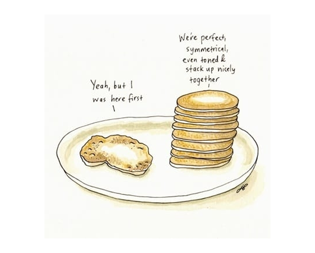
Contrast means difference in size, color, spacing, or shape. It’s how you direct attention. Without it, everything blends into a mess. With it, you control what stands out.
Big vs. small, bold vs. thin, dark vs. light — use contrast to guide the viewer’s eye.

Try this: Design a quote with all text the same, then redesign it with a bold title and smaller body. Notice what changes.
Repetition makes your design feel intentional. Reuse fonts, colors, icons, or shapes to create unity. Don’t switch things up randomly, build visual consistency — a principle that applies just as much to graphic illustration as it does to layout design.

Try this: Make a simple business card. Stick to one font for titles and one or two consistent colors.
Nothing should just float. Pick an edge or center line and align everything to it. Use guides or grids to make layouts feel clean and balanced.
When things line up, they look intentional — a core lesson in design 101.

Group related elements close together. Separate unrelated ones. This helps people understand what goes with what.
If everything’s spaced the same, it’s a visual mess. Let your layout breathe — white space is your friend.

Fonts set the tone. Good typography is clear, consistent, and easy to read.
Use no more than two fonts. Build a hierarchy with size and weight. Don’t cram text. Don’t get fancy with hard-to-read type.

Try this: Grab a block of text from a website you like. Rebuild it using just two fonts and clear spacing. You’ll start seeing why it works.
That’s it. Five basic principles. Use them every time you design, no matter the tool or style. They’re your shortcut to cleaner, smarter work.
Got the basics down? Let’s look at the tools that bring them to life.
Let’s clear something up: you don’t need to master every design tool on day one. You just need to understand what each tool is best for and where to begin.
Probably the easiest entry point. Canva is a free, beginner-friendly tool for layouts, social media graphics, and quick designs. It’s drag-and-drop simple and comes with built-in templates. The Pro version ($12.99/month) adds features like brand kits and export options, giving beginners an early sense of how graphic design pricing can vary across tools and services.

Figma is a free, browser-based tool that’s great for UI design, wireframes, and layouts. Its clean interface and collaborative features make it a top pick for digital design basics. It’s slightly more advanced than Canva but still very beginner-friendly.

A capable, free alternative to Photoshop. It’s great for photo editing and general graphic design work. While the interface isn’t as polished, it covers the essentials for raster-based design without the price tag.

This is a free, open-source vector editor — similar to Illustrator. It’s powerful but has a steeper learning curve, especially when it comes to the interface and usability.

Affinity’s suite is a solid middle ground between free tools and Adobe’s pro software. Designer handles vector work, Photo does raster editing, and Publisher is for layout. Each is a one-time purchase (~$69.99) and suitable for intermediate users.

Most professional designers rely on Adobe’s big three:
Photoshop is the industry standard for photo editing and raster-based graphics. It’s extremely versatile but can be overwhelming for beginners. Best for advanced image manipulation and graphic creation.

This is Adobe’s vector tool — ideal for logos, icons, and illustrations that need to scale. It requires more technical understanding, especially with anchor points and paths.
The most specialized of Adobe’s tools, InDesign excels at complex layouts like books and magazines. It’s text-heavy, feature-rich, and best learned after you’ve mastered the basics of design structure.

Each Adobe app is priced at around $22.99/month individually. You don’t need all three right away — just choose the one that fits the kind of work you’re excited to create.
Tools don’t make the designer. They just bring your graphic design concepts to life. Learn them as you go, not all at once.
And remember: if you get stuck, just search “how to [do X] in [tool name]” on YouTube. That tip alone will save you hours.
Start small. Learn just enough to create something. Then repeat. That’s how real skills grow — not from memorizing buttons, but from building real projects.
Complementary, triadic, monochromatic — color theory sounds like something out of a textbook. But here’s the truth: you don’t need to memorize color wheels to use color well. You just need a few basic ideas and the confidence to try stuff.
Color is how you make people feel something at a glance. It’s not just decoration, it sets tone, builds contrast, and helps guide attention. When it’s off, people notice. When it works, they feel it before they even know why. Understanding how to use color is a big part of basic graphic design.
Here’s what you actually need to know:

You don’t have to build palettes from scratch either. Tools like Adobe Color make it easy to play with combos and save what works. Want to train your eye? Try the game Blendoku. It’s a color puzzle app, and way more fun than memorizing theory.


One simple rule: use fewer colors, not more. Stick to 2–3 main colors in any beginner project. Trying to use the whole rainbow just makes things chaotic. Want to make it easy? Steal a color palette from a photo you like or use a site like Coolors to generate one.

Mini exercise: Take a design, like a poster or Instagram graphic, and recreate it three times using different color schemes: one complementary, one analogous, one monochromatic. Which one feels best?
Color theory isn’t about getting it “right.” It’s about experimenting, reacting, adjusting. Pick a palette, try it out, and see how it feels. That’s how your color instincts develop.
Now let’s bring structure into your work with one of design’s best-kept secrets: grids.
Most people won’t see your grid, but they’ll feel it. Good alignment, structure, and balance? That’s grid magic. Bad design almost always feels off because the invisible structure behind it is a mess, and recognizing that is a core part of any graphic design guide.
Grids help you organize information. They make your design look intentional, even if you’re just working with text and a couple of shapes. They guide the viewer’s eye without the viewer realizing it, which is what makes them one of the most underrated digital design basics.
The basics are dead simple:


Grids aren’t about following rules — they’re about giving your design structure, so that everything feels grounded, even if it looks effortless.
Find a poster or web layout you like. Drop it into your design tool and draw rough columns or lines where things seem to align. Chances are, they follow a grid. Then, try building your own layout using a basic 3-column structure. You'll instantly notice how much more cohesive your design feels.
Want to explore further? TheGridSystem.org is a great resource, or just start noticing grids in the wild. Once you see them, you can’t unsee them.
Ready to level up? Let’s look at how to keep learning smart and steady.
You don’t need a fancy degree or a MacBook to master the basics of graphic design. What you really need is time, curiosity, and a clear path and thankfully, most of that is free.
Your design education can happen right at your desk (or on your phone). The trick is to stop collecting resources and actually use them. Start with one of these and go all in:

The key? Don’t binge 30 tutorials. Choose one resource. Follow it all the way through. Actually, do the exercises. That’s how you learn.
Now, turn that practice into proof; it’s time to build your portfolio.
Once you’ve got some practice under your belt, it’s time to turn that effort into something you can show the world.
Here’s the good news. You don’t need paying clients to build a solid portfolio. What you do need are smart ideas and follow-through.

Redesign something that already exists. Try a poster for your favorite band, a local bakery’s menu, or a fake campaign for a climate app. Treat it like a real job. Research, sketch, design, revise, and don’t forget to incorporate current graphic design trends into your work.
Offer to help a nonprofit, a student club, or a friend’s side hustle. The feedback, deadlines, and limitations are real, and they’ll make you better. Just set boundaries if you’re working for free.
Aim for three to five strong pieces. A logo. A layout. A simple web page. More important than quantity is showing how you think. Include a short paragraph explaining your design decisions. It shows intention and maturity, a trait shared by many standout graphic design portfolio examples.
Good design can still fall flat if it's presented poorly. Use mockups to show your work in context, like a flyer on a wall or a logo on packaging. Whether it’s a simple PDF or a basic website, make your portfolio clean and easy to navigate. It reflects your eye for detail.
Write down three dream projects. Maybe a café rebrand, a poster series for a music festival, or a travel app interface. Pick one and treat it like a real client brief. Research it. Sketch ideas. Build the layout. Add a short description to explain your decisions.
Congrats — you’ve just created your first real portfolio piece. Do that a few more times and you’ll have a body of work that shows what you can do, client or not.
With real work in your hands, you’re not just learning anymore, you’re designing.
You made it through the basics. Now it’s time to build.
Every designer starts out unsure. The ones who improve are the ones who keep going. You don’t need to get everything right, you just need to keep creating.
You’ll get better with each project. You’ll start to spot what works, and your instincts will sharpen. When in doubt, come back to the fundamentals. They’ll never steer you wrong.
So stop reading. Start designing. Pick a project and finish it. The only way forward is through the work.
Need help turning your ideas into visuals that work? Whether you’re refining your UI with pop-up examples, exploring web design trends like brutalist web design, or figuring out the cost to hire a graphic designer, freelance graphic designer, or graphic design outsourcing solutions, we’ll help you make the right call.