Marketing Collateral Design: Types, Strategies, and How to Choose the Right One for Your Brand


Anyone can make a brochure. Fewer know how to make it work. In this guide, we’ll walk you through 15+ marketing collateral types and show how to design assets that hit the mark, every time.
Being spotted on a billboard on the Las Vegas Sphere costs over half a million dollars a day… Luckily, you don’t need that kind of marketing budget to get noticed.
Marketing collateral has been around for decades, and most brands already rely on it. But while the idea isn’t new, the way collateral works (and works well) is constantly evolving. And what worked last year might already be irrelevant.
As a marketing design agency, we know how challenging it is to keep up. To help you cut through the noise, we’ve prepared this guide with everything you need to understand, choose, and design high-performing brand marketing collateral.
Marketing collateral refers to the materials your business uses to communicate with your audience — both digital and physical. It includes everything designed to inform, attract, or convince people as they move through the decision-making process.
These can be blog posts that answer visitors’ questions, a pitch deck sent before a sales call, a social-media graphic with a case study breakdown, and more.
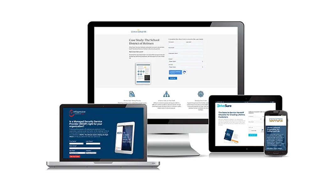
What often causes confusion is the line between brand assets and marketing collateral. Brand assets, like your logo or color palette, set the foundation. Collateral, otherwise, builds on that foundation and puts it to work in the real world.
Collateral in marketing comes in many forms, and the list of possible formats keeps growing. Below, we break down some of the most widely used types of collateral so you can get clear on what’s out there and which formats might fit your goals best.
When people are researching a problem, comparing solutions, or simply looking for insights, blog posts are often their entry point. As a piece of digital marketing collateral, a well-written article can build authority and drive ongoing engagement.

In HubSpot’s 2025 survey of over 500 marketers, 65% of companies maintain a blog, and 47% of those find the blog “very important” to their strategy.
As marketing collateral, you can use blog posts in these ways:
When designing, consider that online readers tend to skim, so format your posts with clear headings, short paragraphs, and bullet points. An informative post that’s easy to scan will keep visitors engaged longer. Incorporate SEO best practices (like using relevant keywords in headings) so that your content appears in search results.
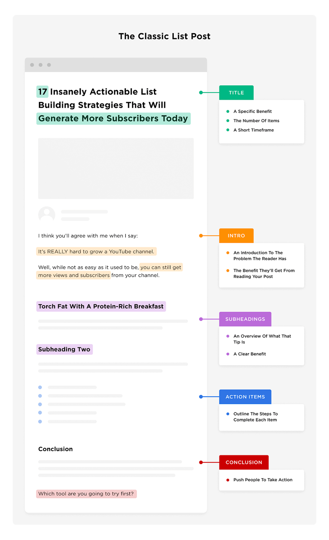
It’s also best to avoid leaving readers with a wall of plain text. To keep them engaged, include images, graphs, or illustrations to break up the copy. Visuals help improve readability and explain complex concepts more clearly.
If you’re working on a TOFU blog, it’s smart to invite further engagement. Conclude with a gentle call-to-action (CTA) such as “Learn more,” “Sign up,” or “Book a call.” This way, interested readers know how to continue their journey with you.
Social media assets refer to the content marketing you create for platforms Facebook, Instagram, LinkedIn, TikTok, etc. Essentially, any visual or multimedia that you publish on social channels can be recognized as a social media asset.
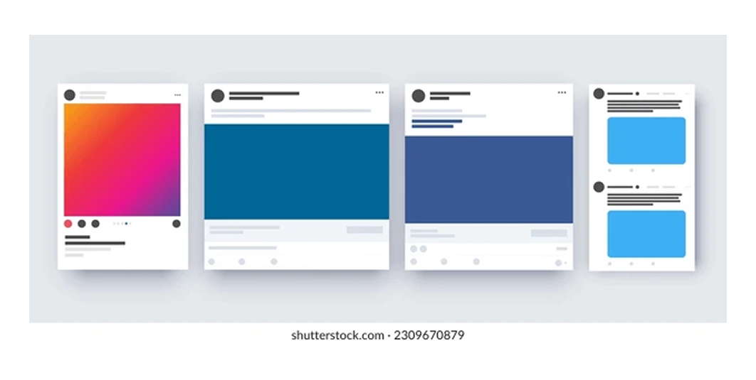
It’s a common fact that a great social media design stops the scroll. In crowded feeds, your creative has to work harder and design for impact.
Social media assets can take many forms:
Start by understanding what each platform expects: image sizes, video durations, caption length limits, and visual tone. Designing to fit these constraints prevents awkward cropping and ensures your valuable content looks professional in the feed.
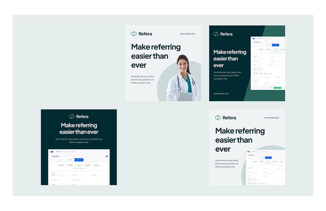
That’s the mindset we brought to the Refera project. The client needed branded social media graphics that worked across platforms. By staying true to the specific formats, we delivered a set of assets that looked consistent and performed well.
Design and copy go hand in hand here. Pose questions, tease value, or use visuals that spark curiosity. Graphics with a single message tend to perform best, especially when paired with a CTA in the caption. When possible, use carousels to deliver layered content in a swipeable format, each slide adding context or a next step.
Motion helps, too. Even subtle animation can draw the eye. Social platforms often prioritize video in their algorithms, and some data suggests that video assets can generate up to 6x more engagement than static visuals.
That kind of boost is hard to ignore, and it’s one of the reasons motion design service has become such an integral part of our creative process.
Explainer videos are short videos (often 1–3 minutes) that simplify and explain a concept, product, or service. Typically, they use a mix of narration and visuals (animations, live-action demos, or a bit of both) to tell a story in a concise way.

According to Wyzowl, 91% of people say they’ve watched an explainer video to learn about a product or service. So if you’re on the fence about making one, do it.
Many explainer videos follow a formula: introduce a problem or question, then show how a solution works and why it matters. The tone is usually light and accessible, aiming to make the viewer think, “Aha, I get it now.”
Here are a few benchmarks to guide your video planning:
Whether you choose animation or live footage, visuals should support the narration. Avoid crowding the screen with text or complicated diagrams. Use simple graphics and icons to illustrate points. If you feature a person speaking, add graphics around them or cut away to examples to keep it visually interesting.

And always keep in mind that audio is half of the experience. Captions are useful, but pairing them with upbeat background music or subtle sound effects makes a big difference. Royalty-free music can help set the tone and keep the pacing sharp.
Digital ads and banners are skim-friendly snapshots of who you are, what you do, who it’s for, and why it matters. They show up across websites, apps, and ad networks to deliver your message wherever your potential customers are browsing.
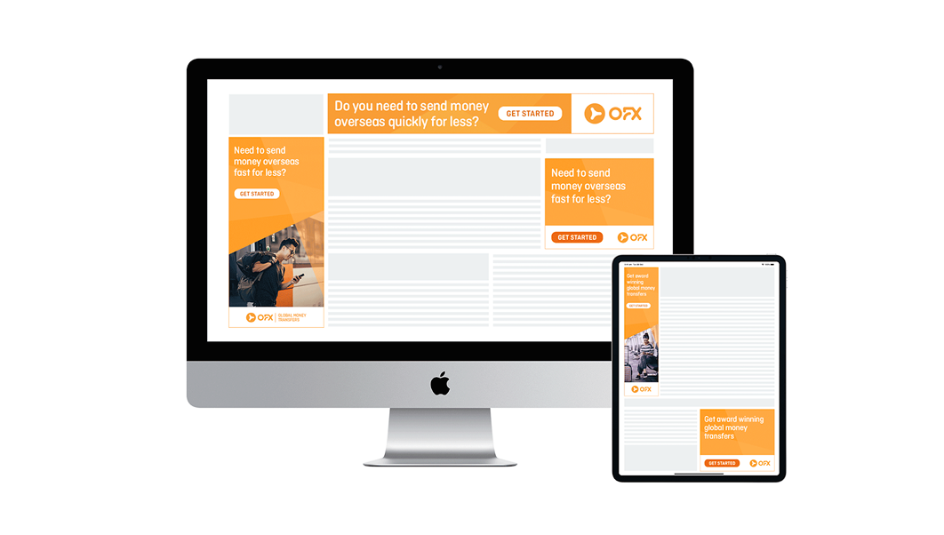
That said, many users simply ignore banner-like content, a phenomenon known as banner blindness. To avoid being invisible, your banner must be visually distinct.
Here are a few elements that tend to perform well in advertising design:
If you want to capture attention immediately, lead with a tight value proposition. Treat it like a headline of a landing page and make sure it encourages action. You can strengthen it with visual trust signals like logos, badges, or star ratings.
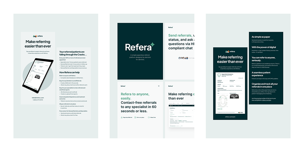
Be aware that dimensions will vary depending on where you plan to place the banner. Prepare for that early, or stick to standard sizes like 300×250, 728×90, or 160×600. It’s also smart to export PDF, A4/Letter, and lightweight image files.
Case studies and testimonials are among the most persuasive types of marketing collateral. They show how your solution has made a real impact, and can be the final push a prospect needs to choose your product or service.
If you look at many top-performing case studies, you’ll notice that most of them use a clean visual hierarchy, strong data callouts, and comparison visuals (like before vs. after) that make the impact obvious at a glance.
As with social media assets, design and copy align closely. Your job is to structure the story clearly, starting with the challenge, moving through your approach, and ending with the results. Visuals are your tool to reinforce the narrative.

When designing case studies, we recommend including some form of social proof. This can be client quotes, short impressions, before/after metrics, outcomes achieved, or even funding updates (if applicable). These elements add weight and help make it clear that the case is not a made-up success story.
Aside from hosting case studies on your website, you can repurpose them:
For prospects doing research before making a decision, ebooks, white papers, and guides serve as proof that you understand the domain. And because they’re downloadable, you can gate them, making them strong lead magnets.
Speaking in terms of ebook design, you can follow some of the next tips:
There’s no hard rule for length, but aim for substantial content. Provide enough depth to truly educate (more than a blog post could), but stay focused on the topic. It’s better that the reader finishes a 20-page ebook than abandons a 100-page tome.
Finally, decide whether to gate the content. For TOFU awareness, you might offer it ungated to build goodwill and widen your reach. If you do gate it, the perceived value has to be high so the reader feels it’s worth handing over their email.
Among marketing collateral examples, a product comparison page lets visitors see side‑by‑side how your product (or service) stacks up against competitors. It helps people clarify differences when choices are close, and nudges them toward yours.

What a good comparison page does:
Once you decide to design such a page, pay special attention to the grid layout. The standard format uses parallel columns that allow visitors to scan differences quickly. Small visuals can do the heavy lifting, helping the eye spot distinctions.
And once you’ve made your case, don’t let the page go cold. Guide the user forward with a gentle CTA button like “Try it on your data” or a short demo video rather than jumping straight to “Talk to sales.”
Webinars and product demos sit somewhere between content and conversion. They’re live (or live‑feeling) presentations that allow your target audience to experience your expertise, your product, and your brand in real time.

According to multiple sources, webinars that engage with polls, Q&A, or chat breaks see significantly better retention. And since these events require registration, they also serve as lead generation tools built into your marketing funnel.
If you plan to share a presentation during your session, avoid overloading each slide. Instead, break ideas into multiple sections to keep the pacing smooth and the messaging clear. At the same time, stick to your brand’s fonts, colors, and style.
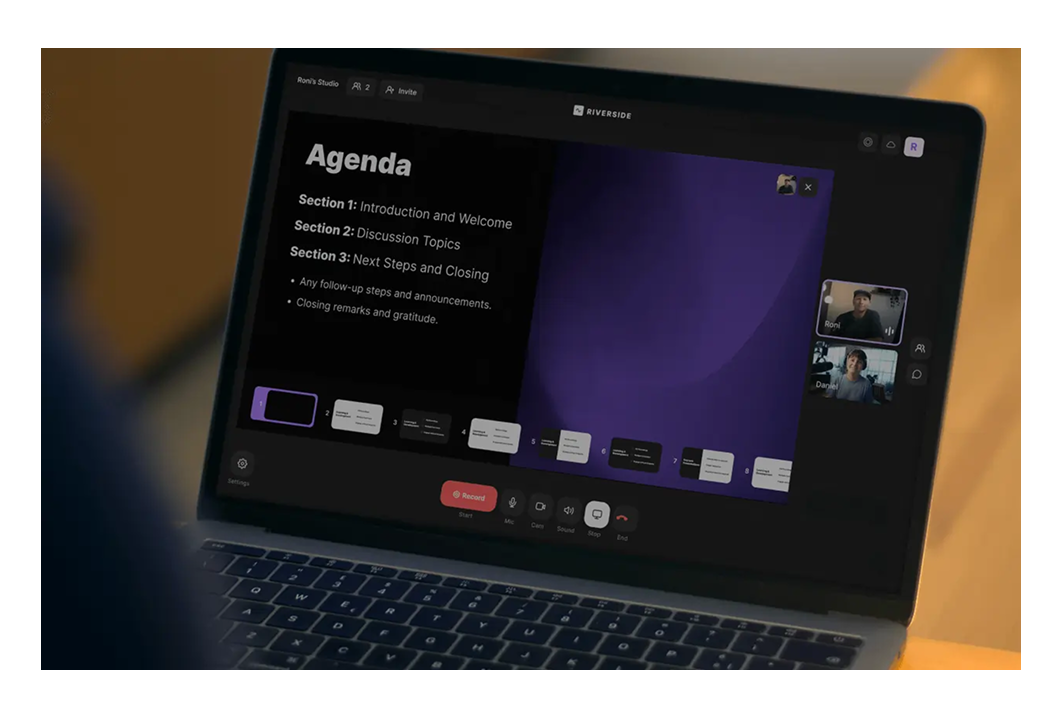
To keep attention high, you can experiment with light animations or transitions between slides. It’s not essential, and won’t fit every brand, but when used tastefully, motion can help maintain interest without distraction.
Once the webinar is over, you can easily repurpose it into other types of collateral:
Pitch decks and sales presentations are structured narratives used in fundraising, enterprise sales, or high-stakes pitches. Your deck must first earn attention, then build trust, and finally make it clear that your solution is the logical next step.
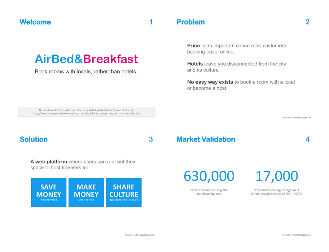
When looking at decks across industries, they tend to focus on the same goals:
And all of that hinges on great presentation design. It means that you should follow core design principles, such as brand consistency, generous use of white space, visual hierarchy, and a clear narrative structure. These basics create a foundation that supports your message rather than distracting from it.
Plus, take into account that the intro is the part people pay most attention to. So, make it count. Place a relevant trend, bold statement, or surprising stat that frames the urgency at the start. Your logo or company history won’t spark much curiosity.
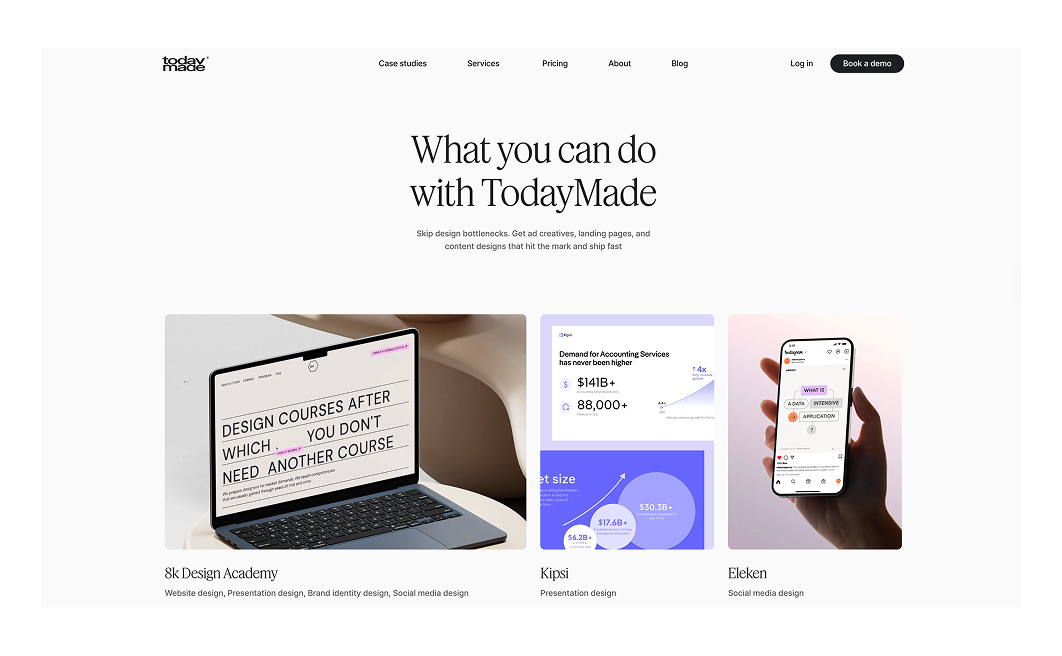
If you’re looking for inspiration, our presentation design for Kipsi is a strong example. We applied all the techniques mentioned above and helped the client make a powerful lasting impression with a deck that truly delivered.

Infographics are visual representations of information or data. They combine text, images, charts, and icons to communicate facts or concepts at a glance and might take the form of a colorful chart, timeline, flowchart, or any other visual format.
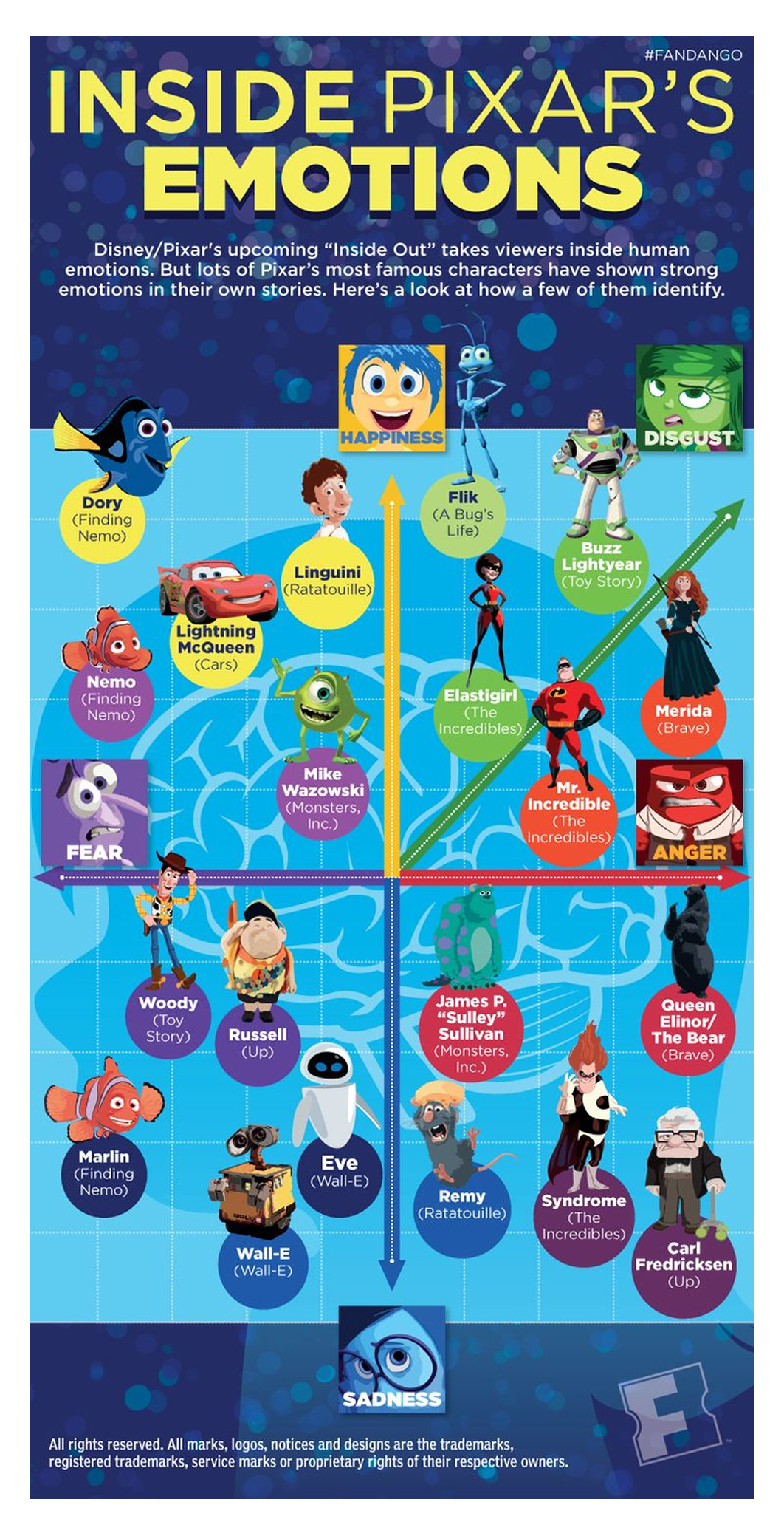
In fact, over 65% of marketers rely on infographics, and businesses using them often see up to 650% higher engagement compared to text-only content.
Infographics might be used for different scenarios, including:
The design should be easy to read and understand within seconds. For this, use concise text labels or captions and avoid long paragraphs. Choose legible fonts and a size that will still be readable if the infographic is viewed on a smaller screen.
Plus, consider that this asset is highly shareable. That means you’ll want to use dimensions that fit well in social feeds. Since many infographics are designed as long vertical scrolls, create a shorter preview version for other platforms.
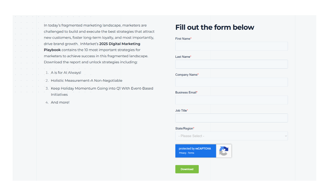
Landing pages are purpose‑built pages designed to convert a visitor via sign-up, trial request, content download, or other single action. Unlike your homepage, they’re laser-focused on one goal, which makes their design just as critical as messaging.
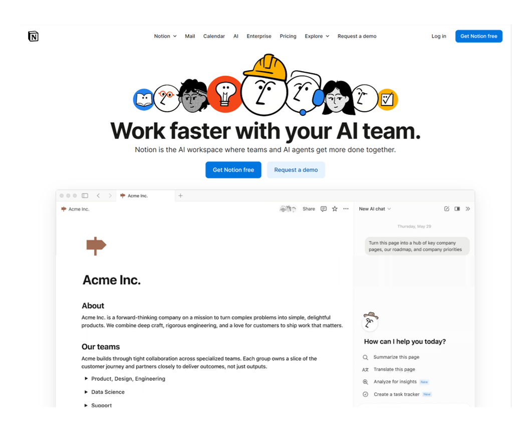
There’s a report that shows that well-designed landing pages have conversion rates around 9.7%, outperforming more generic pages.
If you’re planning to design a landing page, here are the essential elements:
When designing, follow a logical structure: problem → benefit → features → proof → CTA. This keeps users engaged and focused, guiding them naturally toward the intended action without distraction or friction.
Speed also matters. Landing pages that load slowly lose traffic, and often, conversions. To avoid this, steer clear of oversized visuals, heavy animations, or unnecessary scripts. Compress assets, use modern formats (like WebP), and test your page’s performance with tools like Google PageSpeed Insights.
Printed materials remain valuable collateral because they give people something tangible to hold, keep, and revisit. Even in a digital-first world, print assets cut through noise and create a sense of credibility, permanence, and trust.

A neuromarketing study supports that idea and states that physical ads leave a stronger emotional impression and are remembered longer.
Here are soeme printed marketing material examples:
From a design perspective, bear in mind that the fold or layout determines how readers navigate your content. Depending on the content flow, you might use a bi‑fold, tri‑fold, Z-fold, gate fold or other formats.

And one essential note is to always test your print materials. Your layout might look perfect in Figma, but once printed, things may not translate well. Print a physical proof, review every detail, and make adjustments before the final run.
Going back to our mention of the billboard on the Las Vegas Sphere, you can absolutely use large-scale visual media like this as part of your marketing collateral. With this type of asset, you usually have only a few seconds to capture attention.
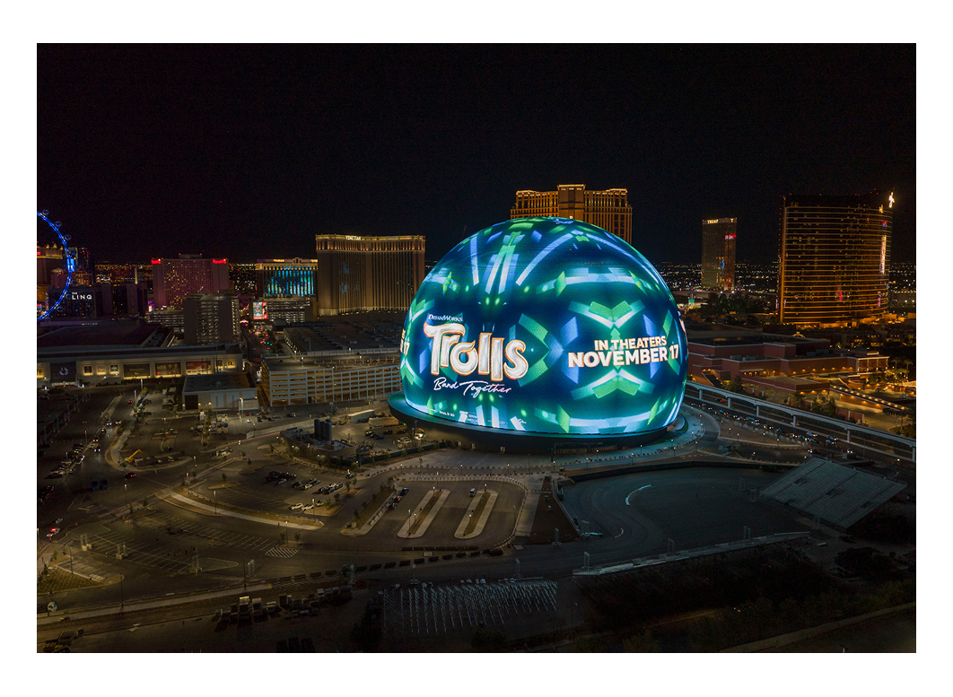
Designing for these formats isn’t always straightforward. First, your core message, logo, and value proposition need to be legible from a distance. That’s why booth backdrops, roll-ups, and billboards should stay simple, bold, and uncluttered.
If you’re working with smaller-scale booth displays, you can incorporate interactive elements like touchscreens, product demos, or augmented reality. These active displays help pull people in and keep them from just walking past.
But there are also some tricky parts that you should be aware of:
In marketing collateral, email design is often the overlooked one. However, it’s a powerful asset that can help you welcome a new user, nudge an inactive one, or guide someone through their journey, reinforcing your brand and driving real action.
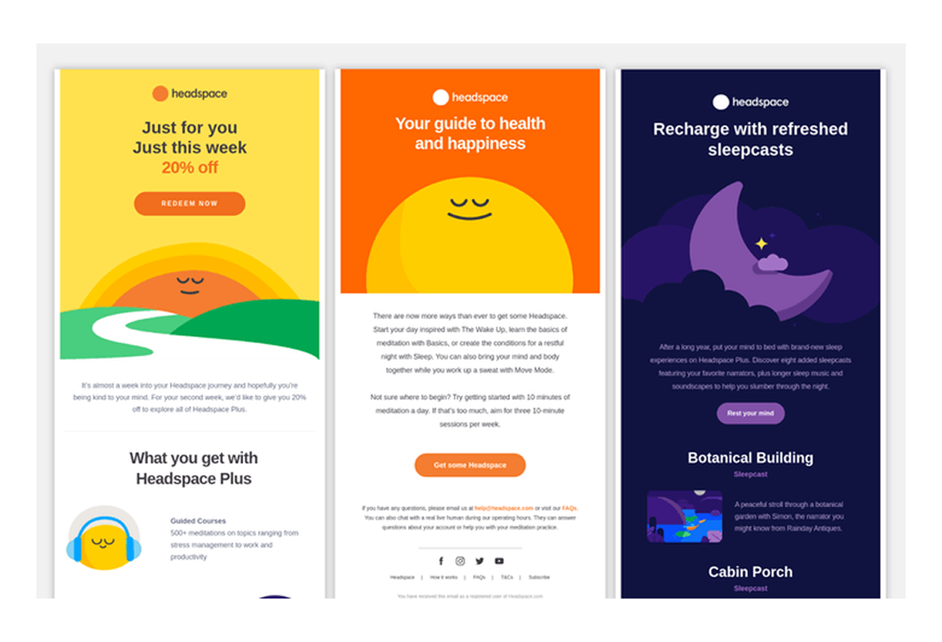
Despite being lightweight in form, emails show up directly in your audience’s inbox and can be tailored for onboarding, engagement, updates, promotions, or referrals.
Of course, crafting great emails starts with strong copy that grabs attention and gets users to open the message. But once they do, it’s the design that holds their focus. Your job is to guide them visually so they don’t lose interest mid-scroll.
Emails serve different purposes, but most follow the same design structure:
And sometimes, email is your last shot at re-engagement. A clean, well-designed message with a new feature, a limited-time offer, or a simple “Need help?” prompt can be just enough to bring someone back.
Branded items are physical touchpoints that bring your brand into the real world. No matter it’s a thank-you package, a personalized gift, or swag like mugs and t-shirts, these items extend your brand experience beyond screens and show that you care.
You can distribute these items at events, run giveaways, use them as client gifts, or even open a branded store for those who want to buy in.

Physical items work as collateral marketing for several reasons:
Designing these kinds of assets comes with its challenges. Since you’re working with different shapes and surfaces, the design approach will vary. The visual foundation (colors, logo, tone) stays the same, but you’ll need to adapt it to fit the item.
A smart move is to include a secondary collateral piece (a printed card, a QR code, or a mini booklet) that connects the physical gift to your digital experience. This helps tie everything together and builds stronger brand awareness across touchpoints.

Creating marketing collateral can be a long run, but even the best piece won’t land if it’s off-message, poorly timed, or misaligned with your audience. At this point, getting design right isn’t the easy part, and the following tips will help you do it better.
Before you ever open a design tool, take a step back and define what your marketing collateral ideas are meant to do. You need to know who this asset is for, where they’ll see it, and when in their journey. If you skip this step, you risk pouring energy into something that looks great but doesn’t move the needle.
Here’s a simple question to answer: what decision do we want to move the user closer to? It could be “book a demo,” “download the guide,” or “understand the value.” Either way, the design won’t be successful unless it aligns with that outcome.
Data helps here, too. Look into analytics, CRM insights, or past campaign performance to identify which creative assets already perform well. If your emails consistently lead to sign-ups, it might be smarter to invest in improving that flow than designing another one-pager no one will open.
As we mentioned earlier, your design should align with your initial message. If you’re communicating something different in each brand collateral, your design should reflect that shift. A great practice is to treat each layout as a single idea — you pick one core message and build your visuals to support it.
Now, if each piece of collateral carries a different message, that doesn’t mean the design has to feel disconnected. You need to be consistent. Your colors, fonts, iconography, and imagery should all speak the same visual language.
And when you’re adapting a single brand message across multiple channels, make sure the design scales well. An asset must work across email, banners, print, or social while still feeling unified and recognizable.
One often overlooked factor is accessibility. Many treat it as an afterthought until it becomes a problem. Be one step ahead by ensuring legible typography, proper color contrast, and mobile readability to quietly signal professionalism.
Designing collateral is never a one‑and‑done task. You build, release it, and then it’s on you to measure whether it’s doing the job. Without feedback, you’re flying blind.
First, define the metrics that matter for each asset. These can include:
Use those numbers as your compass. When you notice a piece underperforming, don’t panic. Just iterate. Try new visuals, adjust the layout, simplify the copy, or refine your CTA. Even subtle changes can unlock meaningful improvement.
It helps to work in cycles. At TodayMade, for example, we stick to a 90-day refresh cadence, and you can easily adapt this to your workflow. Every few months, retire what’s stale, update what’s relevant, and A/B test what’s in between. This mindset keeps your collateral aligned with your audience and your current goals.
A thoughtfully designed asset can spark an entire ecosystem. All you need is to build once, then stretch that design into multiple touchpoints.
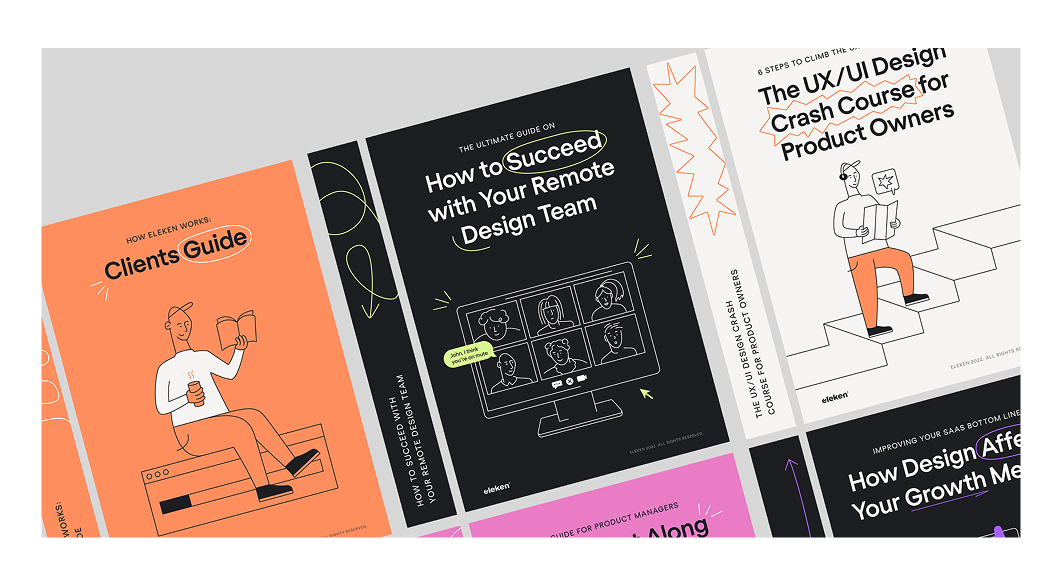
This kind of work we did when working on designs for Eleken. Our team created a flexible visual system with social media formats, email designs, ebook covers, and more, all rooted in the same identity. That way, each channel carries a unified voice and look, while adapting the layout or composition for its format.

When you design, think not just of “this one piece” but of what you can spin from it: the social snippet, a banner, a trimmed-down flyer. A strong original concept gives you derivatives that feel like part of the same story rather than forced variations.
That doesn’t mean you stretch a design too thin. Some adaptations may need adjustments in hierarchy or cropping. But if your core visual components, like colors, typography, and icon sets, are consistent, those variants still feel cohesive.
Picking the right business tools is what lets your ideas live, evolve, and scale.
For professionals, that often means using Adobe Illustrator or Figma, which give you control over layouts, precision, and scalability. At the same time, tools like Canva or Adobe Express are great for quick adaptations or updates by non-designers.
When selecting a tool, take into account your team’s skill level, your production needs, and how your assets will be reused across formats. The goal is to build a library of modular files you can tweak without rebuilding from scratch every time.
And if design isn’t your strength, or if you need to move fast under tight constraints, you can always get in touch with the TodayMade team. We specialize in bringing strategy and design together so your collateral performs from day one.
Most of all, collateral design is about decisions. The small ones you make in a headline. The big ones you make about where to show up. The strength of your design is in how clearly it leads someone to the next step without forcing it.
Get that right, and your brand will feel confident. And the right people will stay with you.


